Series Common Settings
Overview
AnyChart Stock Component supports 14 types of series. Each chart can contain any number of series, but it is not recommended to put more than ten series on one chart, for chart becomes unreadable when too many series are shown at the same time. Series of any type has some common settings and we will talk about them in this article. To learn more about specific settings for each type please see Series Types and Settings.

Series Declaration
Series is a visual representation of the data provider on the chart. To show series on the chart you should declare it in the series list.
Sample XML to declare series:
As you can see series is defined using <series> node, with type, color and data_provider attributes.
type sets the type of the series and can be one of the following:
- Line
- Spline
- SplineArea
- Bar
- Area
- RangeArea
- RangeBar
- RangeSplineArea
- StepLine
- StepLineArea
- Candlestick
- OHLC
- Marker
- Stick
color sets the color of the series and dependent elements. See more about series coloring in Setting Color and using %Color token.
data_provider sets the data provider name with data for the series. See more about series and data providers in Understanding Data Model article.
Depending on the series type the data provider should contain specific named fields. Table below lists all series types and required fields:
| Series Type |
Required fields |
| Line |
"Value" or "Close" |
| Spline |
"Value" or "Close" |
| SplineArea |
"Value" or "Close" |
| Bar |
"Value" or "Close" |
| Area |
"Value" or "Close" |
| RangeArea |
"High", "Low" |
| RangeBar |
"High", "Low" |
| RangeSplineArea |
"High", "Low" |
| StepLine |
"Value" or "Close" |
| StepLineArea |
"Value" or "Close" |
| Candlestick |
"Open", "High", "Low", "Close" |
| OHLC |
"Open", "High", "Low", "Close" |
| Marker |
"Value" or "Close" |
| Stick |
"Value" or "Close" |
Setting Color and using %Color token
By default all series are colored in black, to color series you should set its color explicitly.
Sample syntax to color the series:
16 | color: "Rgb(120,40,120)" |
21 | color: "Hsb(150,79,85)" |
The color can be set in different format, it can be hex code, web-constant, RGB or HSB macros, also you can use transform functions, for example: <series color="DarkColor(#FEFE00)"/>. Learn more about coloring in Using Colors article.
The color set for the series used to draw the series and other depended elements, such as legend item, tooltip and markers.
Wherever you configure the series you can set either a color constant or %Color token, which will be replaced by the value of color attribute upon rendering.
Here is a sample XML for lines and fill of Area series:
05 | color: "DarkColor(%Color)", |
As you can see %Color is used to configure fill and line, but for line color is transformed: DarkColor(%Color), to make border distinct.
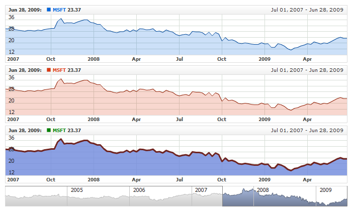
Live sample below shows to Area series, two of them use settings from defaults section and the third one uses personal settings with static colors defined:
Live Sample: Series - Using Dynamic and Static Colors
Setting Name
You can set the name of the series using <name> subnode. Sample XML below shows this:
Legend Element
For each series you can define its element in legend. This element contains the settings for the formatting string of the text in legend that represents the series. Configuration of such elements is described in Legend: Series Labels article.
Tooltips
You can either use global tooltip settings or create personal tooltips for each series. See detailed description in Tooltips tutorial.
Custom Attributes
For each series you can define a set of custom attributes that can hold any additional data about the series. These attributes can be used in legend, tooltips and passed to external event handlers.
Sample XML to define series custom attributes:
06 |
<attr name="LongName"><![CDATA[Microsoft Corparation]]></attr> |
13 |
<attr name="LongName"><![CDATA[Oracle Corparation]]></attr> |
09 | LongName: "Microsoft Corparation", |
10 | StockSymbol: "NASDAQ:MSFT" |
19 | LongName: "Oracle Corparation", |
20 | StockSymbol: "NASDAQ:ORCL" |
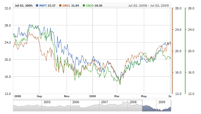
Samples of using custom attributes can be found at:
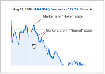
Markers
Series of any type can show point markers of different shape and color.
Marker can be in to states "Normal" and "Hover". "Hover" is shown when user hover over the respective value on X-Axis, in all other cases marker is shown as "Normal".
Illustration below shows what is marker in Hover and in Normal states:
XML for tuning markers for the given series looks like that:
21 | color: "DarkColor(%Color)", |
37 | color: "DarkColor(%Color)", |
As you can see all settings are done in <marker> node. This node should be placed in the settings block of the given series.
Turning On / Off and States
To turn markers on or off enabled attribute of <marker> node is used. By default markers are enabled for all series types. To turn it off set: <marker enabled="false"/>.
Also, you can disable markers for the certain state. By default markers are turned on in "Hover" state, and turned off in "Normal" state. Turning states on and off can be done in enabled attribute of <hover> and <normal>. See sample XML below:
Marker Type
Marker type defines a shape of the marker and is set using type attribute of <marker> node. Table below lists and shows all possible marker types:
| |
Type |
 |
Circle |
 |
Square |
 |
Diamond |
 |
Cross |
 |
DiagonalCross |
 |
HLine |
 |
VLine |
 |
Star4 |
 |
Star5 |
 |
Star6 |
 |
Star7 |
 |
TriangleUp |
 |
TriangleDown |
Marker Size
The size of the marker (in pixels) is set for each state using size attribute in <normal> and <hover> nodes.
Sample XML to define marker size in different states:
As you can see marker has the size of 10 pixels in "Normal" state, and 15 - in "Hover". If you want size to be the same in both states - set it in <marker> node, for example: <marker type="Circle" size="13">.
Marker Fill and Border
You can change marker fill and border. Fill and border are configured in <fill> and <border> nodes for each marker state. When you define the color for them you can use %Color token (see more in Setting Color and using %Color token ).
Sample XML to configure fill and border in different states:
29 | color: "DarkColor(%Color)", |
Marker Sample
Live sample below shows marker settings.
Live Sample: Series - Using Markers
Range Types Specifics
Series of RangeBar, RangeArea and RangeSplineArea types have two markers instead of one (for high and low values).
Specifics is described in the following articles:
Value Highlighter
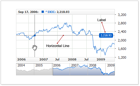
The AnyChart Stock component offers two additional elements for highlighting values under the mouse pointer. Those are Date Highlighter, which is an X-axis customization, and Value Highlighter, which is a customization of a specific series. These two elements together form an element known to end-users as Crosshair.
You can also be interested in Y-Axis value highlighter, which enables user to see the value he hovers on the plot without reference to series value(s).
Value Highlighter is a horizontal line drawn through the entire plot area. The line is drawn through the point pinned by the mouse pointer. Besides the line, Value Highlighter can contain one or more labels, which could display the current value or any static text.
The illustration below demonstrates the elements Value Highlighter consists of:
This section gives a brief coverage on configuring the element. For further details on all available functions, please refer to XML Reference.
Enabling and Customizing Line
By default, Value Highlighter is disabled. The element can be enabled and customized only for a specific data series.
Below is the XML syntax for enabling and customizing the line:
As you can see on the listing, all the settings are provided in the <value_highlighter> node.
The live sample below demonstrates the use of two series with Value Highlighter enabled for one of them:
Live Sample: Series Value Highlighter - Enabling and Line Settings
Detailed information on customizing the value highlighter's line is available in XML Reference.
Adding Value Label
You can add a single or multiple labels to Value Highlighter. A label can display the value of the point, static text or a combination of the value and static text. By default, Value Highlighter does not have any predefined labels.
Below is the XML syntax for setting up a label to be positioned at the right within the plot area. For the sake of better readability, the label has a background:
23 | format: "{%Value}{numDecimals:2}", |
To have the label display a value, insert the {%Value} token into the text formatting string. Below is the XML syntax for inserting the token into the formatting string:
02 | format: "{%Value}{numDecimals:2}" |
The {%Value} token is numeric, so you can customize its appearance. For more information on customizing the numeric token parameters, please refer to Numbers Formatting.
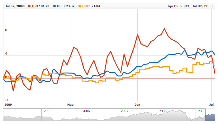
The live sample below demonstrates adding labels to different series; one of them uses two labels.
Live Sample: Series Value Highlighter - Using Label
As you can see from the sample, the lower chart uses a data series of the Candlestick type. For Candlestick and OHLC series, Value Highlighter always appears in the value of the Close field; the value in the captions, returned by the {%Value} token, also matches the value of the Close field.
This section covers only the basic principles of adding and using labels. For the comprehensive coverage, please refer to XML Reference.
Customizing for the RangeBar, RangeArea and RangeSplineArea Series Types
It has been told above that Value Highlighter is configured in the section; however, the exceptions are the RangeBar, RangeArea and RangeSplineArea types series, as they display two values instead of one, and Value Highlighter can be used for each of them.
The XML syntax below gives a simplified demonstration of where Value Highlighters are configured for the high and low values by the example of the Range Area type:
With range-based series, Value Highlighters function the same way as they do with series of other types; thus, you can easily use the entire range of their functions and settings.
This live sample demonstrates the use of the RangeSplineArea and RangeBar type series with Value Highlighter:
Live Sample: Series Value Highlighter for Range Based Series Types
Series binding to extra Y-Axis
AnyChart Stock allows to use extra Y-Axes. The main purpose of extra axes is showing two or more series in different scales, for example when series ranges differs greatly or series are measured in different units.
By default all series are bound to the primary Y-Axis. To bind series to alternative axis you should specify axis identifier, like shown in XML below:
01 |
<?xml version="1.0" encoding="UTF-8"?> |
02 |
<stock xmlns="http://anychart.com/products/stock/schemas/1.9.0/schema.xsd"> |
As you can see there are to extra axes: extra1 and extra2, and three series - one bound to primary Y-Axis, and two other series - to extra axes. Binding is done using axis attribute in <series> node, like that: <series axis="extra5"/>.
Live sample below shows binding series to axes:
Live Sample: Binding Series to the Axis
Extra axes are described in details in "Adding and using Extra Axes" section of Y-Axes Settings Tutorial .
Series Z-Index
By default all series are drawn in the order they are defined in a configuration.
You can change ordering using z_index attribute in <series> that specifies the display order of a series on a certain chart panel. A series with a greater z-index is always in front of a series with a lower z-index. It works for regular series as well as for series that are used to visualize technical indicators.
Sample syntax:
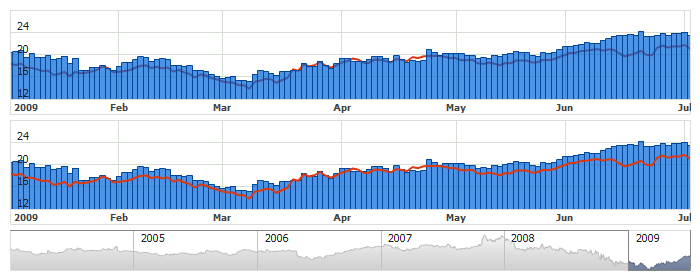
Live sample below demonstrates how to change display order for two series. Top chart demonstrates default order, on the bottom chart Bar series is put behind the line.
Live Sample: Series ordering
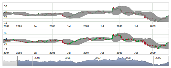
Live sample below demonstrates how to change display order for candlestick series and BBands indicator. Top chart demonstrates default order, on the bottom chart BBands indicator is put behind the candlestick series:
Live Sample: Candlestick series and BBands indicator ordering
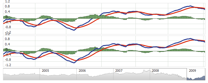
Live sample below demonstrates how to change display order of series for MACD indicator. Top chart demonstrates default order, on the bottom chart histogram series is put behind lines:
Live Sample: Technical Indicator - Series Ordering
Defaults Section
There is a special section to set default values in AnyChart Stock component XML: <series_settings_defaults>, where you can define marker and value highlighter settings for all series of the given type in one place, instead of setting them for each series individually.
For example, to configure line thickness in one chart for all series of
Line, Spline, StepLine and Stick types just set:
Live sample below has three series: of Line, Spline and StepLine types. All series use marker
and value highlighter settings defined in <line_series/> node :
Live Sample: Series - Using Defaults Sections
Default for other types work in the same way. Table below shows what sections in XML configure certain series types:
| Series Type |
Node's Name |
| Line, Spline, StepLine, Stick |
<line_series> |
| Area, SplineArea, StepLineArea |
<area_series> |
| Bar |
<bar_series> |
| RangeArea, RangeSplineArea |
<range_area_series> |
| RangeBar |
<range_bar_series> |
| Candlestick |
<candlestick_series> |
| OHLC |
<ohlc_series> |
| Marker |
<marker_series> |
Note that there is another way to define defaults: