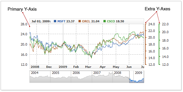
Y-Axes Settings
Overview
AnyChart Stock's value axes (or Y-axes) have a lot of features and
are very configurable. Each chart can contain one or several value axes.
Be default, each chart contains only one Y-axis, the so-called Primary axis; it is
positioned on the left edge of the chart, and all series and technical indicators are bound to it. You can
also add several extra axes, which in terms of configuration options are similar to
Primary axis.
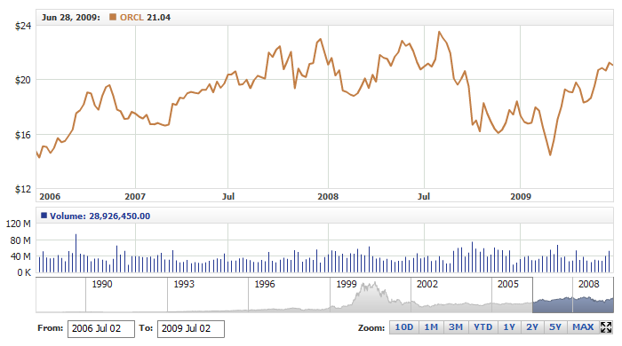
The illustration below demonstrates a chart with the primary and extra axes on
it:
And this sample XML shows where the axes are configured:
Although almost all properties of the axes are described in this
article by the example of the primary axis, they are applicable to the extra
axes too.

Axis Positioning
As it was mentioned earlier, a chart can have multiple axes
simultaneously. Any of the axes (the scale with the labels) can be placed to the right or to the left
side of the chart, with or without any padding.
This sample XML demonstrates changing the position of the Primary axis:
As you can see here, the position is defined with two attributes:
- position - defines which side the axis is to
be positioned on, Left or Right
- offset - defines the distance to the axis from
the chart's edge.
The direction of the offset direction depends on the value set in the position
property. Thus,
if the position value is set to "Left", the offset will go to the left, as well
as setting the position value to "Right" will move the offset to the right.
Offset is helpful when you have multiple axes with the same position value.
The live sample below demonstrates placing the Primary axis on the right
edge of the chart without any offset:
Live Sample: Value Axis Positioning - Primary to the Right
Here is another - more complex - example of using offsets for extra axes:
Live Sample: Values Axis Positioning - Primary and Extra Axes
Adding and using extra axes is covered in detail in the Adding and
Using Extra Axes section of Y-Axes Settings Tutorial .
Using Labels
Every aspect of aspect of axis labels - format, font, background and position
- can be customized. This section covers all applicable settings.
Positioning and Alignment
All label settings are configured in the <labels> node:
The <labels> node has the following attributes:
| Attribute |
Possible Values |
Description |
| enabled |
true|false |
Sets whether or not labels should be shown. |
| position |
Inside|Outside |
Sets whether labels should appear inside or outside the chart. |
| valign |
Top|Center|Bottom |
Sets vertical alignment for labels. |
| padding |
Any Number |
Sets label padding in pixels. |
| show_first |
true|false |
Sets whether the first (smallest by the value) label should be shown. |
| show_last |
true|false |
Sets whether the last (greatest by the value) label should be shown. |
Here is a sample set of XML settings for positioning labels:
The settings above position labels outside of the chart with a 5px padding;
labels are centered, and the last value is always visible.
The live sample below shows these settings in action. Please note that when labels are
positioned outside the chart, you are also to configure the margins in <chart><inside_margin/></chart>:
Live Sample: Value Axis Labels Positioning
Font Settings
You can customize label font with the <font> subnode.
Here is a sample XML for customizing label font:
Here is a live sample demonstrating the settings shown above in
action:
Live Sample: Value Axis Labels Font Settings
Learn more about font settings in Font Settings.
Text Formatting
By default, axis labels show values only, but you can define
your own format for them and have them show your own data. Use the <format> subnode for that
purpose and specify the formatting string in it. To paste the actual value to
the label, use the {%Value} token, which
would be replaced with the actual value upon rendering.
A typical formatting task is adding the percent symbol in the comparison mode. In this mode, you need
the % symbol placed before the value; thus, the formatting string should be configured
as follows: <format>%{%Value}</format>.
You can format the numbers returned by the {%Value} token
by using additional parameters. For example, if the chart shows extremely large and long numbers (billions and millions), you can scale the values. For example,
this way: <format>{%Value}{scale:(1000)(1000)(1000)|( K)( M)( B),numDecimals:0}</format>
To learn more about formatting numbers, please read
Numbers Formatting.
This sample XML shows where the <format> node should be placed, and
how it is to be configured:
05 | format: "${%Value}{numDecimals:1}" |
The live sample below shows two charts with formatted Primary axis labels.
The first chart has the "$" prefix on the labels, and the second
one uses scaling:
Live Sample: Value Axis Labels Formatting
Background
To make labels more contrast and avoid the mixture with elements
of the chart, you can configure label background.
Here is a sample XML for configuring label background:
This live sample demonstrates a chart with configured label background:
Live Sample: Value Axis Labels Background Settings
To learn more about configuring label background, please refer
to the Background and Borders tutorial.
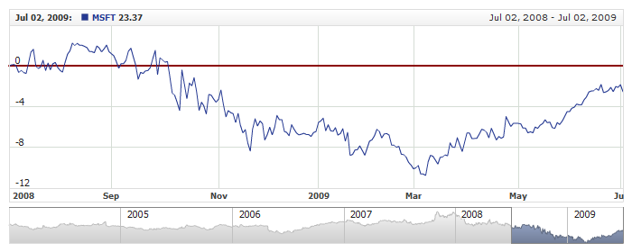
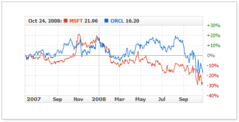
Value-Dependent Coloring
To make your chart more readable, especially in the Comparison Mode, you can
have axis labels set in different colors. AnyChart Stock has a special feature
for defining colors for positive, negative and zero-value labels.
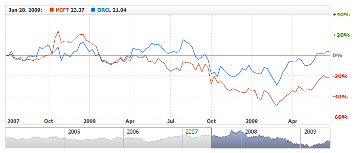
The illustration below shows a chart with an axis in the PercentChanges mode. All
the positive values are colored in Green, negative - in red, and the zero label is
left Gray:
To switch axis label coloring to this mode, you need to add the %Color token in
the <font> node:
This live sample shows labels with value-dependent coloring:
Live Sample: Value Axis - Labels Coloring Conditions
Green for positive, red for negative and gray for zero are the default
settings; to customize these settings, you can use the positive_color, negative_color and zero_color attributes in
the <labels> node.
The sample below demonstrates customizing value-dependent coloring:
Customizing colors for negative and positive values could be critical; for example, in some Orient cultures red
color is a sign of "good" things, and therefore using this color for showing
a price decline could be misleading.
The live sample below demonstrates the "reverse" use of green and red:
Live Sample: Values Axis - Labels Coloring Conditions in Chinese Style
The general settings for configuring label font are covered in Font Settings.
Using the allow_overlap attribute
Be default, the AnyChart Stock engine forbids the overlaps of axis labels. So, in cases when the chart size changes or when the scale interval is rather small, some labels can be omitted.
If you don't want to lose the labels and prefer to have the overlapped labels visible rather than lost, you can disable the overlap control. To do so, set the allow_overlap attribute in the <labels> node to true.
Here is a sample XML with this attribute set:
The live sample below shows a chart with manually configured scale limits and interval. In this case, the labels are overlapping a bit and the allow_overlap prevents them from being omitted:
Live Sample: Values Axis - Allow Labels Overlap Settings
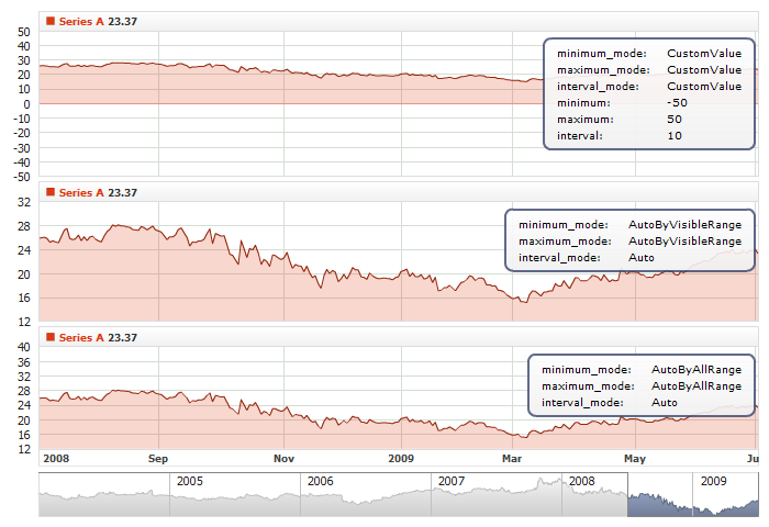
Scale Settings
This section describes how the axis scale can be configured, including intervals, labels, offsets and so on.
Limits, Intervals and Offsets
By default, the component engine calculates the optimal step for labels and
the optimal value range automatically. However, you can override the automatics and set
your own the step and range.
The table below lists the attributes of the <scale> node that are in charge of this:
| Attribute |
Possible Values
(Default in Bold) |
Description |
| minimum_mode |
AutoByVisibleRange
AutoByAllRange
CustomValue |
Sets the mode for axis minimum:
AutoByVisibleRange - the scale minimum is calculated automatically according to the data shown,
AutoByAllRange - the scale minimum is calculated automatically according to the whole data set,
CustomValue - the scale minimum is set in minimum attribute.
|
| minimum |
Any number
e.g. -500, no default
|
Sets axis minimum.
Works only if minimum_mode is set to CustomValue.
|
| soft_minimum |
Any number
e.g. -500, no default
|
Sets axis soft minimum.
Works only if minimum_mode is set to AutoByVisibleRange or AutoByAllRange.
|
| maximum_mode |
AutoByVisibleRange
AutoByAllRange
CustomValue |
Sets the mode for axis maximum:
AutoByVisibleRange - the scale maximum is calculated automatically according to the data shown,
AutoByAllRange - the scale maximum is calculated automatically according to the whole data set,
CustomValue - the scale maximum is set in maximum attribute.
|
| maximum |
Any number
e.g. 500, no default
|
Sets axis maximum.
Works only if maximum_mode is set to CustomValue.
|
| soft_maximum |
Any number
e.g. 500, no default
|
Sets axis soft maximum.
Works only if maximum_mode is set to AutoByVisibleRange or AutoByAllRange.
|
| interval_mode |
Auto
CustomValue |
Sets the mode for interval calculation:
Auto - scale interval is calculated automatically basing on optimal_step_count attribute.
CustomValue - interval is set in interval attribute.
|
| interval |
Any Number
e.g. 20, no default
|
Sets axis interval.
Works only if interval_mode is set to CustomValue.
|
| minimum_offset |
0..1
Default: 0.05
|
Sets offset of the minimum value in quotients to the whole data range. It is used in scale minimum calculation.
Doesn't work if minimum_mode is set to CustomValue.
|
| maximum_offset |
0..1
Default: 0.05 |
Sets the offset of the maximum value in quotients to the entire data range.
Used in the scale minimum calculation routine.
Doesn't work if maximum_mode is set to CustomValue.
|
| optimal_step_count |
Any Number
Default: 4
|
Sets the optimal number of ticks for the axis.
Doesn't work if interval_mode is set to CustomValue.
|
Working with interval and limits modes
The live sample below shows three charts with the same data series
but different scale settings: in the first one, the scale is fixed by the constants, and
the interval is defined; the second and the third ones demonstrate different automatic options:
Live Sample: Value Axis - Limits Settings
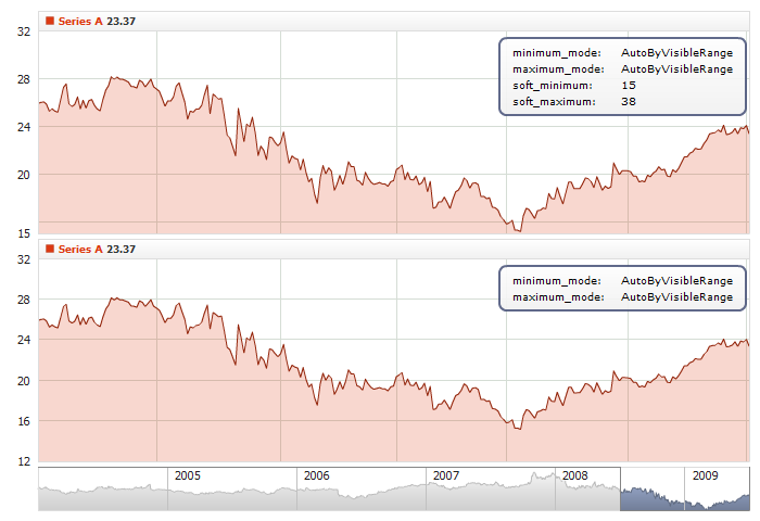
Soft Minimum and Soft Maximum: Tuning Auto Calculation
In some cases you may have no need to define solid minimum or maximum and need a scale to be autocalculated with the help of
AutoByVisibleRange or AutoByAllRange modes, but at the same time you may want a scale to remain
in a certain range (i.e. "never go below zero" or "never go above 100"): that's the case, when soft_maximum and
soft_minimum attributes help you. You just define them along with the minumum_mode and/or maximum_mode attributes:
See a sample below, where two charts contain the same series based on the same data set, but in one case
soft_minimum and soft_maximum tunes autocalculation, so the scale never leaves [15,38] range. Zoom to different time ranges
to see how it works.
Live Sample: Value Axis - Soft Minumum and Soft Maximum
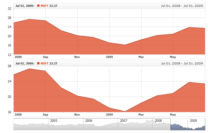
Working with the "minimum_offset" and "maximum_offset" attributes
The minimum_offset and maximum_offset attributes
set offsets from the top and the bottom of the chart. These offsets work only in the automatic modes and don't work at all with fixed minimum and maximum values.
The values can vary in the range from 0 to 1, where 0 is 0% of the total chart height, and 1 is 100% of the total chart height. By default both values are set to 0.05 ( 5% ).
The live sample below shows two charts. One uses the default offsets, and the other has offsets set to zero:
Live Sample: Value Axis - Limits and Offsets
Working with the "optimal_step_count" attribute
optimal_step_count sets an approximate (desirable) number of scale intervals when the minimum and the maximum are calculated automatically.
The live sample below demonstrates how this option works:
Live Sample: Value Axis - Limits and Optimal Step Count
Setting-up Scale-Mode (Comparison Modes)
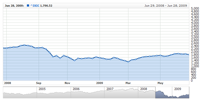
AnyChart Stock supports the so-called "Comparison Mode" - a very important feature for showing stocks-related information - that allows comparing changes in series values for a given date.
This features depends on the value axis, and it has two attributes for configuring the Comparison Mode. Here is a sample XML that demonstrates how to enable the Comparison Mode:
04 | mode: "PercentChanges", |
As you can see in the sample, the two attributes are defined in <scale> node:
mode - sets the scale mode or, to be more specific, defines what values are to be shown on the scale and chart. The table below describes the possible values:
| Value |
Description |
| Values |
Display values. |
| Changes |
Display changes in values. |
| PercentChanges |
Display changes in percents. |
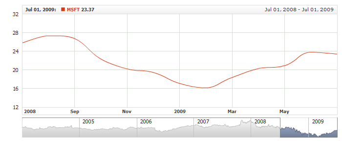
The live sample below shows three charts, and each one of them uses a different mode:
Live Sample: Value Axis Scale Modes
calculate_changes_from - sets the moment since the comparison is to begin with. The table below describes the possible values:
| Value |
Description |
| SeriesStart |
Comparison begins from the earliest point of all data sets on the chart. |
| FirstVisible |
Comparison begins from the earliest point of visible dates. |
| CustomDate |
Comparison begins from the custom date defined in the base_date attribute. |
When using CustomDate in calculate_change_from, make sure to have set that custom date. This sample XML shows how you can do that:
04 | mode: "PercentChanges", |
As you can see here, a custom date is set in the base_date attribute. This date should follow formatting rules described in Input Date-Time Format article.
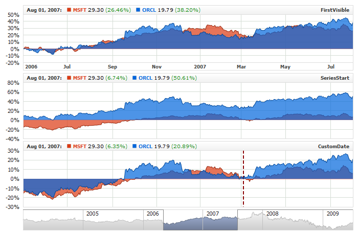
This live sample demonstrates all three calculation modes. All of the charts use the same PercentChanges scale mode, but they all have a different comparison base date:
Live Sample: Value Axis - Scale Modes and Calculate From Parameter
Logarithmic Scale
AnyChart Stock supports the logarithmic scale mode and can use it even with negative values, which makes it indispensable when running in the comparison mode.
Use the following XML instructions to enable the logarithmic mode:
The logarithmic scale has several options; particularly, for working with negative values.
The table below describes the attributes of the <scale> node related to the logarithmic mode:
| Attribute |
Possible Values |
Description |
| log_base |
Any number
e (interpreted as Math.E) |
Sets log base value for the logarithmic scale. By default set to "10". |
| negative_mode |
Linear
Mirrored
Offset |
Defines behavior for processing negative values for the logarithmic scale mode. By default set to "Mirrored". |
| log_limit |
Any number |
Sets the smallest log_base power that is processed by the regular logarithmic rules. The value processor's behavior for values smaller than log_base powered by log_limit is regulated by the negative_mode attribute. If not set, the power is calculated automatically, optimized for the best appearance. |
The live sample below shows a chart with a logarithmic scale:
Live Sample: Value Axis - Using Logarithmic Scale
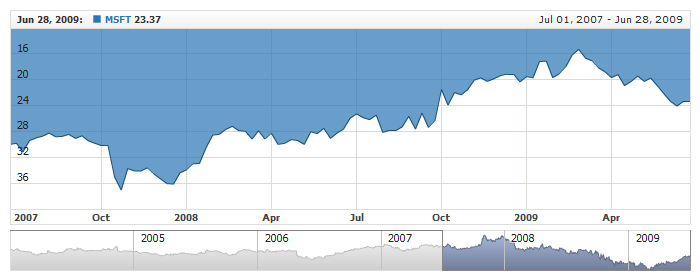
Inverted Scale
Any axis scale can be inverted. To make the scale inverted use the following XML:
This live sample shows the Primary axis in the inverted mode:
Live Sample: Value Axis - Using Inverted Scale
Pinned Value
If you want to ensure visibility of a certain value on a scale you can pin that value in a way it is always drawn in the middle of the scale.
In order to set pinned value use_pinned_value attribute should be set to "true" and the value itself should be set in pinned_value attribute. Here is a configuration sample that demonstrates how to pin zero value:
Live sample that demonstrates how to pin zero value on a scale:
Live Sample: Value Axis - Pinned Value
Limiting Scale Draw Region
If you are using two scales on one chart and want one of them to occupy only a part of chart height, you should use:
scale_start_ratio and scale_end_ratio attributes. Particularly this option is very useful, when you want to display Volume chart on the same plot with Price data. These ratios are set like this:
No labels or tickmarks are shown out of the range defined by scale start and end ratios, and the result may look like in the sample below - volume chart occupies only 20% of the chart
Live Sample: Technical Indicators - Adding Volume Indicator - Same Chart with Scale Region Control
Axis Line
For each axis, you can draw a vertical line of the chart height positioned as defined in the offset attribute. By default, such line is disabled, but you can enable and configure it. Here is a sample XML demonstrating how you can do that:
Here is a live sample with the line enabled and positioned with the offset:
Live Sample: Value Axis - Line Settings
Tickmark Settings
Any value axis can show tickmarks next to the labels. By default, tickmarks are disabled, but you can enable and configure them. Here is a sample XML showing how you can enable and configure tickmarks:
As you can see here, tickmarks are configured in the <tickmarks> node, which has the following attributes:
| Attribute |
Possible Values |
Description |
| enabled |
true
false |
Enables/Disables tickmarks. |
| size |
Any number |
Tickmark line length in pixels. |
| inside |
true
false |
Enables/Disables drawing tickmark within chart plot. |
| outside |
true
false |
Enables/Disables drawing tickmark outside of chart plot. |
| show_first |
true
false |
Enables/Disables drawing tickmark for the smallest value. |
| show_last |
true
false |
Enables/Disables drawing tickmark for the greatest value. |
| thickness |
Any number |
Tickmark line thickness. |
| color |
Any color |
Tickmark line color. |
| opacity |
Number 0..1 |
Tickmark line opacity. |
| pixel_hinting |
true
false |
Enables/Disables pixel hinting (see details below). |
The pixel_hinting attribute should be set to "true" when size is set to a small value (less than 4px) to avoid the smearing of the lines.
This live sample demonstrates tickmarks configured for the Primary axis:
Live Sample: Value Axis Tickmarks Settings
Setting Axis Title
Each Y-axis has a Title - that's an element for displaying a caption for the axis. By default, title is disabled for both Primary and Extra axes. But whenever it becomes necessary, you can enable and configure it as required.
Here is a sample XML for configuring the title for the Primary Y-axis:
As you can see it on the listing, title is enabled and configured in the <title> node. Title has settings typical for caption; those are text, defined in the <format> subnode, and font, customizable in the <font> node.
Below is the table of all attributes that can be used in the <title> node:
| Attribute |
Possible Values |
Description |
| enabled |
true
false |
Enables/Disables showing title. By default set to false. |
| offset |
Any number |
Horizontal offset against axis position. |
| align |
Top
Center
Bottom |
Vertical position of the title along the axis. By default set to "Center". |
| padding |
Any number |
Vertical padding from the top or bottom point of the axis. Applicable only when the align attribute is set to "Top or Bottom". |
| render_as_bitmap |
true
false |
Enables displaying text as raster image. Setting to "true" enables rotating text by any angle. By default set to "true". |
| rotation |
Angle -360...360 |
Defines decimal rotation angle for axis title text. The angle can be divisible by 90 degrees or any other. Rotation works only when the render_as_bitmap attribute is set to "true". By default, the rotation value is set to "-90". |
Here is the live sample demonstrating the simplest configuration of an axis title:
Live Sample: Value Axis Title
Here is a more complex live sample that demonstrates enabling and configuring axis titles for both Primary and Extra axes:
Live Sample: Value Axis - Using Extra Axis with Title
Grid Lines
Each value axis - primary or extra - has its own grid. By default grid is enabled for all axes and looks like a set of gray lines. You can turn it off or configure to fit your needs. Here is a sample XML with grid settings:
As you can see in the sample, grid lines are configured with the <line> node, and the <grid> node has only the enabled attribute.
The table below lists the attributes available for the <line> node:
| Attribute |
Description |
| thickness |
Sets line thickness. |
| color |
Sets line color. |
| opacity |
Sets line opacity. |
| pixel_hinting |
Enables/Disables pixel hinting. |
| dashed |
Enables/Disables dashed mode. |
| dash_length |
Sets dash length. |
| dash_space |
Sets dash space. |
This live sample demonstrates a grid of dashed lines:
Live Sample: Value Axis - Dashed Grid Lines
To learn more about grid line settings, please read about the respective nodes in XML Reference.
Zero Line
The Zero Line of a value axis uses its own settings; by default, it's a semi-transparent red line of 1px width. You can override these settings and use your own instead.
Here is a sample XML demonstrating how you can customize the Zero Line:
This live sample demonstrates a chart with a customized Zero Line:
Live Sample: Value Axis - Zero Line Settings
To learn more about zero line settings, please read about the respective nodes in XML Reference.
Value Highlighter (Crosshair)
The AnyChart Stock component offers several additional elements for highlighting values under the mouse pointer. Those are Date Highlighter, which is an X-axis customization, and Series Settings: Value Highlighter, which is a customization of a specific series. Each Y Axis also has its own value highlighter, which enables user to see the value he hovers on the plot without reference to series value(s) and that's what we describe in this article.
These elements together form an element known to end-users as Crosshair.
Value Highlighter is a horizontal line drawn through the entire plot area. The line is drawn through the point pinned by the mouse pointer. Besides the line, Value Highlighter can contain one or more labels, which could display the current value or any static text.
Live Sample: Value Axis - Value Highlighter
The configuration of Y-Axes Value Highlighter is just the same as Series Value Highlighter, please refer to Series Value Highlighter tutorial and XML Reference.
Adding and Using Extra Axes
Besides the default primary axis, you can add and use extra Y-axes. The number of such extra axes is not limited, but using more than three of them is not recommended.
In terms of functioning, extra axes are similar to the primary Y-axis; they have all the same settings.
The XML sample below demonstrates how extra axes can be added to your chart:
01 |
<?xml version="1.0" encoding="UTF-8"?> |
02 |
<stock xmlns="http://anychart.com/products/stock/schemas/1.9.0/schema.xsd"> |
As you can see here, the extra axes are specified with a set of the <axis> nodes within <extra> node. Each extra axis has the required id attribute with the unique name for the axis; for example, <axis id="extra1"/>.
The id of the extra axis is used for binding the series to that axis. The XML sample below shows one series bound to the primary Y-axis, and two other series bound to the extra1 and extra2 axes.
This live sample demonstrates a chart with extra axes and series bound to them:
Live Sample: Adding Extra Values Axes
Synchronizing Multiple Axes
There is an option for synchronizing two axes to make their scale maximum, minimum and intervals identical. One series there is main, and the other is synchronized with it. Series cannot be bound to a synchronized axis; they should be bound to the main one.
This function is mainly used for decorative purposes, to place identical axis labels to the left and to the right edge of the chart.
This sample XML demonstrates synchronizing the extra axis with the primary one:
As you can see here, the synchronize_with attribute defines the name for the axis the other axes are to be synchronized with.
The live sample below demonstrates the most typical synchronization case: the chart has the primary and an extra axis. No series is bound to the extra one; instead, it is bound to the primary one and looks just like it:
Live Sample: Value Axes Synchronization
Default Settings for All Y-Axes
You can set defaults for all Y axes on the chart. It may be useful to avoid settings duplication.
All default settings are set in <value_axis_defaults> node. Sample XML below shows how to define default settings for Y axes labels:
05 |
<format><![CDATA[{%Value}{numDecimals:3,trailingZeros:false,plusSign:true}]]></format> |
10 | format: "{%Value}{numDecimals:3,trailingZeros:false,plusSign:true}" |
Live sample below shows the chart configured using default settings:
Live Sample: Value Axes Defaults