Legend: Series Labels
Overview
Legend in AnyChart Stock Component is rather complex, but flexible element. It is used not only to show color code for chart series, but also to show a lot of additional information.
In this article we describe so-called series and technical indicators "Legend Items".
Legend Item is a specially formatted string which defines how series or technical indicator looks like in legend in various situations.

Configuration Options
AnyChart Stock XML provide a lot of options to configure legend items: you can control any series or indicator item individually or define defaults to keep XML small and avoid mistakes.
This section tells you where you can configure legend items
Individual settings for any series
If you need to define personal settings for series representation in legend - you need to configure legend item in given series.
No matter what series type is the XML is the same. For example:
07 |
<format><![CDATA[{%SeriesIcon} {%SeriesName}: {%Value.Current}]]></format> |
10 |
<format><![CDATA[{%SeriesIcon} {%SeriesName}: {%Value.LastVisible}]]></format> |
10 | format: "{%SeriesIcon} {%SeriesName}: {%Value.Current}" |
13 | format: "{%SeriesIcon} {%SeriesName}: {%Value.LastVisible}" |
As you can see legend options are configured in <legend_item> node.
Note: in this article we use mostly individual settings, but you can use the same settings in default because the syntax is identical.
Defaults for series types
In case is you use several series of the same type in a chart, these series may have similar settings for representation in the legend. There is an option to define these settings in one place.
For example you have several Lines and you want to show value changes in legend. Sample XML below shows how to set legend defaults for all line series:
08 |
<format><![CDATA[{%SeriesIcon} {%SeriesName}: {%ValueChange.Current}]]></format> |
11 |
<format><![CDATA[{%SeriesIcon} {%SeriesName}: {%ValueChange.LastVisible}]]></format> |
08 | format: "{%SeriesIcon} {%SeriesName}: {%ValueChange.Current}" |
11 | format: "{%SeriesIcon} {%SeriesName}: {%ValueChange.LastVisible}" |
As you can see the legend item is set in <line_series> - subnode of <series_settings>.
<series_settings> node contains defaults for several series types, which are functionally similar: Line, Spline, StepLine and Stick. Table below lists this dependence:
| Series Type |
Node |
| Line, Spline, StepLine, Stick |
<line_series> |
| Area, SplineArea, StepLineArea |
<area_series> |
| Bar |
<bar_series> |
| RangeArea, RangeSplineArea |
<range_area_series> |
| RangeBar |
<range_bar_series> |
| Candlestick |
<candlestick_series> |
| OHLC |
<ohlc_series> |
| Marker |
<marker_series> |
Live sample shows use of <line_series> defaults for Lines:
Live Sample: Series Legend Label Default Settings
Text and Font Formatting
Formatting string is very important for it defines what information is shown in the legend for this or that series or indicator. AnyChart Stock provides very versatile way to configure this string, including HTML, special tokens and formatting options.
States
When you configure legend item you need to define two formats for different situations - States:
- Mouse Over state - when user moves mouse over the plotting area.
- Mouse Out state - when user moves mouse away from any of the chart or out of the Flash movie at all.
You can define two completely different formatting strings for each state. On Mouse Over you can show detailed information - with icon, series name, current value, percent change and so on, and on Mouse Out you can show only icon and series name - to give viewer the idea of what is displayed on the chart.
The main difference between these states is the fact that on Mouse Over you can use "Current" token and its properties. See more about that in Token Properties section .
Sample XML to define format for different states:
04 |
<format><![CDATA[Mouse Out: {%SeriesName} {%SeriesIcon} {%Value.LastVisible}]]></format> |
07 |
<format><![CDATA[Mouse Over: {%SeriesName} {%SeriesIcon} {%Value.Current}]]></format> |
04 | format: "Mouse Out: {%SeriesName} {%SeriesIcon} {%Value.LastVisible}" |
07 | format: "Mouse Over: {%SeriesName} {%SeriesIcon} {%Value.Current}" |
As you can see format is set in <format> node using CDATA section. The formatting string can contain either static text and/or special tokens. See more in Text Formatting and HTML Tags.
Besides formatting strings <labels> node contains some other settings.
Tokens
To show values of series and technical indicator points you can use special tokens that are replaced by actual values when chart is shown. There are a lot of tokens in AnyChart Stock and you can use them with static text or alone.
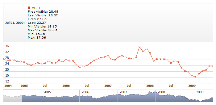
Illustration below shows the legend and highlights sample tokens used to create this legend:
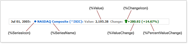
Any token can be used in any part of the formatting string along with another tokens or the static text. Sample XML with {%Value} token:
04 | format: "Value: {%Value.LastVisible}" |
07 | format: "Value: {%Value.Current}" |
As you can see token has properties (Current and LastVisible) that
are retrieved using dot notation and different properties are shown in different states.
Learn how to use tokens in the next article.
Table below list all tokens:
| Token Name |
Type |
Description |
| {%SeriesName} |
String |
Series name. |
| {%SeriesIcon} |
Shape |
Series icon. |
| {%Date} |
DateTime |
Date. |
| {%ChangeIcon} |
Shape |
Changes icon. |
| {%Value} |
Number |
"Value" field value. |
| {%ValueChange} |
Number |
Value change (in comparison mode). |
| {%PercentValueChange} |
Number |
Percent change (in comparison mode). |
| {%Open} |
Number |
"Open" field value. |
| {%High} |
Number |
"High" field value. |
| {%Low} |
Number |
"Low" field value. |
| {%Close} |
Number |
"Close" field value. |
| {%Volume} |
Number |
"Volume" field value. |
Tokens in legend describe only type of the value to be inserted, but this information is not enough to acquire the value. Depending on the state and purpose you should specify one of the properties.
Section below describes how to use properties.
Tokens Properties
Tokens Properties return certain value associated with the token. Some of the tokens are values themselves, but most of them - not. Table below list all tokens and their properties:
| Token Group |
Available Properties |
{%SeriesName}
{%SeriesIcon} |
There are no properties for these tokens. |
{%Value}
{%ValueChange}
{%PercentValueChange}
{%Open}
{%High}
{%Low}
{%Close}
{%Volume}
{%ChangeIcon} *
{%CustomField} **
"%ChangeColor" *** |
First
Last
FirstVisible
LastVisible
Min
Max
MinVisible
MaxVisible
Current |
| {%Date} |
First
Last
FirstVisible
LastVisible
Current |
* - {%ChangeIcon} is replaced by the icon that illustrates whether value grows or decreases, but as any numeric tokens it should know what point should be analyzed. Use of this token is described in details in Using Falling/Rising Icons.
** - {%CustomField} denotes any custom field that can be defined in data provider used by series. If you need some additional information to be shown in legend - you can use custom fields to store them and custom tokens to display them. This option is described in details in Using Custom Fields of Data-Provider.
*** - "%ChangeColor" token is used when you color text using HTML formatting. Using this token you can color the part of the text in Green (growth) or Red (decrease) to show the change direction. And should define what value should be used. Small sample:
<format><![CDATA[Change: <font color="%ChangeColor.Current"></font>]]></format>
You can see that %ChangeColor token is used in color attribute in <font> HTML tag. More detailed description can be found in Using Color Tokens.
Table below lists all available properties:
| Property Name |
Description |
| First |
Value of the field from the first point in a series. |
| Last |
Value of the field from the last point in a series. |
| FirstVisible |
Value of the field from the first visible point in a series. |
| LastVisible |
Value of the field from the last visible point in a series. |
| Min |
Minimal value of the field in a series. |
| Max |
Maximal value of the field in a series. |
| MinVisible |
Minimal value of the field in the visible range of a series. |
| MaxVisible |
Maximal value of the field in the visible range of a series. |
| Current |
Value of the field from the point with the hovered date. If series doesn't have a point with the hovered date property returns empty string. |
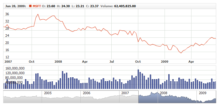
Illustration below shows what properties mean basing on the sample of {%Value} token for Line series. You can see the chart in the state when user zoomed to some range and all series data is not shown on the screen. Blue regions on the left and on the right are imaginable - user can't see the first and the last point, but these values can be shown in the legend using properties:
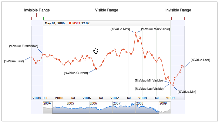
Illustration shows the properties of {%Value} token, but the model is applicable for all other tokens with the sample properties.
Live sample below shows usage of all properties of {%Value} token in legend item of the single series. Zoom, drag and scroll the chart in the sample to see properties changes:
Live Sample: Legend - Token Properties
Tokens formatting
All tokens that return date time or numerical values can be formatted.
1. Numerical tokens. All tokens below return numerical values:
- {%Value}
- {%ValueChange}
- {%PercentValueChange}
- {%Open}
- {%High}
- {%Low}
- {%Close}
- {%Volume}
- {%CustomField}
You can define how numbers returned using these tokens are displayed: what is used as decimal or thousands separator, etc. If, for example, you want to show {%Value.Current} with plus ("+") sign when value is positive - you should write it as {%Value.Current}{plusSign:true}
This works for any tokens in different elements in AnyChart Stock. Learn more in Numbers Formatting article.
2. Date time token {%Date}. It is rather rare situation when you need to put date into the legend item, but you can do that using {%Date} token.
Date token can be formatted too - {%Date}{"%yyyy-%MM-%dd %hh:%mm %tt"}.
This formatting options are applicable to all date time tokens in AnyChart Stock. Learn more in Date/Time Formatting.
Here is a live sample with two Volume+MA technical indicators, the first one doesn't use any formatting in legend, and another uses formatting using scale parameter:
Live Sample: Legend - Token Parameters
As you can see - scaling improves the look of the legend tremendously and makes it easier to read.
Font Settings and HTML tags
<font> node is used to configure font in any text elements in AnyChart Stock.
There are two options for font configuration:
- Set single font for the label
- Use HTML tags to create complex formatting
Single Font
By default legend uses complex HTML formatting from defaults, but you can turn this formatting off and use uniform font for the item.
Sample XML to use uniform font:
08 |
<format><![CDATA[{%SeriesIcon} {%SeriesName} {%Value.Current}]]></format> |
11 |
<format><![CDATA[{%SeriesIcon} {%SeriesName} {%Value.LastVisible}]]></format> |
16 | format: "{%SeriesIcon} {%SeriesName} {%Value.Current}" |
19 | format: "{%SeriesIcon} {%SeriesName} {%Value.LastVisible}" |
As you can see you need to disable HTML mode using render_as_html attribute in <font> node and define font settings in node.
Live sample of such settings:
Live Sample: Legend - Labels Using General Font
As you can see from the sample "IBM" string became black as all other text - different coloring is possible only in HTML mode, which is more complex, but provides more options.
HTML Tags
By default all labels in legend use HTML formatting. Depending on the type of series default is different.
With HTML formatting you have more flexibility. HTML gives you an ability to use %SeriesColor and %ChangeColor tokens, which color parts of the text depending on the value.
HTML tags should be specified using CDATA section. Sample XML with bold HTML tag <b>:
04 |
<format><![CDATA[Value: <b>{%Value.LastVisible}</b>]]></format> |
07 |
<format><![CDATA[Value: <b>{%Value.Current}</b>]]></format> |
04 | format: "Value: <b>{%Value.LastVisible}</b>" |
07 | format: "Value: <b>{%Value.Current}</b>" |
XML syntax below shows sample HTML formatting. It uses coloring, series icon, and value. Each token is colored using <font> tag:
05 |
<format><![CDATA[{%SeriesIcon} <b><font color="%SeriesColor">{%SeriesName}</font> <font color="#808080">Value: </font><font color="#333333">{%Value.Current}</font></b> ]]></format> |
08 |
<format><![CDATA[{%SeriesIcon} <b><font color="%SeriesColor">{%SeriesName}</font> <font color="#808080">Value: </font><font color="#333333">{%Value.LastVisible}</font></b> ]]></format> |
05 | format: "{%SeriesIcon} <b><font color=\"%SeriesColor\">{%SeriesName}</font> <font color=\"#808080\">Value: </font><font color=\"#333333\">{%Value.Current}</font></b> " |
08 | format: "{%SeriesIcon} <b><font color=\"%SeriesColor\">{%SeriesName}</font> <font color=\"#808080\">Value: </font><font color=\"#333333\">{%Value.LastVisible}</font></b> " |
Settings may look complex, but they allow to achieve great results:
Live Sample: Legend - Labels Using HTML Formatting
This sample uses static texts and color tokens that change color of the text depending on the values. See more about this in Color Tokens section.
Flash Player doesn't support all HTML tags. Full list of supported tags can be found in Font Configuration article.
Using Data Provider Custom Fields
In Required and Custom Fields section of Data Provider Configuration article you can find the description how to add custom fields into the data provider. One of the places of application of this feature is legend.
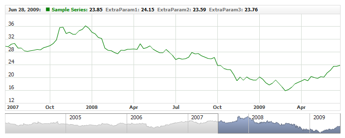
You can add custom fields values into the legend to provide additional information. XML for this may look like:
As you can see there is a standard Value fields and three fields named: ExtraValue1, ExtraValue2 and ExtraValue3, which come from the data set.
XML syntax below shows how to use the fields from data provider:
03 |
<format><![CDATA[{%Value.Current}, {%ExtraParam1.Current}, {%ExtraParam2.Current}]]></format> |
06 |
<format><![CDATA[{%Value.LastVisible}, {%ExtraParam1.LastVisible}, {%ExtraParam2.LastVisible}]]></format> |
03 | format: "{%Value.Current}, {%ExtraParam1.Current}, {%ExtraParam2.Current}" |
06 | format: "{%Value.LastVisible}, {%ExtraParam1.LastVisible}, {%ExtraParam2.LastVisible}" |
When you add custom field value you should {%CustomFieldName} token, where CustomFieldName is the name in data provider, for example: <format>{%ExtraValue1}</format>.
Live sample below shows several custom fields:
Live Sample: Legend - Using Custom Fields
Another example of the similar situation: you show the line chart that visualizes closing price, but may also want to
show open, high, low, close and volume in legend.
You can either define custom name or use standard (reserved) names.
Following live sample shows how to do that:
Live Sample: Legend - Using Custom Fields with OHLC Series
If you need text or additional date time fields you can use "Text" and "DateTime" custom fields as described in Data Provider Configuration: Text Fields
and Data Provider Configuration: DateTime Fields. Sample XML Snippet below shows a data provider with two text fields and one additional DateTime field:
01 |
<?xml version="1.0" encoding="UTF-8"?> |
02 |
<stock xmlns="http://anychart.com/products/stock/schemas/1.9.0/schema.xsd"> |
To use these fields you just refer to them by name and provide formatting options if needed, here is
a live sample of a chart with data provider configured as shown above and tokens used in legend:
Live Sample: Legend - Using Text and DateTime Fields
Series Custom Attributes
Each series can have several custom attributes that contain additional information about the series. These attributes can be used in legend items.
Syntax of series attributes definition:
06 | format: "{%ShortName} - {%LongName}" |
09 | format: "{%ShortName} - {%LongName}" |
21 | LongName: "Microsoft Corp." |
30 | LongName: "Oracle Corp." |
As you can see from the listing - legend item uses custom attributes. To put attribute value into the legend use {%SomeAttributeName} tokens, where SomeAttributeName is the name specified in: <attr name="AttrName"/>.
Live sample below shows series with ShortName and LongName attributes. These attributes are used in legend items:
Live Sample: Legend - Using Series Custom Attributes
Technical Indicators Legend Differences
Technical indicators use pretty similar to series visualization options. Different technical indicators are represented by some parameters that are displayed on the chart. For example, Volume+MA shows: Volume and Moving Average as Bar and Line series.
All visualization settings of technical indicator are identical to the series visualization series and so, the legend item is similar too.
For example, Stochastic Oscillator. This indicator visualizes K-Period and D-Period. There is a special section for both of them in XML. XML below shows the settings for K-Period and D-Period:
As you can see settings are similar to series settings and for each parameter you can configure <legend_item>.
Sample XML of indicator with legend item formatting strings defined:
07 |
<format><![CDATA[{%SeriesIcon} <b><font color="%Color">{%SeriesName} {%Value.Current}</font></b> ]]></format> |
10 |
<format><![CDATA[{%SeriesIcon} <b><font color="%Color">{%SeriesName} {%Value.LastVisible}</font></b> ]]></format> |
15 |
<name><![CDATA[Stochastic: %K(15)]]></name> |
22 |
<format><![CDATA[{%SeriesIcon} <b><font color="%Color">{%SeriesName} {%Value.Current}</font></b>]]></format> |
25 |
<format><![CDATA[{%SeriesIcon} <b><font color="%Color">{%SeriesName} {%Value.LastVisible}</font></b>]]></format> |
12 | format: "{%SeriesIcon} <b><font color=\"%Color\">{%SeriesName} {%Value.Current}</font></b> " |
15 | format: "{%SeriesIcon} <b><font color=\"%Color\">{%SeriesName} {%Value.LastVisible}</font></b> " |
20 | name: "Stochastic: %K(15)" |
30 | format: "{%SeriesIcon} <b><font color=\"%Color\">{%SeriesName} {%Value.Current}</font></b>" |
33 | format: "{%SeriesIcon} <b><font color=\"%Color\">{%SeriesName} {%Value.LastVisible}</font></b>" |
Live sample of such settings:
Live Sample: Legend - Technical Indicators
Learn more about technical indicators settings in Technical Indicator Settings.
Series Icon
When you use {%SeriesIcon} token in legend formatting string it is replaced by icon. Be default icon is a square 8x8 pixels. You can configure icon for each series: shape, size, fill and border.
Sample XML syntax of icon configuration:
14 | color: "DarkColor(%Color)", |
As you can see:
Icon color is set using %Color token. This token value comes from series color attribute. You can use color transform options described in Color article or static color like <fill color="#55DD00"/>.
size attribute defines icon width and height in pixels. Note that setting size to big may result in icon out of legend borders, it is not recommended to use size bigger than 15px.
Shape is set using type attribute. By default it is set to Square, but you can use any of the shapes listed below:
|
Type |
 |
Circle |
 |
Square |
 |
Diamond |
 |
Cross |
 |
DiagonalCross |
 |
HLine |
 |
VLine |
 |
Star4 |
 |
Star5 |
 |
Star6 |
 |
Star7 |
 |
TriangleUp |
 |
TriangleDown |
Live sample of the legend with different icons in different series:
Live Sample: Legend - Labels Icon Settings
Color Tokens
As it was said above HTML formatting is used in legend configuration. To color part of the text <font> tag is used. For example: <font color="#FF0000">{%Value.Current}</font>.
You can either use constant color or color tokens.
There are two color tokens that can be used:
- {%Color} - color of the series set in color attribute: <series color="Red">
- {%ChangeColor} - color of the positive or negative change.
XML to use {%Color} token. In this sample text is colored to the series color:
03 |
<format><![CDATA[<font color="%Color">{%SeriesName} {%Value.Current}</font>]]></format> |
06 |
<format><![CDATA[<font color="%Color">{%SeriesName} {%Value.LastVisible}</font>]]></format> |
03 | format: "<font color=\"%Color\">{%SeriesName} {%Value.Current}</font>" |
06 | format: "<font color=\"%Color\">{%SeriesName} {%Value.LastVisible}</font>" |
XML to use {%ChangeColor} token. In this sample text us either Green or Red - depending on the value:
11 |
<format><![CDATA[<b><font color="%ChangeColor">{%ValueChange.Current}</font></b>]]></format> |
14 |
<format><![CDATA[<b><font color="%ChangeColor">{%ValueChange.LastVisible}</font></b>]]></format> |
14 | format: "<b><font color=\"%ChangeColor\">{%ValueChange.Current}</font></b>" |
17 | format: "<b><font color=\"%ChangeColor\">{%ValueChange.LastVisible}</font></b>" |
As you can see both colors are defined in falling_color and rising_color attributes of <labels> node.
Live sample below shows how {%Color} and {%ChangeColor} tokens can be used:
Live Sample: Legend - Working with Color Tokens
Falling/Rising Icons
Besides coloring the changes you can show them as icons: red arrow down or green arrow up. These icons are added into the legend using {%ChangeIcon} token.
{%ChangeIcon} has Current, First, Last, FirstVisible and LastVisible properties that define which value change should be shown and you should always specify property when you use this token. As the matter of fact {%ChangeIcon} is similar to {%ValueChange} and {%PercentValueChange}, but it shows only the trend.
XML to add these icons into the legend:
03 |
<format><![CDATA[{%SeriesIcon} {%SeriesName} {%ChangeIcon.Current} {%ValueChange.Current}]]></format> |
06 |
<format><![CDATA[{%SeriesIcon} {%SeriesName} {%ChangeIcon.LastVisible} {%ValueChange.LastVisible}]]></format> |
03 | format: "{%SeriesIcon} {%SeriesName} {%ChangeIcon.Current} {%ValueChange.Current}" |
06 | format: "{%SeriesIcon} {%SeriesName} {%ChangeIcon.LastVisible} {%ValueChange.LastVisible}" |
Visual appearance of icons can be configured, you can change size, fill and border.
XML for that looks like that:
Live sample below shows icons configuration:
Live Sample: Legend - Using Change Icons
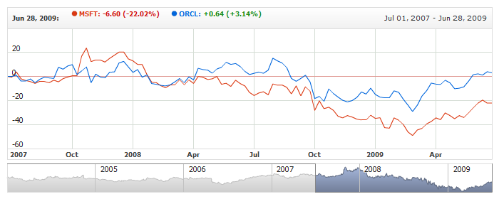
Line Breaks in Legend
In charts with the big number of series or when series names are long it may be useful to put line breaks between to arrange items in several rows.
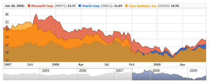
Illustration below shows legend with default settings and line breaks. As you can see "MSFT" and "ORCL" series are not visible at all with default settings:
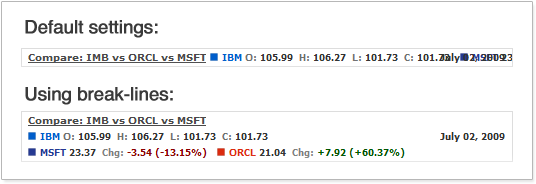
XML below shows how to add line breaks:
Live sample with complex formatting and line breaks:
Live Sample: Legend - Using Breaklines
Removing Items from Legend
By default any series or indicator has the item in the legend. If you don't want to see some of them- you can disable it using enabled attribute: <legend_item enabled="false"> in <series> node.
Sample XML to leave only one series item in legend:
Sample chart below shows three series. For the series named MSFT and CSCO legend item is turned off:
Live Sample: Legend - Excluding Items
Elements with Fixed Width
When legend items do not use line breaks and are displayed in one line you may observe "jumping" of the items when you hover different dates. To avoid this situation you can define fixed width for the items.
Sample XML to set fixed width of the items:
As you can see we use width attribute in <label> node: <labels width="140">. The width is set in pixels, so you should make sure that it is large enough for the longest possible values with the certain font settings.
Live sample where all items have fixed width:
Live Sample: Legend - Label with Fixed Width


