Timescale and X-Axis Settings
Overview
No matter how many charts, series and technical indicators you create in one instance of AnyChart Stock Component - you always use one common argument, Date Time Axis (or, which is the same, X-axis or Timescale).
Some of X-axis settings are global and affect all charts at once; others can be personalized for each chart individually.
An X-axis can show major and minor ticks; each of these has its own settings. The illustration below demonstrates an example for minor and major ticks:
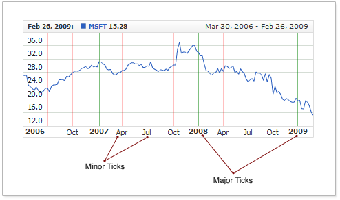
Major ticks stand for larger periods of time, while minor - for smaller ones.

Timescale Settings
This section describes timescale settings that are common to all charts in the component.
Initial Visible Range
By default the component always shows 10 last days of all data sets defined. All data that falls in this range are shown on the chart, scroller and all range selector elements get the default settings to fit this 10 last days.
You can change the default range shown using selected_range node. XML below shows how, for example, one year instead of 10 days can be shown:
01 |
<?xml version="1.0" encoding="UTF-8"?> |
02 |
<stock xmlns="http://anychart.com/products/stock/schemas/1.9.0/schema.xsd"> |
selected_range node has several attributes to configure the range, these attributes are described in the table below:
| Attribute |
Possible Values |
Description |
| type |
Unit
YTD
Max
Custom |
Type of the selected range, this attribute is "main" - other attributes depend on its value.
Unit - allows to define date time unit type, number of units and range anchor (using unit, count and anchor attributes) to set selected range.
For example, to select 5 last days you need to set:
<selected_range type="Unit" unit="Day" count="5" anchor="LastDate"/>.
YTD - selects the latest calendar year in all data sets, from the 1st of January to the last available date. No additional settings needed.
Max - selects all available data. No additional settings needed.
Custom - allows to define custom selected range, from start_date to end_date, which should be set.
Default value is "Unit".
|
| anchor |
FirstDate
Center
LastDate |
This attribute works only when type is set to "Unit", it sets the point from which unit based range is calculated.
FirstDate - unit-based selected range starts from the first date in all data sets. Just as shown in the illustration below:

Center - unit-based selected range is centered in the all data sets time scale. Just as shown in the illustration below:

LastDate - unit-based selected range ends in the last date of all data sets. Just as shown in the illustration below:

Default value is "LastDate".
|
| unit |
Year
Semester
Quarter
Month
ThirdOfMonth
Week
Day
Hour
Minute
Second
Millisecond
|
Date time unit, when type is set to "Unit".
Default value is "Day". |
| count |
Positive Number |
Number of date time units. The length of the range is calculated as count*unit.
For example:
<selected_range type="Unit" unit="Hour" count="48"/> - 48 hours (2 days) range;
<selected_range type="Unit" unit="Day" count="200"/> - 200 days range;
<selected_range type="Unit" unit="Month" count="6"/> - 6 months;
<selected_range type="Unit" unit="Month" count="12"/> - 12 months (1 year);
<selected_range type="Unit" unit="Year" count="1"/> - 1 year;
Default value is 10.
|
| start_date |
DateTime value |
start_date attribute works only when type is set to "Custom", it sets custom range start date.
This timestamp should be set according to: "yyyy-MM-dd hh:mm:ss.fff" mask. Learn why so in: Chart Settings: Input Date-Time Format article.
There is no default for this parameter.
|
| end_date |
DateTime value |
end_date attribute works only when type is set to "Custom", it sets custom range end date.
This timestamp should be set according to: "yyyy-MM-dd hh:mm:ss.fff" mask. Learn why so in: Chart Settings: Input Date-Time Format article.
There is no default for this parameter.
|
Initial selected range affects Range Selector preset panel. If initial settings matches any preset in the panel - appropriate preset button becomes selected.
Learn more about initial range selection in conjunction with Range Selector panel in the following article:
Several samples below show different initial range settings:
1. Unit based selection. Three months range:
Live Sample: Setting Up Default Visible Range - Unit Type
2. Max selector. Showing all available data:
Live Sample: Setting Up Default Visible Range - Max Type
3. YTD selector. Showing the latest year:
Live Sample: Setting Up Default Visible Range - YTD Type
4. Custom selector. Showing custom range:
Live Sample: Setting Up Default Visible Range - Custom Type
Oridnal and Scatter Modes: Regular and Irregular Data Intervals
The X-axis allows two operating modes: By default, the data is plotted evenly, point by point, no matter how far the dates stay apart from each other on the timescale. This is what is called the "Ordinal" mode. If you want to plot the data within the actual intervals ("distance") between the points, you need to turn the ordinal mode off, this mode is called "Scatter".
Here is the XML sample demonstrating how to turn off the ordinal mode:
01 |
<?xml version="1.0" encoding="UTF-8"?> |
02 |
<stock xmlns="http://anychart.com/products/stock/schemas/1.9.0/schema.xsd"> |
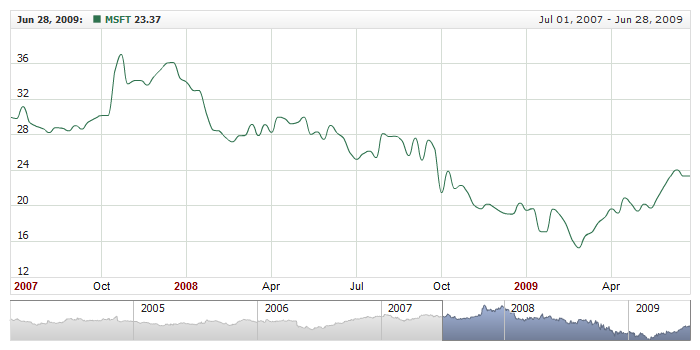
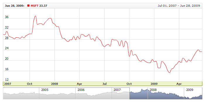
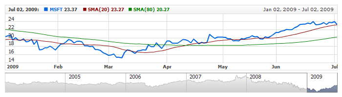
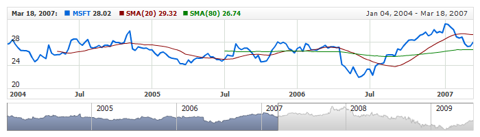
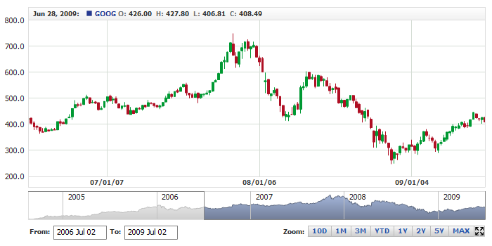
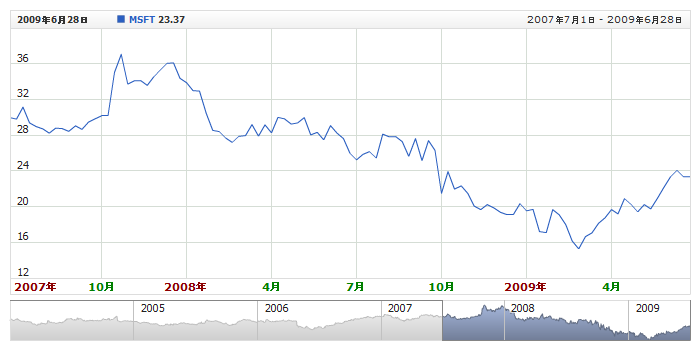
The live sample below shows Microsoft stocks trading data for several years. This data set contains daily data. When the ordinal scale is used - you don't see non-trading days on the chart, but in this sample you can see the days without data - they are still displayed:
Live Sample: Using Data at Irregular Intervals
Minimum and Maximum
By default engine determines minimum and maximum (start and end date) automatically: it finds the oldest and newest timestamps in all datasets and makes the minimum and maximum. You can change this and set your own minimum and maximum, the way to do this is different in ordinal and scatter modes.
Scatter Mode
In scatter mode (when is_ordinal is set to "false") minimum and maximum are set as shown below, date time should follow Input Date Time Settings.
01 |
<?xml version="1.0" encoding="UTF-8"?> |
02 |
<stock xmlns="http://anychart.com/products/stock/schemas/1.9.0/schema.xsd"> |
Ordinal Mode
In ordinal mode (when is_ordinal is set to "true") minimum and maximum are set as shown below, date time should follow Input Date Time Settings.
01 |
<?xml version="1.0" encoding="UTF-8"?> |
02 |
<stock xmlns="http://anychart.com/products/stock/schemas/1.9.0/schema.xsd"> |
Note that setting minimum and maximum in ordinal mode extends further than just defining two timestamps: you should tell component what unit should be used (in "minimum_filling_unit" and "maximum_filling_unit" attributes) and how many units per point should be used (in "maximum_filling_unit_count" and "minimum_filling_unit_count" attributes).
How it works? Say you are charting some intraday data that comes almost every second:
And you want timescale to start at ten o'clock sharp and end at eleven o'clock sharp. The settings for minimum and maximum should look like that:
01 |
<?xml version="1.0" encoding="UTF-8"?> |
02 |
<stock xmlns="http://anychart.com/products/stock/schemas/1.9.0/schema.xsd"> |
Another example, if you have some monthly data:
you may want to see it it context of a decade:
01 |
<?xml version="1.0" encoding="UTF-8"?> |
02 |
<stock xmlns="http://anychart.com/products/stock/schemas/1.9.0/schema.xsd"> |
The same logic as shown in two samples above applies to any other case: you should understand what is an average interval in your data sets and decide which units to use. Here is a sample of ordinal scale with minimum and maximum set:
Live Sample: X-Axis - Minimum and Maximum in Ordinal Mode
Tick Count
No matter what range of data is shown, AnyChart Stock Component shows some data labels,
and this number never exceeds a certain predefined value. Actually, this is the limit on the number of dates displayed
on the X-axis at the moment. By default, the limit is set to 12, but you can change it.
This sample XML demonstrates how you can alter this limit:
01 |
<?xml version="1.0" encoding="UTF-8"?> |
02 |
<stock xmlns="http://anychart.com/products/stock/schemas/1.9.0/schema.xsd"> |
As you can see on the sample, the limit is set by the max_ticks_count attribute.
The live sample below uses the limit of 20 labels; you should use
a great number when the chart is relatively large:
Live Sample: X-Axis - Controlling Ticks Count
Major and Minor Labels
When user alters the period shown on the chart, the component changes the label that displays the range actually
shown on it.
For example if user zooms in to the two-year range, he will see two-year labels, e.g., 2006 and 2007,
along with a number of minor labels: Jan, Feb, Mar, and so on.
You can set how exactly the minor and major labels should appear.
AnyChart Stock Component supports the following intervals for the timescale:
- Years
- Months
- Days
- Hours
- Minutes
- Seconds
- Milliseconds
The sample XML below shows the default settings; use this sample as a template for creating or customizing your own settings:
01 |
<?xml version="1.0" encoding="UTF-8"?> |
02 |
<stock xmlns="http://anychart.com/products/stock/schemas/1.9.0/schema.xsd"> |
08 | hours: "%MMM-%dd %hh %tt", |
When creating a formatting string, you can use the tokens described in Date-Time Formatting and combine them with static text:
For example, to set all ticks to appear with the label in the yy/mm/dd format (e.g.: 07/02/13),
you would have to use the following formatting string: "%yy/%MM/%dd".
The sample XML below demonstrates how to set this format:
01 |
<?xml version="1.0" encoding="UTF-8"?> |
02 |
<stock xmlns="http://anychart.com/products/stock/schemas/1.9.0/schema.xsd"> |
The live sample below demonstrates these settings in action:
Live Sample: X-Axis - Custom Intervals Formatting
You can localize labels too; here is a sample XML for the localization:
01 |
<?xml version="1.0" encoding="UTF-8"?> |
02 |
<stock xmlns="http://anychart.com/products/stock/schemas/1.9.0/schema.xsd"> |
08 | hours: "%M月 %dd日 %HH ", |
Now you can see how to combine tokens with static text.
The live sample below demonstrates the Chinese localization of AnyChart Stock Component:
Live Sample: X-Axis - Formatting Labels
Right and left paddings
There are two option for right and left time scale paddings:
Auto margins adjustment
You can adjust right and left paddings of the time scale so the series like CandleStick, OHLC, Bar and RangeBar are shown uncut at the edges.
To enable paddings you have to enable adjust_margins:
01 |
<?xml version="1.0" encoding="UTF-8"?> |
02 |
<stock xmlns="http://anychart.com/products/stock/schemas/1.9.0/schema.xsd"> |
Illustration below shows how adjust_margins affect the chart:
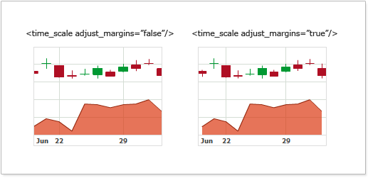
As you can see, when adjust_margins is set to true the first and the last candlesticks are not cut in half, but Area series has paddings between the area and the border of the chart.
Note: adjust_margins flag is global for all charts and engine adds paddings, only if there is some bar, candlestick or ohlc series on some chart.
Here is a live sample, that demonstrates how adjust_margins affects the chart display:
Live Sample: Timescale left-right margins
Manual paddings settings
If you want to create the margins of certain size you can use pixel_margins attribute, which sets the pixel margin to the left and to the right. Sample XML/JSON snippet to set this attribute:
01 |
<?xml version="1.0" encoding="UTF-8"?> |
02 |
<stock xmlns="http://anychart.com/products/stock/schemas/1.9.0/schema.xsd"> |
Illustration below shows what this attribute does with the chart display:
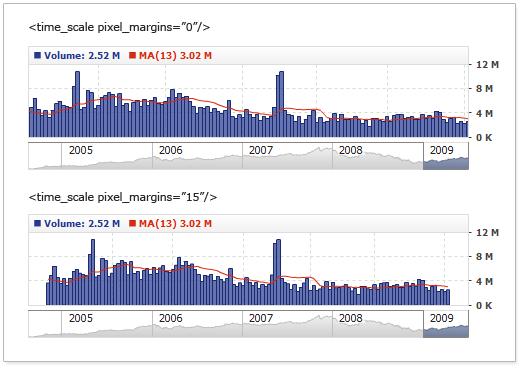
Live sample with pixel_margins set to 30 pixels:
Live Sample: Timescale left-right pixel margins
Note: pixel_margins affects all charts and it can be combined with adjust_margins.
Different Left and Right Paddings
You can fine tune paddings and specify different padding to the right and to the left using left_pixel_margin
and right_pixel_margin attributes. They override value set in pixel_margins. Here is a sample of the chart with
no padding to the left and big padding to the right:
Live Sample: Timescale - different left and right pixel margins
Local Settings for Specific Chart
The above sections have described the global settings that affect all the charts. Some settings can be
customized to affect a specific chart only. These settings are to be made in the <x_axis> subnode of
the <chart> node. Here is a sample XML for that:
01 |
<?xml version="1.0" encoding="UTF-8"?> |
02 |
<stock xmlns="http://anychart.com/products/stock/schemas/1.9.0/schema.xsd"> |
Enable or Disable X-Axis Labels
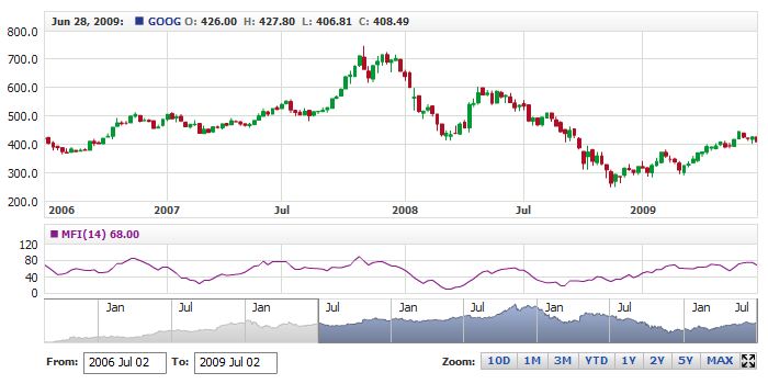
By default, labels are shown for all the charts; however, when you use two or more charts, you may want to
turn off the labels for some of them.
Here is a sample XML for turning off labels for one of the charts:
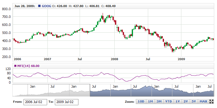
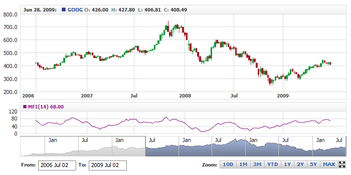
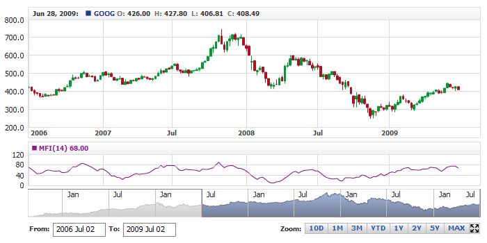
The live sample below shows a chart with stock data and an MFI chart; labels
on the MFI chart are disabled:
Live Sample: X-Axis - Enable and Disable Labels
Gridlines
Gridlines for major and minor ticks are configured separately. For both major and minor ticks you can use solid and dashed lines with the full set of settings. Here is a sample XML with settings for different colors and transparency levels for major and minor ticks:
The live sample below demonstrates the use of such settings:
Live Sample: X-Axis Gridline Settings
To use dashed lines instead of solid, set the dashed property to true in the <line> node. Below is a sample XML for enabling and customizing dashed lines for gridlines:
The live sample below demonstrates the use of dashed lines for gridlines:
Live Sample: X-Axis - Using Dashed Gridlines
Learn more about gridline settings in XML Reference.
Label Settings
You can customize the appearance of major and minor tick labels.
Font
Labels font can be customized in the <font> node; here is a sample XML that shows how you can do that:
The live sample below demonstrates the setting in action:
Live Sample: X-Axis - Labels Font Settings
Learn more about font settings in the Font Article or XML Reference.
Background
Label background lies beneath all labels and is configured in the <background> node. Here is a sample XML that shows how you can customize background settings:
The live sample below demonstrates the settings in action:
Live Sample: X-Axis - Labels Background Settings
Learn more about background settings in the Background Article or XML Reference.
Helper Label
Helper Label is actually a major label that "sticks" to the
left of the X-axis and helps user to understand what period is displayed there. The illustration below provides a demonstration of a Helper Label:
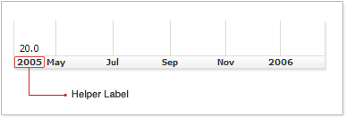
This label doesn't have any special settings - it uses
major tick labels settings. By default, it is turned on, but you can turn it off at any time.
Here is a sample XML that shows how you can turn Helper Label off:
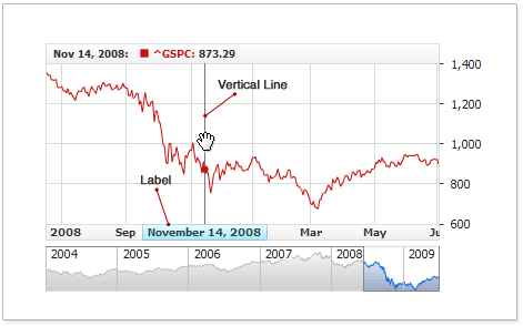
Date Highlighter
Date Highlighter is the vertical line drawn though the date, currently pointed at by the mouse pointer. This element is very helpful when working with multiple data series; it gives user a clear idea of the date the points are presented for in the legend and titles.
Date Highlighter combined with Series Value Highlighter or Y Axis Value Highlighter form an element known to end-users as Crosshair.
By default, Date Highlighter is enabled and displayed on all charts as a gray line. Besides the line, you can also display a single or multiple labels with current date or time combined with a static text.
Look at the captions on the picture below to get a better idea of what this all is about:
Date Highlighter is configured for each chart individually. For any chart, you can define unique settings for the element or completely disable it.
Line
The vertical line can be fully customized. You can draw it with a solid or dashed line alike.
Below is a sample XML syntax for customizing a line for Date Highlighter:
The live sample below demonstrates different line configuration options. The first chart uses the default settings; the second one uses a solid, two pixel-wide line; the third one uses a red dashed line:
Live Sample: X-Axis Date Highlighter - Line Settings
For details on customizing Date Highlighter lines, please refer to XML Reference.
Labels
Date Highlighter can have a single or multiple labels. The label can display the current date in a custom format combined with a static text.
Below is the sample XML syntax for adding a label positioned over the X-Axis draft area:
18 | format: "{%Date}{\"%MMM %dd, %yyyy\"}", |
To have it display the current date, insert the {%Date} token in the caption formatting string. Below is the XML syntax demonstrating the insertion:
06 | format: "{%Date}{\"%MMM %dd, %yyyy\"}" |
{%Date} is a token that returns the date value; you can customize the date format to be used with this token. For more information on customizing the token parameters, please refer to Numbers Formatting.
The live sample below uses two charts with Date Highlighter labels, each configured different from the other:
Live Sample: X-Axis Date Highlighter - Using Labels
This section provides only the basic information on using labels with Date Highlighter. For the detailed coverage of all functions and label application options, please refer to XML Reference.
Enable/Disable
If you do not need Date Highlighter, you can simply disable it. XML syntax for the disabling:
This live sample of a chart without Date Highlighter:
Live Sample: X-Axis Date Highlighter - Disabling

