Range Bar Series
Overview
The Range Bar charts displays a range of data by plotting two Y values per data point. Each Y value used is drawn as the upper, and lower bounds
of a column/bar.
Sometimes range charts are referred as "floating" column/bar charts. Some data may look very nice and are
easily understood in this form, in which the column floats in the chart, spanning a region from a minimum value to a maximum value.

Adding Series
Data-Provider
Before you can add series to the chart you need to prepare Data Provider. You need two fields to
create Range Bar chart:high and low. So the Data Provider should contain both fields.
Sample XML for Range Bar Data Provider:
As you can see both fields are defined: high and low. Now you
can declare series that will use this Data Provider.
Series Declaration
XML syntax to declare series with Data Provider shown above:
04 |
<name><![CDATA[High/Low Temp. (C)]]></name> |
07 | name: "High/Low Temp. (C)", |
Let's put this together and create the very basic Range Bar sample:
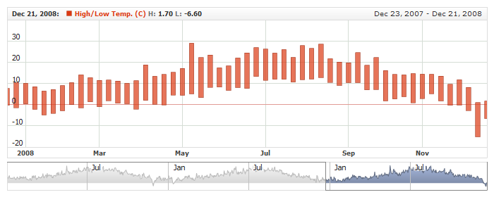
Live Sample: Range Bar Series
To learn more about common series settings see Common Series Settings tutorial.
Configuring visualization
All visual and specific settings for Range Bar series are set in <range_bar_series>
in <series> node.
The width of range bar is set using width attribute:
<range_bar_series width="0.5">, which accepts values from 0 to 1.
Also, you can change the border of the bar and its fill.
Sample XML with bar width and colors defined:
02 |
<name><![CDATA[High/Low Temp. (C)]]></name> |
05 | name: "High/Low Temp. (C)", |
14 | color: "DarkColor(%Color)", |
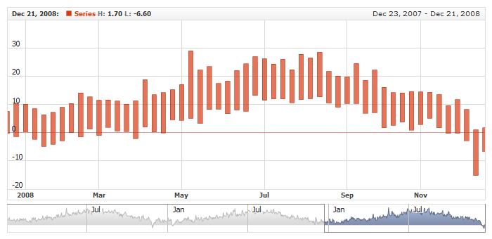
Live Sample below shows Range Bar with configured visualization:
Live Sample: Range Bar Series Visual Settings
Markers
Two markers instead of one can be added to Range Bar series: one for high value, another - for low. There are
special <high> and <low> nodes for that.
Sample XML with marker settings:
To learn more about marker settings see Series Common Settings article.
Live Sample:
Live Sample: Range Bar Series Marker Settings
Legend Element
For each series you can define its element in legend. This element contains the settings for the formatting string of the text in legend that represents the series. Configuration of such elements is described in Legend: Series Labels article.
Tooltips
You can either use global tooltip settings or create personal tooltips for each series. See detailed description in Tooltips tutorial.
Choosing Field for Comparison Mode
When you use Range Bar series in comparison mode (when Value axis is set to "Changes" or
"PercentChanges") - you need to define comparison field.
XML for comparison mode field selection:
As you can see comparison field is set in compare_field_type attribute, which can:
High or Low. By default it is Low.
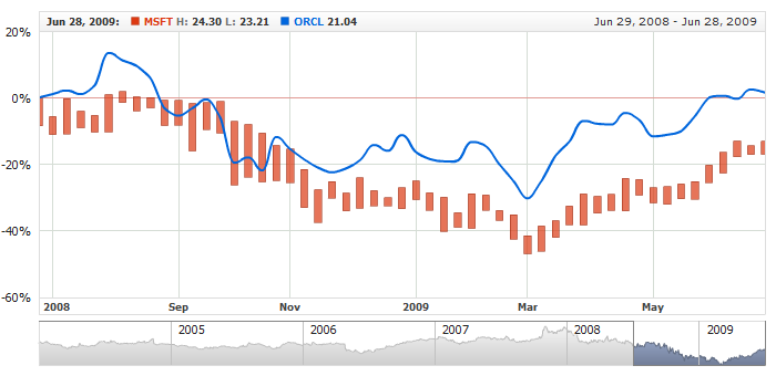
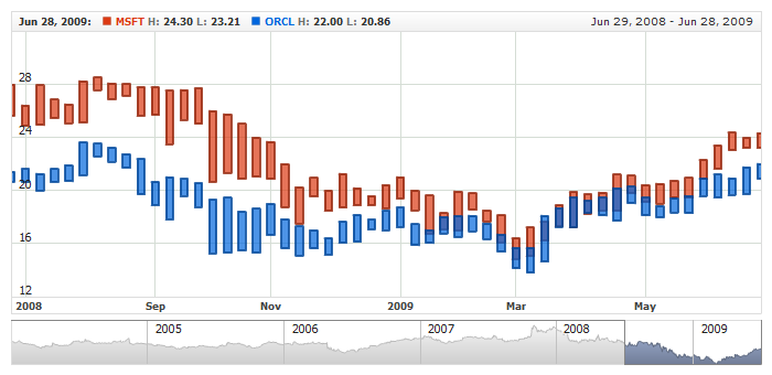
Live sample below shows Range Bar and Line series on one
chart in Comparison mode with comparison field set to Comparison High:
Live Sample: Range Bar Series - Comparison Field Settings
Defaults Section
There is a special section to set default values in AnyChart Stock component XML:
<series_settings_defaults>, where you can define marker and value highlighter settings for all
series of the given type in one place, instead of setting them for each series individually.
For example, to configure bar border in one chart for all series of RangeBar type just set:
07 | color: "DarkColor(%Color)", |
Live sample below has two series of Range Bar type. All common settings defined in <range_bar_series/> node:
Live Sample: Range Bar Series - Using Defaults Section