Dashboard Creation Tutorial
Overview
Like the instrument panel in a car, the computer version-dashboard displays critical info in easy-to-read graphics, assembled from data pulled in real time from corporate software programs. Dashboards deliver the detailed information needed by everyone for day-to-day decision-making. Simple yet powerful analysis allows any user to discover vital trends in business performance and continuously monitor the performance of your organization at all levels and in real time.
Dashboards provide your business with real-time business intelligence across all areas of your company – from accounting and sales, to fulfillment and support. The Dashboard offers instant snapshots of your designated key performance indicators (KPIs), and provides real-time trend graphs and ad hoc reports appropriate for each role in your business. With direct drill-down capability, you can move from a summary level directly to greater detail, and you can see real-time information to proactively manage for better results.
While most enterprise dashboards in production are probably still custom built, we provide you a new way of dashboard creation - using AnyChart Flash Component Dashboard mode.
Since all charts created by AnyChart Flash Chart Component are rendered using a single swf file it is very easy to place such swf file to your web-site and provide it with an XML configuration file that configures a dashboard.
In this tutorial we will create step-by-step a sample dashboard, at first - we will make a static one - that can be used for presentation purposes, and then - we will add interactivity, which makes dashboard a really useful and modern tool of business data analytics.
Step 1 - Choose Data to be Displayed
Let's say, for example, that you are the CEO of "Duff Pubs" Chain, that have five pubs in chain - in Georgia, Washington, Florida, Texas and Nevada.
There are three major types of products sold in pubs: Beverages, Alcohol and Food.
You've done a research and collected reports and sales data per product type, and chain profitability data for all four quarters for previous year. Also you have an information about revenue of each pub in that year. And the last, but not the least important data, we have the beer brands popularity chart all over the chain in that year.
In order to give shareholders the report on annual meeting you want to put this all together on the single dashboard representing all data obtained.
Here are the data tables you have collected:
Products Sales Per Category for Each Quarter (USD)
| Product Type |
Quarter 1 |
Quarter 2 |
Quarter 3 |
Quarter 4 |
| Beverages and Beer |
$1 454 000 |
$1 440 000 |
$1 404 000 |
$1 629 000 |
| Hard Liquors |
$1 480 000 |
$1 100 000 |
$1 470 000 |
$1 784 000 |
| Food and Snack |
$1 209 000 |
$1 406 000 |
$1 361 000 |
$1 521 000 |
Chain Profit for Each Quarter
| Quarter |
Quarter 1 |
Quarter 2 |
Quarter 3 |
Quarter 4 |
Year |
| Profit (thou.) |
$4 143 |
$3 946 |
$4 235 |
$4 934 |
$17 358 |
| Profit (%) |
24.01% |
22.86% |
24.54% |
28.59% |
100% |
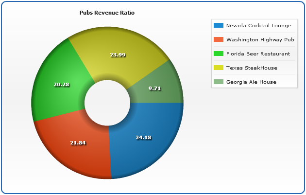
Pubs Revenue
| Pub |
Revenue (mil.) |
| Nevada Cocktail Lounge |
$4.173 |
| Washington Highway Pub |
$3.77 |
| Florida Beer Restaurant |
$3.5 |
| Texas SteakHouse |
$4.14 |
| Georgia Ale House |
$1.675 |
Beer Brand Popularity Chart
| Brand |
Pints Sold |
| Duff Original |
226 380 |
| Bud Light |
218 415 |
| Budweiser |
200 779 |
| Coors Light |
171 232 |
| Miller Lite |
162 326 |
| Busch |
139 004 |
| Michelob Light |
89 046 |
| Other |
83 964 |

Step 2 - Choose Layout
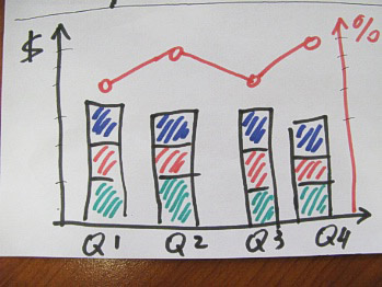
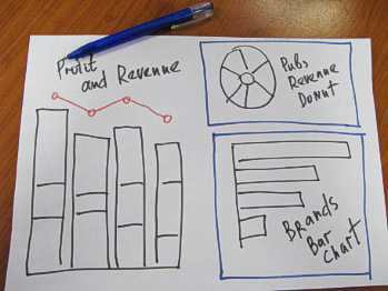
Usually to choose the best layout for dashboard you should simply draw it by hand - to do a "paper design", in our case we took the sticky note and draw, for the first, profitability chart:
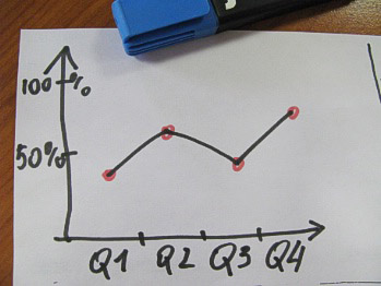
To demonstrate the changes of profitability by time we will use a line chart. We will not show an actual profit, but percents of each quarter to the year profit.
To see the changes of products sales we will use column chart in its stacked variation to demonstrate how different products contribute to the sales total.
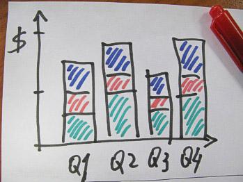
Since profitability chart and sales chart have the same argument - we will draw them on the same plot to save the space on our dashboard and see how the changes in product sales affect the profit.
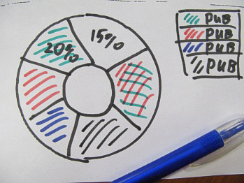
To demonstrate the proportion of revenue of all pubs in chain it is better to use a pie chart, or even doughnut - just for attractive appearance.
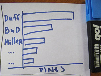
To show the brands popularity chart we will use a bar chart, as it is not comfortable to place a big number of labels on the column chart X-Axis (it is possible with rotated labels, but it is not easy to read the rotated text).
Now, when you have chosen the charts, you should arrange them somehow on the dashboard - and you can do that in a way you like, but keep in mind what you want to accentuate:
Step 3 - Convert Data
Now we need to convert data we have (in tables) to the form acceptable by AnyChart - XML Configuration files. These configuration files will be almost the same for all chart types we use.
For example, our data XML settings for doughnut chart:
First we need to convert this data table into XML, this format will be accepted by AnyChart. In terms of AnyChart data model we have one series of data with categories that hold pubs' names. Each point in series represents one pub and its revenue. Converted XML Settings looks like:
01 |
<?xml version="1.0" encoding="UTF-8"?> |
04 |
<chart plot_type="Doughnut" template="template_bg"> |
07 |
<point name="Nevada Cocktail Lounge" y="4.173" /> |
08 |
<point name="Washington Highway Pub" y="3.77" /> |
09 |
<point name="Florida Beer Restaurant" y="3.5" /> |
10 |
<point name="Texas SteakHouse" y="4.14" /> |
11 |
<point name="Georgia Ale House" y="1.675" /> |
15 |
<pie_series style="Aqua"> |
16 |
<tooltip_settings enabled="true"> |
17 |
<format><![CDATA[{%Name} / ${%YValue}{numDecimals:2} mil. / {%YPercentOfSeries}{numDecimals:2}%]]></format> |
19 |
<label_settings enabled="true" mode="inside"> |
20 |
<position anchor="Center" valign="Center" halign="Center" /> |
21 |
<background enabled="false" /> |
23 |
<effects enabled="True"> |
24 |
<drop_shadow enabled="True" /> |
27 |
<format><![CDATA[{%YPercentOfSeries}]]></format> |
33 |
<text><![CDATA[Pubs Revenue Ratio]]></text> |
35 |
<legend enabled="True" ignore_auto_item="True"> |
36 |
<title enabled="false" /> |
38 |
<item source="Points" /> |
As you can see, we've created one <series> node, added several <point> nodes and set name attribute that defines category and y attribute that defines value. Also we defined plot_type="Doughnut" in <chart> node. And we have tuned the chart settings a bit - formatted tooltips and labels and chart title, these settings will create a chart like this:
Live Sample: Dashboard Pubs Revenue Doughnut Chart
Then we should save this configuration file as pubs-revenue.xml, if you are already interested in further configuration of chart, its labels and tooltips, please refer to: Pie and Doughnut Tutorial, Labels Formatting Tutorial and Tooltips Formatting tutorial.
You can read more about bar chart data conversion on this page: Preparing Data for Bar Chart, it is almost the same - just convert data and create titles for axes, skip reading this if you've already got a general idea and go on with reading this tutorial.
Configuration file for bar chart will be saved as brands-popularity-chart.xml
The same for column and line chart, you can read more about their configuration on this page: Preparing Data for Stacked Column and Line Charts. We will create two axes, one of them will be stacked, and bind data to the appropriate axes.
Configuration file for combination chart will be saved as profit-and-sales.xml
Step 4 - Convert Layout
Above we did a "paper design" of our dashboard layout, now we need to convert this layout to AnyChart dashboard layout configuration settings. Full explanation of dashboard layout can be found in Dashboard Layout Explained Tutorial.
In our case everything is rather easy:
1) We have one dashboard, so we should do the following: create <dashboard> node in <anychart> node and create <view type="Dashboard">, with <title> defined, in it:
01 |
<?xml version="1.0" encoding="UTF-8"?> |
04 |
<view type="Dashboard"> |
06 |
<text><![CDATA["Duff Pubs" Annual Report]]></text> |
2) We have three charts, so we need three <view type="Chart"> within our dashboard view:
01 |
<?xml version="1.0" encoding="UTF-8"?> |
04 |
<view type="Dashboard"> |
3) Now we have three charts and can arrange them, first we will arrange them horizontally:
01 |
<?xml version="1.0" encoding="UTF-8"?> |
04 |
<view type="Dashboard"> |
05 |
<hbox width="100%" height="100%"> |
4) And now two of them will be arranged vertically, and with proper width and heights set:
01 |
<?xml version="1.0" encoding="UTF-8"?> |
04 |
<view type="Dashboard"> |
05 |
<hbox width="100%" height="100%"> |
06 |
<vbox width="50%" height="100%"> |
07 |
<view type="Chart" width="100%" height="50%" /> |
08 |
<view type="Chart" width="100%" height="50%" /> |
10 |
<view type="Chart" width="50%" height="100%" /> |
Layout is ready, now we just have to put layout and data together, see next step.
Step 5 - Put Data and Layout Together
When layout and data is ready - the only thing we have to do is to specify certain data sources for dashboard views, in our case all data is placed in files, so we have to set files as the sources:
01 |
<?xml version="1.0" encoding="UTF-8"?> |
04 |
<view type="Dashboard"> |
05 |
<hbox width="100%" height="100%"> |
06 |
<vbox width="50%" height="100%"> |
07 |
<view source="./dashboard/profit-and-sales.xml" source_mode="externalData" type="Chart" width="100%" height="50%" /> |
08 |
<view source="./dashboard/pubs-revenue.xml" source_mode="externalData" type="Chart" width="100%" height="50%" /> |
10 |
<view source="./dashboard/brands-chart.xml" source_mode="externalData" type="Chart" width="50%" height="100%" /> |
Resources Path
By the way - you can configure AnyChart to look for XML Data files in the certain folder using <xml_resources> node:
01 |
<?xml version="1.0" encoding="UTF-8"?> |
04 |
<xml_resources path="./" path_type="relativeToHTML" /> |
The code above tells AnyChart to look for XML Files in the folder where HTML file is located
(these settings are default). Path type can be: "RelativeToHTML", "RelativeToSWF", "Absolute"
Intermediate result - Presentation Dashboard is Ready
Everything is ready - launch the dashboard and see the result: Launch Dashboard Sample.
Step 6 - Concept Plan of Interactivity
Now let's think about really interactive dashboard. Suppose we have even more data than described above - sales and profit data for each pub in chain and brands popularity chart in every pub. It means that we can use the same charts to show analytics for every pub in chain.
Let's create the following plan of interactive dashboard:
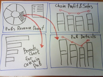
We want to place Donut chart in the top left corner and when user clicks on
a slice - popularity chart and revenue details will be reloaded.
Step 7 - Data for Interactive Dashboard
Now we need to prepare data for Interactive Dashboard. We have more data tables and, therefore, more XML files.
All files are listed on this subsidiary page: Data Files and Tables for Interactive Dashboard.
We will name files in the following way - brands popularity chart for the certain pub "PUBNAME_brands-poularity-chart.xml", and revenue sales and profit data "PUBNAME_profit-and-sales.xml".
Note: Using AnyChart "Chart Templates" for easier chart configuration
Instead of three files as in the previous sample we now have six files for Combined Stacked Column and Line chart (5 for each pub
and one for all chain) and five files for brand popularity charts for each pub.
These files will have different data and titles, but their settings will be the same - to avoid simple copy-pasting and to ease possible further configuration we will use AnyChart "Chart Templates". Chart template is named preset for a chart, that contains everything, but the data section. Templates can be stored within an XML file of chart and in an external file. In our case we will create one external file with templates and put two named templates in it - one for combined stacked column and line chart, and one for bar chart.
When the templates are ready - we just specify that we should use certain template file and template name in every chart based on the desired template. In any of the files listed on Data Files and Tables for Interactive Dashboard you will find the section like that:
01 |
<?xml version="1.0" encoding="UTF-8"?> |
03 |
<templates path="templates.xml" /> |
05 |
<chart template="StackedColumnAndLine" /> |
You can look closer at templates.xml - you will see that each template looks (for example) like that:
01 |
<template name="TemplateName"> |
03 |
<title enabled="True"> |
04 |
<text><![CDATA[Template Title]]></text> |
Such settings mean that every chart using this template will have the title enabled and its text will be "Template Title",
unless someting else is specified in chart itself.
Read more about templates in AnyChart Chart Templates Tutorial.
Step 8 - Interactive Dashboard Implementation
In our interactivity plan we defined that on click of the slice in Doughnut chart two charts should be updated with the new data sets. This task can be accomplished using AnyChart Actions, you can read more about actions and other interactivity options in Interactivity Tutorial, and in our case we will use only "updateView" action, that can update certain view in Dashboard.
To define the actions for the point we have to modify data section of Doughnut chart in the following way:
04 |
<action type="updateView" view="Profit Details" source_mode="externalData" source="{%Name}_profit-and-sales.xml" /> |
05 |
<action type="updateView" view="Brands Details" source_mode="externalData" source="{%Name}_brands-poularity-chart.xml" /> |
07 |
<point name="Nevada Cocktail Lounge" y="4.75" /> |
08 |
<point name="Washington Highway Pub" y="3.75" /> |
09 |
<point name="Florida Beer Restaurant" y="3.4" /> |
10 |
<point name="Texas SteakHouse" y="3.1" /> |
11 |
<point name="Georgia Ale House" y="2" /> |
These settings mean that on click of every point in series two views in dashboard will be updated and proper files with the names constructed from pub name and postfix (remember, we named our data files in that way "PUBNAME__profit-and-sales.xml" and "{%Name}_brands-poularity-chart.xml").
The last thing we have to do is to arrange new dashboard layout and set proper chart sources and view names (for update actions):
01 |
<?xml version="1.0" encoding="UTF-8"?> |
04 |
<view type="Dashboard"> |
05 |
<vbox width="100%" height="100%"> |
06 |
<hbox width="50%" height="100%"> |
07 |
<view source="./dashboard/pubs-revenue.xml" source_mode="externalData" type="Chart" width="100%" height="50%" /> |
08 |
<vbox height="100%" width="50%"> |
09 |
<view source="./dashboard/profit-and-sales.xml" source_mode="externalData" type="Chart" width="100%" height="50%" /> |
12 |
<view name="Brands Details" source="./dashboard/brands-chart.xml" source_mode="externalData" type="Chart" width="50%" height="100%" /> |
Step 9 - Enjoying the Result - Interactive Flash Dashboard
Everything is ready - launch the dashboard and see how it will update charts when you click on doughnut slices: Launch Interactive Dashboard Sample.
Concluding Remarks
We've created a dashboard, but it is still pretty static, all that have been done using XML files can be done using some scripting language, that will get data from your corporative database or reports.
You can use Flash Charts almost in every environment, because Flash Player is installed on more than 97% Internet enabled PC all over the world.