Pie and Donut Chart
Overview
Data that is arranged in one column or row only can be plotted in a single series pie chart.
Single series pie charts show the size of items in one data series, proportional to the sum of the items.
The data points in a pie chart are displayed as a percentage of the whole pie.
Consider using a single series pie chart when:
- You only have one data series that you want to plot.
- None of the values that you want to plot are negative.
- Almost none of the values that you want to plot are zero values.
- You don't have more than seven categories.
- The categories represent parts of the whole.
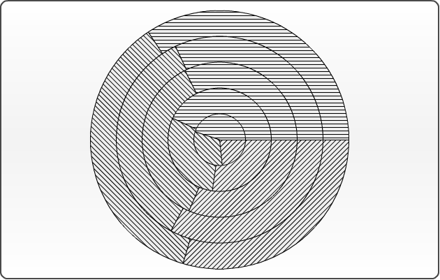
Data that is arranged in several columns or rows only can be plotted in
a multi series pie chart. When you create a Pie chart with multiple data series, the first data series is placed in the center of the pie. Each successive series forms a ring on the pie. Keep in mind that although a data item may appear larger on the outside of the ring than one on a ring toward the center of the chart, the size is proportional to the values within the series.
Doughnut chart are functionally identical to pie charts, it also has single-series and multi-series versions, the only difference is that it has a hole in the middle.

Chart building
Depending on data model and the visualization purpose the pie chart may contain single series or multi series, they can also be displayed in 3D Style. Pie and doughnut charts can not be combined with any other charts, so they have their own plot_type="Pie" and plot_type="Doughnut", so if one of this plot types is set - all series in a chart will be plotted as pies or doughnuts. If only one series is supplied - a chart will be single-series, several series supplied - chart will be multi-series.
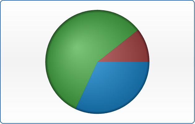
Single-Series Pie Chart
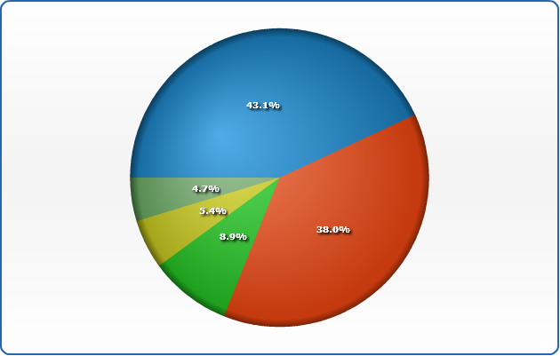
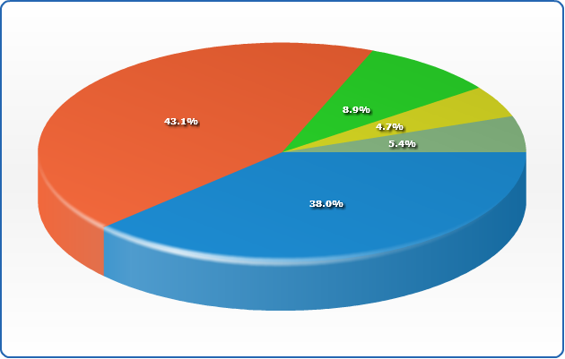
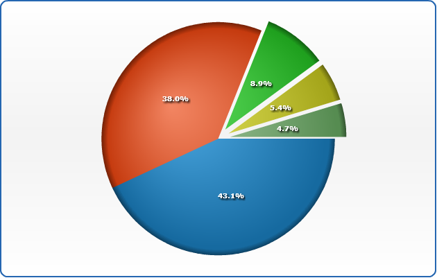
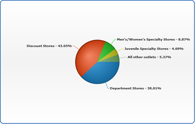
Let's see single series pie chart created using the following data - sales of ACME Corp. apparel through different retail channels in one year:
| Retail Channel |
Sales |
| Department Stores |
$637.166 |
| Discount Stores |
$721.630 |
| Men's/Women's Specialty Stores |
$148.662 |
| Juvenile Specialty Stores |
$78.662 |
| All other outlets |
$90.000 |
Now we need to convert this data table into XML, this format will be accepted by AnyChart. In terms of AnyChart data model we have one series of data (Sales)
with categories that hold Retail channels names. Each point in series represents one channels and an sales amount through this channel. Converted XML Data looks like:
02 |
<series name="Year 2003"> |
03 |
<point name="Department Stores" y="637166" /> |
04 |
<point name="Discount Stores" y="721630" /> |
05 |
<point name="Men's/Women's Specialty Stores" y="148662" /> |
06 |
<point name="Juvenile Specialty Stores" y="78662" /> |
07 |
<point name="All other outlets" y="90000" /> |
As you can see, we've created one <series> node, added several <point> nodes and set name attribute that defines category and y attribute that defines slice value.
All we need to do to finalize pie chart XML creation is to define plot_type="Pie" in <chart> node. Here it is - AnyChart can now visualize your data. Look at the chart sample below and click on on it to see Live Flash Chart preview and full configured XML.
Live Sample: Sample Single-Series Pie Chart 1
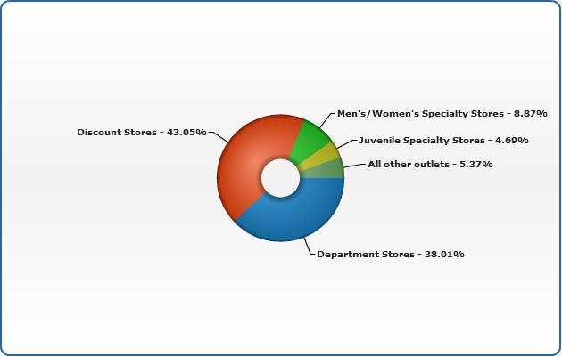
Single Series Doughnut Chart
Donut chart is all the same as Pie chart, and all you need to do to switch to it: change plot_type="Doughnut"
01 |
<chart plot_type="Doughnut" /> |
And here is the same data as above, displayed as a Single Series Doughnut chart:
Live Sample: Sample Single-Series Donut Chart
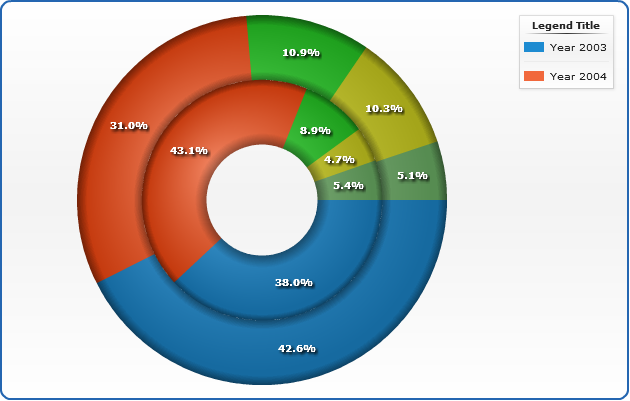
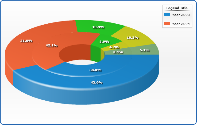
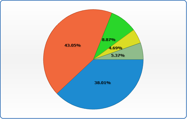
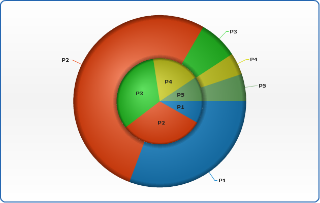
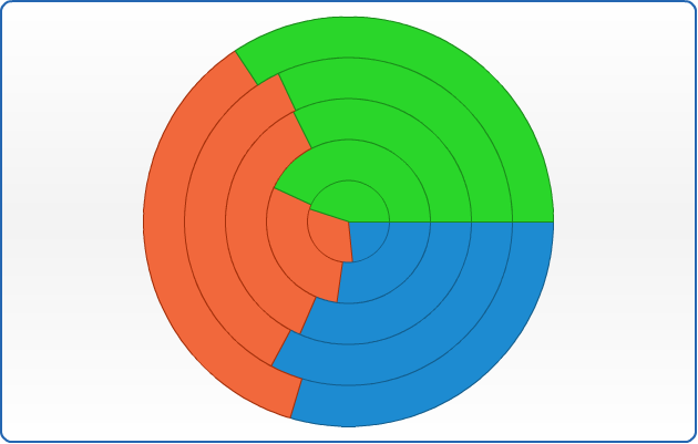
Multi-series pie chart
To compare two or more data rows you have to use multi-series pie charts as it shown in the sample below.
Let's compare year 2003 sales to year 2004 sales:
| Retail Channel |
Year 2003 Sales |
Year 2004 Sales |
| Department Stores |
$637.166 |
$737.166 |
| Discount Stores |
$721.630 |
$537.166 |
| Men's/Women's Specialty Stores |
$148.662 |
$188.662 |
| Juvenile Specialty Stores |
$78.662 |
$178.662 |
| All other outlets |
$90.000 |
$89.000 |
As we do in single-series pie sample above we need to convert this table into XML, the only difference between these two samples is the fact that now we have two series of data - one series for each year, and we give proper names to each series:
02 |
<series name="Year 2003"> |
03 |
<point name="Department Stores" y="637166" /> |
04 |
<point name="Discount Stores" y="721630" /> |
05 |
<point name="Men's/Women's Specialty Stores" y="148662" /> |
06 |
<point name="Juvenile Specialty Stores" y="78662" /> |
07 |
<point name="All other outlets" y="90000" /> |
09 |
<series name="Year 2004"> |
10 |
<point name="Department Stores" y="737166" /> |
11 |
<point name="Discount Stores" y="537166" /> |
12 |
<point name="Men's/Women's Specialty Stores" y="188662" /> |
13 |
<point name="Juvenile Specialty Stores" y="178662" /> |
14 |
<point name="All other outlets" y="89000" /> |
Live Sample: Sample Multi-series pie chart
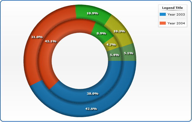
Multi-Series Doughnut Chart
Donut charts are more likely to be used as multi-series, than Pie charts. Switching is easy: just change the plot_type="Doughnut":
01 |
<chart plot_type="Doughnut" /> |
And here is the same data as above, displayed as a Multi-Series Doughnut chart:
Live Sample: Sample Multi-series Doughnut chart
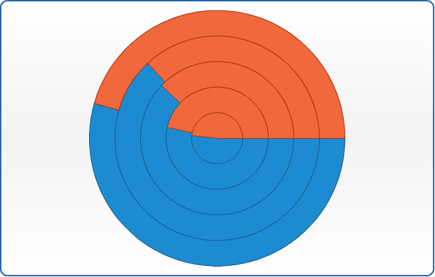
Setting inner radius of the donut
You can set the inner radius of the donut in percents of Pie radius, by using inner_radius attribute
of pie_series node
01 |
<pie_series inner_radius="50" /> |
Here is a sample multi-series data with inner radius set to 50:
Live Sample: Sample Multi-series Doughnut chart inner radius
3D Pie and Doughnut chart
This feature has BETA status and will be improved in the next version.
It is very easy to display the data from the sample above in 3D mode - just set enable_3d_mode attribute and columns will become 3D:
<data_plot_settings enable_3d_mode="True">
Live Sample: Sample Single-Series 3D Pie Chart
3D Pie and Doughnut Multiseries
Multiseries Donuts and Pies are just the same as 2D, just enable 3D mode and you can use
multiseries 3D:
Live Sample: Sample Multi-series 3d Doughnut chart
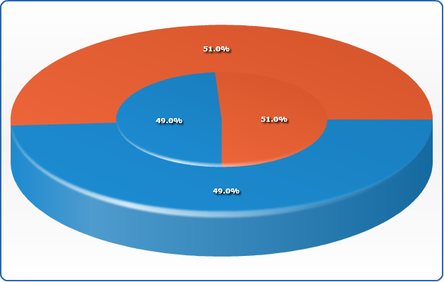
Slices Starting Angle
You can set starting angle for the first slice for all pie charts or for the given series, in the sample below multiseries pie chart is shown with identical series, but they have a different starting angle:
03 |
<pie_series start_angle="0" /> |
06 |
<series name="2000" start_angle="90"> |
07 |
<point name="Men" y="49" /> |
08 |
<point name="Women" y="51" /> |
11 |
<point name="Men" y="49" /> |
12 |
<point name="Women" y="51" /> |
Live Sample: Sample Multi-series Pie Chart Start Angle
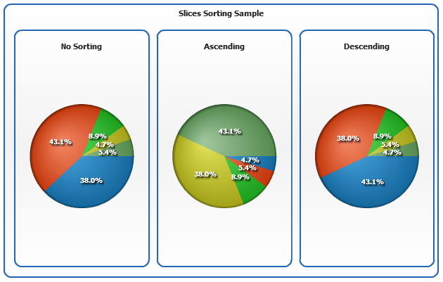
Slices Sorting
If you want you can sort the series in Pie and Donut Chart - Ascending or Descending,
this feature is controlled using sort attribute of pie_series.
In the sample below three pie charts with identical series are shown, first isn't sorted,
the second is sorted ascending and the third - descending.
Live Sample: Sample Pie Chart Slices Sorting
Exploded Slices
You can set pie and donut chart slices to be exploded when user clicks on it and you can set certain slices to be exploded be default, this can be done both in 3d and 2d mode.
To enable/disable and tune slices exploding use explode_on_click and explode attributes of <pie_series>. explode attribute defines how far slices are exploded, this value is set in percents of pie radius ("10" stands for 10% of pie radius).
01 |
<pie_series explode_on_click="True" explode="10" /> |
If you want pie to be exploded on start use exploded attribute of series node:
01 |
<series exploded="True" /> |
Te explode only one slice set exploded to a point:
01 |
<point name="A" y="56" exploded="True" /> |
Sample chart below is exploded by default, you can launch the live sample and click on slices to move them in place.
Live Sample: Sample Single-Series Pie Chart 2
Using styles
In this section we will describe main parts of pie chart style and demonstrate how style can be created and applied. Also you will see list of predefined styles.
The main idea of styles is to segregate visualization and data definition. Visual appearance of pies is defined using certain styles and then you just apply the style to the certain data elements. Style can be applied to data series, data category or single slice.
Pie chart style is configured in <pie_style> and <pie_series> nodes.
Also, styles are used to make charts interactive, you can define how elements will be displayed by default, when selected, when user moves cursor over an element, etc. More information about these features can be found in Interactivity tutorial.
Simple style
Now, let's look how to create a simple style and apply it to the chart. As we've already said style consists of several elements, here is an XML structure:
01 |
<pie_style name="style1"> |
02 |
<fill type="Solid" color="Gold" opacity="1" /> |
03 |
<border thickness="4" color="Rgb(86,86,26)" /> |
04 |
<hatch_fill enabled="True" type="DiagonalBrick" color="Gray" /> |
06 |
<bevel enabled="true" highlight_opacity="0.4" shadow_opacity="0.4" distance="2" /> |
07 |
<drop_shadow enabled="true" opacity="0.3" /> |
11 |
<border color="DarkRed" thickness="6" /> |
12 |
<hatch_fill color="DarkRed" /> |
Using such settings we've created a style that defines slices of Gold color, rather thick border, hatch filled with DiagonalBrick and a couple of effects. Also, we've defined that when user will move cursor over an element it will be highlighted with a DarkRed thick border and hatch fill colored DarkRed too.
Now we will take a sample single-series chart described above, define style in XML and apply it to all chart elements, using <pie_series style="style1"/>
Live Sample: Sample Simple Style for Pie chart
Application of different styles to chart elements
Now we will demonstrate how to apply different styles to different series and slices. To do it we will use multi-series sample that was demonstrated above and create two more styles: "style2" and "style3", both inherited from the "style1".
"style1" will be applied to "Year 2003 " series, "style2" will be applied to "Year 2004" series and "style3" will be applied to the pie with a highest value (Note - we will find highest value and set its style manually in this sample. But with AnyChart it is possible to do that automatically using Thresholds, read more about it in Thresholds tutorial).
So - the definitions of the styles are:
Style 1:
01 |
<pie_style name="style1"> |
02 |
<fill type="Solid" color="Gold" opacity="1" /> |
03 |
<border thickness="4" color="Rgb(86,86,26)" /> |
04 |
<hatch_fill enabled="True" type="DiagonalBrick" color="Gray" /> |
06 |
<bevel enabled="true" highlight_opacity="0.4" shadow_opacity="0.4" distance="2" /> |
07 |
<drop_shadow enabled="true" opacity="0.3" /> |
11 |
<border color="DarkRed" thickness="6" /> |
12 |
<hatch_fill color="DarkRed" /> |
Style 2:
This style is inherited from "style1" and the only thing changed is a color of the fill: from "Gold" to "Rgb(180,180,255)". We've used styles inheritance to avoid duplication of the common settings.
01 |
<pie_style name="style2" parent="style1"> |
02 |
<fill color="Rgb(180,180,255)" /> |
Style 3:
This style is also inherited from "style1" and the new color of the fill is "Rgb(255,170,170)". And again we've used styles inheritance.
01 |
<pie_style name="style3" parent="style1"> |
02 |
<fill color="Rgb(255,170,170)" /> |
And, as a result here is an example of these styles usage:
Live Sample: Sample Pie chart - Application of different styles to chart elements
Working with data labels and tooltips
In this section we will explain how to add and configure data labels and tooltips. Full explanation of formatting and tuning visual appearance for them can be found in Labels and tooltips.
If you want to configure data labels and tooltips for all series - you should do that in
<label_settings> and <tooltip_settings> sub-nodes of <pie_series> node. You can tune their visual appearance, positioning and format. Let's do that in the following example: we will make data labels appear inside of the slices, also, we will format labels so they show only the percentage corresponding to the slices and tooltip will show detailed description.
When formatting data labels text and tooltip we will use formatting keywords:
{%Name} - to show sales retail channel,
{%YValue} - to show sales,
{%SeriesName} - to show period (year),
{%YPercentOfSeries} - to show every retail channel sales percentage to total sales per year.
Live Sample: Sample Pie chart - Working with data labels and tooltips
Related Help Topics:
Working with labels connectors
If you want pie slices labels to be shown outside of the chart, connected with slices using
a smart non overlapping lines - you should change labels mode to "Outside" and configure connector line:
02 |
<label_settings mode="Outside" text_align="Center" /> |
03 |
<connector enabled="True" color="Black" opacity="1" thickness="1" /> |
Here is a sample single-series chart with connectors:
Live Sample: Sample Pie chart - Working with labels connectors
And here is a sample multi-series chart with connectors:
Live Sample: Sample Pie chart - Working with multiseries labels connectors
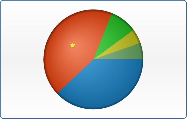
Using markers
Marker is an object with a specified shape, size, and color or an image used to mark and to identify chart elements.
AnyChart allows to add markers to any data element including slices.
In the sample below we will take single-series data described above and mark the highest slice in series with a "Star5" of the "Gold" color.
To make marker visually appealing we will create a style, that will tell AnyChart to set marker size to 16 pixels in normal state, and make it bigger (22 pixels) when user moves cursor over an element.
Marker style "myMarker":
01 |
<marker_style name="myMarker" color="Gold"> |
02 |
<marker type="Star5" size="16" /> |
To apply marker to the certain we need to create <marker> sub-node in <point> and add
<marker enabled="True" style="myMarker"/>
01 |
<point name="Peter" y="18000"> |
02 |
<marker enabled="True" style="myMarker" /> |
And here is a result - the best retail channel for ACME Corp. is Discount Stores and we show this on the chart:
Live Sample: Sample Pie chart - Working with markers
Related help topics:
- You can read more about working with markers in Markers tutorial.
- Full reference of marker style can be found in XMLReference, particularly <marker_style> node.
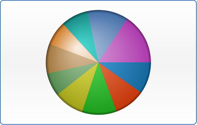
Working with colors and color palettes
AnyChart uses default color palette to colorize data elements of chart automatically even if you have not define special colors. But you can use your own palettes or palettes shipped with AnyChart. Also you can set and apply the color to exact data series or data point.
Setting colors to the elements
Let's demonstrate how to apply different colors to different data series. To apply the color to the exact series we need to set "color" attribute in the <series> node. In the sample below we have 5 series with sample data and we'll color each series to different color. Here is the sample:
Live Sample: Sample Pie chart - Setting colors to the elements
In the sample below we will see how we can colorize individual points. We have chart with one series and predefined color for all elements. We will set "Rgb(180,77,77)" color for minimum point and "Rgb(77,180,77)" for the maximum one. As you see it is very easy to do by setting "color" attribute for <point> node.
Live Sample: Sample Pie chart - Setting colors to the series
Important Note:
AnyChart takes care of visualization and users convenience seriously - that is why we have a number of ways to set colors, for example, instead of "Rgb(180,77,77)" you can set "HSV(?,?,?)" or "HTMLConstant" or "#HEXCode"- and the color will be the same. Depending on your system/site/application design you may need - and use - any of this color setting methods. But even this is not everything about colors in AnyChart: read more about setting colors below and in the following Help Sections:
Color palettes
AnyChart allows to apply color palettes to all series or to the exact series. In the first case each next series will take each next color from palette. If the number of the colors in palette is less than the number of series - palette will be looped. If you have only one series it will be colored by the first color in the palette. To apply palette to all series we have to set "palette" attribute in <data> node. Here it is:
Live Sample: Sample Pie chart - Setting Palette to all series
When you have one series only, sometimes it is useful to color each point in series. You can do it by setting color of each point individually or you can apply a palette. For sure the second method is easier and more useful. To apply palette to the exact series you should set "palette" attribute for exact <series> node.
Live Sample: Sample Pie chart - Working with palettes - Setting Palettes to the certain series
In the samples above we have shown usage of predefined palettes only, but AnyChart allows to create your own custom palettes. To learn more about it read Palettes tutorial.
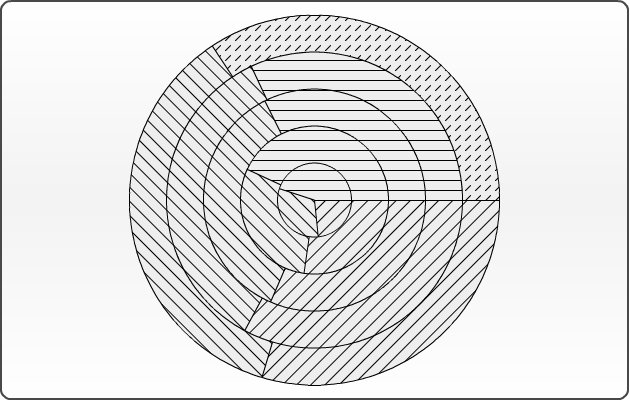
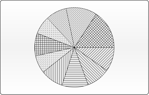
Working with hatch fills and hatch palettes
AnyChart technology allows printing of charts. Some color printers print colors unpredictable and very often it is hard to identify similar colors. Also it is impossible to identify colors on prints of b/w (monochrome) printers. AnyChart has very useful feature - hatch fills, ideal for differentiating elements for black and white display or for those who are color blind. Hatch fill is fully-independent structure, it doesn't rely on color fill and it has own settings and palettes. To see whole range of available hatch types see Hatch tutorial.
Setting hatch fills to the elements
To demonstrate hatch fill feature we've prepared the following sample. As you see it is completely monochrome. We have chart with 5 series with 3 data points in each. For every series we've applied different hatch fills by setting "hatch_type" attribute for <series> node. Also we've changed hatch type for last element in 5th series by setting "hatch_type" attribute for <point> node.
Live Sample: Sample Pie chart - Setting hatch palette to the series
Hatch palettes
When you have a lot of points or series it is very useful to use hatch palettes. Methods of working with hatch palette is very similar to color palette. You can apply hatch palette to all series or to exact series. In the first case each next series will take each next hatch type from palette. If the number of hatch types in palette is less than number of series - palette will be looped. If you have only one series each point will take the first hatch type from the palette. To apply palette to all series we have to set "hatch_palette" attribute in <data> node. Here it is:
Live Sample: Sample Pie chart - Setting hatch fills to the series
When you have one series only you can can apply hatch palette to this series. To do it you should set "hatch_palette" attribute for <series> node. See the sample below:
Live Sample: Sample Pie chart - Setting hatch fills to the certain series
In the samples above we have shown usage of predefined hatch palettes only, but AnyChart allows to create your own custom hatch palettes. To learn more about it read Hatch and hatch palettes .