Label settings and formatting
Overview
The label is a common graphical user interface element - text box used to show description or additional data near some element. On charts it is used in conjunction with data elements (points, columns, bars, etc.).
AnyChart allows to add labels to all data elements. Label has a lot of settings: visual appearance - like background and font, positioning settings and text formatting.
Enabling/Disabling labels
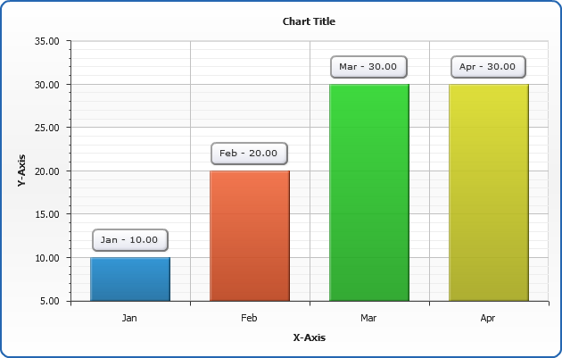
By default labels for all types of charts are disabled. You can enable labels for the given chart type (series type, actually), given series or point.
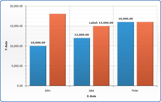
In the sample column chart below we will enable labels for all Bar charts:
02 |
<label_settings enabled="true"> |
03 |
<format><![CDATA[{%YValue}]]></format> |
Disabled label for "Quarter 2" series:
01 |
<series name="Quarter 2"> |
02 |
<label enabled="false" /> |
Enabled and set the custom format for the second point in "Quarter 2" series:
01 |
<point name="Jake" y="15000"> |
02 |
<label enabled="true"><![CDATA[Label: {%YValue}]]></label> |
Here is the live sample of these settings at work:
Live Sample: Sample labels enabling disabling
Note:
Each series type has own settings for labels,
so you should configure <label_settings> in a proper node in <data_plot_settings>, for example: <bar_series> for Bar or Column charts, <line_series> for Line and Spline charts - and so on.
When you are configuring format or enabling labels for the given series (in <series> or <point>) - it will work on any series type.
If you want to use the same settings for different series types - consider creating of a label style - this method is described below, in Label style chapter of this article.

Formatting label text
You can format label text in any way you like, to make it useful and informative. Label text formatting may be set for all series of a given chart type, given series or a certain point. Formatting is set in <format> or <label> subnode.
To make text formatting easier AnyChart has a special mechanism called Keywords. Every keyword is a unique token that can be specified in <format> or <label> node in a following way: {%KeywordName}, for example {%Value} or {%YAxisName}. Before displaying text every keyword is replaced by a corresponding value.
There is a lot of keywords that can be used in labels, you can find a full reference of them in the end of this article.
The values supplied by keywords can be formatted with a special formatting postfixes like that {%Keyword}{param:value}, for example you can set {%Value}{numDecimals:2}, or specify several postfixes: {%Value}{numDecimals:2,thousandsSeparator:,,useNegativeSign;false}. All available number formatting parameters are listed and explained in Number formatting section.
Not only built-in keywords can be used, but you also can create your own custom attributes and attach them to data points, as described below in Custom attributes chapter of this article.
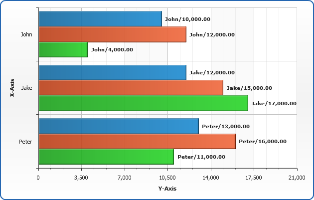
In the sample bar chart below we will format labels for all Bar charts using keywords:
02 |
<label_settings enabled="true"> |
03 |
<format><![CDATA[{%Name}/{%YValue}]]></format> |
Tooltip texts for "Quarter 2" series will be set manually:
01 |
<series name="Quarter 2"> |
02 |
<lables enabled="false" /> |
Enabled and set the custom format for the last point in "Quarter 2" series:
01 |
<point name="Peter" y="16000"> |
02 |
<label enabled="true"><![CDATA[Label]]></label> |
Launch the live sample and see how these settings work.
Live Sample: Sample labels in bar chart
Custom attributes
Additional information stored in databases can be attached to data points and series and used in a chart to provide further information in a tooltip, an element's label or within a legend. This can make creation of tooltips and labels easier - once configured, they can easily be modified and you can concentrate only on data extraction.
Custom attributes are specified within <attributes> subnode of <series> or <point> nodes, each attribute has a unique name, which can be used (with a % prefix, in braces) as a keyword in labels text.
To attach custom attribute to a point the following syntax is used:, when attribute value is a simple string with no
special characters in it:
02 |
<attribute name="id"><![CDATA[value]]></attribute> |
03 |
<attribute name="id2"><![CDATA[value2]]></attribute> |
If you need to pass special characters use CDATA section within <attribute> node:
02 |
<attribute name="id"><![CDATA[%cbegin <b>value</b> %cend]]></attribute> |
03 |
<attribute name="id1"><![CDATA[%cbegin <b>value1</b> %cend]]></attribute> |
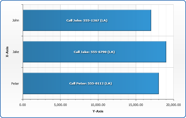
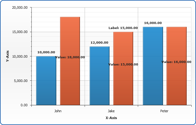
In the sample below we will attach the following info about sales managers to
each point: phone, as shown in the table:
| Name |
Sales |
Phone |
| John |
$10.000 |
555-1267 |
| Jake |
$12.000 |
555-6790 |
| Peter |
$18.000 |
555-0112 |
XML for "Peter" point will look like:
01 |
<point name="Peter" y="18000"> |
03 |
<attribute name="phone"><![CDATA[555-0112]]></attribute> |
Also, we can attach an attribute to the series:
03 |
<attribute name="location"><![CDATA[LA]]></attribute> |
When all attributes are attached we can create a label, that uses them:
02 |
<label_settings enabled="true"> |
03 |
<format><![CDATA[Call {%Name}: {%phone} ({%location})]]></format> |
Now in live chart preview you can see what labels were created:
Live Sample: Sample labels using custom attributes
Setting maximum of visible characters
If the value (a number or a text) is to large, you may want to limit the number of characters using maxChar keyword. This parameters sets the maximal number of symbols, that are displayed.
For example if the length of the string in {%Token} is greater than maxChar, then it will be trimmed and symbols set in maxCharFinalChars (by default "...") are shown at the end (this is done to show explicitly, that string is trimmed).
If the number of characters in {%Token} is less than or equal to maxChar, then {%Token}
is displayed as is.
If you don't want to show anything when value is trimmed - just set maxCharFinalChars to nothing.
Sample setting maximum of visible characters to 2 and no final characters:
01 |
<label_settings enabled="true"> |
02 |
<format><![CDATA[{%Name}{maxChar:2,maxCharFinalChars:}/{%YValue}]]></format> |
Try this settings
Live Sample: Sample setting maximum of visible characters
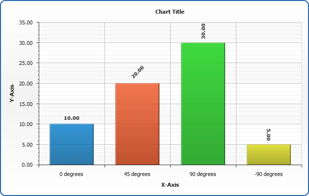
Rotation of labels
You can rotate labels if that will make your charts more readable or allow to put more information on the data plot.
Unlike many other flash chart component AnyChart allows you to rotate any text with to any angle, however,
certain limitations apply - learn more about them in Fonts tutorial.
You can define that label is rotated in certain series labels settings:
02 |
<label_settings rotation="90" /> |
And in label style:
01 |
<label_style rotation="45" /> |
Sample chart with labels rotated to the different angles:
Live Sample: Sample labels text rotation
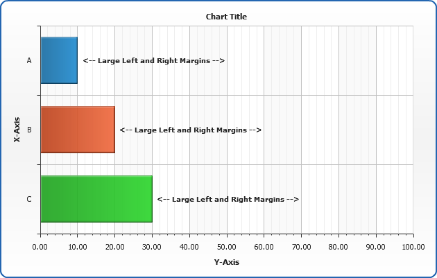
Setting text margins
You can control text margins in labels using <inside_margin> subnode of label settings <background> node, this can be configured in label style or certain series label settings. You can set identical margins for all sides using all attribute, or given margins using left, right, top and bottom attributes. If both all and one/several of the left, right, top or bottom are set - the last four override all value.
Picture below shows what are text margins, and XML - typical margin settings:
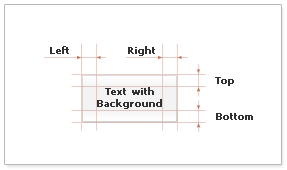
03 |
<inside_margins all="2" left="10" right="10" /> |
This is a sample chart with large left and right label margins:
Live Sample: Sample label text margins
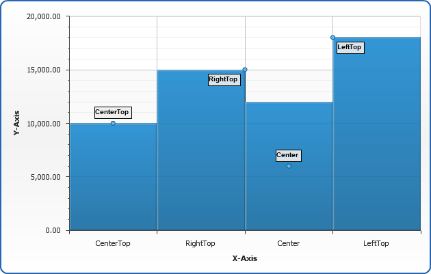
Positioning label
You can define where label will appear using <position> node, that can be configured for given chart type or certain label style. <position> node have four attributes: anchor, halign, valign and padding:
02 |
<position anchor="Center" valign="Left" halign="Top" padding="10" /> |
Anchor attribute sets the point, to which label is anchored and from which valign,
halign and padding work.
| Anchor value |
Description |
| XAxis |
Tooltip will at the X-Axis, between axis line and axis labels (if they are displayed). |
| Center |
Geometric center of the data point shape. |
| CenterLeft |
The center of the left side of the data point shape. |
| LeftTop |
The left corner of the upper side of the data point shape. |
| CenterTop |
The center of the upper side of the data point shape. |
| RightTop |
The right corner of the upper side of the data point shape. |
| CenterRight |
The center of the right side of the data point shape. |
| RightBottom |
The right corner of the bottom side of the data point shape. |
| CenterBottom |
The center of the bottom side of the data point shape. |
| LeftBottom |
The left corner of the bottom side of the data point shape. |
Attributes halign and valign define the alignments of tooltip relative to anchor point.
halign possible values are "Left", "Right" and "Center".
valign possible values are "Top", "Bottom" and "Center".
Padding is a numeric value that defines (in pixels) the shift of an anchor point. It can be positive and negative.
In the sample below we will show how different position settings affect the label position.
We will create three label styles (see more about styles below) and apply them to the different points.
This is a sample style that define label position:
01 |
<label_style name="LeftTop"> |
02 |
<position anchor="LeftTop" halign="Right" valign="Bottom" /> |
That's how label style is applied to a point:
01 |
<point name="LeftTop" y="18000"> |
02 |
<label style="LeftTop" /> |
Live Sample: Sample labels position
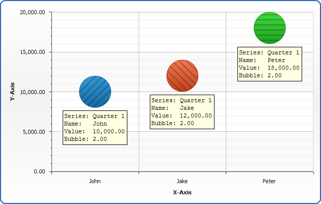
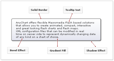
Visual appearance settings
You can tune visual appearance of label using either given series settings and/or label style. Label visual settings consist of background settings (which include margins and border), font settings and effects.
You can learn more about these settings in: Background tutorial, Fonts tutorial and Effects tutorial.
In the sample below label are designed to look like standard Windows tooltips: yellow background, Courier font and thin black border.
Live Sample: Sample labels visual appearance
Note: Don't forget that you always can turn of all settings, for example - if you
want labels to have no background just set <background enabled="false"/>
Label style
Label style allows you to configure all visual, text and format settings in one place, and then use and re-use them
in different series, points and chart styles. This is a very mighty mechanism, when it is used in a right way. Styles can
be inherited, so it is very easy to create new style just modifying only setting that need to be modified and
inherit already configured settings from the basic style.
On the picture below all elements of label style a marked-up and XML below highlights all elements settings:
01 |
<label_style name="Vista"> |
02 |
<background enabled="true"> |
03 |
<fill enabled="True" type="Gradient" opacity="1"> |
05 |
<key position="0" color="#FFFFFF" opacity="1" /> |
06 |
<key position="0.5" color="#F3F4F8" opacity="1" /> |
07 |
<key position="1" color="#E4E5F0" opacity="1" /> |
10 |
<border enabled="True" type="Solid" color="#767676" thickness="2" opacity="0.8" /> |
11 |
<corners type="Rounded" all="5" /> |
12 |
<effects enabled="True"> |
13 |
<bevel enabled="true" highlight_opacity="0.2" shadow_opacity="0.2" /> |
15 |
<inside_margin all="8" top="4" bottom="4" /> |
17 |
<font color="#373737" bold="false" italic="false"> |
18 |
<effects enabled="True"> |
19 |
<drop_shadow enabled="true" distance="1" blur_x="2" blur_y="2" opacity="0.1" /> |
22 |
<format><![CDATA[{%Name} - {%Value}]]></format> |
The labels of this chart are configured using the style defined in XML above, we've tried to reproduce
Vista style tooltip in it:
Live Sample: Sample data labels Vista style
Style Inheritance
The next thing we will learn is style inheritance: we will create three new styles that will
use the "Vista" style as a basic one, the only thing that will be modified is border color (to DarkRed , to Green and to Gold). The
parent attribute of <label_style> node defines that new style inherits all settings of a given "Vista" style.
Sample style that inherits "Vista" and changes the color of the border:
01 |
<label_style name="Heritage1" parent="Vista"> |
03 |
<border color="DarkRed" /> |
In the sample chart below the first column will use original "Vista" style and last three - modified styles:
Live Sample: Sample labels style inheritance
Style Application
There are three ways to apply tooltip style: apply style to all charts of the given type,
apply style to the certain series and to the certain point.
To apply style to all charts of the given type you should do that in a proper series settings
node in <data_plot_settings> node, here is an example of bar charts series settings
(the same can be accomplished in <area_series>, <line_series> and so on):
03 |
<label_settings style="styleName" /> |
To apply label style to the certain series you should do that in <label> subnode of <series> node (no matter what type of series is set):
02 |
<label style="styleName" /> |
To apply label style to the certain point you should do that in <label> subnode of <point> node:
01 |
<point name="Point 1" y="10"> |
02 |
<label style="styleName" /> |
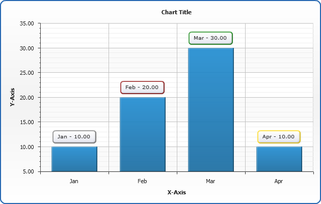
Using multiple labels
In AnyChart you can set more than one label for any object, such as series type, specific series or point. It can be done through specification of a
<extra_labels> node. This node can be used in every place, where <label_settings> node can be used. This node contains
<label> subnodes that have just the same syntax as <label_settings> does.
Let's add an extra label to a series named "Quarter 2" of a chart from the beginning of our tutorial. Here is an extra label xml:
02 |
<label enabled="true"> |
03 |
<format><![CDATA[Value: {%YValue}]]></format> |
04 |
<position anchor="Center" /> |
And here is a live sample of how it works:
Live Sample: Extra labels sample
Keywords reference
In the tables below you can find all built-in keywords that can be used in label texts,
in Description column you an find notices that identify in what chart types keyword will be active. If
a certain attribute value stands behind keyword - you will find this attribute in Attribute column.
Point keywords
This table list all built-in keywords that provide point data and point-related precalculated values.
| Keyword |
Description |
Attribute |
| {%Value} = {%YValue} |
The y value of this point. |
<point y=""/> |
| {%YValue} |
The y value of this point. |
<point y=""/> |
| {%YPercentOfCategory} |
The percentage of all the points with the same name this point represents. |
|
| {%YPercentOfSeries} |
The percentage of the series this point represents. |
|
| {%YPercentOfTotal} |
The percentage of all the series on the chart this point represents. |
|
| {%High} |
The high value of this point (OHLC, Candlestick). |
<point high=""/> |
| {%Low} |
The low value of this point (OHLC, Candlestick). |
<point low=""/> |
| {%Open} |
The open value of this point (OHLC, Candlestick). |
<point open=""/> |
| {%Close} |
The close value of this point (OHLC, Candlestick). |
<point close=""/> |
| {%XValue} |
The x value of this point (Scatter Plot charts). |
<point x=""/> |
| {%XPercentOfSeries} |
The percentage of the series this point represents (Scatter Plot charts). |
|
| {%XPercentOfTotal} |
The percentage of all the series on the chart this point represents. |
|
| {%BubbleSize} |
The bubble size value of this point (Bubble chart). |
<point size=""/> |
| {%BubbleSizePercentOfCategory} |
The percentage of all the points with the same name this point represents (Categorized charts). |
|
| {%BubbleSizePercentOfSeries} |
The percentage of the series this point represents. |
|
| {%BubbleSizePercentOfTotal} |
The percentage of all the series on the chart this point represents. |
|
| {%Name} |
The name of this point. |
<point name=""/>
|
| {%Index} |
The index of this point in the series this point represents (zero-based). |
|
| {%RangeStart} |
The starting value of this point (Range charts). |
<point start=""/> |
| {%RangeEnd} |
The ending value of this point (Range charts). |
<point end=""/> |
| {%Range} |
The range of this point (RangeEnd - RangeStart). |
|
Series keywords
This table list all built-in keywords that provide series data and series-related precalculated values.
| Keyword |
Description |
Attribute |
| {%SeriesName} |
The name of this series. |
<series name=""/> |
| {%SeriesFirstXValue} |
The x value of the first point in this series (Scatter plot charts). |
|
| {%SeriesFirstYValue} |
The y value of the first point in this series. |
|
| {%SeriesLastXValue} |
The x value of the last point in this series (Scatter plot charts). |
|
| {%SeriesLastYValue} |
The y value of the first point in this series. |
|
| {%SeriesYSum} |
The sum of all the points y values. |
|
| {%SeriesXSum} |
The sum of all the points x values (Scatter plot charts). |
|
| {%SeriesBubbleSizeSum} |
The sum of all the points bubble sizes (Bubble chart). |
|
| {%SeriesYMax} |
The maximal y value of all the elements within this series. |
|
| {%SeriesYMin} |
The minimal y value of all the elements within this series. |
|
| {%SeriesXMax} |
The maximal x value of all the elements within this series (Scatter plot charts). |
|
| {%SeriesXMin} |
The minimal x value of all the elements within this series (Scatter plot charts). |
|
| {%SeriesBubbleMaxSize} |
The maximal bubble size value of all the points within this series (Bubble chart). |
|
| {%SeriesBubbleMinSize} |
The minimal bubble size value of all the points within this series (Bubble chart). |
|
| {%SeriesYAverage} |
The average y value of all the points within this series. |
|
| {%SeriesXAverage} |
The average x value of all the points within this series. |
|
| {%SeriesBubbleSizeAverage} |
The average bubble size value of all the points within this series (Bubble chart). |
|
| {%SeriesYMedian} |
The median y value of all the points within this series. |
|
| {%SeriesXMedian} |
The median x value of all the points within this series (Scatter plot charts). |
|
| {%SeriesBubbleSizeMedian} |
The median bubble size value of all the points within this series (Bubble chart). |
|
| {%SeriesYMode} |
The mode y value of all the points within this series. |
|
| {%SeriesXMode} |
The mode x value of all the points within this series (Scatter plot charts). |
|
| {%SeriesBubbleSizeMode} |
The mode bubble size value of all the points within this series (Bubble chart). |
|
| {%SeriesPointCount} |
The number of points in this series. |
|
| {%SeriesYAxisName} |
The title text of the Y Axis. |
|
| {%SeriesXAxisName} |
The title text of the X Axis. |
|
| {%SeriesYRangeMax} |
The maximal range in this series (Range charts). |
|
| {%SeriesYRangeMin} |
The minimal range in this series (Range charts). |
|
| {%SeriesYRangeSum} |
The sum of all ranges in this series (Range charts). |
|
Category
This table list all built-in keywords that provide category data and category-related precalculated values.
When creating categorized charts category is a set of points within the chart with the same name.
| Keyword |
Description |
| {%CategoryYPercentOfTotal} |
The percent of all the data on the chart this category represents. |
| {%CategoryYSum} |
The sum of all the points within this category. |
| {%CategoryYAverage} |
The average of all the points within this category. |
| {%CategoryYMedian} |
The median of all the points within this category. |
| {%CategoryYMode} |
The mode of all the points within this category. |
| {%CategoryName} |
The name of the category. |
| {%CategoryYRangeMax} |
The maximal range in this category (Range charts). |
| {%CategoryYRangeMin} |
The minimal range in this category (Range charts). |
| {%CategoryYRangeSum} |
The sum of all ranges in this category (Range charts). |
Data Plot
This table list all built-in keywords that provide category data and category-related precalculated values.
| Keyword |
Description |
| {%DataPlotYSum} |
The sum of all the points y values. |
| {%DataPlotXSum} |
The sum of all the points x values (Scatter plot charts). |
| {%DataPlotBubbleSizeSum} |
The sum of all the points bubble sizes (Bubble chart). |
| {%DataPlotYMax} |
The maximal of all the points y values. |
| {%DataPlotYMin} |
The minimal of all the points y values. |
| {%DataPlotXMax} |
The maximal of all the points x values (Scatter plot chart). |
| {%DataPlotXMin} |
The minimal of all the points x values (Scatter plot chart). |
| {%DataPlotBubbleMaxSize} |
The maximal of all the points bubble sizes (Bubble chart). |
| {%DataPlotBubbleMinSize} |
The minimal of all the points bubble sizes (Bubble chart). |
| {%DataPlotXAverage} |
The average x value of all the points (Scatter plot charts). |
| {%DataPlotYAverage} |
The average y value of all the points. |
| {%DataPlotBubbleSizeAverage} |
The average bubble size of all the points (Scatter plot charts). |
| {%DataPlotMaxYValuePointName} |
The name of the point with a maximal of all the points y values. |
| {%DataPlotMinYValuePointName} |
The name of the point with a minimal of all the points y values. |
| {%DataPlotMaxYValuePointSeriesName} |
The name of the series with a maximal of all the points y values. |
| {%DataPlotMinYValuePointSeriesName} |
The name of the series with a minimal of all the points y values. |
| {%DataPlotMaxYSumSeriesName} |
The name of the series with a maximal sum of the points y values. |
| {%DataPlotMinYSumSeriesName} |
The name of the series with a minimal sum of the points y values. |
| {%DataPlotYRangeMax} |
The maximal of the ranges of the points within the chart. |
| {%DataPlotYRangeMin} |
The minimal of the ranges of the points within the chart. |
| {%DataPlotYRangeSum} |
The sum of the ranges of the points within the chart. |
| {%DataPlotPointCount} |
The number of the points within the chart. |
| {%DataPlotSeriesCount} |
The number of the series within the chart. |
Y Axis
This table list all built-in keywords that provide Y axis data and y axis-related precalculated values.
| Keyword |
Description |
| {%YAxisSum} |
The sum of all y values of all points in series that are bound to this axis. |
| {%YAxisBubbleSizeSum} |
The sum of all bubble sizes of all points in series that are bound to this axis. |
| {%YAxisMax} |
The maximal y value of all points in series that are bound to this axis. |
| {%YAxisMin} |
The minimal y value of all points in series that are bound to this axis. |
| {%YAxisScaleMax} |
The maximal scale value. |
| {%YAxisScaleMin} |
The minimal scale value. |
| {%YAxisBubbleSizeMax} |
The maximal bubble size of all points in series that are bound to this axis. |
| {%YAxisBubbleSizeMin} |
The minimal bubble size of all points in series that are bound to this axis. |
| {%YAxisAverage} |
The average y value of all points in series that are bound to this axis. |
| {%YAxisMedian} |
The median y value of all points in series that are bound to this axis. |
| {%YAxisMode} |
The mode y value of all points in series that are bound to this axis. |
| {%YAxisName} |
The name of the axis. |
X Axis
This table list all built-in keywords that provide X axis data and x axis-related precalculated values. Only for Scatter plot charts.
| Keyword |
Description |
| {%XAxisSum} |
The sum of all x values of all points in series. |
| {%XAxisBubbleSizeSum} |
The sum of all bubble sizes of all points in series. |
| {%XAxisMax} |
The maximal x value of all points in series. |
| {%XAxisMin} |
The minimal x value of all points in series. |
| {%XAxisScaleMax} |
The maximal scale value. |
| {%XAxisScaleMin} |
The minimal scale value. |
| {%XAxisBubbleSizeMax} |
The maximal bubble size of all points in series. |
| {%XAxisBubbleSizeMin} |
The minimal bubble size of all points in series. |
| {%XAxisAverage} |
The average x value of all points in series. |
| {%XAxisMedian} |
The median x value of all points in series. |
| {%XAxisMode} |
The mode x value of all points in series. |
| {%XAxisName} |
The name of the axis. |