Preparing Data for Stacked Column and Line Charts
Data Tables
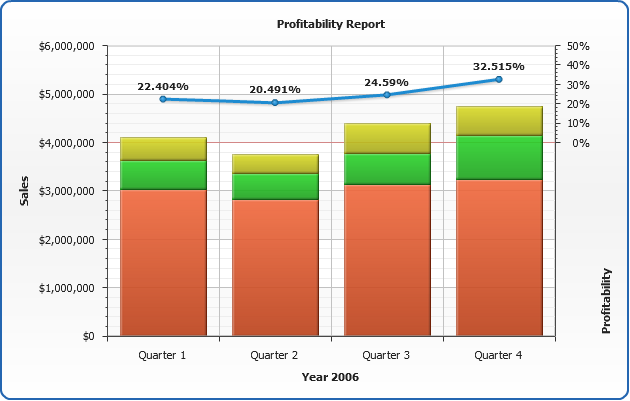
As it was said in Dashboard Creation Tutorial we have the Products Sales Per Category for Each Quarter (in th. USD) and Chain Profit for Each Quarter, as follows:
Products Sales Per Category for Each Quarter (USD)
| Product Type |
Quarter 1 |
Quarter 2 |
Quarter 3 |
Quarter 4 |
| Beverages and Beer |
$3 025 000 |
$2 825 000 |
$3 125 000 |
$3 225 000 |
| Hard Liquors |
$605 000 |
$525 000 |
$645 000 |
$925 000 |
| Food and Snack |
$470 000 |
$400 000 |
$630 000 |
$600 000 |
Chain Profit for Each Quarter (in th. USD)
| Quarter |
Quarter 1 |
Quarter 2 |
Quarter 3 |
Quarter 4 |
Year |
| Profit (th.) |
$1 025 |
$937.5 |
$1 125 |
$1 487.5 |
$4 575 |
| Profit (%) |
22.404% |
20.491% |
24.59% |
32.515% |
100% |

Converting to XML
Now we need to convert this data table into XML, this format will be accepted by AnyChart.
In terms of AnyChart data model for stacked column chart we have three series of data that hold product sales data. Each point in series represents one quarter sales of product for this quarter in dollars. Converted XML Data looks like (only one series is shown - other series is just the same):
02 |
<series type="Bar" name="Beverages and Beer"> |
03 |
<point name="Quarter 1" y="3025000" /> |
04 |
<point name="Quarter 2" y="2825000" /> |
05 |
<point name="Quarter 3" y="3125000" /> |
06 |
<point name="Quarter 4" y="3225000" /> |
As you can see, we've created one <series> node, specified its type="Bar", added several <point> nodes and set name attribute that defines bar category and y attribute that defines bar value.
Read more about bar charts in Bar Chart Tutorial.
Line chart has almost the same settings, but y values hold percents to total revenue, we've set this series type to "Line" and set its axis to "y2" (this will be explained later):
02 |
<series type="Line" name="Revenue" y_axis="y2"> |
03 |
<point name="Quarter 1" y="22.404" /> |
04 |
<point name="Quarter 2" y="20.491" /> |
05 |
<point name="Quarter 3" y="24.59" /> |
06 |
<point name="Quarter 4" y="32.515" /> |
Additional Chart Settings
All we need to do to finalize bar chart XML creation is to define proper axes for stacked column chart and line chart.
Stacked Axis
To stack th bar series we configured in data section we will male default Y-Axis
Stacked, this should be done using <scale mode="Stacked"/>. We also formatted axis label and title.
Read more about axes scales in Axes Scales Tutorial.
02 |
<scale mode="Stacked" /> |
04 |
<text><![CDATA[Sales]]></text> |
06 |
<labels align="Inside"> |
07 |
<format><![CDATA[${%Value}{numDecimals:0}]]></format> |
Additional Axis
In AnyChart you can add as many additional axes to chart, as you need. In out case we need only one. So we add <extra> node with <y_axis name="y2"> to <axes> node, format its labels and title and set minimum, maximum and base_value in a way that allows line not to overlap stacked columns:
02 |
<y_axis name="y2" enabled="True"> |
03 |
<scale minimum="-100" maximum="50" base_value="0" major_interval="10" /> |
05 |
<format><![CDATA[{%Value}{numDecimals:0}%]]></format> |
08 |
<text><![CDATA[Profitabilty, %]]></text> |
Read more about Extra Axes in Extra Axes Tutorial, about Axes Configuration - in Axes Basics Tutorial, about scale configuration - in Axes Scales Tutorial.
That's is - we also did a small configuration of tooltips and labels for both stacked column and line charts and now our chart is ready, look at the chart sample below and click on on it to see Live Flash Chart preview and full configured XML.
Live Sample: Dashboard Stacked Column and Line Combination
Get Back to Dashboard Creation Tutorial.