Column Chart
- Overview
- Chart building
- Single-Series column chart
- Multi-Series column chart
- Multi-Series column chart grouped by series
- 3D column chart
- 3D column chart clustered by Z Axis
- Axes management
- Padding between columns and column groups
- Using styles
- Working with data labels and tooltips
- Using markers
- Working with colors and color palettes
- Working with hatch fills and hatch palettes
Overview
A column chart, also known as a bar chart, is a chart with rectangular bars of lengths usually proportional to the magnitudes or frequencies of what they represent. The bars can be horizontally or vertically oriented. The column chart is vertically oriented bars. If you want to build horizontally oriented bar charts, please go to: Bar Chart Help section.
Column charts are useful for showing data changes over a period of time or for illustrating comparisons among items. In column charts, categories are typically organized along the horizontal axis and values along the vertical axis.
Chart building
Depending on data model and the visualization purpose the column chart may contain single series or multi series. AnyChart solution allows to build both 2D (two-dimensional) and 3D (three-dimensional) column charts.
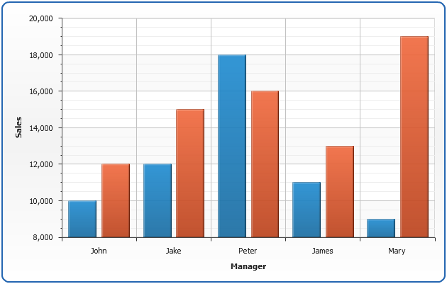
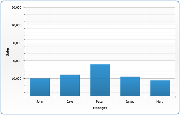
Single-Series Column Chart
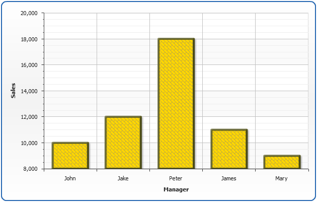
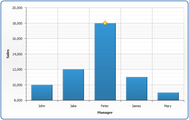
Let's look at the single-series column chart created using the following data - sales of several managers in one quarter:
| Name | Sales |
|---|---|
| John | $10000 |
| Jake | $12000 |
| Peter | $18000 |
| James | $11000 |
| Mary | $9000 |
Now we need to convert this data table into XML, this format will be accepted by AnyChart. In terms of AnyChart data model we have one series of data (Sales) with categories that hold managers names. Each point in series represents one manager and his/her sales. Converted XML Data looks like:

01 |
<data> |
02 |
<series name="Sales" type="Bar"> |
03 |
<point name="John" y="10000" /> |
04 |
<point name="Jake" y="12000" /> |
05 |
<point name="Peter" y="18000" /> |
06 |
<point name="James" y="11000" /> |
07 |
<point name="Mary" y="9000" /> |
08 |
</series> |
09 |
</data> |
As you can see, we've created one <series> node, specified its type="Bar", added several <point> nodes and set x attribute that defines column category and y attribute that defines column value.
All we need to do to finalize column chart XML creation is to define plot_type="CategorizedVertical" in <chart> node and add axes titles. Here it is - AnyChart can now visualize your data. Look at the chart sample below and click on XML button if you want to see full configured XML.

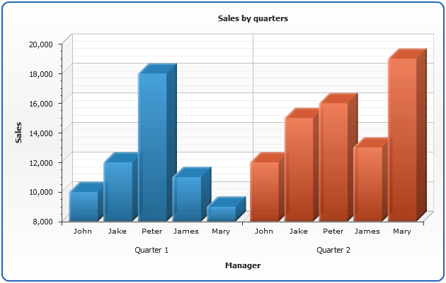
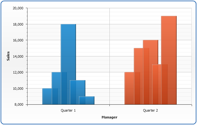
Multi-Series column chart
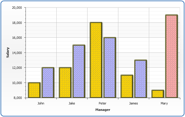
To compare two or more data rows you have to use multi-series column charts as it is shown in the sample below.
Let's compare the First quarter sales with the Second quarter sales:
| Name | Quarter 1 Sales | Quarter 2 Sales |
|---|---|---|
| John | $10000 | $12000 |
| Jake | $12000 | $15000 |
| Peter | $18000 | $16000 |
| James | $11000 | $13000 |
| Mary | $9000 | $19000 |
As we do in single series column sample above we need to convert this table into XML, the only difference between these two samples is the fact that now we have two series of data - one series for each quarter, and we give proper names to each series:
01 |
<data> |
02 |
<series name="Quarter 1"> |
03 |
<point name="John" y="10000" /> |
04 |
<point name="Jake" y="12000" /> |
05 |
<point name="Peter" y="18000" /> |
06 |
<point name="James" y="11000" /> |
07 |
<point name="Mary" y="9000" /> |
08 |
</series> |
09 |
<series name="Quarter 2"> |
10 |
<point name="John" y="12000" /> |
11 |
<point name="Jake" y="15000" /> |
12 |
<point name="Peter" y="16000" /> |
13 |
<point name="James" y="13000" /> |
14 |
<point name="Mary" y="19000" /> |
15 |
</series> |
16 |
</data> |
As we now have multi-series chart we don't want to set type for each series individually (there can be much more than two series in multi-series chart), so we add <data_plot_settings default_series_type="Bar"/> node to <chart>. Now all series in chart will be of Bar type by default.
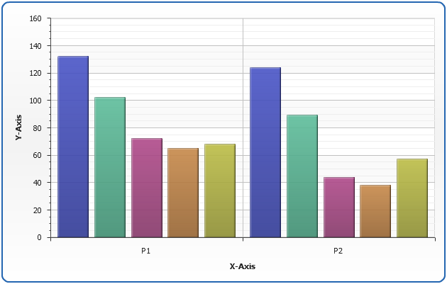
Multi-Series Column Chart grouped by series
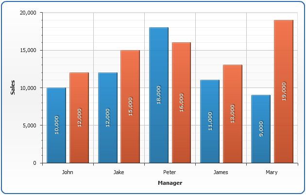
Sometimes it is useful to visualize comparison in a different way - group columns by series. In our sample it means that we want to compare the sales of all the managers in each quarter, not each manager's sales in different quarters. You don't have to reformat your data to do this - all you need to do is to switch plot_type attribute to "CategorizedBySeriesVertical". Look at the resulting chart below:

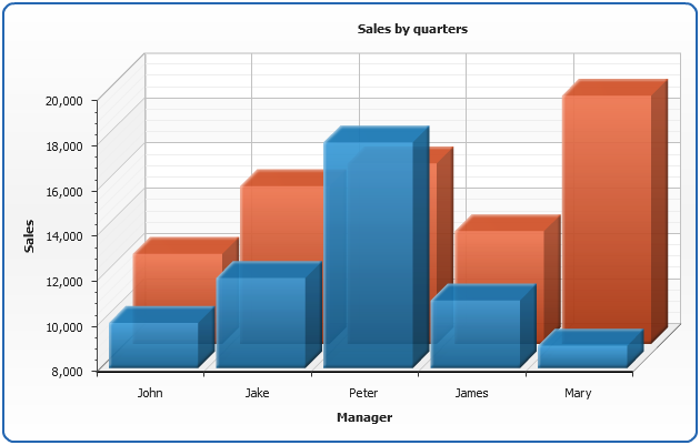
3D Column chart
It is very easy to display the data from the sample above in 3D mode - just set enable_3d_mode attribute and columns will become 3D: <data_plot_settings enable_3d_mode="True">
3D Column chart clustered by Z Axis
In 3D mode you may want to show columns one over another - in other words: to cluster them along Z Axis. To do this you should change scale mode of Y Axis to "Overlay":
01 |
<y_axis> |
02 |
<scale mode="Overlay" /> |
03 |
</y_axis> |
Also, we will tune up 3D visualization by setting z_aspect="0.7" and z_padding="0.3". z_aspect attribute controls the depth of 3D plot (0 stands for 2D - flat plot), z_padding controls the space between the clustered elements along Z Axis.
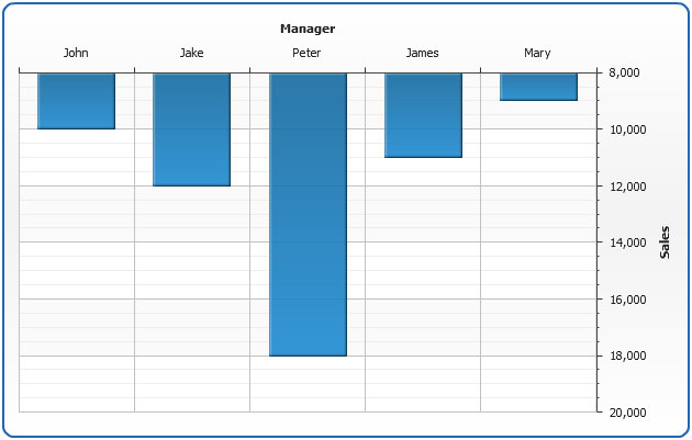
Axes management
In AnyChart axis is an object that allows you to configure chart grid, axis line along with tick marks and labels, axis scale and settings. All axis features are described in Working with Axes tutorial, in this section we will quickly demonstrate how axis position can be adjusted, how axis scale can be inverted and how minimum and maximum values can be controlled.
Positioning
With AnyChart you can place axes to any side of the chart, all you need to do is to adjust position attribute of <y_axis> or <x_axis> nodes.
Positioning depends on plot type and inversion of axes, you will find list of all possible positining and inversion settings in Axes Positioning and Inverting Templates.
01 |
<axes> |
02 |
<y_axis position="Opposite" /> |
03 |
<x_axis position="Opposite" /> |
04 |
</axes> |
Look at the demonstration of this feature on the Single-series sample:
Inversion
AnyChart allows to invert any axis: Y, X or any extra axis. Inversion is controlled by axis <scale>:
01 |
<y_axis> |
02 |
<scale inverted="True" /> |
03 |
</y_axis> |
Look at the demonstration of Y Axis inversion on the Single-series sample:
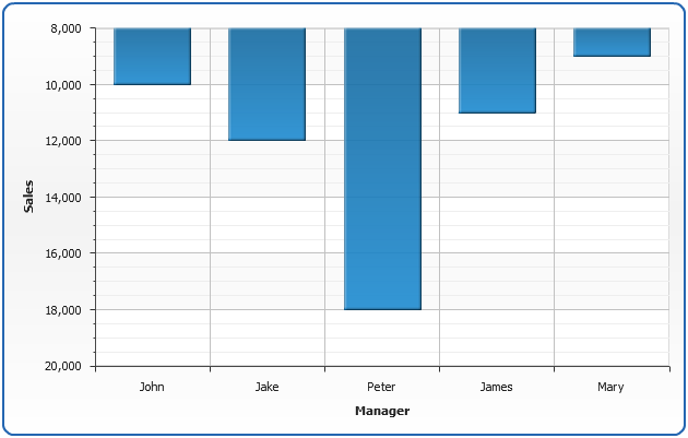
Minimum and Maximum values control
By default AnyChart calculates axis minimum and maximum automatically, you can see it on the scale inversion chart sample above: minimal value on the Y Axis is 8.000, and maximum is 20.000. You can control these values by setting maximum and minimum attributes of <scale> node:
01 |
<y_axis> |
02 |
<scale minimum="0" maximum="50000" /> |
03 |
</y_axis> |
Look at the demonstration of maximum and minimum values on the Single-series sample:
Padding between columns and column groups
The special thing about column charts are the paddings between columns and column groups (in multi-series charts), on the picture below you can see what are these paddings:
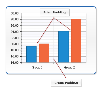
If you want to set these paddings you need to set point_padding or group_padding attributes in <bar_series> node. Paddings are measured as a ratio to column width (columns widths are calculated automatically). For example, if you set point_padding to 0.5 - the space between two columns will be equal to the half of each column width. If you want to have no padding between columns or groups you should set point_padding or group_padding to 0.
Here is a sample of multi-series column chart with point_padding and group_padding set to -0.1 and 2, accordingly, negative point_padding leads to columns overlay and large group_padding moves column groups away from each other:
Using styles
In this section we will describe main parts of column chart style and demonstrate how style can be created and applied. You will also see list of the predefined styles.
The main idea of styles is to segregate visualization and data definition. Visual appearance of columns is defined using certain styles and then you just apply the style to the certain data elements. Style can be applied to all column charts, data series or single column.
As a column chart is just a sub-type of bar chart, its style can be configured in <bar_style> and <bar_series> nodes. On the image below you can see what bar_style consists of: fill (including solid color fill, hatch fill, image fill and gradient fill), border and effects applied to whole column.

Styles are also used to make charts interactive, you can define how elements will be displayed by default, when selected, when user moves cursor over an element, etc.
Simple style
Now, let's fins out how to create a simple style and apply it to the chart. As we've already told style consists of several elements, here is an XML structure:
01 |
<bar_style name="style1"> |
02 |
<fill type="Solid" color="Gold" opacity="1" /> |
03 |
<border thickness="4" color="Rgb(86,86,26)" /> |
04 |
<hatch_fill enabled="True" type="DiagonalBrick" color="Gray" /> |
05 |
<effects> |
06 |
<bevel enabled="true" highlight_opacity="0.4" shadow_opacity="0.4" distance="2" /> |
07 |
<drop_shadow enabled="true" opacity="0.3" /> |
08 |
</effects> |
09 |
<states> |
10 |
<hover> |
11 |
<border color="DarkRed" thickness="6" /> |
12 |
<hatch_fill color="DarkRed" /> |
13 |
</hover> |
14 |
</states> |
15 |
</bar_style> |
Using such settings we've created a style that defines columns of Gold color, rather thick border, hatch filled with DiagonalBrick and a couple of effects. Also, we've defined that when user will move cursor over an element it will be highlighted with a DarkRed thick border and hatch fill colored DarkRed too.
Now we will take a sample single series chart described above, define style in XML and apply it to all chart elements, using <bar_series style="style1"/>
Application of different styles to chart elements
Now we will demonstrate how to apply different styles to different series and columns. To do it we will use multi-series sample that was demonstrated above and create two more styles: "style2" and "style3", both inherited from the "style1".
"style1" will be applied to "Quarter 1" series, "style2" will be applied to "Quarter 2" series and "style3" will be applied to the column with a highest value (Note - we will find the highest value and set its style manually in this sample. But with AnyChart it is possible to do that automatically using Thresholds, read more about it in Thresholds tutorial).
So - the definitions of the styles are:
Style 1:
01 |
<bar_style name="style1"> |
02 |
<fill type="Solid" color="Gold" opacity="1" /> |
03 |
<border thickness="4" color="Rgb(86,86,26)" /> |
04 |
<hatch_fill enabled="True" type="DiagonalBrick" color="Gray" /> |
05 |
<effects> |
06 |
<bevel enabled="true" highlight_opacity="0.4" shadow_opacity="0.4" distance="2" /> |
07 |
<drop_shadow enabled="true" opacity="0.3" /> |
08 |
</effects> |
09 |
<states> |
10 |
<hover> |
11 |
<border color="DarkRed" thickness="6" /> |
12 |
<hatch_fill color="DarkRed" /> |
13 |
</hover> |
14 |
</states> |
15 |
</bar_style> |
Style 2:
This style is inherited from "style1" and the only thing changed is a color of the fill: from "Gold" to "Rgb(180,180,255)". We've used styles inheritance to avoid duplication of the common settings.
01 |
<bar_style name="style2" parent="style1"> |
02 |
<fill color="Rgb(180,180,255)" /> |
03 |
</bar_style> |
Style 3:
This style is also inherited from "style1" and the new color of the fill is "Rgb(255,170,170)". And again we've used styles inheritance.
01 |
<bar_style name="style3" parent="style1"> |
02 |
<fill color="Rgb(255,170,170)" /> |
03 |
</bar_style> |
And, as a result - an example of these styles usage:
Predefined styles
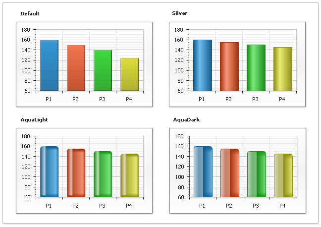
There are several predefined styles that you can use and modify with help of styles inheritance (setting them as a parent styles for your styles). On the picture below you can see how these styles will change the appearance of the columns and their names: "Default", "Silver", "AquaLight" and "AquaDark".
Note 1:
When you are inheriting from "AquaLight" and "AquaDark" styles you can change only the color, opacity, hatch-fill and effects of the column.
Note 2:
When creating and applying styles to columns in 3D mode you can change only the color, opacity, hatch-fill and effects of the column.
- You can read more about styles and their usage in Styles tutorial.
- Full reference of column chart style can be found in XML Reference, particularly <bar_style> and <bar_series> nodes.
- General things about tuning visual appearance, working with borders, colors, fills, etc. - can be found in Visual Appearance Section
Working with data labels and tooltips
In this section we will explain how to add and configure data labels and tooltips. Full explanation of formatting and tuning visual appearance for them can be found in Labels and tooltips tutorials.
If you want to configure data labels and tooltips for all series - you should do that in <label_settings> and <tooltip_settings> sub-nodes of <bar_series> node. You can tune their visual appearance, positioning and format. Let's do that in the following example: we will make data labels appear in the center of the columns, format labels so they show only the value corresponding to the column and tooltip will show detailed description.
When formatting data labels text and tooltip we will use formatting keywords:
{%CategoryName} - to show sales manager name,
{%YValue} - to show his/her sales,
{%SeriesName} - to show period (quarter),
{%YPercentOfSeries} - to show every person sales percentage to total sales per quarter.
Using markers
Marker is an object with a specified shape, size, and color or an image used to mark and to identify chart elements. AnyChart allows to add markers to any data element including columns.
In the sample below we will take single-series data described above and mark the highest column in series with a "Star5" of the "Gold" color.
To make marker visually appealing we will create a style, that will tell AnyChart to set marker size to 16 pixels in normal state, and make it bigger (22 pixels) when user moves cursor over an element.
Marker style "myMarker":
01 |
<marker_style name="myMarker" color="Gold"> |
02 |
<marker type="Star5" size="16" /> |
03 |
<states> |
04 |
<hover> |
05 |
<marker size="22" /> |
06 |
</hover> |
07 |
</states> |
08 |
</marker_style> |
To apply marker to the certain column we need to create <marker> sub-node in <point> and add
<marker enabled="True" style="myMarker"/>
01 |
<point name="Peter" y="18000"> |
02 |
<marker enabled="True" style="myMarker" /> |
03 |
</point> |
And here is a result - Peter sold more than others and we are showing this on the chart:
Working with colors and color palettes
AnyChart uses default color palette to colorize data elements of chart automatically even if you have not defined special colors. But you can use your own palettes or palettes shipped with AnyChart. You can also set and apply the color to exact data series or data point.
Setting colors to the elements
Let's demonstrate how to apply different colors to different data series. To apply the color to the exact series we need to set "color" attribute in the <series> node. In the sample below we have 5 series with sample data and we'll color each series in different color. Here is the sample:
In the sample below we will see how we can colorize individual points. We have chart with one series and predefined color for all elements. We will set "Rgb(180,77,77)" color for minimum point and "Rgb(77,180,77)" for the maximal one. As you see it is very easy to do by setting "color" attribute for <point> node.

Important Note:
AnyChart seriously takes care of visualization and users convenience - that is why we have a number of ways to set colors, for example, instead of "Rgb(180,77,77)" you can set "HSB" or "HTMLConstant" or "#HEXCode"- and the color will be the same. Depending on your system/site/application design you may need - and use - any of this color setting methods. But even this it is not all about colors in AnyChart: read more about setting colors below and in the following Help Sections:
Color palettes
AnyChart allows to apply color palettes to all series or to the exact series. In the first case each next series will take each next color from palette. If the number of the colors in palette is less than the number of series - palette will be looped. If you have only one series it will be colored by the first color in the palette. To apply palette to all series we have to set "palette" attribute in <data> node. Here it is:
When you have only one series, sometimes it is useful to color each point in series. You can do it by setting color of each point individually or you can apply a palette. For sure the second method is easier and more useful. To apply palette to the exact series you should set "palette" attribute for exact <series> node.
In the samples above we have shown usage of predefined palettes only, but AnyChart allows to create your own custom palettes. To learn more about it read Palettes tutorial.
Working with hatch fills and hatch palettes
AnyChart technology allows printing of charts. Some color printers print colors unpredictable and very often it is hard to identify similar colors. Also it is impossible to identify colors on prints of b/w (monochrome) printers. AnyChart has very useful feature - hatch fills, ideal for differentiating elements for black and white display or for those who are color blind. Hatch fill is fully-independent structure, it doesn't rely on color fill and it has own settings and palettes. To see the whole range of available hatch types see Hatch tutorial.
Setting hatch fills to the elements
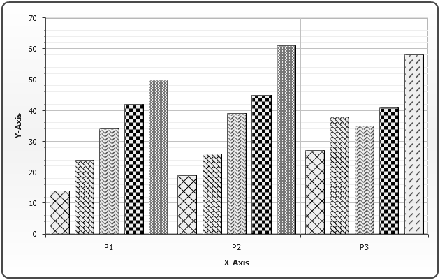
To demonstrate hatch fill feature we've prepared the following sample. As you see it is completely monochrome. We have a chart with 5 series with 3 data points in each. For every series we've applied different hatch fills by setting "hatch_type" attribute for <series> node. Also we've changed hatch type for last element in 5th series by setting "hatch_type" attribute for <point> node.
Hatch palettes
When you have a lot of points or series it is very useful to use hatch palettes. Method of working with hatch palette is very similar to color palette. You can apply hatch palette to all tha series or to exact series. In the first case each next series will take each next hatch type from palette. If the number of hatch types in the palette is less than a number of series - the palette will be looped. If you have only one series, each point will take the first hatch type from the palette. To apply the palette to all the series we have to set "hatch_palette" attribute in <data> node. Here it is:

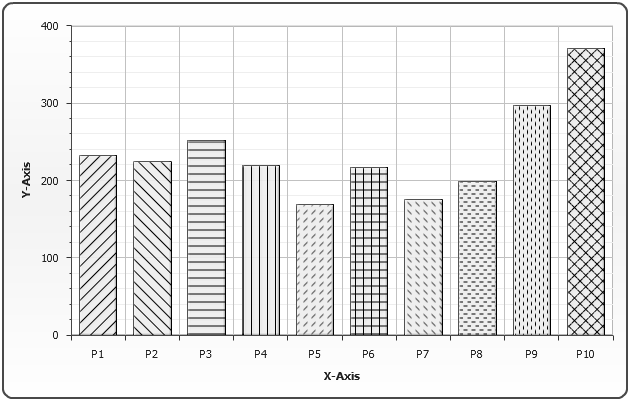
When you have one only series you can apply hatch palette to this series. To do it you should set "hatch_palette" attribute for <series> node. See the sample below:
In the samples above we have shown the usage of predefined hatch palettes only, but AnyChart allows to create your own custom hatch palettes. To learn more about it read Hatch and hatch palettes .