Thresholds Tutorial
Overview
Thresholds are used to color chart elements according to some predefined conditions, this allow you to segregate data output and visualization.
For example, you can create threshold that will always color maximal element in series in Red, or color all negative values on the chart in Blue.
Every threshold can contain several conditions and you can create several thresholds and apply them to certain series or to all chart data.

Creating Thresholds
To create thresholds create <thresholds> node in <chart> node and place one or several conditions named thresholds:
03 |
<threshold name="SampleThreshold"> |
04 |
<condition name="Excellent Rating" type="greaterThanOrEqualTo" value_1="{%YValue}" value_2="10000" color="Red" /> |
You can create as many <threshold> nodes as you need, you should give each threshold a unique name, each threshold can contain as many <condition> nodes as you need.
Defining Conditions
Each condition tests one value against one (or two) another values and sets a color. There are eight types of conditions - you will find full list and description of each type in the next section.
The simple syntax for conditions is the following:
01 |
<threshold name="SampleThreshold"> |
02 |
<condition name="From 100 to 200" type="between" value_1="{%YValue}" value_2="100" value_3="200" color="Red" /> |
03 |
<condition name="Negative" type="lessThen" value_1="{%YValue}" value_2="0" color="Blue" /> |
In the sample above all values from 100 to 200 will be colored in Red, and all negative values - in Blue.
As you can see - you can use keywords in value_1, value_2 and value_3 attributes full list of keywords you can use can be found in the end of this article.
You can also use custom attributes values using {%CustomAttributeName} syntax.
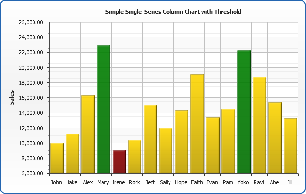
In the sample below we will create Column chart that shows sales of different managers for the current month, columns for those who's sales amount is less than 10.000 will be colored with DarkRed, from 10.000 to 20.000 with Gold and over 20.000 - with Green, tooltips will show sales data and rating:
Live Sample: Sample Thresholds Simple Conditions Column Chart
Condition Types
There are 8 types of conditions, below you can see a table with all condition types and their description:
| Type |
Values required |
Description |
| between |
value_1, value_2, value_3 |
True when value_1 is greater than or equal to value_2 and less than or equal to value_3. |
| notBetween |
value_1, value_2, value_3 |
True when value_1 is less than value_2 or greater than value_3. |
| equalTo |
value_1, value_2 |
True when value_1 is equal to value_2. |
| notEqualTo |
value_1, value_2 |
True when value_1 is not equal to value_2. |
| greaterThan |
value_1, value_2 |
True when value_1 is greater than value_2. |
| greaterThanOrEqualTo |
value_1, value_2 |
True when value_1 is greater than or equal to value_2. |
| lessThan |
value_1, value_2 |
True when value_1 is less than value_2. |
| lessThanOrEqualTo |
value_1, value_2 |
True when value_1 is less than or equal to value_2. |
Thresholds Application
Once your thresholds are defined you can apply them to all data on the chart or to the certain series, to do that just set threshold attribute of <data> or <series> node:
01 |
<data threshold="Threshold1"> |
02 |
<series name="Series1" threshold="Threshold2" /> |
03 |
<series name="Series2" /> |
If you define settings as above - "Threshold1" will be applied to "Series 2" and "Threshold1" - to "Series 1".
Thresholds Custom Attributes
You can attach any data to conditions to use this data in labels, tooltips or legend. For example
you can describe a condition and place this condition description in label.
To add custom attributes to condition create <attributes> subnode in <condition> and place as many <attribute> nodes in it as you need.
02 |
<threshold name="TempreatureTreshold"> |
03 |
<condition name="c1" type="lessThanOrEqualTo" value_1="{%YValue]" value_2="127" color="Red"> |
05 |
<attribute name="Description"><![CDATA[The price is less or equal than 127 - and that is a very dangerous situation!]]></attribute> |
08 |
<condition name="c2" type="greaterThan" value_1="{%YValue}" value_2="127" color="Yellow"> |
10 |
<attribute name="Description"><![CDATA[The price is greater than 127 - and that is fine.]]></attribute> |
In the next two section we will show how to use conditional data in Labels, Tooltips and Legend.
Using Thresholds Data in Labels and Tooltips
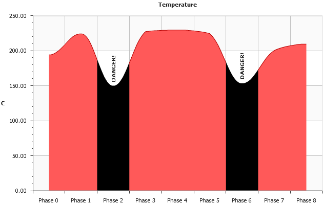
In the sample below you can see area chart that shows a temperature of some engine - values are colored using threshold, and labels and tooltips use "Description" and "Details" custom attributes of threshold conditions.
To define custom attributes of conditions we set the following:
02 |
<threshold name="TempreatureTreshold"> |
03 |
<condition name="c1" type="lessThanOrEqualTo" value_1="{%YValue}" value_2="153" color="Black"> |
05 |
<attribute name="Description"><![CDATA[DANGER!]]></attribute> |
06 |
<attribute name="Details"><![CDATA[The Temprature is less than or equal to 154.]]></attribute> |
To use conditional data in labels we set:
01 |
<label_settings enabled="true" rotation="90"> |
02 |
<format><![CDATA[{%ConditionDescription}]]></format> |
And to show detailed description in tooltip we set:
01 |
<tooltip_settings enabled="true"> |
02 |
<format><![CDATA[Temp: {%YValue} |
03 |
{%ConditionDescription} {%ConditionDetails}]]></format> |
That's it - now our chart shows a dangerous Phases with color and label:
Live Sample: Sample Thresholds Area Chart Labels and Tooltips
Displaying Thresholds in Legend
When coloring different items using thresholds it can be useful to show conditions and their description in chart legend.
To make AnyChart show information about conditions into the legend set the following:
01 |
<legend enabled="true"> |
03 |
<item source="thresholds" /> |
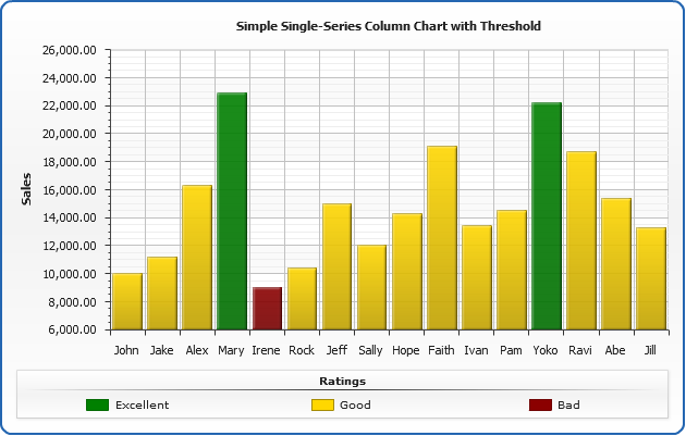
Here is the sales sample with thresholds shown in legend, when viewing a live sample you
should note that when you move mouse cursor over the condition name in legend - all columns on the chart that are colored
using condition are highlighted.
Live Sample: Sample Thresholdsin Legend
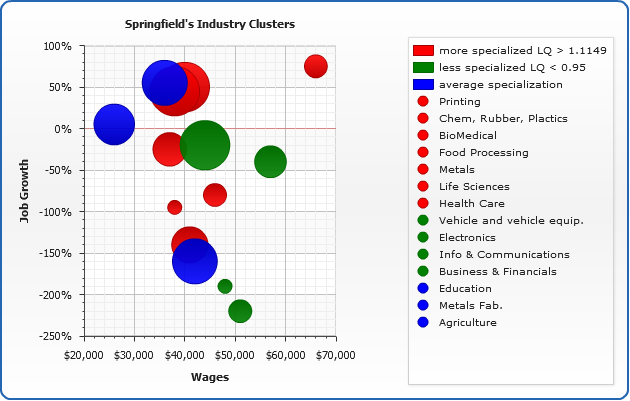
Sample Cluster Analysis Bubble
When there are custom attributes attached to conditions - you can use them in legend as well as in tooltips and labels.
In the sample below we will use point attribute value in threshold and attach custom attributes to threshold conditions, then we will use conditions attributes to create legend.
We are charting a bubble chart for industry cluster analysis, each bubble shows jobs growth (y) and wages level (x), the size of the chart shows Employment size of the industry and color of the bubble shows how specialized this industry is.
To add custom attribute that shows specialization we need to set the following:
01 |
<point name="Printing" x="38000" y="-95" size="1"> |
03 |
<attribute name="type"><![CDATA[more]]></attribute> |
To create threshold that tests attributes we set the following:
02 |
<threshold name="Specialization"> |
03 |
<condition name="more specialized" type="EqualTo" value_1="{%type}" value_2="more" color="Red"> |
05 |
<attribute name="description"><![CDATA[%cbeginLQ > 1.1149 %cend]]></attribute> |
08 |
<condition name="less specialized" type="EqualTo" value_1="{%type}" value_2="less" color="Green"> |
10 |
<attribute name="description"><![CDATA[%cbeginLQ < 0.95 %cend]]></attribute> |
13 |
<condition name="average specialization" type="EqualTo" value_1="{%type}" value_2="average" color="Blue" /> |
And to put thresholds and points to legend we just set:
01 |
<legend enabled="true" ignore_auto_item="true" align_by="Chart" align="Spread" padding="50" columns="1" rows_padding="1"> |
02 |
<title enabled="false" /> |
03 |
<rows_separator enabled="false" /> |
05 |
<item source="thresholds"> |
06 |
<text><![CDATA[{%Icon} {%ConditionName} {%ConditionDescription}]]></text> |
08 |
<item source="points" /> |
Here we are - bubble chart is ready, data and data visualizations are segregated - you can easily modify
thresholds, colors and chart settings - without any modifications of data section.
Live Sample: Sample Scatter Bubble Charts for Cluster Analysis with thresholds
Sample Scatter Line Chart with Thresholds
Keywords reference
In the tables below you can find all built-in keywords that can be used in condition values,
in Description column you an find notices that identify in what chart types keyword will be active. If
a certain attribute value stands behind keyword - you will find this attribute in Attribute column.
You can also use custom attributes values using {%CustomAttributeName} syntax.
Point keywords
This table list all built-in keywords that provide point data and point-related precalculated values.
| Keyword |
Description |
Attribute |
| {%Value} = {%YValue} |
The y value of this point. |
<point y=""/> |
| {%YValue} |
The y value of this point. |
<point y=""/> |
| {%YPercentOfCategory} |
The percentage of all the points with the same name this point represents. |
|
| {%YPercentOfSeries} |
The percentage of the series this point represents. |
|
| {%YPercentOfTotal} |
The percentage of all the series on the chart this point represents. |
|
| {%High} |
The high value of this point (OHLC, Candlestick). |
<point high=""/> |
| {%Low} |
The low value of this point (OHLC, Candlestick). |
<point low=""/> |
| {%Open} |
The open value of this point (OHLC, Candlestick). |
<point open=""/> |
| {%Close} |
The close value of this point (OHLC, Candlestick). |
<point close=""/> |
| {%XValue} |
The x value of this point (Scatter Plot charts). |
<point x=""/> |
| {%XPercentOfSeries} |
The percentage of the series this point represents (Scatter Plot charts). |
|
| {%XPercentOfTotal} |
The percentage of all the series on the chart this point represents. |
|
| {%BubbleSize} |
The bubble size value of this point (Bubble chart). |
<point size=""/> |
| {%BubbleSizePercentOfCategory} |
The percentage of all the points with the same name this point represents (Categorized charts). |
|
| {%BubbleSizePercentOfSeries} |
The percentage of the series this point represents. |
|
| {%BubbleSizePercentOfTotal} |
The percentage of all the series on the chart this point represents. |
|
| {%Name} |
The name of this point. |
<point name=""/>
|
| {%Index} |
The index of this point in the series this point represents (zero-based). |
|
| {%RangeStart} |
The starting value of this point (Range charts). |
<point start=""/> |
| {%RangeEnd} |
The ending value of this point (Range charts). |
<point end=""/> |
| {%Range} |
The range of this point (RangeEnd - RangeStart). |
|
Series keywords
This table list all built-in keywords that provide series data and series-related precalculated values.
| Keyword |
Description |
Attribute |
| {%SeriesName} |
The name of this series. |
<series name=""/> |
| {%SeriesFirstXValue} |
The x value of the first point in this series (Scatter plot charts). |
|
| {%SeriesFirstYValue} |
The y value of the first point in this series. |
|
| {%SeriesLastXValue} |
The x value of the last point in this series (Scatter plot charts). |
|
| {%SeriesLastYValue} |
The y value of the first point in this series. |
|
| {%SeriesYSum} |
The sum of all the points y values. |
|
| {%SeriesXSum} |
The sum of all the points x values (Scatter plot charts). |
|
| {%SeriesBubbleSizeSum} |
The sum of all the points bubble sizes (Bubble chart). |
|
| {%SeriesYMax} |
The maximal y value of all the elements within this series. |
|
| {%SeriesYMin} |
The minimal y value of all the elements within this series. |
|
| {%SeriesXMax} |
The maximal x value of all the elements within this series (Scatter plot charts). |
|
| {%SeriesXMin} |
The minimal x value of all the elements within this series (Scatter plot charts). |
|
| {%SeriesBubbleMaxSize} |
The maximal bubble size value of all the points within this series (Bubble chart). |
|
| {%SeriesBubbleMinSize} |
The minimal bubble size value of all the points within this series (Bubble chart). |
|
| {%SeriesYAverage} |
The average y value of all the points within this series. |
|
| {%SeriesXAverage} |
The average x value of all the points within this series. |
|
| {%SeriesBubbleSizeAverage} |
The average bubble size value of all the points within this series (Bubble chart). |
|
| {%SeriesYMedian} |
The median y value of all the points within this series. |
|
| {%SeriesXMedian} |
The median x value of all the points within this series (Scatter plot charts). |
|
| {%SeriesBubbleSizeMedian} |
The median bubble size value of all the points within this series (Bubble chart). |
|
| {%SeriesYMode} |
The mode y value of all the points within this series. |
|
| {%SeriesXMode} |
The mode x value of all the points within this series (Scatter plot charts). |
|
| {%SeriesBubbleSizeMode} |
The mode bubble size value of all the points within this series (Bubble chart). |
|
| {%SeriesPointCount} |
The number of points in this series. |
|
| {%SeriesYAxisName} |
The title text of the Y Axis. |
|
| {%SeriesXAxisName} |
The title text of the X Axis. |
|
| {%SeriesYRangeMax} |
The maximal range in this series (Range charts). |
|
| {%SeriesYRangeMin} |
The minimal range in this series (Range charts). |
|
| {%SeriesYRangeSum} |
The sum of all ranges in this series (Range charts). |
|
Category
This table list all built-in keywords that provide category data and category-related precalculated values.
When creating categorized charts category is a set of points within the chart with the same name.
| Keyword |
Description |
| {%CategoryYPercentOfTotal} |
The percent of all the data on the chart this category represents. |
| {%CategoryYSum} |
The sum of all the points within this category. |
| {%CategoryYAverage} |
The average of all the points within this category. |
| {%CategoryYMedian} |
The median of all the points within this category. |
| {%CategoryYMode} |
The mode of all the points within this category. |
| {%CategoryName} |
The name of the category. |
| {%CategoryYRangeMax} |
The maximal range in this category (Range charts). |
| {%CategoryYRangeMin} |
The minimal range in this category (Range charts). |
| {%CategoryYRangeSum} |
The sum of all ranges in this category (Range charts). |
Data Plot
This table list all built-in keywords that provide category data and category-related precalculated values.
| Keyword |
Description |
| {%DataPlotYSum} |
The sum of all the points y values. |
| {%DataPlotXSum} |
The sum of all the points x values (Scatter plot charts). |
| {%DataPlotBubbleSizeSum} |
The sum of all the points bubble sizes (Bubble chart). |
| {%DataPlotYMax} |
The maximal of all the points y values. |
| {%DataPlotYMin} |
The minimal of all the points y values. |
| {%DataPlotXMax} |
The maximal of all the points x values (Scatter plot chart). |
| {%DataPlotXMin} |
The minimal of all the points x values (Scatter plot chart). |
| {%DataPlotBubbleMaxSize} |
The maximal of all the points bubble sizes (Bubble chart). |
| {%DataPlotBubbleMinSize} |
The minimal of all the points bubble sizes (Bubble chart). |
| {%DataPlotXAverage} |
The average x value of all the points (Scatter plot charts). |
| {%DataPlotYAverage} |
The average y value of all the points. |
| {%DataPlotBubbleSizeAverage} |
The average bubble size of all the points (Scatter plot charts). |
| {%DataPlotMaxYValuePointName} |
The name of the point with a maximal of all the points y values. |
| {%DataPlotMinYValuePointName} |
The name of the point with a minimal of all the points y values. |
| {%DataPlotMaxYValuePointSeriesName} |
The name of the series with a maximal of all the points y values. |
| {%DataPlotMinYValuePointSeriesName} |
The name of the series with a minimal of all the points y values. |
| {%DataPlotMaxYSumSeriesName} |
The name of the series with a maximal sum of the points y values. |
| {%DataPlotMinYSumSeriesName} |
The name of the series with a minimal sum of the points y values. |
| {%DataPlotYRangeMax} |
The maximal of the ranges of the points within the chart. |
| {%DataPlotYRangeMin} |
The minimal of the ranges of the points within the chart. |
| {%DataPlotYRangeSum} |
The sum of the ranges of the points within the chart. |
| {%DataPlotPointCount} |
The number of the points within the chart. |
| {%DataPlotSeriesCount} |
The number of the series within the chart. |
Y Axis
This table list all built-in keywords that provide Y axis data and y axis-related precalculated values.
| Keyword |
Description |
| {%YAxisSum} |
The sum of all y values of all points in series that are bound to this axis. |
| {%YAxisBubbleSizeSum} |
The sum of all bubble sizes of all points in series that are bound to this axis. |
| {%YAxisMax} |
The maximal y value of all points in series that are bound to this axis. |
| {%YAxisMin} |
The minimal y value of all points in series that are bound to this axis. |
| {%YAxisScaleMax} |
The maximal scale value. |
| {%YAxisScaleMin} |
The minimal scale value. |
| {%YAxisBubbleSizeMax} |
The maximal bubble size of all points in series that are bound to this axis. |
| {%YAxisBubbleSizeMin} |
The minimal bubble size of all points in series that are bound to this axis. |
| {%YAxisAverage} |
The average y value of all points in series that are bound to this axis. |
| {%YAxisMedian} |
The median y value of all points in series that are bound to this axis. |
| {%YAxisMode} |
The mode y value of all points in series that are bound to this axis. |
| {%YAxisName} |
The name of the axis. |
X Axis
This table list all built-in keywords that provide X axis data and x axis-related precalculated values. Only for Scatter plot charts.
| Keyword |
Description |
| {%XAxisSum} |
The sum of all x values of all points in series. |
| {%XAxisBubbleSizeSum} |
The sum of all bubble sizes of all points in series. |
| {%XAxisMax} |
The maximal x value of all points in series. |
| {%XAxisMin} |
The minimal x value of all points in series. |
| {%XAxisScaleMax} |
The maximal scale value. |
| {%XAxisScaleMin} |
The minimal scale value. |
| {%XAxisBubbleSizeMax} |
The maximal bubble size of all points in series. |
| {%XAxisBubbleSizeMin} |
The minimal bubble size of all points in series. |
| {%XAxisAverage} |
The average x value of all points in series. |
| {%XAxisMedian} |
The median x value of all points in series. |
| {%XAxisMode} |
The mode x value of all points in series. |
| {%XAxisName} |
The name of the axis. |