Axes Basics
Overview
In AnyChart axes are used to control values or arguments scales, grids, axes labels, lines and tick marks.
In this section we will demonstrate most of the axes visualization options, which are the same for Y and X and Extra axes.

Define an axis
If you want to control any of the axes settings - you should do that in <axes> sub-node of <chart_settings> node:
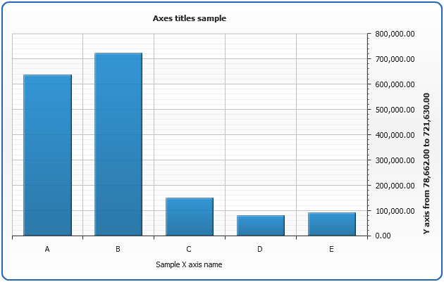
Setting axis title
You can define a title of any axis, you can control its position, font
and use keywords, when specifying text. Full reference of parameters can be found in
XML Reference: <y_axis><title> or <x_axis><title>. Here is a sample titles definition:
04 |
<text><![CDATA[Sample X axis name]]></text> |
08 |
<y_axis position="Opposite"> |
10 |
<text><![CDATA[Y axis from %DataPlotYMax to %DataPlotYMin]]></text> |
As you can see, we've set titles both to X and Y axis, made X axis title bold, aligned Y axis and used {%DataPlotYMax} and %DataPlotYMin keywords.
Full reference of available keywords is available in the end of this article: Keywords reference.
General formatting questions are answered in Text Formatting and Keywords section.
Learn how to format keywords in Number Formatting section.
Live Sample: Axes Titles Sample
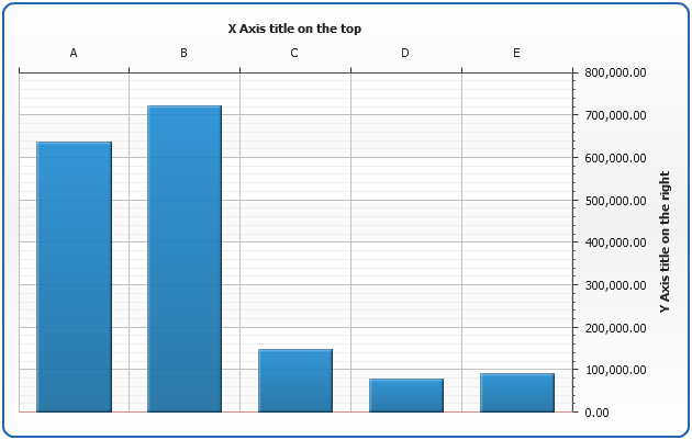
Axes position
With AnyChart you can place axes to any side if the chart, all you need to do is to adjust position attribute
of <y_axis> or <x_axis> nodes. Positioning depends on plot type and inversion of axes, you will find list of all possible positioning and inversion settings in Axes Positioning and Inverting Templates.
02 |
<y_axis position="Opposite" /> |
03 |
<x_axis position="Normal" /> |
And here is the demonstration of this feature on the Single-series column chart:
Live Sample: Axes Position Sample
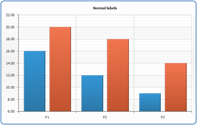
Axes labels
To enable axes labels you need to specify <labels enabled="true"/> sub-node in desired axis node. You can specify how labels should look like, padding between labels and an axis line, should labels be rotated or staggered, etc.
Learn more about axes labels formatting in Axes Labels Tutorial
Look at the demonstration of possible labels display modes: "Normal" and "Stager".
Labels normal mode
02 |
<labels display_mode="Normal" /> |
Live Sample: Axis Labels Sample - Normal mode
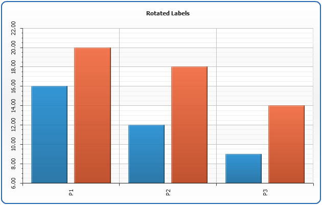
Rotated labels:
02 |
<labels display_mode="Normal" rotation="90" /> |
Live Sample: Axis Labels Sample - Normal Mode rotatated to 90
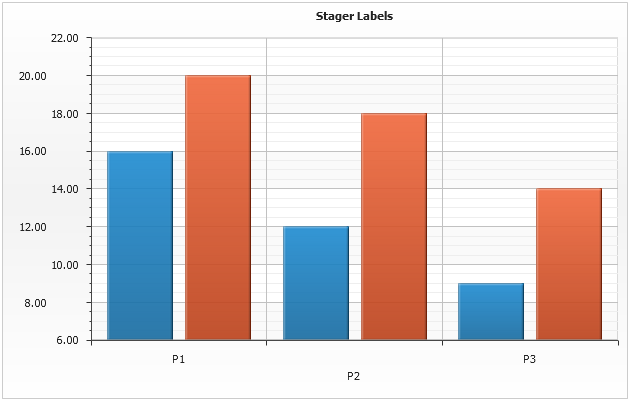
Make labels staggered:
02 |
<labels display_mode="Stager" /> |
Live Sample: Axis Labels Sample - Stager Mode
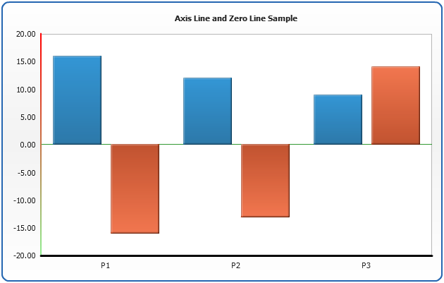
Axis lines
It is possible to tune visual appearance of axis segment line and zero line. To do this
you need to specify line settings in <line> and <zero_line> sub-nodes of axis node.
04 |
<zero_line color="Red" /> |
07 |
<line_style color="Red" /> |
08 |
<zero_line_style color="Red" /> |
As in any line, you can make them gradient, change opacity and thickness, read more about lines in Borders and Lines:
Live Sample: Axis Line and Zero Line Sample
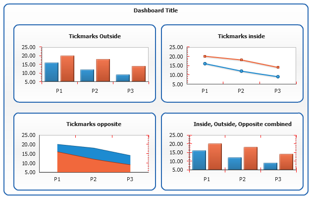
Axis tickmarks
Tickmarks are the small marks used to represent a point on an axis scale,
there are major and minor tickmarks, first used to indicate major step of an axis scale,
second - minor step. You can control their appearance and position. To enable/disable
tickmarks set enabled="True" or enabled = "false"
to <major_tickmark> or <minor_tickmark>
03 |
<major_tickmark enabled="True" /> |
04 |
<minor_tickmark enabled="False" /> |
Tickmarks can be placed "inside", "outside" and "opposite"
relatively to axis line. These features are controlled by inside, outside and
opposite attributes:
03 |
<major_tickmark enabled="True" outside="True" inside="False" opposite="False" /> |
04 |
<minor_tickmark enabled="False" outside="False" inside="True" opposite="False" /> |
The dashboard below shows how these settings work:
Live Sample: Tickmarks Position Sample
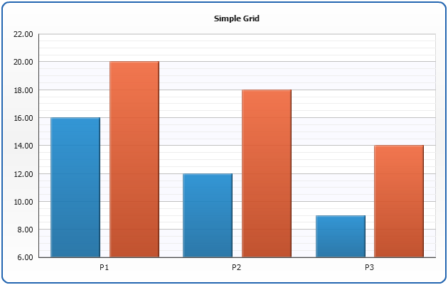
Grid configuration
Major and Minor Grids
There are two types of grids in AnyChart - major grid and minor grid, which correspond to
major and minor scale steps. To enable grid you have to specify:
02 |
<major_grid enabled="True" /> |
03 |
<minor_grid enabled="True" /> |
For each grid you can define line style:
02 |
<major_grid enabled="True"> |
03 |
<line color="Black" /> |
05 |
<minor_grid enabled="True"> |
06 |
<line color="Black" opacity="0.5" dashed="True" /> |
That's how simple grid will look like:
Live Sample: Simple Grids Sample
Dashed Grids
You can also make your grid lines dashed:
01 |
<major_grid enabled="True"> |
02 |
<line color="Black" opacity="0.2" dashed="True" dash_length="5" space_length="5" /> |
And create chart like this:
Live Sample: Simple Dashed Grids Sample
Interlaced Grids
You can make both major and minor grids interlaced. To do this you need to
set interlaced="True" attribute in corresponding grid nodes and specify
even and/or odd fills. Fill can be gradient, image and/or hatch as well as any other fill.
02 |
<major_grid enabled="True" interlaced="True"> |
05 |
<fill color="rgb(244,245,255)" opacity="0.5" /> |
That's how simple interlaced grid will look like:
Live Sample: Interlaced Grids Sample
Keywords Reference
This table list all built-in keywords that can be used in axes titles formatting.
| Keyword |
Description |
| {%DataPlotYSum} |
The sum of all the points y values. |
| {%DataPlotXSum} |
The sum of all the points x values (Scatter plot charts). |
| {%DataPlotBubbleSizeSum} |
The sum of all the points bubble sizes (Bubble chart). |
| {%DataPlotYMax} |
The maximal of all the points y values. |
| {%DataPlotYMin} |
The minimal of all the points y values. |
| {%DataPlotXMax} |
The maximal of all the points x values (Scatter plot chart). |
| {%DataPlotXMin} |
The minimal of all the points x values (Scatter plot chart). |
| {%DataPlotBubbleMaxSize} |
The maximal of all the points bubble sizes (Bubble chart). |
| {%DataPlotBubbleMinSize} |
The minimal of all the points bubble sizes (Bubble chart). |
| {%DataPlotXAverage} |
The average x value of all the points (Scatter plot charts). |
| {%DataPlotYAverage} |
The average y value of all the points. |
| {%DataPlotBubbleSizeAverage} |
The average bubble size of all the points (Scatter plot charts). |
| {%DataPlotMaxYValuePointName} |
The name of the point with a maximal of all the points y values. |
| {%DataPlotMinYValuePointName} |
The name of the point with a minimal of all the points y values. |
| {%DataPlotMaxYValuePointSeriesName} |
The name of the series with a maximal of all the points y values. |
| {%DataPlotMinYValuePointSeriesName} |
The name of the series with a minimal of all the points y values. |
| {%DataPlotMaxYSumSeriesName} |
The name of the series with a maximal sum of the points y values. |
| {%DataPlotMinYSumSeriesName} |
The name of the series with a minimal sum of the points y values. |
| {%DataPlotYRangeMax} |
The maximal of the ranges of the points within the chart. |
| {%DataPlotYRangeMin} |
The minimal of the ranges of the points within the chart. |
| {%DataPlotYRangeSum} |
The sum of the ranges of the points within the chart. |
| {%DataPlotPointCount} |
The number of the points within the chart. |
| {%DataPlotSeriesCount} |
The number of the series within the chart. |
Axis
This table list all built-in keywords that provide axis data and axis-related precalculated values.
| Keyword |
Description |
| {%AxisSum} |
The sum of all values of all points in series that are bound to this axis. |
| {%AxisBubbleSizeSum} |
The sum of all bubble sizes of all points in series that are bound to this axis. |
| {%AxisMax} |
The maximal value of all points in series that are bound to this axis. |
| {%AxisMin} |
The minimal value of all points in series that are bound to this axis. |
| {%AxisScaleMax} |
The maximal scale value. |
| {%AxisScaleMin} |
The minimal scale value. |
| {%AxisBubbleSizeMax} |
The maximal bubble size of all points in series that are bound to this axis. |
| {%AxisBubbleSizeMin} |
The minimal bubble size of all points in series that are bound to this axis. |
| {%AxisAverage} |
The average value of all points in series that are bound to this axis. |
| {%AxisMedian} |
The median value of all points in series that are bound to this axis. |
| {%AxisMode} |
The mode value of all points in series that are bound to this axis. |
| {%AxisName} |
The name of the axis. |