01 | { |
02 | enabled: true, |
03 | presets: { |
04 | enabled: false |
05 | } |
06 | } |
Presets Panel is a set of ranges, which for the user look as the buttons that change the selected dates range. AnyChart Stock supports several types of such ranges: by date time units and by the custom start and end dates.
By default Presets Panel is enabled, but you can disable it, if you want.
To disable the panel use this XML:

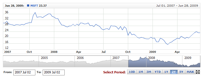
Live Sample with Presets Panel disabled:
By default there are several ranges in Presets Panel and if you need to add some or remove any - you need to rearrange it from the scratch.
The list of the ranges is set in <ranges> node, and each range in <range> node. Each <range> node is actually a button in presets panel.
Here is a sample XML with ranges defined:
01 |
<range_selector enabled="true"> |
02 |
<presets> |
03 |
<ranges> |
06 |
</range> |
09 |
</range> |
12 |
</range> |
13 |
</ranges> |
14 |
</presets> |
15 |
</range_selector> |
Table below lists attributes of <range> node:
| Attribute | Possible Values | Description |
|---|---|---|
| type | Unit YTD Max Custom |
Sets the range type of the button. |
| unit | Year Semester Quarter Month ThirdOfMonth Week Day Hour Minute Second Millisecond | Sets the date/time unit. The required attribute for the "Unit" preset type. |
| count | Any positive number greater than 0 | Sets the number of units defined by unit attribute that are represented by this range button. |
| start_date | Any date/time value | Sets the custom start date for the preset button "Custom" type. This date should follow formatting rules described in Input Date-Time Format article. |
| end_date | Any date/time value | Sets the custom end date for the preset button "Custom" type. This date should follow formatting rules described in Input Date-Time Format article. |
| anchor | FirstDate FirstVisibleDate Center LastVisibleDate LastDate |
Sets an anchor for floating date time ranges. |
Also <range> node can contain two subnodes: <format> - where you can define the text of the button, and <button_settings> - where button is configured.
Sample XML with ranges of different type:
01 |
<range_selector enabled="true"> |
02 |
<presets> |
03 |
<ranges> |
06 |
</range> |
09 |
</range> |
12 |
</range> |
13 |
<range type="Custom" start_date="2005-01-01" end_date="2007-12-31"> |
15 |
</range> |
18 |
</range> |
19 |
</ranges> |
20 |
<button_settings spacing="5" /> |
21 |
</presets> |
22 |
<range_picker enabled="false" /> |
23 |
</range_selector> |
01 | { |
02 | enabled: true, |
03 | presets: { |
04 | ranges: [ |
05 | { |
06 | type: "Unit", |
07 | unit: "Month", |
08 | count: 3, |
09 | format: "3 Months" |
10 | }, |
11 | { |
12 | type: "YTD", |
13 | format: "YTD" |
14 | }, |
15 | { |
16 | type: "Unit", |
17 | unit: "Year", |
18 | count: 1, |
19 | format: "1 Year" |
20 | }, |
21 | { |
22 | type: "Custom", |
23 | startDate: "2005-01-01", |
24 | endDate: "2007-12-31", |
25 | format: "Period: 2005-2007" |
26 | }, |
27 | { |
28 | type: "Max", |
29 | format: "MAX" |
30 | } |
31 | ], |
32 | buttonSettings: { |
33 | spacing: 5 |
34 | } |
35 | }, |
36 | rangePicker: { |
37 | enabled: false |
38 | } |
39 | } |
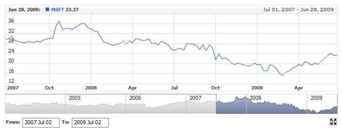
Live sample below shows different ranges and visual configuration of one of the buttons:
In Timescale and X-Axis Settings: Initial Visible Range you can find the description how to define the visible range.
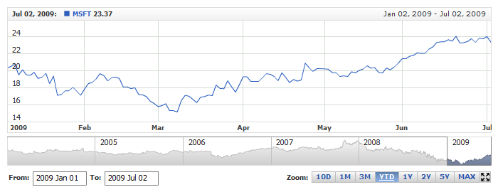
If, for example, you'd like to see the last 5 months from the end of the chart and "5M" button to be selected in presets panel, you can simply set that range as usual (all range parameters should match), the corresponding range preset button will be selected automatically.
Here is a sample XML with the fourth range defined as selected:
01 |
<?xml version="1.0" encoding="UTF-8"?> |
02 |
<stock xmlns="http://anychart.com/products/stock/schemas/1.9.0/schema.xsd"> |
03 |
<settings> |
04 |
<range_selector enabled="true"> |
05 |
<presets> |
06 |
<ranges> |
09 |
</range> |
12 |
</range> |
15 |
</range> |
18 |
</range> |
21 |
</range> |
24 |
</range> |
27 |
</range> |
30 |
</range> |
31 |
</ranges> |
32 |
</presets> |
33 |
</range_selector> |
34 |
<time_scale> |
35 |
<selected_range type="YTD" /> |
36 |
</time_scale> |
37 |
</settings> |
38 |
</stock> |
01 | { |
02 | settings: { |
03 | rangeSelector: { |
04 | enabled: true, |
05 | presets: { |
06 | ranges: [ |
07 | { |
08 | type: "Unit", |
09 | unit: "Day", |
10 | count: 10, |
11 | format: "10D" |
12 | }, |
13 | { |
14 | type: "Unit", |
15 | unit: "Month", |
16 | count: 1, |
17 | format: "1M" |
18 | }, |
19 | { |
20 | type: "Unit", |
21 | unit: "Month", |
22 | count: 3, |
23 | format: "3M" |
24 | }, |
25 | { |
26 | type: "YTD", |
27 | format: "YTD" |
28 | }, |
29 | { |
30 | type: "Unit", |
31 | unit: "Year", |
32 | count: 1, |
33 | format: "1Y" |
34 | }, |
35 | { |
36 | type: "Unit", |
37 | unit: "Year", |
38 | count: 2, |
39 | format: "2Y" |
40 | }, |
41 | { |
42 | type: "Unit", |
43 | unit: "Year", |
44 | count: 5, |
45 | format: "5Y" |
46 | }, |
47 | { |
48 | type: "Max", |
49 | format: "MAX" |
50 | } |
51 | ] |
52 | } |
53 | }, |
54 | timeScale: { |
55 | selectedRange: { |
56 | type: "YTD" |
57 | } |
58 | } |
59 | } |
60 | } |
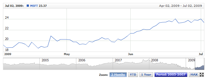
Live sample below shows this. In presets year-to-day (YTD) button is selected. Note that all attributes, responsible for the range selection (for current range type) such as type, unit and count and anchor are equal for the range preset and the selected range:
You can configure how buttons look like - altogether or any button of your choice.
Each button has three states: normal, hover and selected. For each button you can define fill, border, corners shape, font and so on.
Sample XML of button visualization settings:
01 |
<range_selector enabled="true"> |
02 |
<presets> |
03 |
<button_settings spacing="3"> |
05 |
<states> |
06 |
<normal> |
09 |
</normal> |
10 |
<hover> |
12 |
</hover> |
13 |
<selected> |
15 |
</selected> |
16 |
</states> |
17 |
</button_settings> |
18 |
</presets> |
19 |
</range_selector> |
01 | { |
02 | enabled: true, |
03 | presets: { |
04 | buttonSettings: { |
05 | spacing: 3, |
06 | font: { |
07 | size: 10 |
08 | }, |
09 | states: { |
10 | normal: { |
11 | font: { |
12 | color: "#000000", |
13 | bold: false |
14 | }, |
15 | fill: { |
16 | type: "Solid", |
17 | color: "White" |
18 | } |
19 | }, |
20 | hover: { |
21 | fill: { |
22 | type: "Solid", |
23 | color: "Red" |
24 | } |
25 | }, |
26 | selected: { |
27 | fill: { |
28 | type: "Solid", |
29 | color: "DarkRed" |
30 | } |
31 | } |
32 | } |
33 | } |
34 | } |
35 | } |
As you can see different fill is defined for different stats. Also, the spacing attribute of <button_settings> node defines spacing between the buttons.
In the same way you can modify one button:
01 |
<range_selector enabled="true"> |
02 |
<presets> |
03 |
<button_settings spacing="3" /> |
04 |
<ranges> |
07 |
<button_settings> |
09 |
<states> |
10 |
<normal> |
13 |
</normal> |
14 |
<hover> |
16 |
</hover> |
17 |
<selected> |
19 |
</selected> |
20 |
</states> |
21 |
</button_settings> |
22 |
</range> |
25 |
</range> |
28 |
</range> |
29 |
</ranges> |
30 |
</presets> |
31 |
</range_selector> |
01 | { |
02 | enabled: true, |
03 | presets: { |
04 | buttonSettings: { |
05 | spacing: 3 |
06 | }, |
07 | ranges: [ |
08 | { |
09 | type: "Unit", |
10 | unit: "Year", |
11 | count: 1, |
12 | format: "1Y", |
13 | buttonSettings: { |
14 | font: { |
15 | size: 10 |
16 | }, |
17 | states: { |
18 | normal: { |
19 | font: { |
20 | color: "#000000", |
21 | bold: false |
22 | }, |
23 | fill: { |
24 | type: "Solid", |
25 | color: "White" |
26 | } |
27 | }, |
28 | hover: { |
29 | fill: { |
30 | type: "Solid", |
31 | color: "Red" |
32 | } |
33 | }, |
34 | selected: { |
35 | fill: { |
36 | type: "Solid", |
37 | color: "DarkRed" |
38 | } |
39 | } |
40 | } |
41 | } |
42 | }, |
43 | { |
44 | type: "Unit", |
45 | unit: "Year", |
46 | count: 5, |
47 | format: "5Y" |
48 | }, |
49 | { |
50 | type: "Max", |
51 | format: "MAX" |
52 | } |
53 | ] |
54 | } |
55 | } |
Sample below shows modification of all buttons:

By default title of Presets Panel shows text: "Zoom:". You can disable this text or change it and its settings.
Sample XML for title configuration:
Live sample shows this setting at work: