01 | { |
02 | enabled: true, |
03 | thickness: 1, |
04 | color: "Black", |
05 | opacity: 0.5 |
06 | } |
A lot of chart element in AnyChart Stock Component has background, which consists of fill, border, corner shape settings and inside margins settings. Some elements has only fill and border, but the configuration is similar.
This document describes all available background configuration options.
Border is configured using <border> node. Table below lists available attributes:
| Attribute | Type | Description |
|---|---|---|
| enabled | Boolean | Sets whether the border is drawn or not. |
| color | Color | Sets border color. |
| opacity | Number (0 to 1) | Sets color opacity. |
| thickness | Number | Sets border thickness. |
Typical solid border settings look like:
With AnyChart you it is possible to color background with a solid color, or with a gradient transition. Fill is configured in the <fill> node and depending on the type it has different settings.
Table below lists and describes attributes of <fill> node:
| Attribute | Type | Description |
|---|---|---|
| enabled | Boolean | Sets whether the file is drawn or not. |
| type | Enum: Solid Gradient |
Sets fill type. |
| color | Color | Sets fill color (in Solid mode). |
| opacity | Number (0 to 1) | Sets fill opacity. |
When fill type is set to "Solid", background is filled with one color and you can control this color opacity. Colors can be defined with any of the methods described in Color tutorial. Typical solid fill settings are:
AnyChart allows to create Gradient fills for any background. To create gradient fill you need to set type="Gradient" and configure gradient settings in <gradient> sub-node.
There are two types of gradient fills - "Linear" and "Radial"
Typical gradient border settings look like:

Sample below shows how different background settings look like using custom labels:

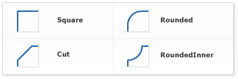
You can adjust the shape of borders corners, there are 4 types for corners: "Square", "Rounded", "Cut" and "RoundedInner". Appearance of these types is shown on the image below:
For "Rounded", "Cut" and "RoundedInner" types you can control not only a shape, but also a radius of "rounding" or "cutting" for all corners, or given corners.
Typical settings for "rounding" all corners are:
To set only left top corner shape to "Cut" type settings like this should be used:
If you want to increase or decrease the spaces between border and background content (texts, chart, etc.) you can do that setting inside margins. Margins are measured in pixels. Every side margin can be set individually, "all" attribute is used to set them all together. Note that every individual settings override "all" value.
Typical settings for inside margins are:
Live Sample Below shows two axis markers with different margins and corner shapes: