Open High Low Close (OHLC) Chart
Overview
An open-high-low-close chart (also known as OHLC, HLOC chart) is a type of chart typically used
to illustrate movements in the price of a financial instrument over time. Each vertical line on the
chart shows the price range (the highest and lowest prices) over one unit of time, e.g. one day or
one hour. Tick marks project from each side of the line indicating the opening price (e.g. for a
daily bar chart this would be the starting price for that day) on the left, and the closing price
for that time period on the right. The bars may be shown in different hues depending on whether
prices rose or fell in that period.
The Japanese candlestick chart
is another way of displaying market price data, with the opening and closing prices defining a rectangle
within the range for each time unit. Both charts show the exact same data, i.e. the opening, high,
low, and closing prices during a particular time frame. Some traders find the candlestick chart easier
to read.
Chart building
OHLC chart uses four values, so we need to pass opening, high, low and closing price
values to chart, this should be done using open, high, low, close attributes of <point> node:
01 |
<point name="28-Aug-07" open="511.53" high="514.98" low="505.79" close="506.40" /> |
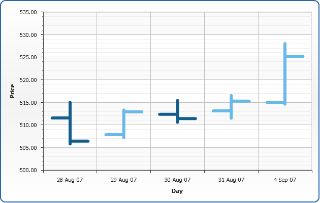
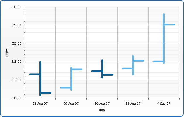
Single-Series OHLC Chart
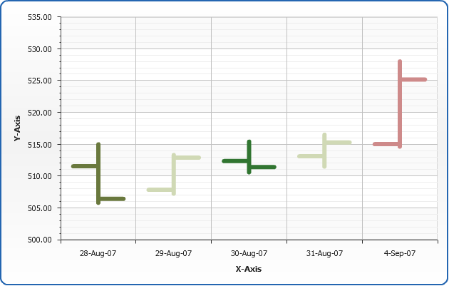
Let's see single-series OHLC chart created using the following data - ACME Corp. stock price changes through one week:
| Day |
Open |
High |
Low |
Close |
| 28-Aug-07 |
511.53 |
514.98 |
505.79 |
506.40 |
| 29-Aug-07 |
507.84 |
513.30 |
507.23 |
512.88 |
| 30-Aug-07 |
512.36 |
515.40 |
510.58 |
511.40 |
| 31-Aug-07 |
513.10 |
516.50 |
511.47 |
515.25 |
| 4-Sep-07 |
515.02 |
528.00 |
514.62 |
525.15 |
Now we need to convert this data table into XML, this format will be accepted by AnyChart. In terms of AnyChart data model we have one series of data with categories that hold days names. Each point in series represents one day and open, high, low, close prices. Converted XML Data looks like:
02 |
<series name="ACME" type="OHLC"> |
03 |
<point name="28-Aug-07" open="511.53" high="514.98" low="505.79" close="506.40" /> |
04 |
<point name="29-Aug-07" open="507.84" high="513.30" low="507.23" close="512.88" /> |
05 |
<point name="30-Aug-07" open="512.36" high="515.40" low="510.58" close="511.40" /> |
06 |
<point name="31-Aug-07" open="513.10" high="516.50" low="511.47" close="515.25" /> |
07 |
<point name="4-Sep-07" open="515.02" high="528.00" low="514.62" close="525.15" /> |
As you can see, we've created one <series> node, specified its type="OHLC", added several <point> nodes and set name attribute that defines category and open, high, low, close attributes that define values.
Here it is - AnyChart can now visualize your data. Look at the chart sample below and click on on it to see Live Flash Chart preview and full configured XML.
Live Sample: Sample Single-Series OHLC Chart

Multi-Series OHLC chart
To compare two or more data rows you have to use multi-series OHLC charts as it shown in the sample below.
Let's compare ACME Corp. and Duff Brewing Corp. stock prices sales:
| Company |
ACME Corp. |
Duff Brewery Corp. |
| Day |
Open |
High |
Low |
Close |
Open |
High |
Low |
Close |
| 28-Aug-07 |
511.53 |
514.98 |
505.79 |
506.40 |
522.95 |
523.10 |
522.50 |
522.52 |
| 29-Aug-07 |
507.84 |
513.30 |
507.23 |
512.88 |
522.60 |
522.69 |
522.27 |
522.55 |
| 30-Aug-07 |
512.36 |
515.40 |
510.58 |
511.40 |
522.49 |
522.91 |
522.38 |
522.61 |
| 31-Aug-07 |
513.10 |
516.50 |
511.47 |
515.25 |
522.81 |
522.83 |
522.51 |
522.73 |
| 4-Sep-07 |
515.02 |
528.00 |
514.62 |
525.15 |
523.30 |
524.50 |
523.20 |
523.97 |
As we do in single series sample above we need to convert this table into XML, the only difference between these two samples is the fact that now we have two series of data - one series for each year, and we give proper names to each series:
03 |
<point name="28-Aug-07" open="511.53" high="514.98" low="505.79" close="506.40" /> |
04 |
<point name="29-Aug-07" open="507.84" high="513.30" low="507.23" close="512.88" /> |
05 |
<point name="30-Aug-07" open="512.36" high="515.40" low="510.58" close="511.40" /> |
06 |
<point name="31-Aug-07" open="513.10" high="516.50" low="511.47" close="515.25" /> |
07 |
<point name="4-Sep-07" open="515.02" high="528.00" low="514.62" close="525.15" /> |
10 |
<point name="28-Aug-07" open="522.95" high="523.10" low="522.50" close="522.52" /> |
11 |
<point name="29-Aug-07" open="522.60" high="522.69" low="522.27" close="522.55" /> |
12 |
<point name="30-Aug-07" open="522.49" high="522.91" low="522.38" close="522.61" /> |
13 |
<point name="31-Aug-07" open="522.81" high="522.83" low="522.51" close="522.73" /> |
14 |
<point name="4-Sep-07" open="523.30" high="524.50" low="523.20" close="523.97" /> |
As we now have multi-series chart we don't want to set type for each series individually (there can be much more than two series in multi-series chart), so we add <data_plot_settings default_series_type="OHLC"/> node to <chart>. Now all series in chart will be of OHLC type by default.
Live Sample: Sample Multi-Series Open High Low Close Chart
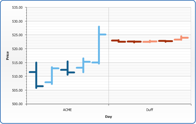
Multi-Series OHLC Chart grouped by series
Sometimes it is useful to visualize comparison in a different way - group values be series. You don't have to reformat your data to do this - all you need to do is to switch plot_type attribute to "CategorizedBySeriesVertical". Look at the resulting chart below:
Live Sample: Sample Multi-Series gruoped by Series Open High Low Close Chart
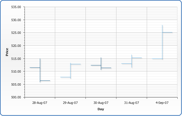
Axes management
In AnyChart axis is an object that allows you to configure chart grid, axis line along with tick marks and labels, axis scale and settings and many more. All axis features are described in
Working with Axes tutorial, in this section we will quickly demonstrate how axis position can be adjusted, how axis scale can be inverted and how minimum and maximum values can be controlled.
Positioning
With AnyChart you can place axes to any side if the chart, all you need to do is to adjust position attribute of <y_axis> or <x_axis> nodes.
Positioning depends on plot type and inversion of axes, you will find list of all possible positining and inversion settings in Axes Positioning and Inverting Templates.
02 |
<y_axis position="Opposite" /> |
03 |
<x_axis position="Opposite" /> |
And here is the demonstration of this feature on the Single-series sample:
Live Sample: Axes Position Sample Single-Series OHLC Chart
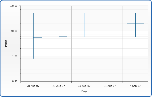
Logarithmic
AnyChart allows to make Y, X or any extra axis Logarithmic. This is controlled by axis <scale>:
02 |
<scale type="Logarithmic" /> |
And here is the demonstration of Logarithmic Y Axis on slightly modified the Single-series sample:
Live Sample: Axis Logarithmic Sample Single-Series HLOC Chart
Minimum and Maximum values control
By default AnyChart calculates axis minimum and maximum automatically, you can see this on the scale
positioning chart sample above: minimal value on the Y Axis is 500, and maximum is 535. You can control these
values by setting maximum and minimum attributes of <scale> node:
02 |
<scale minimum="505" maximum="530" /> |
And here is the demonstration of maximum and minimum values on the Single-series sample:
Live Sample: Scale Maximum and Minimum Values Sample Single-Series OHLC Chart
Using styles
In this section we will describe main parts of OHLC chart style and demonstrate how style can be created and applied. Also you will see list of predefined styles.
The main idea of styles is to segregate visualization and data definition. Visual appearance of lines is defined using certain styles and then you just apply the style to the certain data elements. Style can be applied to data series, data category or single data point.
OHLC chart style can be configured in <ohlc_style> and <ohlc_series> nodes.
Also, styles are used to make charts interactive, you can define how elements will be displayed by default, when selected, when user moves cursor over an element, etc. More information about these features can be found in Interactivity tutorial.
Simple style
Now, let's look how to create a simple style and apply it to the chart. As we've already said style consists of several elements, here is an XML structure:
01 |
<ohlc_style name="style1"> |
02 |
<line enabled="true" thickness="1" /> |
03 |
<open_line enabled="true" thickness="1" /> |
04 |
<close_line enabled="true" thickness="1" /> |
06 |
<bevel enabled="true" highlight_opacity="0.4" shadow_opacity="0.4" distance="2" /> |
07 |
<drop_shadow enabled="true" opacity="0.3" /> |
11 |
<line enabled="true" thickness="3" color="Red" /> |
12 |
<open_line enabled="true" thickness="3" color="Red" /> |
13 |
<close_line enabled="true" thickness="3" color="Red" /> |
Using such settings we've created a style that defines that all OHLC chart line will be thin,
and a couple of effects applied. Also, we've defined that when user will move cursor over an element
lines will become rather thick and their color will turn to Red.
Now we will take a sample single series chart described above, define style in XML and apply it to all chart elements, using <ohlc_series style="style1"/>
Live Sample: Sample Simple Style for OHLC chart
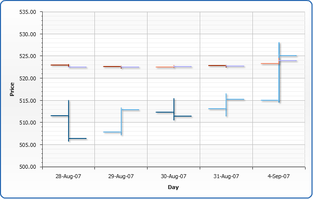
Application of different styles to chart elements
Now we will demonstrate how to apply different styles to different series and data elements. To do it we will use multi-series sample that was demonstrated above and create two more styles: "style2" and "style3", both inherited from the "style1".
"style1" will be applied to "ACME " series, "style2" will be applied to "Duff brewery " series and "style3" will be applied to the data element with a highest high price (Note - we will find highest value and set its style manually in this sample. But with AnyChart it is possible to do that automatically using Thresholds, read more about it in Thresholds tutorial).
So - the definitions of the styles are:
Style 1:
01 |
<ohlc_style name="style1"> |
02 |
<line enabled="true" thickness="1" /> |
03 |
<open_line enabled="true" thickness="1" /> |
04 |
<close_line enabled="true" thickness="1" /> |
06 |
<bevel enabled="true" highlight_opacity="0.4" shadow_opacity="0.4" distance="2" /> |
07 |
<drop_shadow enabled="true" opacity="0.3" /> |
11 |
<line enabled="true" thickness="3" color="Red" /> |
12 |
<open_line enabled="true" thickness="3" color="Red" /> |
13 |
<close_line enabled="true" thickness="3" color="Red" /> |
Style 2:
This style is inherited from "style1" and the only thing changed is a color of the line: from "Gold" to "Rgb(180,180,255)". We've used styles inheritance to avoid duplication of the common settings.
01 |
<ohlc_style name="style2" parent="style1"> |
02 |
<close_line color="Rgb(180,180,255)" /> |
Style 3:
This style is also inherited from "style1" and the new color of the line is "Rgb(255,170,170)". And again we've used styles inheritance.
And, as a result here is an example of these styles usage:
Live Sample: Sample OHLC chart - Application of different styles to chart elements
Working with data labels and tooltips
In this section we will explain how to add and configure data labels and tooltips. Full explanation of formatting and tuning visual appearance for them can be found in Labels and tooltips.
If you want to configure data labels and tooltips for all series - you should do that in
<label> and <tooltip> sub-nodes of <ohlc_series> node. You can tune their visual appearance, positioning and format. Let's do that in the following example: we will make data labels appear to the top of the data points, also, we will format labels so they show only the value corresponding to the point and tooltip will show detailed description.
When formatting data labels text and tooltip we will use formatting keywords:
{%Open} - to show opening price,
{%High} - to show highest price,
{%Low} - to show lowest price,
{%Close} - to show closing price.
Live Sample: Sample Open Hi Lo Close chart - Working with data labels and tooltips
Related Help Topics:
Working with colors and color palettes
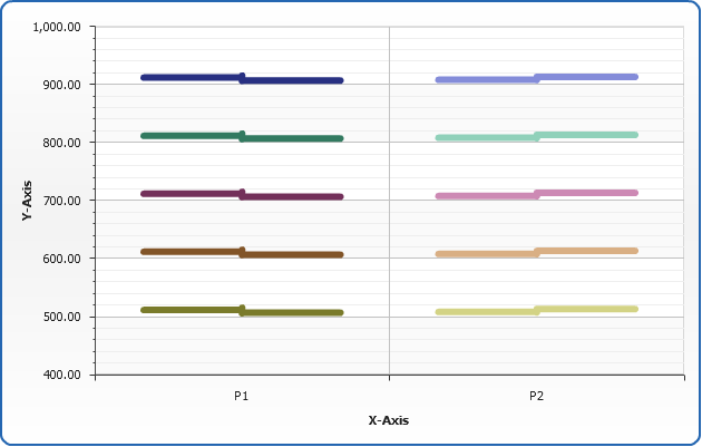
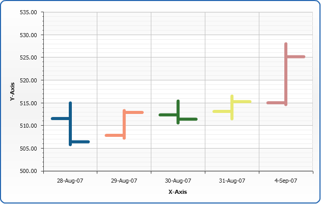
AnyChart uses default color palette to colorize data elements of chart automatically even if you have not define special colors. But you can use your own palettes or palettes shipped with AnyChart. Also you can set and apply the color to exact data series or data point.
Setting colors to the elements
Let's demonstrate how to apply different colors to different data series. To apply the color to the exact series we need to set "color" attribute in the <series> node. In the sample below we have 5 series with sample data and we'll color each series to different color. Here is the sample:
Live Sample: Sample Open-High-Low-Close chart - Setting colors to the elements
In the sample below we will see how we can colorize individual points. We have chart with one series and predefined color for all elements. We will set "Rgb(180,77,77)" color for minimum point and "Rgb(77,180,77)" for the maximal one. As you see it is very easy to do by setting "color" attribute for <point> node.
Live Sample: Sample OHLC chart - Setting colors to the series
Important Note:
AnyChart takes care of visualization and users convenience seriously - that is why we have a number of ways to set colors, for example, instead of "Rgb(180,77,77)" you can set "HSV(?,?,?)" or "HTMLConstant" or "#HEXCode"- and the color will be the same. Depending on your system/site/application design you may need - and use - any of this color setting methods. But even this is not everything about colors in AnyChart: read more about setting colors below and in the following Help Sections:
Color palettes
AnyChart allows to apply color palettes to all series or to the exact series. In the first case each next series will take each next color from palette. If the number of the colors in palette is less than the number of series - palette will be looped. If you have only one series it will be colored by the first color in the palette. To apply palette to all series we have to set "palette" attribute in <data> node. Here it is:
Live Sample: Sample High Low Open Close chart - Setting Palette to all series
When you have one series only, sometimes it is useful to color each point in series. You can do it by setting color of each point individually or you can apply a palette. For sure the second method is easier and more useful. To apply palette to the exact series you should set "palette" attribute for exact <series> node.
Live Sample: Sample OHLC chart - Working with palettes - Setting Palettes to the certain series
In the samples above we have shown usage of predefined palettes only, but AnyChart allows to create your own custom palettes. To learn more about it read Palettes tutorial.
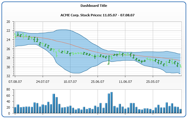
Advanced OHLC Chart sample - OHLC, Line and Range Area Combination
In the real world application Open-High-Low-Close rarely used alone,
in technical analysis they are often combined with other chart types, such as Lines
(to show moving average), Range Areas (to show "Bollinger bands"),
and column charts (to show trading volume).
AnyChart provides most of features that developer needs to create a complex
financial chart, this includes Combination charts, Dashboards and Interactivity features.
The sample below shows a typical stock trading report and it can be used as
a starting point in your integration of AnyChart into Financial/Trading/Reporting application.
Live Sample: Sample OHLC chart - Advanced usage - Area Line Combination Report Dashboard