Extra Axes
Overview
In AnyChart axes are used to control values or arguments scales, grids, axes labels, lines and tickmarks. You can add multiple X and Y axes ot your charts with AnyChart.
This note will describe how to use the multi axis feature of AnyChart. With this feature an arbitrary number of axes can be added to the chart. AnyChart itself doesn't impose any restrictions on the number of extra axes but from a practical concern it is most likely very difficult to interpret a chart with more than 2-3 extra axes.
Consider using multiple axes when you need:
- Compare data point values in different units, for example: Celsius against Fahrenheit degrees,
kilopascal (KPa) or hectopascal (HPa) against millimeters or inches of mercury (mmHg or inHg), different
currencies (USD against EUR), etc.
- Show data from the different ranges on the same plot, for example: absolute stock price changes
and sales volume (price will be in dollars and volume in millions of dollars)
- Show data measured in different units on the same plot, for example:
gross domestic product (GDP) volume and GDP growth rate (GDP will be in billions and rate in percents)

Define an extra axis
If you want to define an extra axis all you need to do
is to add <extra> node to <axes> node, and place as many <y_axis> or <x_axis> nodes into it, each additional axis should have a unique name:
06 |
<y_axis name="y2" enabled="true" /> |
07 |
<y_axis name="y3" enabled="true" /> |
08 |
<y_axis name="y4" enabled="true" /> |
Note: this axes definition format is introduced in 4.2 version. Old extra axes format is supported,
but we recommend to switch to new one.
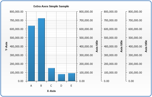
Here is the sample of the chart that will be show when three extra y axes are
added and almost no configuration is done, as you can see three extra axes are drawn on
the right side of data plot and their maximum and minimum values are calculated
automatically (and they are the same as main Y axis have):
Live Sample: Extra Y Axes Simple Sample
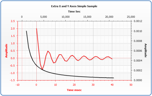
Another example of multiple axes use is multiple Y Axes along with multiple X Axes, which may be very useful in certain areas:
Live Sample: Extra X Axes Simple Sample
Tuning extra axes
If you want to change any settings of extra axes you can that just the same way as
basic X and Y axes are configured, see Axes basics and Axes Scale
for the details:
06 |
<text><![CDATA[Basic Y Axis]]></text> |
08 |
<scale minimum="0" maximum="800000" /> |
11 |
<y_axis name="y2" enabled="true"> |
13 |
<text><![CDATA[Extra Y Axis]]></text> |
15 |
<scale minimum="800000" maximum="1600000" /> |
17 |
<x_axis name="x2" enabled="true"> |
19 |
<text><![CDATA[Extra X Axis]]></text> |
21 |
<scale minimum="800" maximum="1600" /> |
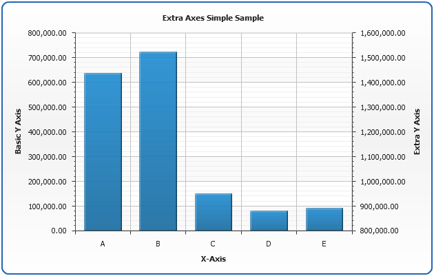
In the a sample below we will add one extra axis and set
value ranges and titles for both basic Y axis and extra Y axis:
Live Sample: Extra Axes Tuning Sample
Binding data series to extra axis
To bind data series to the certain axis you should specify it in y_axis or x_axis attribute of <series> node,
by default all series work with basic <y_axis> or <x_axis>:
03 |
<point name="A" y="1" /> |
04 |
<point name="B" y="2" /> |
05 |
<point name="C" y="3" /> |
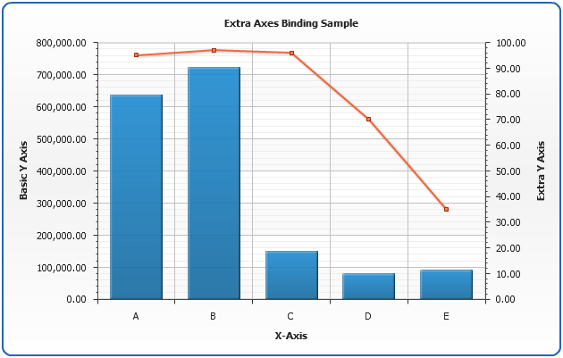
In the a sample below we will add one extra axis with a range from 0 to 100 and and bind series of "Line" type to it:
Live Sample: Extra Axes Binding Sample
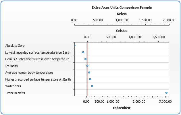
Multi axes sample for comparing units
Lets see how extra axes can be used to compare data in different units, for example
we measure temperature an want to show Celsius, Fahrenheit and Kelvin scales. To do that we have to create
three Y Axes - the basic one will be Celsius degrees, first extra axis - Fahrenheit and second
extra axis - Kelvin:
04 |
<text><![CDATA[Celsius]]></text> |
06 |
<scale minimum="273.15" maximum="1668" /> |
09 |
<y_axis name="Fahrenheit" enabled="true"> |
11 |
<text><![CDATA[Fahrenheit]]></text> |
13 |
<scale minimum="459.67" maximum="3034" /> |
15 |
<y_axis name="Kelvin" enabled="true"> |
17 |
<text><![CDATA[Kelvin]]></text> |
19 |
<scale minimum="0" maximum="1941" /> |
We defined three axes and set absolute zero as a minimum value, and
Titanium melting temperature as a maximum value. We will create one series of
a "Marker" type and bind it to Kelvin scale:
02 |
<series type="Marker" y_axis="Kelvin"> |
03 |
<point name="Absolute Zero" y="0" /> |
04 |
<point name="Lowest recorded surface temperature on Earth" y="184" /> |
05 |
<point name="Celsius / Fahrenheit's 'cross-over' temperature" y="233.15" /> |
06 |
<point name="Ice melts" y="273.15" /> |
07 |
<point name="Average human body temperature" y="309.95" /> |
08 |
<point name="Highest recorded surface temperature on Earth" y="331" /> |
09 |
<point name="Water boils" y="373.1339" /> |
10 |
<point name="Titanium melts" y="1941" /> |
Here it is - a sample that shows different important temperatures:
Live Sample: Extra Axes Units Comparison Sample
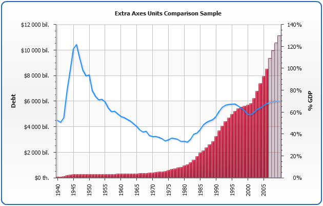
Multi axes sample for showing different data on the same plot
Lets see how extra axes can be used to show different data on the same plot: we will
plot a US Debt amount in dollars and in percents of GDP. We need to create to axes:
04 |
<text><![CDATA[Debt]]></text> |
06 |
<scale minimum="0" maximum="12000000000000" /> |
11 |
<text><![CDATA[% GDP]]></text> |
13 |
<scale minimum="0" maximum="140" /> |
We defined two axes and will create one series of
a "Bar" type to show debt and bind it to <y_axis>,
one series of a "Line" type to show percentage changes.
Here it is - a sample chart comparing the US debt, in red, to the debts percent of GDP, in blue.
Live Sample: Extra Axes Different Data Comparison Sample