Date/Time Axes
Overview
You can use Date/Time values as input data for chart, moreover - you can localize input data formatso you don't have to reformat it before setting data to XML. Read more about it in Date Time Input Tutorial.
To utilize these input features you should use Date Time Axes. In this tutorial we will show how to do this.
Creating DateTime Axes
You can make both X and/or Y axis a DateTime axis, to do that, set scale type to DateTime:
03 |
<scale type="DateTime" /> |
Before starting to create chart based on datetime values, you should study DateTime Input Tutorial, in which
this input data formatting is explained.
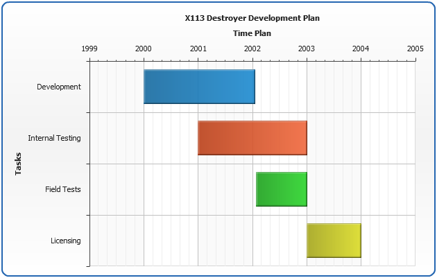
Sample Range Bar With Y DateTime Axis
Lets create a simple Range Bar chart with DateTime Y Axis. For the first we have to choose data to be shown:
| Task Name |
Task Start |
Task End |
| Development |
01/01/2000 |
02/15/2002 |
| Internal Testing |
06/01/2001 |
07/01/2003 |
| Field Test |
02/25/2002 |
07/01/2003 |
| Licensing |
07/01/2003 |
07/01/2004 |
Date is collected, and now we know what datetime input format should be used: %mm/%dd/%yyyy (we've done that according too
DateTime Input and DateTime Formatting), so let's set it:
01 |
<?xml version="1.0" encoding="UTF-8"?> |
06 |
<format><![CDATA[%mm/%dd/%yyyy]]></format> |
Now we need to create data XML for range bars, here it is:
03 |
<point start="01/01/2000" end="02/15/2002" name="Development" /> |
04 |
<point start="06/01/2001" end="07/01/2003" name="Internal Testing" /> |
05 |
<point start="02/25/2002" end="07/01/2003" name="Field Tests" /> |
06 |
<point start="07/01/2003" end="07/01/2004" name="Licensing" /> |
Now we will create DateTime Y Axis and set it to show process in years (explained later):
03 |
<scale type="DateTime" major_interval_units="Year" minimum="01/01/1999" maximum="01/01/2005" /> |
05 |
<format><![CDATA[{%Value}{dateTimeFormat:%yyyy}]]></format> |
Thats it - all we have to add are axes and chart titles and put all we've done together:
01 |
<?xml version="1.0" encoding="UTF-8"?> |
06 |
<format><![CDATA[%mm/%dd/%yyyy]]></format> |
11 |
<chart plot_type="CategorizedHorizontal"> |
14 |
<point start="01/01/2000" end="02/15/2002" name="Development" /> |
15 |
<point start="06/01/2001" end="07/01/2003" name="Internal Testing" /> |
16 |
<point start="02/25/2002" end="07/01/2003" name="Field Tests" /> |
17 |
<point start="07/01/2003" end="07/01/2004" name="Licensing" /> |
22 |
<text><![CDATA[X113 Destroyer Development Plan]]></text> |
27 |
<text><![CDATA[Tasks]]></text> |
32 |
<text><![CDATA[Time Plan]]></text> |
34 |
<scale type="DateTime" major_interval_unit="Year" minimum="01/01/1999" maximum="01/01/2005" /> |
36 |
<format><![CDATA[{%Value}{dateTimeFormat:%yyyy}]]></format> |
That's it - chart with DateTime Y Axis is ready:
Live Sample: Sample Range Bar chart - Y DateTime Axis

Major and Minor Interval Units
For datetime axes you can set Major and Minor Interval Units using major_interval_unit and minor_interval_unit attributes of <scale> node:
01 |
<scale major_interval_unit="Year" minor_interval_unit="Month" type="DateTime" /> |
This units define what inits should be used for minor and major steps, when you use
minor_interval and major_interval attrubutes together with units attributes - interval are used as
multipliers, for example these settings mean that Major Step is two years and Minor Step is a quarter:
01 |
<scale type="DateTime" major_interval="2" minor_interval="3" major_interval_unit="Year" minor_interval_unit="Month" /> |
This feature will be demonstrated in the next sample.
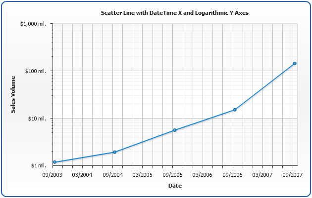
Sample Scatter Line Chart with Y DateTime Axis
In this sample we will create a Scatter Line Chart with DateTime X Axis and set major and minor interval units
and intervals. Y Axis will be Logarithmic - to show small values in the first years and big values in last year.
The chart gets data input as unix time and shows ACME Corp. sales data for 5 years:
Live Sample: Date Time Axes Scatter Line