Axes Labels Formatting
Overview
With AnyChart you have a full control over the axes labels, you can format them, tune visual appearance and position.
In this tutorial all major settings and features of axes labels are described.
Enabling/Disabling Axes Labels
Each axis in AnyChart has its own labels settings, these settings can be configured
in labels sub node of a give axis:
By default labels for all axes are enabled. You can enable/disable labels for the given axis using enabled attribute of <labels> node:
03 |
<labels enabled="False" /> |
06 |
<labels enabled="True" /> |
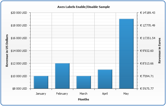
In the sample below a line chart with Y-Axis, X-Axis and Secondary Y-Axis is shown,
with labels enabled for both Y Axes and disabled for X-Axis:
Live Sample: Sample Axes Labels Enable Disable

Formatting labels
In order to make chart readable and understandable it is very important to format
axes labels in a proper way, for example: add "$" prefix if values are given in dollars or
add "°F" postfix if values are given in Fahrenheit degrees.
You have a full control over the axis labels in <format> subnode of <labels> node.
To make text formatting easier AnyChart has a special mechanism called Keywords. Every keyword is a unique token that can be specified in <format> node in a following way: {%KeywordName}, for example {%Value} or {%AxisName}. Before displaying text every keyword is replaced by a corresponding value. Full reference of available keywords can be found in the end of this tutorial:Keywords reference.
The main keyword you should know to format labels is {%Value} - it stands for the axis value that corresponds to the label (labels are drawn near the major tickmark that correspond to major interval - see Axes Scales and Axes Basics for more).
03 |
<format><![CDATA[{%Value}]]></format> |
Prefixes and Postfixes
To add prefix or postfix to the label you just need to specify required string before or after the {%Value} keyword:
03 |
<format><![CDATA[${%Value} USD]]></format> |
Number Formatting
You may need to format the value that corresponds to the label, to do this you should use so-called formatting parameters, read more about them in Number formatting section.
The general idea is adding formatting directives, that will change the format of the number in a desired way, for example you may want to change the number of decimal digits, change the decimal or thousands separator, to do that you should specify {%Value}{numDecimals:2,decimalSeparator:.,thousandsSeparator: }, instead of simply {%Value}:
03 |
<format><![CDATA[${%Value}{numDecimals:2,decimalSeparator:.,thousandsSeparator: } USD]]></format> |
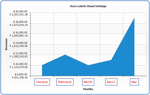
In the sample chart below we will create a column chart with dual Y-Axis,
the main axis will be formatted to show values in "$1 000 USD" format,
the secondary Y-Axis - in " € 1'000.00" format:
Live Sample: Sample Axes Postfix Prefix and Number Formatting Sample
Note: "Euro" Y-Axis is recalculated according to "imaginable" exchange
rate - USD/EUR : 1.4095/1 using scaling feature of AnyChart number formatting, read more
about it in Number Formatting - Values Scaling Section
Setting maximum of visible characters
If the value (a number or a text) is to large, you may want to limit the number of characters using maxChar keyword. This parameters sets the maximal number of symbols, that are displayed.
For example if the length of the string in {%Token} is greater than maxChar, then it will be trimmed and symbols set in maxCharFinalChars (by default "...") are shown at the end (this is done to show explicitly, that string is trimmed).
If the number of characters in {%Token} is less than or equal to maxChar, then {%Token}
is displayed as is.
If you don't want to show anything when value is trimmed - just set maxCharFinalChars to nothing.
Sample setting maximum of visible characters to 5 and no final characters:
01 |
<text><![CDATA[{%Value}{maxChar:5,maxCharFinalChars:}]]></text> |
Here is a previous sample where we set maxChar to 3 in X-Axis.
Live Sample: Sample setting maximum of visible characters
Visual Appearance
You can tune visual appearance of axes labels according to your chart design. Label visual settings consist of background settings (which include margins and border), font settings and effects.
In general you can learn more about these settings in: Background tutorial, Fonts tutorial and Effects tutorial, in this section we will cover the basics that allow to tune labels appearance and some special features (Multi-line labels).
Font
Font settings of labels are configured using <font> subnode of <labels> node, you can specify size, face and color or set the text to HTML mode, also, you can add effects to be applied to the text:
02 |
<font family="Courier" size="12" color="Red" bold="True" italic="False" underline="False" render_as_html="False"> |
03 |
<effects enabled="true"> |
04 |
<drop_shadow enabled="true" /> |
Note: there are some special things you should know about font setting when
working with Rotated labels, please study them and learn more about fonts in AnyChart in Fonts tutorial.
You can look at font settings at work in the sample below.
Multi line Labels and Align
With AnyChart it is possible to create multi-line labels and you can controls their alignment, it is useful, for example, when you want to specify label values in different scales:
02 |
<labels text_align="Left"> |
03 |
<format><![CDATA[$ {%Value}{numDecimals:2} |
04 |
€ {%Value}{numDecimals:2,scale:(1.4095)|()}]]></format> |
Background
As stated in the beginning of this section - you can learn more about background settings in Background tutorial, and here we will demonstrate the most usual task - enabling/disabling background and configuring labels border.
Labels background is configured in <background> subnode of <labels> node, here are sample settings - background is disabled for Y-Axis labels and only a border is enabled for X-Axis labels:
04 |
<background enabled="false" /> |
09 |
<background enabled="True"> |
10 |
<fill enabled="false" /> |
11 |
<border enabled="True" /> |
In this sample we will demonstrate labels background settings, multi-line labels and align and font settings:
Live Sample: Sample Axes Labels Visual Settings
Positioning
AnyChart gives you a number of options to control the position of axes labels, depending on the values displayed - you can choose where and how labels should be placed, whether they should be rotated or staggered and set alignment.
Labels Align and Position
To specify how labels are aligned you need to set align attribute of <labels> node, its possible values are: "Inside", "Outside" and "Center". These values are given relative to axis position and work the same way on both Horizontal and Vertical charts.
Also, when using non-rotated and non-staggered labels you can change the position attribute and make labels appear inside of the data plot area, to do that set position="Inside".
02 |
<labels align="Inside" position="Inside" /> |
Padding
If you want to change the padding between axis and labels - use padding attribute (the value in Pixels):
02 |
<labels padding="10" /> |
Rotated Labels
One of the most useful features of label positioning is ability to show rotated labels.
To rotate labels just set angle of rotation in rotation attribute of <labels> node:
02 |
<labels rotation="90" /> |
Note: certain limitations are applied when using rotated texts in AnyChart,
read more about them in Fonts tutorial.
Stager Mode
When you have a lot of long labels, you may find useful to use "Stager" display mode for labels, this may work particularly good on X-Axis, when labels contain category names:
02 |
<labels display_mode="Stager" /> |
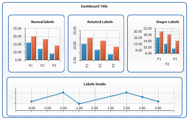
Here is a sample dashboard showing the most of positioning labels settings:
Live Sample: Sample Axes Labels Position Settings
First, Last and Crossing labels
There are special attributes that give you a control over such special labels as:
First (minimal value) label on the axis, Last label (maximal value) and Cross label (crossing with
perpendicular axis value). You can force them to be shown or hide them using appropriate attributes:
show_first_label, show_last_label and show_cross_label.
Turning off the last the first label is shown on the dashboard above in "Labels Inside" Line chart.
02 |
<labels show_first_label="False" show_last_label="False" show_cross_label="True" /> |
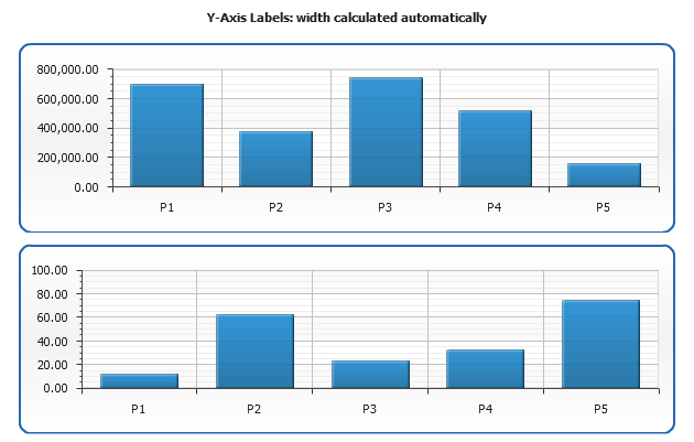
Y-Axis labels: Fixed width
You can set fixed width for Y-Axis labels. If label content doesn't fit - text is automatically wrapped.
This function may be of great use when you use Dashboards and you want to sync several charts left and/or right border, which is especially needed when they are displayed in a column and share the same X-Axis arguments.
To set the width you should use width attribute in
<labels> node, which accepts positive integer values in pixels:
Sample dashboard shows two charts with values in completely different ranges: upper charts shows up to hundreds of thousands and the one beneath shows only hundreds and as the result charts aren't synced to the left:
Live Sample: Y-Axis Labels width is calculated automatically
And now the same data with Y-Axis label width set to 70 pixels, which results in synced left border:
Live Sample: Y-Axis Labels width is set to 70 pixels
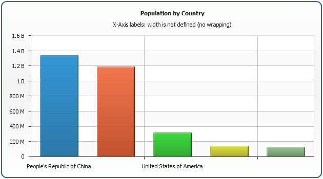
X-Axis labels: Fixed width and text wrapping
Sometimes you may encounter situation when point names (which are used as arguments and are displayed in X-Axis labels) are too long and chart engine removes some of them because they don't fit the chart size — it may be undesired result and it can be avoided in several ways, like allowing labels to overlap (using allow_overlap attribute in <labels> node) or using maxChar keyword in formatting, but you can also set fixed width and make them wrap.
To set the fixed width you have to use width attribute in <labels> element:
The following example demonstrates standard behavior of the X-Axis labels. As you can see long labels cause component to skip several labels in order to prevent overlapping:
Live Sample: X-Axis Labels width is not set - no wrapping
Exactly the same configuration but the labels width is set manually to 60 pixels. In this case, component wraps texts in order to fit in the width set:
Live Sample: X-Axis Labels width is set to 60 pixels
This works as well for other plot types. The following example demonstrates the same data displayed on CategorizedHorizontal plot. In order to align multiline text to the right side text_align attribute is set to Right:
Live Sample: X-Axis Labels width is set to 60 pixels on CategorizedHorizontal plot type
Keywords reference
In the tables below you can find all built-in keywords that can be used in label texts,
in Description column you an find notices that identify in what chart types keyword will be active.
Axis
This table lists all built-in keywords that provide axis data and axis-related pre calculated values.
| Keyword |
Description |
| {%Value} |
The value corresponding to the axis label. |
| {%AxisSum} |
The sum of all y values of all points in series that are bound to this axis. |
| {%AxisBubbleSizeSum} |
The sum of all bubble sizes of all points in series that are bound to this axis. |
| {%AxisMax} |
The maximal value of all points in series that are bound to this axis. |
| {%AxisMin} |
The minimal value of all points in series that are bound to this axis. |
| {%AxisScaleMax} |
The maximal scale value. |
| {%AxisScaleMin} |
The minimal scale value. |
| {%AxisBubbleSizeMax} |
The maximal bubble size of all points in series that are bound to this axis. |
| {%AxisBubbleSizeMin} |
The minimal bubble size of all points in series that are bound to this axis. |
| {%AxisAverage} |
The average value of all points in series that are bound to this axis. |
| {%AxisMedian} |
The median value of all points in series that are bound to this axis. |
| {%AxisMode} |
The mode value of all points in series that are bound to this axis. |
| {%AxisName} |
The name of the axis. |
Data Plot
This table list all built-in keywords that provide category data and category-related pre calculated values.
| Keyword |
Description |
| {%DataPlotYSum} |
The sum of all the points y values. |
| {%DataPlotXSum} |
The sum of all the points x values (Scatter plot charts). |
| {%DataPlotBubbleSizeSum} |
The sum of all the points bubble sizes (Bubble chart). |
| {%DataPlotYMax} |
The maximal of all the points y values. |
| {%DataPlotYMin} |
The minimal of all the points y values. |
| {%DataPlotXMax} |
The maximal of all the points x values (Scatter plot chart). |
| {%DataPlotXMin} |
The minimal of all the points x values (Scatter plot chart). |
| {%DataPlotBubbleMaxSize} |
The maximal of all the points bubble sizes (Bubble chart). |
| {%DataPlotBubbleMinSize} |
The minimal of all the points bubble sizes (Bubble chart). |
| {%DataPlotXAverage} |
The average x value of all the points (Scatter plot charts). |
| {%DataPlotYAverage} |
The average y value of all the points. |
| {%DataPlotBubbleSizeAverage} |
The average bubble size of all the points (Scatter plot charts). |
| {%DataPlotMaxYValuePointName} |
The name of the point with a maximal of all the points y values. |
| {%DataPlotMinYValuePointName} |
The name of the point with a minimal of all the points y values. |
| {%DataPlotMaxYValuePointSeriesName} |
The name of the series with a maximal of all the points y values. |
| {%DataPlotMinYValuePointSeriesName} |
The name of the series with a minimal of all the points y values. |
| {%DataPlotMaxYSumSeriesName} |
The name of the series with a maximal sum of the points y values. |
| {%DataPlotMinYSumSeriesName} |
The name of the series with a minimal sum of the points y values. |
| {%DataPlotYRangeMax} |
The maximal of the ranges of the points within the chart. |
| {%DataPlotYRangeMin} |
The minimal of the ranges of the points within the chart. |
| {%DataPlotYRangeSum} |
The sum of the ranges of the points within the chart. |
| {%DataPlotPointCount} |
The number of the points within the chart. |
| {%DataPlotSeriesCount} |
The number of the series within the chart. |