01 | { |
02 | settings: { |
03 | tooltip: { |
04 | enabled: true |
05 | } |
06 | } |
07 | } |
To provide detailed information on an event presented on a chart, you can take advantage of balloon tooltips. Balloon tooltips can be generated with HTML, as demonstrated in Using HTML Tooltips, or with an internal mechanism for displaying tooltips for event markers.
This article covers all aspects of using the internal tooltip mechanism.
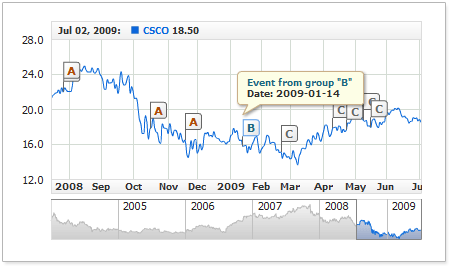
The screen shot below demonstrates a chart with a tooltip for an event marker:
Tooltips can be customized at any level. You can set same text and visual settings for all markers or personalize them for a certain group or individual marker.
Before you can start experimenting with tooltips, you need to enable them. By default, displaying tooltips for event markers is disabled; to enable it, use the following XML syntax:

This syntax enables displaying tooltips with default settings. The sections below cover tooltip customization at different levels.
Note: In the majority of cases the examples provided throughout the article, demonstrate customizing tooltips for the entire group. But you can use any of the techniques described below in your applications.
To use the global tooltip settings for all event markers regardless of the group they belong to, use the following syntax:
The live example below demonstrates that all event markers have tooltips with a very similar text like "Event Date: 2008-05-01"; the only thing that varies in a tooltip text is date:
To personalize tooltips for a certain group, the tooltip settings are to be placed at the group's level. In this case, a similar tooltip will be displayed for all event markers that belong to the group.
Here is a sample XML for customizing a tooltip for a certain group of event markers:
01 |
<event_markers> |
02 |
<groups> |
04 |
<settings> |
07 |
</tooltip> |
08 |
</settings> |
09 |
<events> |
10 |
<event locale_based_date="2008-11-18" /> |
11 |
<event locale_based_date="2008-10-16" /> |
12 |
</events> |
13 |
</group> |
15 |
<settings> |
18 |
</tooltip> |
19 |
</settings> |
20 |
<events> |
21 |
<event locale_based_date="2006-10-12" /> |
22 |
<event locale_based_date="2007-01-25" /> |
23 |
</events> |
24 |
</group> |
26 |
<events> |
27 |
<event locale_based_date="2009-02-21" /> |
28 |
<event locale_based_date="2009-04-12" /> |
29 |
</events> |
30 |
</group> |
31 |
</groups> |
32 |
</event_markers> |
01 | { |
02 | groups: [ |
03 | { |
04 | chart: "idMainChart", |
05 | series: "idSeries", |
06 | format: "A", |
07 | settings: { |
08 | tooltip: { |
09 | enabled: true, |
10 | format: "A: {%SourceDate}{\"%yyyy-%MM-%dd\"}" |
11 | } |
12 | }, |
13 | events: [ |
14 | { |
15 | localeBasedDate: "2008-11-18" |
16 | }, |
17 | { |
18 | localeBasedDate: "2008-10-16" |
19 | } |
20 | ] |
21 | }, |
22 | { |
23 | chart: "idMainChart", |
24 | series: "idSeries", |
25 | format: "B", |
26 | settings: { |
27 | tooltip: { |
28 | enabled: true, |
29 | format: "B: {%SourceDate}{\"%yyyy-%MM-%dd\"}" |
30 | } |
31 | }, |
32 | events: [ |
33 | { |
34 | localeBasedDate: "2006-10-12" |
35 | }, |
36 | { |
37 | localeBasedDate: "2007-01-25" |
38 | } |
39 | ] |
40 | }, |
41 | { |
42 | chart: "idMainChart", |
43 | series: "idSeries", |
44 | format: "C", |
45 | events: [ |
46 | { |
47 | localeBasedDate: "2009-02-21" |
48 | }, |
49 | { |
50 | localeBasedDate: "2009-04-12" |
51 | } |
52 | ] |
53 | } |
54 | ] |
55 | } |
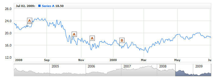
The live example below demonstrates two groups of event markers with individual tooltip settings for each group:
In case each event marker must have a radically distinct text or appearance, the tooltip settings can be defined for each of them individually.
Here is a sample XML for customizing a tooltip for three event markers individually:
01 |
<event_markers> |
02 |
<groups> |
04 |
<events> |
05 |
<event locale_based_date="2009-01-21" format="A"> |
06 |
<settings> |
10 |
</tooltip> |
11 |
</settings> |
12 |
</event> |
13 |
<event locale_based_date="2009-02-12" format="B"> |
14 |
<settings> |
18 |
</tooltip> |
19 |
</settings> |
20 |
</event> |
21 |
<event locale_based_date="2009-04-23" format="C"> |
22 |
<settings> |
26 |
</tooltip> |
27 |
</settings> |
28 |
</event> |
29 |
</events> |
30 |
</group> |
31 |
</groups> |
32 |
</event_markers> |
01 | { |
02 | groups: [ |
03 | { |
04 | chart: "idMainChart", |
05 | series: "idSeries", |
06 | events: [ |
07 | { |
08 | localeBasedDate: "2009-01-21", |
09 | format: "A", |
10 | settings: { |
11 | tooltip: { |
12 | enabled: true, |
13 | font: { |
14 | bold: true, |
15 | color: "#00DD00" |
16 | }, |
17 | format: "\"A\" Event" |
18 | } |
19 | } |
20 | }, |
21 | { |
22 | localeBasedDate: "2009-02-12", |
23 | format: "B", |
24 | settings: { |
25 | tooltip: { |
26 | enabled: true, |
27 | font: { |
28 | bold: true, |
29 | color: "#DD0000" |
30 | }, |
31 | format: "\"B\" Event" |
32 | } |
33 | } |
34 | }, |
35 | { |
36 | localeBasedDate: "2009-04-23", |
37 | format: "C", |
38 | settings: { |
39 | tooltip: { |
40 | enabled: true, |
41 | font: { |
42 | bold: true, |
43 | color: "#0000DD" |
44 | }, |
45 | format: "\"C\" Event" |
46 | } |
47 | } |
48 | } |
49 | ] |
50 | } |
51 | ] |
52 | } |
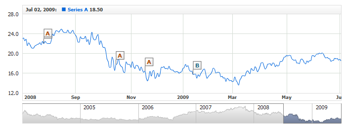
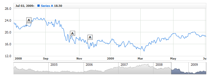
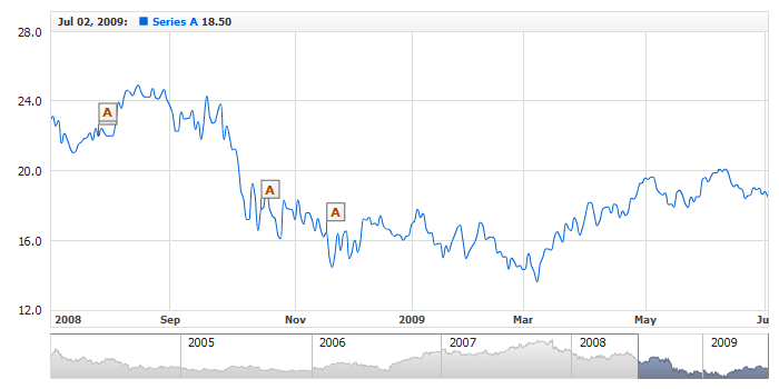
The live example below demonstrates three event markers that belong to the same group but have radically distinct tooltips:
To generate the text, tooltips can use static text combined with special tokens, which are replaced with custom-formatted date/time string that was set when adding the event marker to the group.
Tooltip text is specified in the <format> node, which is a subnode of <tooltip> at the corresponding level. Below is a sample XML for customizing a tooltip text:
01 |
<event_markers> |
02 |
<groups> |
04 |
<settings> |
07 |
</tooltip> |
08 |
</settings> |
09 |
<events> |
10 |
<event locale_based_date="2009-01-21" /> |
11 |
<event locale_based_date="2009-02-12" /> |
12 |
<event locale_based_date="2009-04-23" /> |
13 |
</events> |
14 |
</group> |
15 |
</groups> |
16 |
</event_markers> |
01 | { |
02 | groups: [ |
03 | { |
04 | chart: "idMainChart", |
05 | series: "idSeries", |
06 | format: "A", |
07 | settings: { |
08 | tooltip: { |
09 | enabled: true, |
10 | format: "SAMPLE TEXT: Group \"A\"" |
11 | } |
12 | }, |
13 | events: [ |
14 | { |
15 | localeBasedDate: "2009-01-21" |
16 | }, |
17 | { |
18 | localeBasedDate: "2009-02-12" |
19 | }, |
20 | { |
21 | localeBasedDate: "2009-04-23" |
22 | } |
23 | ] |
24 | } |
25 | ] |
26 | } |
It is required to enter the date/time values when adding event markers - in order to position them against the time scale. That value can be used later on for customizing the tooltip text.
Inserting the {%SourceDate} token into the tooltip text makes it display the date the event marker was added for.
Below is a sample XML for inserting the token into the tooltip text format string:
01 |
<event_markers> |
02 |
<groups> |
04 |
<settings> |
07 |
</tooltip> |
08 |
</settings> |
09 |
<events> |
10 |
<event locale_based_date="2009-01-21" /> |
11 |
<event locale_based_date="2009-02-12" /> |
12 |
<event locale_based_date="2009-04-23" /> |
13 |
</events> |
14 |
</group> |
15 |
</groups> |
16 |
</event_markers> |
01 | { |
02 | groups: [ |
03 | { |
04 | chart: "idMainChart", |
05 | series: "idSeries", |
06 | format: "A", |
07 | settings: { |
08 | tooltip: { |
09 | enabled: true, |
10 | format: "Alert! Date: {%SourceDate}{\"%yyyy-%MM-%dd\"}" |
11 | } |
12 | }, |
13 | events: [ |
14 | { |
15 | localeBasedDate: "2009-01-21" |
16 | }, |
17 | { |
18 | localeBasedDate: "2009-02-12" |
19 | }, |
20 | { |
21 | localeBasedDate: "2009-04-23" |
22 | } |
23 | ] |
24 | } |
25 | ] |
26 | } |
Like all other tokens that return date/time values, {%SourceDate} allows custom formatting. This technique is covered in detail in Date-Time Formatting.
You can also use the second token supported by the tooltip - {%GroupedDate}. This token displays the date the data series was grouped on when viewing the data at a large scale.
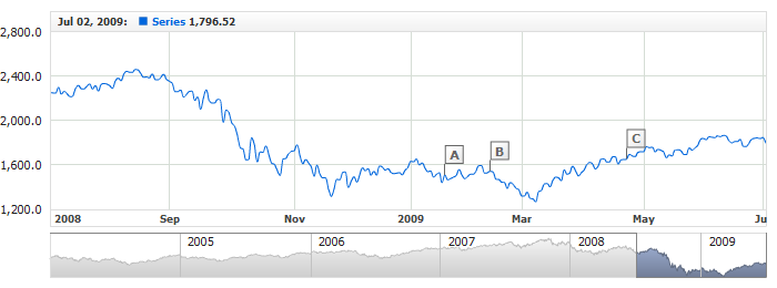
The live example below demonstrates using the {%SourceDate} token when customizing the tooltip text in three different groups:

Event Markers Creation article describes how custom attributes, carrying additional information, can be bound to markers. Attributes bound to an event marker can be used in the tooltip text.
This mechanism is very helpful, as it allows to avoid getting text duplicates when customizing the tooltip for each event marker and thus cut the size of the configuration file.
Adding custom attributes:
01 |
<group> |
02 |
<events> |
03 |
<event locale_based_date="2009-01-18" format="A"> |
04 |
<attributes> |
08 |
</attributes> |
09 |
</event> |
10 |
<event locale_based_date="2009-02-11" format="B"> |
11 |
<attributes> |
15 |
</attributes> |
16 |
</event> |
17 |
<event locale_based_date="2009-04-24" format="C"> |
18 |
<attributes> |
22 |
</attributes> |
23 |
</event> |
24 |
</events> |
25 |
</group> |
01 | { |
02 | events: [ |
03 | { |
04 | localeBasedDate: "2009-01-18", |
05 | format: "A", |
06 | attributes: { |
07 | Status: "Normal", |
08 | Param1: "78", |
09 | Param2: "17" |
10 | } |
11 | }, |
12 | { |
13 | localeBasedDate: "2009-02-11", |
14 | format: "B", |
15 | attributes: { |
16 | Status: "High", |
17 | Param1: "119", |
18 | Param2: "45" |
19 | } |
20 | }, |
21 | { |
22 | localeBasedDate: "2009-04-24", |
23 | format: "C", |
24 | attributes: { |
25 | Status: "Low", |
26 | Param1: "45", |
27 | Param2: "4" |
28 | } |
29 | } |
30 | ] |
31 | } |
The live example below demonstrates configuring tooltips within a group using custom attributes:

When customizing tooltip text, you can either apply the same settings for the entire text or define a custom formatting for the individual elements by using a limited set of HTML tags supported by the Flash Player.
The font for an entire tooltip text is defined in the standard <font> node. Here is an XML sample for defining the font settings:
01 |
<event_markers> |
02 |
<groups> |
04 |
<settings> |
08 |
</tooltip> |
09 |
</settings> |
10 |
<events> |
11 |
<event locale_based_date="2009-01-21" /> |
12 |
<event locale_based_date="2009-02-12" /> |
13 |
<event locale_based_date="2009-04-23" /> |
14 |
</events> |
15 |
</group> |
16 |
</groups> |
17 |
</event_markers> |
01 | { |
02 | groups: [ |
03 | { |
04 | chart: "idMainChart", |
05 | series: "idSeries", |
06 | format: "A", |
07 | settings: { |
08 | tooltip: { |
09 | enabled: true, |
10 | font: { |
11 | family: "Tahoma", |
12 | size: 13, |
13 | color: "#333333", |
14 | bold: true |
15 | }, |
16 | format: "Alert: {%SourceDate}{\"%yyyy-%MM-%dd\"}" |
17 | } |
18 | }, |
19 | events: [ |
20 | { |
21 | localeBasedDate: "2009-01-21" |
22 | }, |
23 | { |
24 | localeBasedDate: "2009-02-12" |
25 | }, |
26 | { |
27 | localeBasedDate: "2009-04-23" |
28 | } |
29 | ] |
30 | } |
31 | ] |
32 | } |
The detailed coverage for customizing font settings is provided in Font Settings.
It is often helpful to use HTML formatting to draw user's attention to the most important pieces of the tooltip text and to give it a more attractive look.
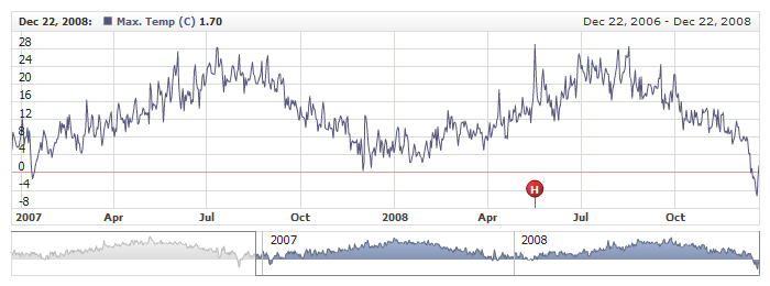
This XML sample demonstrates how you can customize the look and feel of a tooltip text:
01 |
<event_markers> |
02 |
<groups> |
04 |
<events> |
05 |
<event locale_based_date="2008-05-17" format="H" position="Axis"> |
06 |
<settings> |
08 |
<format><![CDATA[<textformat leading="4"><b>{%SourceDate}{"%MMMM %d, %yyyy"}</b><br/><font color="#666666"><b>It was the hottest day in Vancouver<br/>during 2006-2008 years!</font><br/><font color="#CC0000">Temperature: +29 (C)</font></b></textformat>]]></format> |
09 |
</tooltip> |
10 |
</settings> |
11 |
</event> |
12 |
</events> |
13 |
</group> |
14 |
</groups> |
15 |
</event_markers> |
01 | { |
02 | groups: [ |
03 | { |
04 | chart: "idMainChart", |
05 | series: "idSeriesMaxTemp", |
06 | events: [ |
07 | { |
08 | localeBasedDate: "2008-05-17", |
09 | format: "H", |
10 | position: "Axis", |
11 | settings: { |
12 | tooltip: { |
13 | enabled: true, |
14 | format: "<textformat leading=\"4\"><b>{%SourceDate}{\"%MMMM %d, %yyyy\"}</b><br/><font color=\"#666666\"><b>It was the hottest day in Vancouver<br/>during 2006-2008 years!</font><br/><font color=\"#CC0000\">Temperature: +29 (C)</font></b></textformat>" |
15 | } |
16 | } |
17 | } |
18 | ] |
19 | } |
20 | ] |
21 | } |
As you can see in the sample, the HTML-formatted text is also defined in the <format> node; however, it requires using the CDATA block, which enables the use special characters.
The live example below demonstrates a few text formatting techniques. Place the mouse pointer over the marker with the "H" caption to get the tooltip:

The detailed coverage for all supported HTML tags and available options is provided in Using HTML Tags in Text Formatting.
This section provides examples for customizing tooltip background. The default tooltip settings are optimized to suit just about any content displayable on the chart. But whenever it's necessary, you can completely change the tooltip appearance by customizing its background at your discretion.
Tooltip background is configured in the <background> node. The following listing shows where it is located and which subnodes has available for customizing:
02 |
<background> |
03 |
<fill /> |
04 |
<border /> |
05 |
<corners /> |
06 |
<inside_margin /> |
07 |
<shadow /> |
08 |
</background> |
09 |
</tooltip> |
01 | { |
02 | enabled: true, |
03 | background: { |
04 | fill: {}, |
05 | border: {}, |
06 | corners: {}, |
07 | insideMargin: {}, |
08 | shadow: {} |
09 | } |
10 | } |
Fill and border are configured in the <fill> and <border> nodes respectively. A tooltip can have a solid or gradient background fill.
Here is a sample XML for configuring the background fill and border:
02 |
<background> |
03 |
<fill /> |
04 |
<border /> |
05 |
<corners /> |
06 |
<inside_margin /> |
07 |
<shadow /> |
08 |
</background> |
09 |
</tooltip> |
01 | { |
02 | enabled: true, |
03 | background: { |
04 | fill: {}, |
05 | border: {}, |
06 | corners: {}, |
07 | insideMargin: {}, |
08 | shadow: {} |
09 | } |
10 | } |
This live example demonstrates these settings in action:
To learn more about all background fill and border configuration options, please refer to Background Settings.
Like for any other background, for a tooltip too you can customize the corner shape and size. These properties are customized in the standard <corners> node.
Here is a sample XML for customizing corners a tooltip background:
02 |
<background> |
03 |
<corners type="Cut" left_top="0" right_top="8" right_bottom="0" left_bottom="0" /> |
04 |
</background> |
05 |
</tooltip> |
01 | { |
02 | enabled: true, |
03 | background: { |
04 | corners: { |
05 | type: "Cut", |
06 | leftTop: 0, |
07 | rightTop: 8, |
08 | rightBottom: 0, |
09 | leftBottom: 0 |
10 | } |
11 | } |
12 | } |
This live example demonstrates these settings in action:
To learn more about customizing corners, please refer to Background Settings.
Inside margins are configured in the standard <inside_margin> node, where you can define the margin for each side.
The XML sample below demonstrates inside margins set by all sides:
02 |
<background> |
03 |
<inside_margin left="20" top="10" right="20" bottom="10" /> |
04 |
</background> |
05 |
</tooltip> |
01 | { |
02 | enabled: true, |
03 | background: { |
04 | insideMargin: { |
05 | left: 20, |
06 | top: 10, |
07 | right: 20, |
08 | bottom: 10 |
09 | } |
10 | } |
11 | } |
Here is a live example demonstrating these settings in action:

Tooltip backgrounds can drop shadow. By default, shadow for event marker tooltips is enabled, but you can disable or customize it as necessary. Here is a sample XML for configuring tooltip shadow:
Here is a live example demonstrating event markers with a background dropping red shadow:
To learn more about all shadow properties and their configuration options, please refer to XML Reference.