Radar Chart
Overview
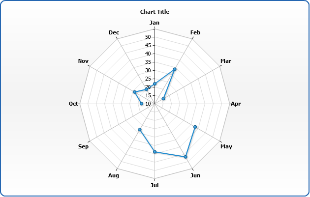
A radar chart is a graphical method of displaying multivariate data in the form of a two-dimensional chart of three or more quantitative variables represented on axes starting from the same point. The relative position and angle of the axes is typically uninformative.
The radar chart is also known as web chart, spider chart, star chart, cobweb chart, star plot, irregular polygon, polar chart, or kiviat diagram.
Chart Building
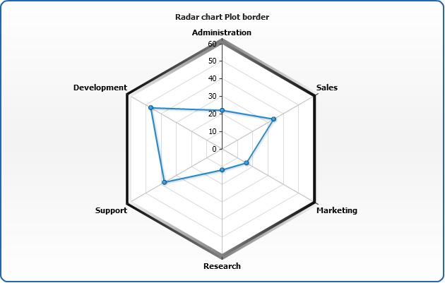
AnyChart allows to display three types of series on Radar chart: Line, Area and Marker. You need to set plot_type="Radar" in<chart> to display Radar chart:
01 |
<chart plot_type="Radar"> |
03 |
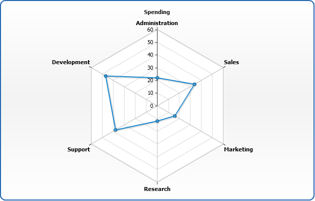
<series name="Spendings"> |
04 |
<point name="Administration" y="22" /> |
05 |
<point name="Sales" y="34" /> |
06 |
<point name="Marketing" y="16" /> |
07 |
<point name="Research" y="12" /> |
08 |
<point name="Support" y="38" /> |
09 |
<point name="Development" y="47" /> |
As you can see each point is represented by category set using name attribute and value set using y attribute.
Here is a basic Radar sample:
Live Sample: Radar Chart Simple sample

Radar plot configuration
Radar plot has several distinctive configuration options, which are presented in this section: chart radius settings, chart rotation and background settings.
Radius size
Radar plot radius can be set absolute or relative. To use absolute settings you need to set fixed_radius="true" in <radar> node, and set radius in pixels, for example: radius="120"
02 |
<radar fixed_radius="true" radius="120" /> |
Here is a sample of the radar chart with fixed radius:
Live Sample: Radar Chart Fixed radius
You can also set radius in percents, relative to chart height and width, to do so you have to set,
for example: radius="50%"
01 |
<radar fixed_radius="true" radius="50%" /> |
Sample chart with radius set to 85%:
Live Sample: Radar Chart Percent radius
Start angle
By default radar starts drawing from the top center point (0°), but you can change this using
start_angle attribute in <radar> node:
02 |
<radar start_angle="90" /> |
Sample chart with starting angle shifted to 90°:
Live Sample: Radar Chart Start Angle Sample
Using polar coordinates
Radar chart supports polar coordinates, which allow you to join lines using arcs, to enable this mode set use_polar_coords="true":
02 |
<radar use_polar_coords="true" /> |
Here is a sample chart where points are joined with arcs:
Live Sample: Radar chart polar X-axis Sample
Note: if you need Polar Chart, refer to Polar Chart article.
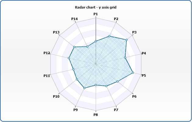
Draw grid lines as circles
Grid lines can be drawn both as "spider web" or circles, to draw them as circles set drawing_style="Circle" (the default is "Polygon"):
02 |
<radar drawing_style="Circle" /> |
Note: even if the grid of is disabled - axis itself is drawn as circle.
Here is a sample chart with grid displayed as circles:
Live Sample: Radar Chart X-axis circle grid lines
Plot background
You can change radar background using <background> node, learn more about
this node at Background settings tutorial.
03 |
<fill type="Gradient"> |
04 |
<gradient type="Radial" focal_point="-0.7" angle="45"> |
05 |
<key color="#ffffff" position="0" opacity="0.5" /> |
06 |
<key color="DarkColor(gray)" position="0.7" opacity="0.5" /> |
09 |
<border thickness="3" enabled="true" color="black" opacity="0.7" /> |
Sample radar chart with tuned background:
Live Sample: Radar Chart Plot background Sample
Border settings
Radar border consists of two different lines: <border> of <background> node described
above, and X-axis setting - <line> node:
04 |
<line enabled="true" thickness="4" type="Gradient"> |
Sample below shows Х-axis line width and background border are set to 4 pixels:
Live Sample: Radar Chart Plot border
Data under axes
Another special feature of Radar chart is an ability to set whether data series are displayed under or above axes lines.
This is set using display_data_mode attribute, which can be either "AboveAxes" (default) or
"UnderAxes".
02 |
<radar display_data_mode="UnderAxes" /> |
Sample chart with data series displayed under axes lines:
Live Sample: Radar Chart axis under data sample
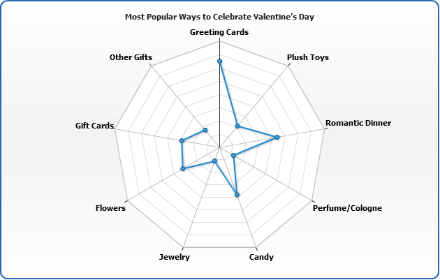
Closed and open contour
By default all series are close - the last point is joined with the first one. You can disjoin
any series by setting close_contour attribute of <series> node to false:
01 |
<series close_contour="false"> |
02 |
<point name="Greeting Cards" y="65" /> |
03 |
<point name="Plush Toys" y="21" /> |
04 |
<point name="Romantic Dinner" y="44" /> |
05 |
<point name="Perfume/Cologne" y="12" /> |
06 |
<point name="Candy" y="38" /> |
07 |
<point name="Jewelry" y="11" /> |
08 |
<point name="Flowers" y="32" /> |
09 |
<point name="Gift Cards" y="29" /> |
10 |
<point name="Other Gifts" y="17" /> |
Sample chart with disjointed line:
Live Sample: Radar Chart close series line sample
X axis settings
This section tells how to configure Х axis and its elements, such as tick marks, grid and labels.
X axis enable/disable
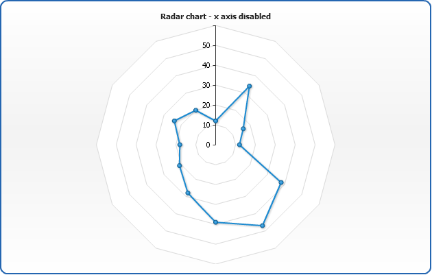
To turn X axis on or off use enabled attribute of <x_axis> node - setting it to false hides all visible components of X axis:
02 |
<x_axis enabled="false" /> |
Sample chart with X-axis turned off:
Live Sample: Radar Chart X Axis disabled
Note: You see the chart outline - it comes from background.
Tickmarks
Tickmarks are the small marks used to represent a point on an axis scale, used to indicate major step of an axis scale. You can control their appearance and position.
To enable/disable tickmarks set enabled="true" or enabled = "False" to <major_tickmark>
03 |
<major_tickmark enabled="true" size="10" thickness="3" inside="true" outside="true" /> |
Tickmarks can be placed "inside" and "outside" relatively to axis line. These features are controlled by inside and outside attributes.
Live Sample: Radar Chart X Axis Tickmarks
Warning: X axis in Radar plot doesn't support minor grids and tickmarks. Only major.
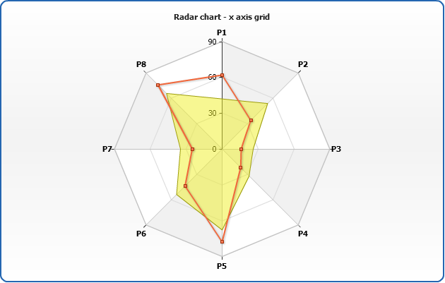
Grids
Each axis has its own grid. By default grid is enabled for all axes and looks like a set of black lines. You can turn it off or configure to fit your needs.
Here is a sample XML with grid settings:
02 |
<major_grid enabled="true" interlaced="true" draw_last_line="true"> |
03 |
<line thickness="2" /> |
06 |
<fill type="Gradient" opacity="0.4" focal_point="0"> |
07 |
<gradient type="Radial"> |
In <line> node you can change:
| Attribute |
Description |
| color |
Sets line color. |
| opacity |
Sets line opacity. |
| thickness |
Sets line thickness. |
In <interlaced_fills> node you can set <even> and <odd> fills,
fills start from axis and the first section is "even".
Live Sample: Radar Chart X Axis Grid
Warning: X axis in Radar plot doesn't support minor grids and tickmarks. Only major.
Labels settings
You can change format, rotation, placement, paddings and visual settings of axis labels, this section covers all basic
available options.
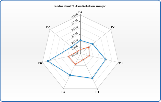
Rotation settings
Using circular_labels_style attribute you can change the way labels are placed near the circular axis of radar chart: the placement options are: "Horizontal", "Circular" or "Radial".
By default Horizontal is set, but you can always change it:
02 |
<labels circular_labels_style="Horizontal" /> |
Horizontal labels sample:
Live Sample: Radar Chart Rotation Sample
Setting Circular mode sample:
03 |
<labels circular_labels_style="Circular" /> |
And the chart with with such settings:
Live Sample: Radar Chart Circular rotation Sample
Setting Radial mode:
03 |
<labels circular_labels_style="Radial" /> |
And the chart with radially placed labels:
Live Sample: Radar Chart Radial rotation Sample
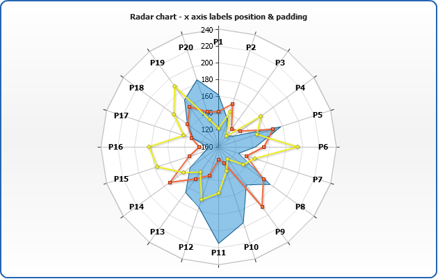
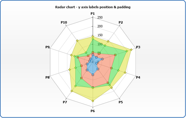
Position and padding
Labels can be Inside or Outside of the axis and this is configured using position attribute,
which is set to Outside by default.
You can also set the padding between the axis and labels (in pixels):
02 |
<labels position="Inside" padding="10" /> |
Sample with padding set to 10 and labels placed inside:
Live Sample: Radar chart X-axis labels position
Background settings
You can change labels background. Learn more about background configuration in
Background settings tutorial.
02 |
<background enabled="true"> |
03 |
<fill type="Gradient"> |
04 |
<gradient type="Linear"> |
05 |
<key color="LightColor(DeepSkyBlue)" position="0.1" opacity="0.01" /> |
06 |
<key color="White" position="0.9" /> |
09 |
<inside_margin all="2" /> |
10 |
<border enabled="true" thickness="1" color="Blue" type="Linear" opacity="0.2" /> |
11 |
<corners all="2" type="Cut" left_top="1" /> |
Sample with labels with tuned background:
Live Sample: Radar chart Labels Background Sample
Formatting settings
In labels format you can access only %Value token, which can be formatted according to the
Axis Labels Formatting rules:
03 |
<format><![CDATA[{%Value}{maxChar:3,maxCharFinalChar:.}]]></format> |
In the sample below all names are limited to the length of 3:
Live Sample: Radar chart Labels Formatting Sample
Y axis settings
This section tells how to configure Y axis mode, scale and its elements, such as tick marks, grid and labels.
Y axis enable/disable
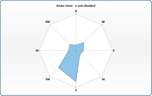
To turn Y axis on or off use enabled attribute of <y_axis> node - setting it to false hides all visible components of Y axis:
02 |
<y_axis enabled="false" /> |
Sample with Y axis turned off:
Live Sample: Radar chart Y-axis disabled
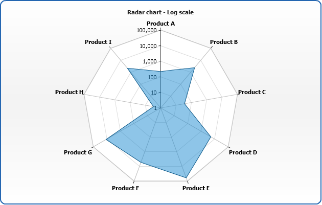
Linear and Logarithmic scale
Radar chart supports to scale types: linear and logarithmic. This is controlled using type attribute of <scale> node :
02 |
<scale type="Logarithmic" /> |
Sample radar chart with logarithmic axis:
Live Sample: Radar chart with log scale
Scale modes
Radar chart Y axis supports three modes: Normal, Stacked and PercentStacked.
Stacked scale mode
Stacked scale mode stacks all y vales within each category, set this mode via mode attribute of <scale> node:
02 |
<scale mode="Stacked" /> |
Sample stacked radar chart:
Live Sample: Radar chart with stack
Note: different series types do not stack (i.e. Line do not stack with Area).
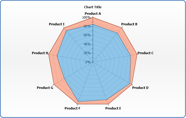
PercentStacked scale mode
Percent stacked mode calculates the proportion of each point to the category sum and uses this percentage as a value. This mode is also set using mode attribute of <scale> node:
02 |
<scale mode="PercentStacked" /> |
Sample Radar chart with PercentStacked axis scale mode:
Live Sample: Radar chart with percentStack
Note: different series types do not stack (i.e. Line do not stack with Area).
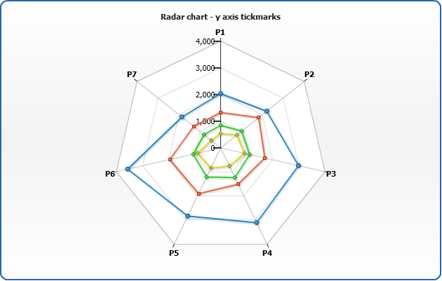
Tickmarks
Tickmarks are the small marks used to represent a point on an axis scale, used to indicate major step of an axis scale. You can control their appearance and position.
To enable/disable tickmarks set enabled="True" or enabled = "False" to <major_tickmark>
03 |
<major_tickmark enabled="true" size="10" thickness="2" inside="true" outside="true" /> |
Tickmarks can be placed "inside" and "outside" relatively to axis line. These features are controlled by inside and outside attributes.
Live Sample: Radar Chart Y Axis Tickmarks
Warning: Y axis in radar plot doesn't support minor grids and tickmarks. Only major.
Grids
Each axis has its own grid. By default grid is enabled for all axes and looks like a set of black lines. You can turn it off or configure to fit your needs.
Here is a sample XML with grid settings:
01 |
<major_grid enabled="true" interlaced="true" draw_last_line="true"> |
02 |
<line thickness="1" opacity="0.4" /> |
05 |
<fill type="Gradient" opacity="0.4" focal_point="0"> |
06 |
<gradient type="Radial"> |
07 |
<key color="SkyBlue" /> |
13 |
<fill type="Solid" opacity="0.1" color="DeepSkyBlue" /> |
Attributes of <line>:
| Attribute |
Description |
| color |
Sets line color. |
| opacity |
Sets line opacity. |
| thickness |
Sets line thickness. |
In <interlaced_fills> node you can set <even> and <odd> fills, fills start from axis and the first section is "even".
Live Sample: Radar Chart Y-Axis Grid
Warning: Y axis in radar plot doesn't support minor grids and tickmarks. Only major.
Labels settings
You can tune Y axis labels format, position, rotation, padding and change visual settings.
Rotation
To rotate the labels you should set rotation angle in rotation attribute:
02 |
<labels rotation="33" /> |
Sample Radar chart with rotated labels:
Live Sample: Radar Chart Y-Axis Rotation Sample
Position and padding
Labels can be Inside or Outside of the axis and this is configured using position attribute, which is set to Outside by default.
You can also set the padding between the axis and labels (in pixels):
02 |
<labels position="Inside" padding="10" /> |
Sample with padding set to 10 and labels placed inside:
Live Sample: Radar chart Y-axis labels position
Background settings
You can change labels background. Learn more about background configuration in Background settings tutorial.
02 |
<background enabled="true"> |
03 |
<fill type="Gradient"> |
04 |
<gradient type="linear"> |
05 |
<key color="LightColor(DeepSkyBlue)" position="0.1" opacity="0.01" /> |
06 |
<key color="White" position="0.9" /> |
09 |
<inside_margin all="2" /> |
10 |
<border enabled="true" thickness="1" color="Blue" type="linear" opacity="0.2" /> |
11 |
<corners all="2" type="Cut" left_top="1" /> |
Sample with labels with tuned background:
Live Sample: Radar chart Y-axis Labels Background Sample
Formatting settings
In Y axes labels you can use only %Value token, which can be formatted as described at Axis Labels Formatting.
03 |
<format><![CDATA[${%Value}{numDecimals:1}]]></format> |
Sample with formatted labels:
Live Sample: Radar chart Y-axis Labels Formatting Sample
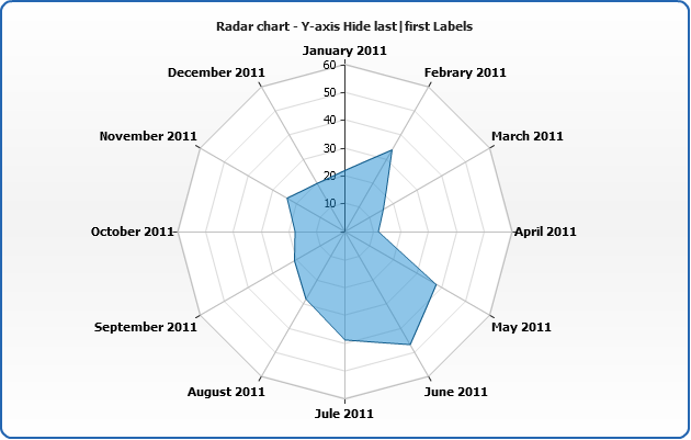
Hide first and last labels
You can hide first and/or last labels using show_first_label and show_last_label attributes:
02 |
<labels show_first_label="false" /> |
Sample chart with first label hidden:
Live Sample: Radar chart Y-axis Hide last|first Labels Sample
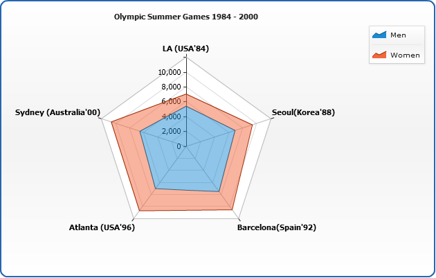
Working with data labels and tooltips
In this section we will explain how to add and configure data labels and tooltips. Full explanation of formatting and tuning visual appearance for them can be found in Labels and tooltips.
If you want to configure data labels and tooltips for all series - you should do that in
<label> and <tooltip> sub-nodes of <radar> node. You can tune their visual appearance, positioning and format. Let's do that in the following example: we will make data labels appear to the top of the data points, also, we will format labels so they show only the value corresponding to the point and tooltip will show detailed description.
When formatting data labels text and tooltip we will use formatting keywords:
{%Name} - to show month name,
{%YValue} - to show sales for this month,
{%SeriesName} - to show period (Year),
{%YPercentOfSeries} - to show every month percentage to total sales per year.
Live Sample: Radar chart - Working with data labels and tooltips
Supported series types
Radar chart supports: Line, Area and Marker series types. You can learn
how to change and configure styles of these types at: Area styles, Line styles and Marker styles.
Live Sample: Radar series types
Missing points
Radar chart supports missing control: missing and non-numeric y are ignored:
Live Sample: Radar plot missing points sample