How to use Thresholds to Color the Map
Overview
Thresholds is the best way to color the map, they allow to predefine rules and apply colors to regions, based on some data attached to the map.
There are two types of thresholds - Custom (when you can define a set of rules and specify colors) and Automatic (choose one of automatic thresholding method and AnyChart will do the rest).
In this article both Custom and Automatic thresholds are demonstrated.
![]()
Custom Thresholds
Every custom thresholds is a set of rules that define the color for the region basing on some data attached to the map, to leran how to attach data to the map see Attaching Data to a Map tutorial, to learn more about conditions (rules) and threshold configuration - see Thresholds Tutorial.
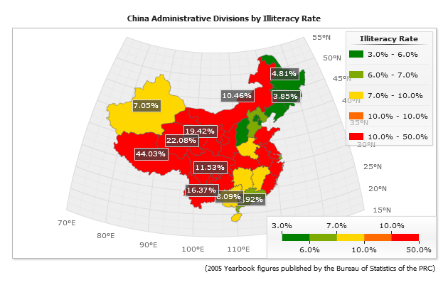
In the sample below we will display a map of China, and color China provinces according to Illiteracy Rate. We will define a custom threshold that will color provinces with Illiteracy Rate higher than 40% in "Red", from 10% to 40% percents in "Gold" and lower than 10% - in "Green".
That is how this custom threshold is defined:

01 |
<thresholds> |
02 |
<threshold name="thrIlliteracy"> |
03 |
<condition name="High" type="greaterThanOrEqualTo" value_1="{%YValue}" value_2="0.4" color="Red" /> |
04 |
<condition name="Average" type="between" value_1="{%YValue}" value_2="0.1" value_3="0.4" color="Gold" /> |
05 |
<condition name="Low" type="lessThanOrEqualTo" value_1="{%YValue}" value_2="0.1" color="Green" /> |
06 |
</threshold> |
07 |
</thresholds> |
And it is simply applied to all data on the chart:
01 |
<data threshold="thrIlliteracy" /> |
Please note that the data values are set as (for example):
01 |
<point name="Jilin" y="0.0385" /> |
But on the labels and in tooltips you can see this value as 3.85% - it is done using AnyChart number formatting feature:
01 |
<label_settings enabled="true"> |
02 |
<format><![CDATA[{%Value}{scale:(0.01)|(%)}]]></format> |
03 |
</label_settings> |

![]()
Automatic Thresholds
Automatic thresholds is a great feature for map coloring, they allow to create the thematic maps (choropleth maps) in which areas are shaded in proportion to the measurement of the statistical variable being displayed on the map.
Let's create the same China Illiteracy Rate map using one of the automatic thresholds type, to learn about available types please study the Automatic Thresholds.
01 |
<thresholds> |
02 |
<threshold name="thrIlliteracy" type="Quantiles" range_count="5" palette="YellowGradient" /> |
03 |
</thresholds> |
![]()