Attaching data to a map
Overview
AnyChart allows you to attach any data to a map, using XML configuration files, this data can contain numeric and text information that can be formatted and used in map tooltips, labels, legend or actions. In this tutorial you will learn how to attach you data to maps and how to use them.
We suppose that you've already studied at least How to create Simple Map tutorial and Map Architecture tutorial
To attach data to a map, you have to choose the map, locate the required amap file and create XML settings file, that tells AnyChart to render certain map (i.e. use certain ".amap" file), the same XML file can contain data to be attached to a map regions.

Simple values
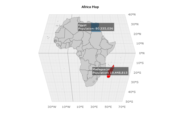
The most easy way to attach value to region is to create series of "MapRegions" type and specify y attribute that will contain numerical value (for example sales amount or region population):
02 |
<series type="MapRegions"> |
03 |
<point name="Egypt" y="80335036" /> |
04 |
<point name="Madagascar" y="19448815" /> |
Now, when this data is attached you can show the map and use this values, for example - in labels (read more about labels and tooltips configuration in Labels and Tooltips tutorial):
01 |
<map_series source="world/africa.amap"> |
02 |
<projection type="eckert1" /> |
04 |
<label_settings enabled="true"> |
05 |
<format><![CDATA[{%Name} |
06 |
Population: {%YValue}{numDecimals:0}]]></format> |
Here is a sample of a map of Africa in Eckert1 projection with population values attached and labels shown:
Live Sample: Sample Map Regions Y Value attached
Values attached to regions can be used for automatic coloring using thresholds - read more about
this in Thresholds Tutorial
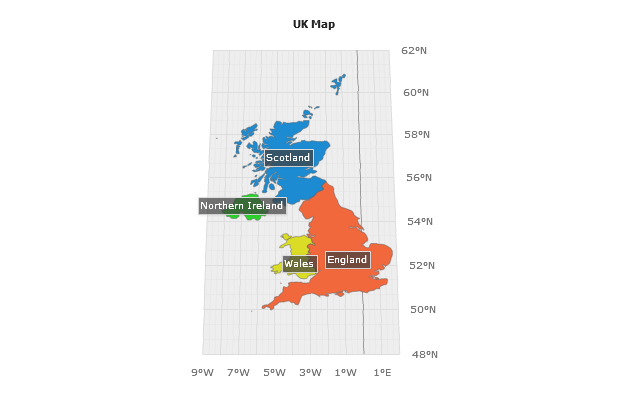
Custom Attributes (Meta Data/Additional Data)
You can attach not only simple numerical values to regions, but any number of custom
data fields - both of numerical and text type. You should use point attributes for this.
Below we will show the map of United Kingdom and attach four custom data fields to each region,
these fields will contain Population, Area (in sq miles), GDP (in trillions of USD) and Patron Saint name.
Look at sample XML settings that attach this information to England region:
01 |
<point name="England"> |
03 |
<attribute name="Population"><![CDATA[50431700]]></attribute> |
04 |
<attribute name="Area"><![CDATA[50346]]></attribute> |
05 |
<attribute name="GDP"><![CDATA[2.2]]></attribute> |
06 |
<attribute name="Patron Saint"><![CDATA[St. George]]></attribute> |
Now, when this data is attached you can show the map and use this values, for example - in tooltips,
labels will show only the names of regions (read more about labels and tooltips configuration in Labels and Tooltips tutorial):
01 |
<map_series source="europe/united_kingdom.amap"> |
02 |
<projection type="Robinson" /> |
04 |
<label_settings enabled="true"> |
05 |
<format><![CDATA[{%Name}]]></format> |
07 |
<tooltip_settings enabled="true"> |
08 |
<format><