Automatic Thresholds
Overview
Automatic thresholds is a great feature for map coloring, they allow to create the thematic maps (choropleth maps) in which areas are shaded in proportion to the measurement of the statistical variable being displayed on the map, such as population density or per-capita income. It provides an easy way to visualize how a measurement varies across a geographic area.
To learn about Thresholds in general please refer to: How to use thresholds.
![]()
Creating Automatic Threshold
To create automatic threshold you should create <thresholds> node in <chart> node and add one or several <threshold> nodes in it:

01 |
<thresholds> |
02 |
<threshold name="SampleAutoThreshold" type="EqualSteps" /> |
03 |
</thresholds> |
You can create as many <threshold> nodes as you need, you should give each threshold a unique name and set automatic threshold type.
Types of thresholds:
| Type | Description |
|---|---|
| EqualSteps | Divides the entire data range into intervals of equal size |
| Quantiles | Unequally sized data intervals based on quantiles. |
| AbsoluteDeviation | Adjusts the size of data intervals in order to minimize classification error |
| Custom (default) | Custom thresholds with user defined conditions. See more in Thresholds tutorial. |
![]()
Equal Steps Threshold
Equal Steps (or ranges, or intervals) threshold method divides the entire data range into intervals of equal size.
For example let's create a color map of Mexican states population using only four steps. We have a map of Mexico (mexico.amap) and a table of population figures for them.
States population fall within a range from 0 to 15 million, dividing this range into four equal intervals of approximately 3.75 million each. For example, the first interval could range from 0 to 3.75 million, the second interval could range from 3.75 to 7 million, etc.
To define threshold like that you have to set the following:
01 |
<thresholds> |
02 |
<threshold name="thrPopulation" type="EqualSteps" range_count="4" palette="YellowGradient" /> |
03 |
</thresholds> |
Note, that besides the type the range_count and the palette are set. range_count defines the number of intervals and palette - colors for them.
Palette is defined in <palettes> node and we've used ColorRange palette for this sample (read more about Palettes):
01 |
<palettes> |
02 |
<palette name="YellowGradient" type="ColorRange"> |
03 |
<gradient> |
04 |
<key color="Yellow" /> |
05 |
<key color="Red" /> |
06 |
</gradient> |
07 |
</palette> |
08 |
</palettes> |
Sample Map Colored with Equal Steps Threshold:

One of the obstacles of this threshold method is that it does not take into consideration how the data is distributed. Given population data is pretty much asymmetrical because Mexico State and Mexico City have a much higher population than the other states. This fact makes most of the other states to fall into the first step range and thus - the map loses a potential of showing difference in population.
![]()
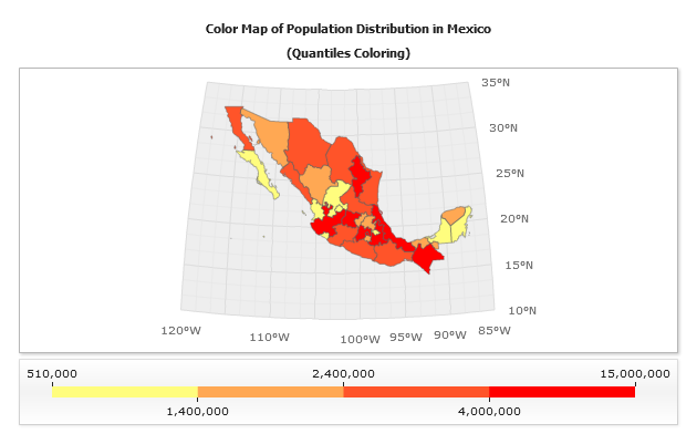
Quantiles Threshold
Quantiles method creates unequally sized intervals and arranges intervals limits so an equal number of points falls into each interval.
In the case of population data, we can set the sizes of the intervals so that 8 (of 32 total) states fit into the first one, the next 8 states - into the second, etc.
XML Settings for this threshold are (palette and ranges are the same as in previous sample):
01 |
<thresholds> |
02 |
<threshold name="thrPopulation" type="Quantiles" range_count="4" palette="YellowGradient" /> |
03 |
</thresholds> |
This method allows to create map with balanced look, but it also does not take into consideration how the data is actually distributed. This distribution method may put points which have noticeably different values into the same range. Or, it may disjoin points which have almost similar values into different intervals. As a result the map coloring may be delusive.
In the sample below map colored with Quantiles threshold looks more harmonious than previous one (colored with Equal Steps threshold) , but it leads to fallacious conclusion that there are a lot of states with high population.
![]()
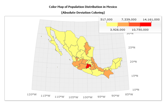
Absolute Deviation Threshold
The absolute deviation method groups points in intervals sized in a way that allows to minimize values classification error. Classification error is calculated using a formula of an absolute deviation from class median.
Consequently, the resulting maps coloring not only look harmonious, but this coloring reflects values distribution more really.
XML Settings:
01 |
<thresholds> |
02 |
<threshold name="thrPopulation" type="AbsoluteDeviation" range_count="4" palette="YellowGradient" /> |
03 |
</thresholds> |
The sample below shows population map with colors assigned by absolute deviation method. Notice that the map looks balanced, and the coloring results are more accurate, viz. - only a few states fall into in the highest population (Red) range, as it always happens in real world.
![]()
Thresholding Value
By default automatic threshold uses y value, you can use any custom attribute instead of it, just set auto_value attribute to some custom attribute or bubble size:
Bubble Size (use threshold to color bubbles):
01 |
<thresholds> |
02 |
<threshold auto_value="{%BubbleSize}" name="thrPopulation" type="Quantiles" range_count="4" palette="YellowGradient" /> |
03 |
</thresholds> |
Custom Attribute (color points of any type by their custom attribute value):
01 |
<thresholds> |
02 |
<threshold auto_value="{%CustomAttributeName}" name="thrPopulation" type="Quantiles" range_count="4" palette="YellowGradient" /> |
03 |
</thresholds> |
![]()
Color Swatch Control
Colors Watch Control is used in all three samples above, this control allows you to show thresholds in a nice and easily readable way, it is interactive and if you move the mouse over Color Range Blocks of this control - regions that fall in this range will be highlighted.
To add Color Swatch Control to your maps you should set the following in <chart_settings>:
01 |
<controls> |
02 |
<color_swatch threshold="thrPopulation" /> |
03 |
</controls> |
Read more about it in Color Swatch Control Tutorial.
![]()