Adding Custom Points, Markers and Labels to the a Map.
Overview
AnyChart allows you to add any number of custom points and/or labels to a map, you can show cities, offices or any other locations, add map description or any additional data you want to see on the map.
Note, that you can define actions to be performed on marker click (just the same way as for chart elements ) or handle events in JavaScript and get the moment when point is selected.
Markers can be positioned by latitude and longitude coordinates or bound to the regions of the given map.

Elements Positioning on a Map
There are two ways of positioning marker (label) on a map - set the coordinates of the point where marker should be placed or bind marker to the region of the map.
Binding elements to regions
Binding markers to regions is useful when you want to mark some state or a country, when you bind marker to the region it is placed in the center of the region, coordinates of the regions centers are listed in the reference of each map - CENTROID_X and
CENTROID_Y (latitude and longitude of the center) columns.
To bind marker to the region you should use link attribute of <point> node, the value of the link attribute should be one of the values from id_column (read more about identifying regions), sample xml settings are:
01 |
<series type="Marker"> |
02 |
<point link="WY" name="HQ State" /> |
You can take a look at binding markers in Points/Markers Chapter of this tutorial.
Latitude and Longitude Coordinates
Positioning points and markers using geo-coordinates is a great opportunity to make a map of your choice: you show cities, offices locations, ports or history places. Each point can have a label and tooltip, so you can add some information about the point which can be displayed near it (label) or shown when user moves the mouse over it.
To place point on a map using geo-coordinates you should set it in x and y (or lat and long) attributes of the <point>:
01 |
<point name="Los Angeles" y="34.05" x="-118.25" /> |
Or (which is the same):
01 |
<point name="Los Angeles" lat="34.05" long="-118.25" /> |
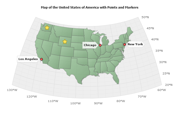
Cities markers in the sample below are positioned using this method.
Adding Points/Markers
Points and Markers are the same - it is just a point in series which type is "Marker", it can have a name, a label, a tooltip, actions attached and states (different visual appearance on hover and select).
For example you want to put several point to show main cities in USA and mark with a label some states - where ACME, corp have offices. So, you have to create two series of the marker type, create styles to tune marker appearance and settings and put this series into the data section of the chart, which is configured to show map of the USA.
Sample data section:
02 |
<series type="Marker" style="Cities"> |
03 |
<point name="New York" y="40.716667" x="-74" /> |
04 |
<point name="Los Angeles" y="34.05" x="-118.25" /> |
05 |
<point name="Chicago" y="41.881944" x="-87.627778" /> |
07 |
<series type="Marker" style="States"> |
08 |
<label enabled="false" /> |
09 |
<point link="WA" name="Washington" /> |
10 |
<point link="WY" name="Wyoming" /> |
As described in Positioning Elements Chapter you can position elements by coordinates (so we are doing for cities) and bind them to regions (that is how we are placing markers on states), note that we disabled labels for states only and left them turned on for cities.
So, we have just defined the points and set two different styles to <series>, let's take a look at the styles definitions.
They are very simple: settings for colors, marker types and borders. You can tune them more if you need to.
02 |
<marker_style name="Cities" color="Red"> |
03 |
<marker size="8" type="Circle" /> |
04 |
<border color="Black" thickness="1" /> |
06 |
<marker_style name="States" color="Gold"> |
07 |
<marker size="18" type="Star5" /> |
Now we are just creating a map th US (no Alaska and Hawaii) and adding these data series and styles:
Live Sample: Sample US Flash Map with Points and Markers Attached by geo coordinates
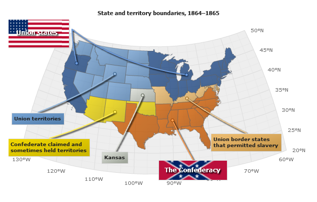
Adding Labels
Label is just a marker with marker_type="none", in the sample below we will show
the map of United States and territory boundaries as they were separated in 1864 - 1865 during the Civil War (War of Secession).
And we will add labels that will explain the map. To disable markers we set:
03 |
<marker type="none" /> |
To add markers we do all the same stuff as described above, and tune labels using several label styles, for example we
define "Union States" label like that:
01 |
<point name="Union states" x="-127" y="51" color="rgb(32, 74, 135)"> |
02 |
<label style="Union" /> |
And the "Confederacy" label style is defined in <styles> section as follows:
01 |
<label_style name="Confederacy" parent="Labels"> |
02 |
<font color="#FFFFFF" size="12"> |
04 |
<drop_shadow enabled="true" /> |
07 |
<background enabled="true"> |
08 |
<fill enabled="True" type="Image" image_url="Confederate.png" image_mode="fitbyproportions" /> |
09 |
<inside_margin all="10" /> |
Note that "Confederacy" style has a parent "Labels" style and it inherits label position from it.
Also, we've added several connectors to show explicitly the connection between areas and labels, map is colored using MapRegion series where regions are identified by their built-in names.
Live Sample: Sample US Flash Map States and Territories Civil War Secession War