CandleStick Series

Overview

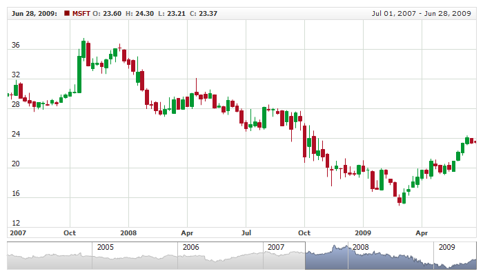
The Japanese candlestick chart is a style of bar-chart used primarily to describe price movements of an equity over time. It is a combination of a line-chart and a bar-chart, in that each bar represents the range of price movement over a given time interval. It is most often used in technical analysis of equity and currency price patterns.

Candlesticks are usually composed of the body (black or white), an upper and a lower shadow (wick). The wick illustrates the highest and lowest traded prices of a stock, and the body the opening and closing trades. If the stock went up, the body is white, with the opening price at the bottom of the body and the closing price at the top. If the stock went down, the body is black, with the opening price at the top and the closing price at the bottom. A candlestick need not have either a body or a wick.

to top

Adding Candlestick Series

Data-Provider

Before you can add Candlestick series to the chart you need to prepare Data Provider. You need four fields to create Candlestick chart: open, high, low and close. So the Data Provider should contain all these four fields.

Sample XML for Candlestick Data Provider:

XML/JSON Syntax
Plain code
01 <data_provider data_set="dataSet1" id="dp1">
02   <fields>
03     <field type="Open" column="1" approximation_type="Open" />
04     <field type="High" column="2" approximation_type="High" />
05     <field type="Low" column="3" approximation_type="Low" />
06     <field type="Close" column="4" approximation_type="Close" />
07   </fields>
01{
02  dataSet: "dataSet1",
03  id: "dp1",
04  fields: [
05    {
06      type: "Open",
07      column: 1,
08      approximationType: "Open"
09    },
10    {
11      type: "High",
12      column: 2,
13      approximationType: "High"
14    },
15    {
16      type: "Low",
17      column: 3,
18      approximationType: "Low"
19    },
20    {
21      type: "Close",
22      column: 4,
23      approximationType: "Close"
24    }
25  ]
26}

As you can see four fields are defined open, high, low and close. Now you can declare series that will use this Data Provider.

to top

Series Declaration

XML syntax to declare series with Data Provider shown above:

XML/JSON Syntax
Plain code
01 <chart>
02   <series_list>
03     <series type="Candlestick" data_provider="dp1" color="#005ECB">
04       <name><![CDATA[IBM]]></name>
05     </series>
06   </series_list>
07 </chart>
01{
02  seriesList: [
03    {
04      type: "Candlestick",
05      dataProvider: "dp1",
06      color: "#005ECB",
07      name: "IBM"
08    }
09  ]
10}

Let's put this together and create the very basic Candlestick sample:

Live Sample:  Candlestick Series

To learn more about common series settings see Common Series Settings tutorial.

to top

Configuring visualization

All visual and specific settings for Candlestick series are set in <candlestick_series> in <series> node.

The width of candlestick bar is set using width attribute: <candlestick_series width="0.5">, which accepts values from 0 to 1.

Also, you can tune different candlestick visualization depending on rise or fall of the price. These settings are done in <rising>, and <falling> nodes.

Sample XML with width and different visualization for rise and fall:

XML/JSON Syntax
Plain code
01 <series type="Candlestick" data_provider="dp1" color="#005ECB" compare_field_type="Close">
02   <name><![CDATA[IBM]]></name>
03   <candlestick_series width="0.5">
04     <rising>
05       <line enabled="true" color="#000000" thickness="1" opacity="1" />
06       <border enabled="true" color="#000000" thickness="1" opacity="1" />
07       <fill enabled="true" color="#FFFFFF" opacity="1" />
08     </rising>
09     <falling>
10       <line enabled="true" color="#000000" thickness="1" opacity="1" />
11       <border enabled="true" color="#000000" thickness="1" opacity="1" />
12       <fill enabled="true" color="#494949" opacity="1" />
13     </falling>
14   </candlestick_series>
15 </series>
01{
02  type: "Candlestick",
03  dataProvider: "dp1",
04  color: "#005ECB",
05  compareFieldType: "Close",
06  name: "IBM",
08    width: 0.5,
09    rising: {
10      line: {
11        enabled: true,
12        color: "#000000",
13        thickness: 1,
14        opacity: 1
15      },
16      border: {
17        enabled: true,
18        color: "#000000",
19        thickness: 1,
20        opacity: 1
21      },
22      fill: {
23        enabled: true,
24        color: "#FFFFFF",
25        opacity: 1
26      }
27    },
28    falling: {
29      line: {
30        enabled: true,
31        color: "#000000",
32        thickness: 1,
33        opacity: 1
34      },
35      border: {
36        enabled: true,
37        color: "#000000",
38        thickness: 1,
39        opacity: 1
40      },
41      fill: {
42        enabled: true,
43        color: "#494949",
44        opacity: 1
45      }
46    }
47  }
48}

Live Sample below shows two charts with different Candlestick series, each with own specific settings:

Live Sample:  Candlestick Series Visual Settings

To learn more about all available settings about visual settings see respective nodes in XML Reference.

to top

Legend Element

For each series you can define its element in legend. This element contains the settings for the formatting string of the text in legend that represents the series. Configuration of such elements is described in Legend: Series Labels article.

to top

Tooltips

You can either use global tooltip settings or create personal tooltips for each series. See detailed description in Tooltips tutorial.

to top

Choosing Field for Comparison Mode

When you use Candlestick series in comparison mode (when Value axis is set to "Changes" or "PercentChanges") - you need to define comparison field.

XML for comparison mode field selection:

XML/JSON Syntax
Plain code
01 <chart>
02   <series_list>
03     <series type="Candlestick" data_provider="dp1" compare_field_type="Close">
04       <name><![CDATA[MSFT]]></name>
05     </series>
06   </series_list>
07 </chart>
01{
02  seriesList: [
03    {
04      type: "Candlestick",
05      dataProvider: "dp1",
06      compareFieldType: "Close",
07      name: "MSFT"
08    }
09  ]
10}

As you can see comparison field is set in compare_field_type attribute, which can be: Open, High, Low and Close. By default it is Close.

Live sample below shows Candlestick and Line series on one chart in Comparison mode with comparison field set to Open:

Live Sample:  Candlestick Series In Comparision Mode

to top

Defaults Section

There is a special section to set default values in AnyChart Stock component XML: <series_settings_defaults>, where you can define marker and value highlighter settings for all series of the given type in one place, instead of setting them for each series individually.

For example, to configure all series of Candlestick type just set:

XML/JSON Syntax
Plain code
01 <chart>
03     <candlestick_series width="0.5">
04       <rising>
05         <line enabled="true" color="%Color" thickness="1" opacity="1" />
06         <border enabled="true" color="DarkColor(%Color)" thickness="1" opacity="1" />
07         <fill enabled="true" color="%Color" opacity="1" />
08       </rising>
09       <falling>
10         <line enabled="true" color="%Color" thickness="1" opacity="1" />
11         <border enabled="true" color="LightColor(%Color)" thickness="1" opacity="1" />
12         <fill enabled="true" color="White" opacity="1" />
13       </falling>
14     </candlestick_series>
16 </chart>
01{
03    candlestickSeries: {
04      width: 0.5,
05      rising: {
06        line: {
07          enabled: true,
08          color: "%Color",
09          thickness: 1,
10          opacity: 1
11        },
12        border: {
13          enabled: true,
14          color: "DarkColor(%Color)",
15          thickness: 1,
16          opacity: 1
17        },
18        fill: {
19          enabled: true,
20          color: "%Color",
21          opacity: 1
22        }
23      },
24      falling: {
25        line: {
26          enabled: true,
27          color: "%Color",
28          thickness: 1,
29          opacity: 1
30        },
31        border: {
32          enabled: true,
33          color: "LightColor(%Color)",
34          thickness: 1,
35          opacity: 1
36        },
37        fill: {
38          enabled: true,
39          color: "White",
40          opacity: 1
41        }
42      }
43    }
44  }
45}

Live sample below has two series of Candlestick type. All common settings defined in <series_settings_defaults/> node :

Live Sample:  Candlestick Series - Using Defaults Sections

to top