Maps in Dashboards
Overview
In dashboard mode AnyChart offers you a unique opportunity to create geo-related dashboards with maps and charts, you can show certain statistics for regions or show maps of regions on chart element click.
To learn more about dashboards read the following tutorials:
In this section we will demonstrate several Map and Charts dashboards and explain how they are created.
Dashboard with chart drill down on region select
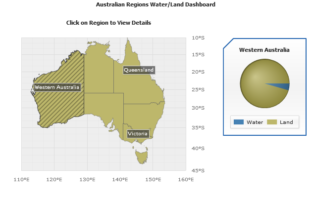
In this sample we will create a dashboard that will show the ratio pf land and water areas in the regions
of Australia. Dashboard will contain the map of Australia and a pie chart to show the ratio, when user clicks on some
region - a pie chart shows the ratio of land and water area in this region.

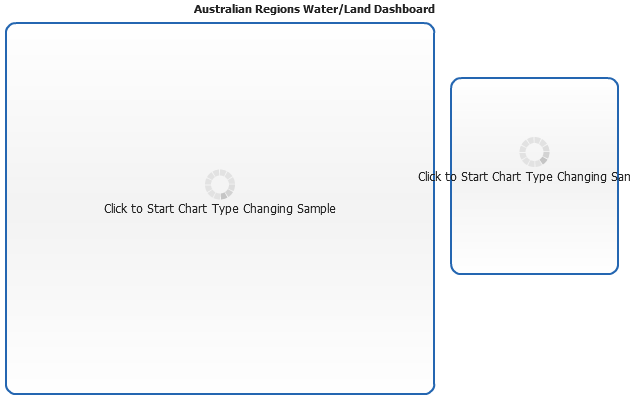
Dashboard Layout
Lets start creating this dashboard, first we will create a layout, its XML settings are:
02 |
<view type="Dashboard"> |
03 |
<background enabled="false" /> |
06 |
<text><![CDATA[Australian Regions Water/Land Dashboard]]></text> |
08 |
<hbox width="100%" height="100%"> |
10 |
<view name="Country" type="Chart" width="70%" height="100%" source="Australia" /> |
11 |
<view name="PieDetails" type="Chart" width="30%" height="70%"> |
We have added two chart "stubs" and can show this layout:
Live Sample: Australian Regions Water Land Map And Chart Dashboard Sample Layout
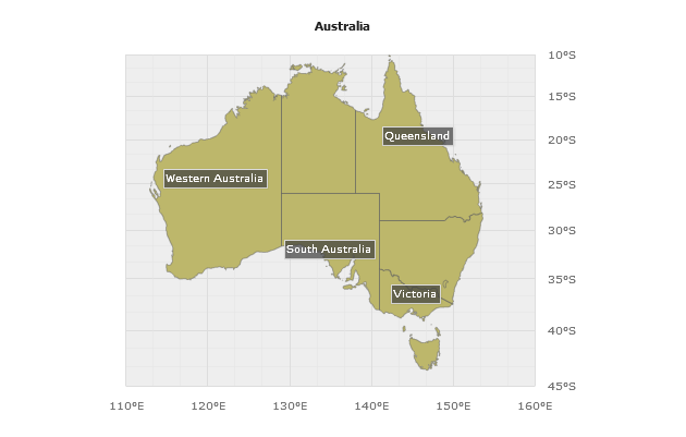
Australia Map Settings and binding data to Regions
Now we will create a map of Australia and populate it with data we need.
We will set AnyChart to use australia.amap file and in data section
we will create a MapRegion series, with one point corresponding to each region
of Australia and two custom data attributes: LandArea and WaterArea.
Creating map is easy, set source to "/oceania/australia.amap", set key
column to "REGION_NAME" and put this names in labels text:
02 |
<map_series source="oceania/australia.amap" id_column="REGION_NAME"> |
03 |
<projection type="Mercator" /> |
05 |
<label_settings enabled="true"> |
06 |
<format><![CDATA[{%REGION_NAME}]]></format> |
Adding region point with attributes is easy, too:
01 |
<point name="Victoria"> |
03 |
<attribute name="LandArea"><![CDATA[227416]]></attribute> |
04 |
<attribute name="WaterArea"><![CDATA[10213]]></attribute> |
Now we will put map settings and points together and can look at the map of Australia:
Live Sample: Australian Regions Water Land Map And Chart Dashboard Sample Australia Map
Pie Chart Settings
As mentioned above, we want to show Pie chart for each region when user clicks on it - to do this we need to configure pie chart itself, and set actions that will be performed on regions click.
Let's start with pie chart, its XML settings look like that:
01 |
<chart name="PieChart" plot_type="Pie"> |
05 |
<effects enabled="false" /> |
07 |
<tooltip_settings enabled="true"> |
08 |
<format><![CDATA[{%Name} - {%YPercentOfSeries}{numDecimals:2}%]]></format> |
10 |
<label_settings enabled="false" /> |
14 |
<series palette="Default"> |
15 |
<point name="Water" y="{$WaterArea}" color="SteelBlue" /> |
16 |
<point name="Land" y="{$LandArea}" color="DarkKhaki" /> |
20 |
<chart_background enabled="true"> |
22 |
<corners type="Cut" left_top="20" all="0" /> |
24 |
<legend enabled="true" ignore_auto_item="True" position="Bottom" align="Spread"> |
25 |
<title enabled="false" /> |
26 |
<columns_separator enabled="false" /> |
28 |
<item source="points" /> |
31 |
<title enabled="true"> |
32 |
<text><![CDATA[{$Region}]]></text> |
To understand what most of Pie Chart settings mean please refer to Pie Chart Tutorial, the only thing that should be mentioned is that {$WaterArea}, {$LandArea} and {$Region} are tokens that will be replaced by actions defined on regions click.
Region Click Action Settings
The last thing we have to do before we can arrange our interactive dashboard is to add actions on regions click.
The following settings should be added to <series> node of map:
02 |
<action type="updateView" view="PieDetails" source_mode="internalData" source="PieChart"> |
03 |
<replace token="{$Region}"><![CDATA[{%REGION_NAME}]]></replace> |
04 |
<replace token="{$LandArea}"><![CDATA[{%LandArea}{enabled:False}]]></replace> |
05 |
<replace token="{$WaterArea}"><![CDATA[{%WaterArea}{enabled:False}]]></replace> |
These settings will make AnyChart on point click collect {%LandArea} and {%WaterArea}
attrubutes, along with {%REGION_NAME} (which comes from "australia.amap") and replace
by their values the specified tokens within chart named "PieChart" and put this chart into
the view of dashboard named "PieDetails".
Final Map to Chart Dashboard
Now let's collect everything we've done (Dashboard layout, Two charts - one for map, with
attributes attached; one for pie chart, with tokens instead of values) and put it into one XML file.
Also, we will set that one of the points will be selected by default (<point selected="True">). Here it is, dashboard is ready - launch the live sample and click on regions to see the ratio of land and water areas in selected region:
Live Sample: Australian Regions Water Land Map And Chart Dashboard Sample
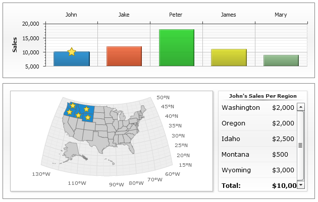
Dashboard with map drill down on column select
The sample below shows an ability to show certain geo-related data on chart elements clicks,
we will display a column chart that will show a sales amount by managers, and when user will click on the certain column - map will show in which regions this manager works and what are the sales amounts in certain regions.
All the ideas and techniques are just the same as in previous sample, and the only actual difference is that we will place a set of <point> nodes into custom attribute of each column and we will place them into <series> section to show detailed statistics on the map.
Live Sample: USA Sales Details Dashboard