Color Swatch Control
Overview
Colors Watch Control allows you to show automatic thresholds in a nice and easily readable way, it is interactive and if you move the mouse over Color Range Blocks of this control - regions that fall in this range will be highlighted.
Color Swatch can be both vertical and horizontal, can be placed to any place of a map, and you can configure it's title, labels, range blocks and tickmarks.
Color swatch also has a title, a title separator, background and margins - so it's layout is fully controlled.
Adding Color Swatch Control to a Map
To add Color Swatch Control to your maps you should set the following in <chart_settings>:
02 |
<color_swatch threshold="thrPopulation" /> |
Color Swatch works only with automatic threshold and you should always provide a proper threshold attribute value - a name of some automatic threshold defined in <thresholds> node.
In the sample below we will use a map of Mexico with the following automatic threshold on states population:
02 |
<threshold name="thrPopulation" type="EqualSteps" range_count="4" palette="YellowGradient" /> |
This is an Quantiles automatic threshold, and it works with YellowGradient color range palette:
01 |
<palette name="YellowGradient" type="ColorRange" color_count="4"> |
03 |
<key color="Yellow" /> |
This is a sample of simple Color Swatch control XML settings (placed to Bottom and width to 100%):
02 |
<color_swatch enabled="true" threshold="thrPopulation" position="Bottom" width="100%" /> |
Sample Mexico map:
Live Sample: Sample Simple Color Swatch Mexico States
Orientation and Position
Color swatch can be placed to any part of a map, as any other control, read more about Controls and Control Positioning. The special thing about Color Swatch is that it can be vertically or horizontally oriented.
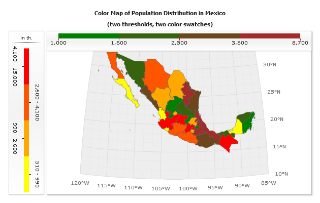
Orientation is set using orientation attribute, in the sample below we will add two Color Swatch controls, that will use two different thresholds. Thresholds will be applied to the different parts of Mexico and use different palettes.
One Color Swatch will be horizontally oriented and placed inside data plot in the top right corner, and another - vertically and placed to the left of the map with height set to 100%.
02 |
<color_swatch enabled="true" threshold="thrPopulation1" position="Left" orientation="vertical" height="100%" inverted="True"> |
03 |
<title enabled="true"> |
04 |
<text><![CDATA[in th.]]></text> |
07 |
<format><![CDATA[{%Value}{numDecimals:0,scale:(1000)|()}]]></format> |
10 |
<color_swatch enabled="true" threshold="thrPopulation2" inside_dataplot="true" anchor="RightTop" position="Fixed" width="25%"> |
11 |
<labels enabled="false" /> |
Live Sample: Sample Simple Two Oriented Color Swatches

Labels and Tickmarks
You can configure Color Swatch labels and tickmarks. Labels and tickmarks can be placed on the ranges bounds or in the center of the ranges, this option is controlled using tickmarks_placement (can be Center or RangeBounds) attribute of <color_swatch> node:
01 |
<color_swatch tickmarks_placement="Center" /> |
Labels Formatting
You can change text settings for labels, the main point is that
you can use {%Value} keyword when tickmarks are placed on the ranges bounds, or use
{%RangeMin} and {%RangeMax} keywords when tickmarks are placed
in the centers of ranges. {%Value} keyword in the last case returns arithmetic mean of interval.
Labels Appearance
You can tune labels appearance, rotate them or turn off them, all these settings can be done in <labels> subnode of <color_swatch>.
Tickmarks Appearance
Tickmarks are configured as a simple line in <tickmark> subnode, you can change its color, thickness and size (length).
Sample labels and tickmarks configuration
In the sample below we will show two Color Swatch controls with labels and tickmarks configured in a different way:
Live Sample: Sample Color Swatches Labels Tickmarks
Range Bars Appearance
Range Bars Appearance can be changed in <range_item> subnode. You can set bar width, height and background (Tip: use %Color to get range auto generated color).
Look at all settings reference in XML Reference.