Controls and Controls Positioning
Overview
There are several types of controls that you can add to any Chart or Map, you can create multiple titles, multiple legends, add custom labels or images. For Maps there are three special controls: Color Swatch, Zoom Panel and Navigation Panel.
Control Types
| Type/Node | Description | Multiple | Charts | Maps |
|---|---|---|---|---|
| Label <label> |
Adds a text with background to a chart or map. | Yes | Yes | Yes |
| Adds a legend with automatic or custom items. | Yes | Yes | Yes | |
| Same as label, used to ease adding title to a chart or a map. | No | Yes | Yes | |
| Subtitle <subtitle> |
Same as label, used to ease adding subtitle to a chart or a map. | No | Yes | Yes |
| Footer <footer> |
Same as label, used to ease adding footer to a chart or a map. | No | Yes | Yes |
| Color Swatch <color_swatch> |
Used to visualize automatic thresholds. | Yes | No | Yes |
| Navigation Panel <navigation_panel> |
Arrows to navigate a map when it is zoomed. | No | No | Yes |
| Zoom Panel <zoom_panel> |
Zoom control that provides zoom in/out capability. | No | No | Yes |
| Custom Map Regions Label <map_region_label> |
Custom Map Labels for Small regions | Yes | No | Yes |
Positioning controls
There are two groups of control which are positioned in a little bit different way: first group consists of <title>, <subtitle> and <footer>, and the second group - all the rest controls.
Here is the list of attributes that are used to configure control position - they are also described in XML Reference, in appropriate control node description.
| Node | Attribute | Description |
|---|---|---|
| <controls> | align_top_by | When inside_dataplot="false" this attributes defines alignment base for all controls with position set to "Top|Bottom|Left|Right" accordingly, can be "Chart" or "Dataplot". Read more |
| align_bottom_by | ||
| align_left_by | ||
| align_right_by | ||
| <label>, <legend>, <color_swatch>, <navigation_panel>, <zoom_panel> (any control) |
position | Sets control position ("Left","Right","Top",
"Bottom",
"Fixed", "
Float"). Read more |
| align | Sets control alignement, doesn't work with float and fixed position ("Near", "Far", "Center", "Spread") | |
| inside_dataplot | Defines whether control is placed inside dataplot ("True", "False"). | |
| z_index | Defines z-index of control - only for Float anf Fixed positions. Read more |
|
| anchor | Sets control placement in Float or Fixed position modes. Read more |
|
| horizontal_padding | Sets horizontal padding of control (Float and Fixed position modes). Read more |
|
| vertical_padding | Sets vertical padding of control (Float and Fixed position modes). Read more |
|
| width | Sets width of control, can be either absolute (pixels) or percentage (to chart width). | |
| height | Sets height of control, can be either absolute (pixels) or percentage (to chart width). | |
| <margin> | all | <margin> subnode can be contained in any control and defined top, botttom, left and/or right outer margins of control. |
| left | ||
| right | ||
| top | ||
| bottom |
Title, Subtitle and Footer
Title, Subtitle and Footer are created to cover basic annotating needs. All these controls can be placed to the right, to the left, to the bottom or to the top of the chart, they can be aligned by chart or data plot only, also they can be placed inside of the data plot.
When placed to the left or to the right - they are rotated automatically. No other control can be placed "near" - in the same row or column where title, subtitle or footer is placed. If you need to titles in the same line - use custom labels in <controls> node to create them.
Most of titles options are explained in Chart Titles Article.
Fixed and Float Positioning
Fixed and Float Position modes are created to place a controls anywhere on the chart, the difference between them is that in when position is Float - user can drag the control to other place, and when position is Fixed - it is not possible.
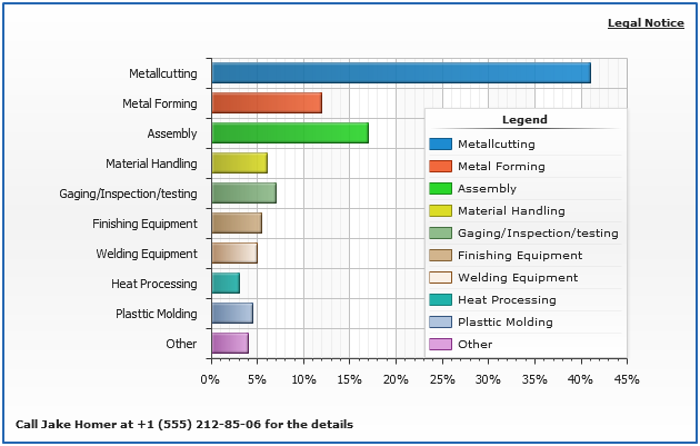
On the sample chart below legend placed inside of the data plot can be moved, and custom labels in the corners of the chart - can't.
Anchors
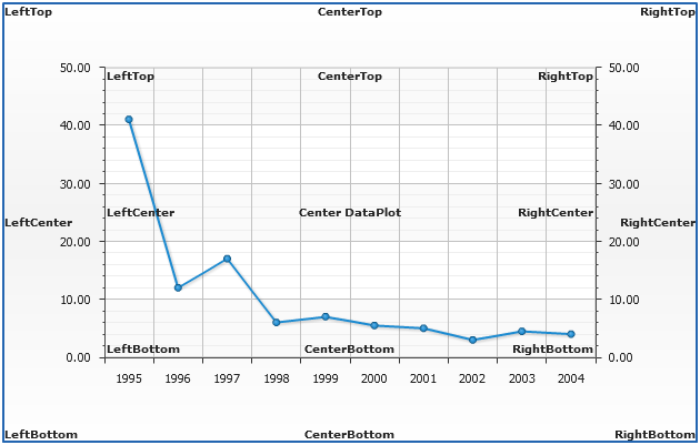
When the control is positioned in Float or Fixed modes they are always anchored to the one of nine possible anchor points: "LeftTop", "RightTop", "LeftBottom", "RightBottom", "LeftCenter", "RightCenter", "TopCenter", "BottomCenter" or "Center".
Actually there are 16 of them - anchor depends on the value of inside_dataplot attribute.

01 |
<controls align_top_by="Chart" align_bottom_by="DataPlot"> |
02 |
<label position="Fixed" anchor="LeftTop" inside_dataplot="true"> |
03 |
<text><![CDATA[Sample Label]]></text> |
04 |
</label> |
05 |
<label position="Fixed" anchor="LeftTop"> |
06 |
<text><![CDATA[Sample Label]]></text> |
07 |
</label> |
08 |
</controls> |
The sample chart belows demonstrates all (without Center Chart) possible anchors with a label controls:
Paddings
Attributes horizontal_padding and vertical_padding paddings define the vertical and horizontal shifts of anchor point, the directions of the shifts depend on anchor - for example: if anchor is set to "LeftTop", horizontal padding will shift control to the left down and vertical - down; if anchor is set to "RightBottom", horizontal padding will shift control to the left and vertical - up.
01 |
<controls> |
02 |
<label position="Float" anchor="RightBottom" inside_dataplot="true" vertical_padding="30" horizontal_padding="30"> |
03 |
<text><![CDATA[Percentage of Total Spendings]]></text> |
04 |
</label> |
05 |
</controls> |
z-Index
If you several controls in Fixed or Float overlay each other you can use z-index attribute to set which of them will be in front, and which shold be sent to back.
01 |
<controls align_top_by="Chart" align_bottom_by="DataPlot"> |
02 |
<label position="Fixed" anchor="LeftTop" width="100" height="100" /> |
03 |
<label position="Fixed" anchor="LeftTop" width="200" height="80" vertical_padding="10" horizontal_padding="10"> |
04 |
<text><![CDATA[Sample Label]]></text> |
05 |
</label> |
06 |
</controls> |
Using this attribute you can create a "Toolbar"-like panel of controls.
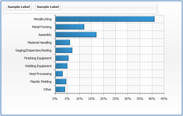
Side Positioning (Top/Bottom/Left/Right)
You can place any number of custom controls to one of four sides of the chart: "Top", "Bottom", "Left" or "Right".
AnyChart automatic engine will move all controls and data plot to create most usefull view of the chart, however you may not be satisified with the results - in this case you should use "Fixed" positioning mode with paddings and margind set manually.
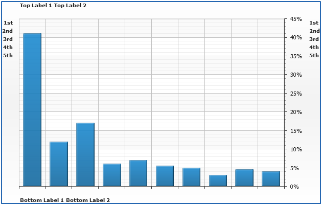
Align By (Chart/Data Plot)
When you are placing several custom controls to one of four sides you can set whether this controls should be aligned by chart or only by data plot. This is controlled using: align_top_by, align_bottom_by, align_left_by and align_right_by attributes of <controls> node.
01 |
<controls align_top_by="Chart" align_bottom_by="DataPlot"> |
02 |
<label position="Top" align="Center"> |
03 |
<text><![CDATA[Sample Label]]></text> |
04 |
</label> |
05 |
<label position="Bottom" align="Center"> |
06 |
<text><![CDATA[Sample Label]]></text> |
07 |
</label> |
08 |
</controls> |
In the sample below titles on the top are aligned by the chart, and titles to the bottom - by the data plot.
Align (Near/Far/Center/Spread)
Each control can be aligned, possible align: "Near", "Far", "Center" and "Spread", this can stand for "Left", "Right", "Top", "Bottom" in general sense. The sample below shows what is "Near" and, "Far" for "Top", "Bottom", "Right" and "Left" positions.
01 |
<controls> |
02 |
<label position="Right" align="Near"> |
03 |
<text><![CDATA[Sample Label in Right Near]]></text> |
04 |
</label> |
05 |
<label position="Bottom" align="Far"> |
06 |
<text><![CDATA[Sample Label]]></text> |
07 |
</label> |
08 |
</controls> |
Multiple labels sample: