Custom Labels
Overview
Custom labels are text or image controls that can be placed anywhere on your chart or map to add descriptions or comments. Labels can be both text and image, they also can have actions attached.
This article describes labels visualisation and interactivity settings - if you need to know about custom labels positioning, please study Controls and Controls Positioning.

Text Labels
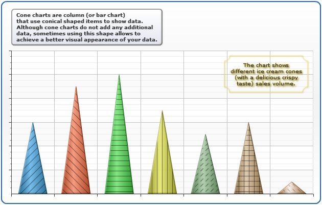
The sample below demostrates two labels - one at the top, with Cone type description, it is styled using <label_style name="Vista"> defined in <styles>, and the second label - placed inside data plot - it is styled within <label> node.
Full list of available settings can be found in XML Reference, <controls><label> node and <styles><label_style> node.
Live Sample: Sample Custom Labels Cone Chart
Image Labels
If you need to place image on the chart, you have to create label without text (or with text, if you'd like to) and configure image background for it. You can as as many images as you need.
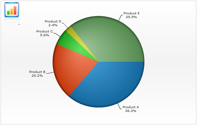
Sample chart below shows a revenue chart with a company logo in the left top corner of data plot, image label settings should be like this:
02 |
<label text_align="Center" position="Fixed" anchor="LeftTop" inside_dataplot="true" width="51" height="65"> |
03 |
<background enabled="true"> |
04 |
<fill enabled="True" type="Image" image_url="logo_anychart.gif" image_mode="FitByProportions" /> |
05 |
<border enabled="false" /> |
07 |
<text><![CDATA[.]]></text> |
Adding this to the <chart_settings> section will allow you to display chart like that:
Live Sample: Sample Image Labels Pie Chart
Attaching Actions
You can attach actions to labels and turn them into controls that can change an appearance of
a chart or invoke some external function.
Sample below wil demonstrate you calling external function on text labels and changing chart on image labels click.
To attach an action to the label you have to add <actions> node into <label> and specify any number of <action> nodes in it. Full list of available actions is described in Interactivity Article.
Three chart types icons update the chart and change its type and some settings, all charts settings are stored in a single xml (named <chart> nodes), all three charts are based on one <template> that sets defaults (like chart title and labels themselves).
Sample action labels settings look like this:
01 |
<label position="fixed" anchor="LeftTop" align_by="Chart" vertical_padding="10" horizontal_padding="30" width="20" height="19"> |
02 |
<background enabled="true"> |
03 |
<fill enabled="True" type="Image" image_url="bar.gif" image_mode="FitByProportions" /> |
04 |
<border enabled="false" /> |
07 |
<action type="updateChart" source_mode="internalData" source="Bar" /> |
Launch the live sample and click on labels to see how chart changes, "Notice" and "Terms" launch
JavaScript functions, not that "Terms" label has two actions attached.
Live Sample: Sample Interactive Labels