Convert Simple Chart to Column/Pie/Area etc.
Overview
In this tutorial we suppose that you've already studied Creating Simple Chart using JavaScript tutorial and understand how to create a chart using AnyChart and place it into web page.
AnyChart offers you a very flexible mechanism allowing to plot a lot of charts using single swf file, so the only thing you have to do to change chart type is to switch some XML Settings.
Experienced users, please refer to Chart Combination tutorial.

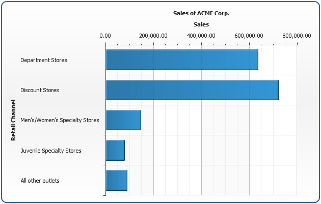
So we have a Bar chart, that is configured using an XML shown below:
01 |
<?xml version="1.0" encoding="UTF-8"?> |
04 |
<chart plot_type="CategorizedHorizontal"> |
06 |
<series name="Year 2003" type="Bar"> |
07 |
<point name="Department Stores" y="637166" /> |
08 |
<point name="Discount Stores" y="721630" /> |
09 |
<point name="Men's/Women's Specialty Stores" y="148662" /> |
10 |
<point name="Juvenile Specialty Stores" y="78662" /> |
11 |
<point name="All other outlets" y="90000" /> |
16 |
<text><![CDATA[Sales of ACME Corp.]]></text> |
21 |
<text><![CDATA[Sales]]></text> |
25 |
<labels align="Outside" /> |
27 |
<text><![CDATA[Retail Channel]]></text> |
Here it is - you can view it clicking on a sample image:
Live Sample: Sample Converting Bar Chart
Read more about Bar Chart.
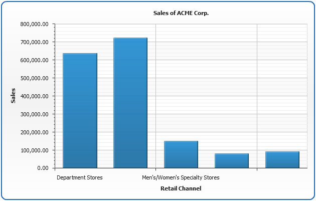
Convert to Column Chart
Column chart is the same chart as Bar chart, but its orientation is different, so we have to change an orientation
of our data plot to create Column Chart. Orientation is controlled using plot_type attribute of chart node, so let's change it:
01 |
<chart plot_type="CategorizedVertical" /> |
That's it. Column chart is ready, launch the live sample and see that it is the only thing in XML that had changed:
Live Sample: Sample Converting Column Chart
Read more about Column Chart.
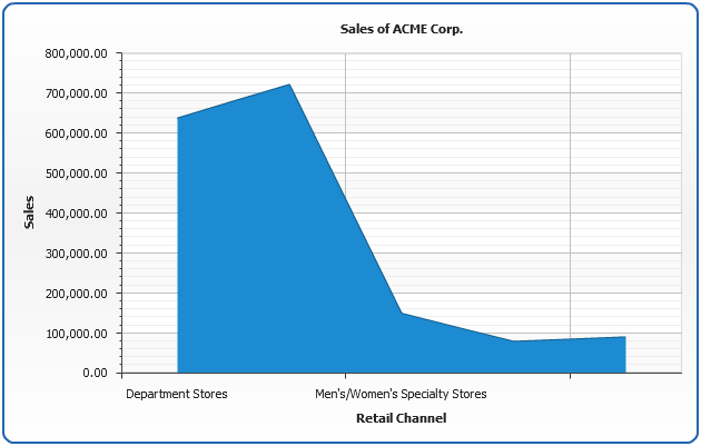
Convert to Area Chart
In order to get Area Chart from Bar chart we have to set plot_type="CategorizedVertical" and <series type="Area">:
01 |
<chart plot_type="CategorizedVertical"> |
03 |
<series type="Area" /> |
That's it. Area chart is ready, launch the live sample and see XML:
Live Sample: Sample Converting Area Chart
Read more about Area Chart.
Convert to Pie Chart
Pie chart is a little bit different than others: we have to set plot_type="CategorizedVertical" and remove series type <series>:
01 |
<chart plot_type="Pie"> |
That's it. Pie chart is ready, launch the live sample and see XML:
Live Sample: Sample Converting Pie Chart
Read more about Pie Chart.
Conclusion
Hope you've get a general idea - to built a certain chart type using AnyChart you just have to know
what XML Settings create it, to find this out you just have to open a certain type tutorial - read it, or even
simply open the first sample from the tutorial and copy its XML Settings.
Full list of charts and links to tutorials can be found here: Chart Types