Chart Combination
Overview
AnyChart architecture allows you to combine all types of featured charts. There two methods of combination: combination within one data plot and combination within a dashboard. The first way has some limitations - some types of chart can be combined and some - can not, dashboard allows you to combine everything, because it can contain several data plots arranged in the way you like. Below you will see a table presenting an availability if combination and samples for both ways.

Available Combinations
Many other chart vendors list different combined charts as a new chart type - in AnyChart we don't do that, because the number of charts will be out several hundreds. We just give you a very flexible method of combining different chart types, and you can combine not only two of them, but several types at once. Below both single data plot and dashboard combination methods are demonstrated and explained.
Please note that an abilty to combine may depend on the swf file used .
Combination within one data plot
If you want to show to charts of the different types on the same data plot,
all you need to do is to create several data series of the different (but combinable) types.
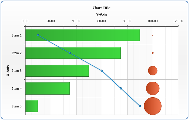
Lets take a closer look at this method: we will combine Bar, Line and Bubble chart:
The data tables for all three data series, note that all three series
have the same arguments (names):
| Type |
Column |
Line |
Bubble |
| Values\Argument(s) |
Y |
Y |
Y |
Size |
| Item A |
90 |
10 |
100 |
10 |
| Item B |
75 |
35 |
100 |
20 |
| Item C |
50 |
50 |
100 |
30 |
| Item D |
35 |
75 |
100 |
40 |
| Item E |
10 |
90 |
100 |
50 |
Now we need to convert this data to XML:
02 |
<series name="Bar series" type="Bar"> |
03 |
<point name="Item 1" y="90" /> |
04 |
<point name="Item 2" y="75" /> |
05 |
<point name="Item 3" y="50" /> |
06 |
<point name="Item 4" y="35" /> |
07 |
<point name="Item 5" y="10" /> |
09 |
<series name="Line series" type="Line"> |
10 |
<point name="Item 1" y="10" /> |
11 |
<point name="Item 2" y="35" /> |
12 |
<point name="Item 3" y="50" /> |
13 |
<point name="Item 4" y="75" /> |
14 |
<point name="Item 5" y="90" /> |
16 |
<series name="Bubble series" type="Bubble"> |
17 |
<point name="Item 1" y="100" size="10" /> |
18 |
<point name="Item 2" y="100" size="10" /> |
19 |
<point name="Item 3" y="100" size="10" /> |
20 |
<point name="Item 4" y="100" size="10" /> |
21 |
<point name="Item 5" y="100" size="10" /> |
Now set this data section into AnyChart XML and the combined chart is ready:
Live Sample: Sample Combination Chart - Line Column and Bubble
If now we will switch plot_type to "CategorizedHorizontal" - we will get a
Bar, Line and Bubble combination Chart:
01 |
<chart plot_type="CategorizedHorizontal" /> |
Live Sample: Sample Combination Chart - Line Bar and Bubble
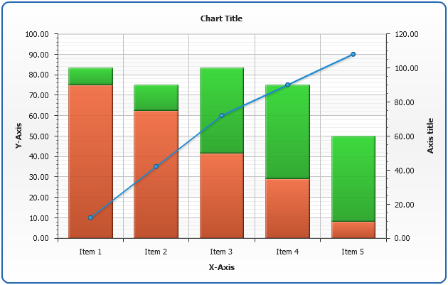
And the last thing you need to know about chart combination within a data plot is the fact that you can use different axes to the series you combine, below we will plot a Stacked Column chart combined with a Line chart, Stacked Column will use an additional Y axis:
To configure an extra axis you should use the following XML Settings (learn more about Extra Axes in Extra Axes Tutorial)
03 |
<y_axis name="y2" enabled="True"> |
04 |
<scale mode="Stacked" /> |
To bind bar series to this axis you should use y_axis attribute of <series> node:
01 |
<series name="Sample" type="Bar" y_axis="extra_y_axis_1" /> |
Sample Stacked Column Chart combined with Line chart:
Live Sample: Sample Combination Chart - Stacked Column and Line
Combination within a dashboard
Dashboard option of AnyChart allows you to combine all featured types, actually
allowing you to create several charts within one XML and specify how the should be displayed
within one Flash movie. Learn more about dashboard building in Dashboard Tutorial.
Below you can see a sample dashboard built using the data introduced above and a
Pie chart - they can not be combined within a single data plot:
Live Sample: Sample Combination Chart - Simple Dashboard - Line Column and Pie