Your first vertical gauge
Overview
In this tutorial we will go through the creation of the basic vertical gauge step by step, trying to cover all major elements and pointing to the articles for the further tuning a gauge.
So, a Vertical Gauge is a slider, with a single or multiple pointers to show your data value, gauge has some scale, usually colored for easy value quality distinction.
We will start from the scratch adding or configuring gauge elements on the each step, as a result we will create a typical ACME Corp. Monthly Sales Level gauge.
Note: in this sample AnyChart.swf is used, but you can optimize the page with selected chart type if you use custom type dependent swf. These swfs are described in SWFs Guide.
Gauge Sample:

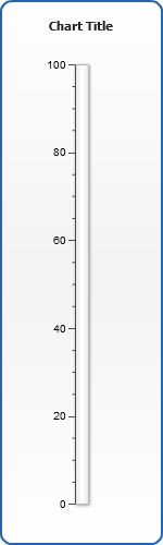
Step 1. Basic Gauge - Choosing Layout
First of all we need to choose a gauge type, in this sample it should be horizontal linear gauge, so we put the
following XML settings:
01 |
<?xml version="1.0" encoding="UTF-8"?> |
05 |
<linear orientation="vertical" /> |
As you can clearly see from this XML Snippet we tell AnyChart to create one linear gauge with vertical
orientation, as a result we get the following output:
Live Sample: Sample Simple vertical Gauge Step 1
As you can see, by default gauge has no pointers and some default scale with labels and tickmarks,
when trying to recreate this sample please note that you should set appropriate size for AnyChart object
in you page (height="500" width="150" in our sample). AnyChart Gauges can be resized, but if you want
to create the vertical linear gauge - it is recommended to start with height that is greater than width.
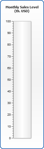
Step 2. Scale Settings and Title
Now we will define the scale of the gauge, let's say that ACME Corp.
monthly sales level is measured in thousands of dollars from 0 to 1000 th.
Let's put this into XML:
01 |
<?xml version="1.0" encoding="UTF-8"?> |
06 |
<title text_align="Center"> |
07 |
<text><![CDATA[Monthly Sales Level |
11 |
<linear orientation="vertical"> |
13 |
<scale minimum="0" maximum="100" major_interval="10" minor_interval="2" /> |
Note: <axis size="50"> means that we want gauge axis to cover 50% percents of a gauge width - to understand this better you need to study Positioning, Resizing and Axis Overview Tutorials.
Now we will see the following result:
Live Sample: Sample Simple vertical Gauge Step 2
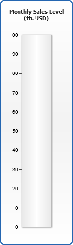
Step 3. Labels and Tickmarks
When the scale is ready we can set how labels and tickmarks, we will remove
decimal digits from labels and minor tickmarks. Only axis node is shown
for better comprehension:
02 |
<scale minimum="0" maximum="100" major_interval="10" minor_interval="2" /> |
03 |
<labels enabled="true"> |
05 |
<format><![CDATA[{%Value}{numDecimals:0}]]></format> |
07 |
<minor_tickmark enabled="false" /> |
Now the scale looks this way:
Live Sample: Sample Simple vertical Gauge Step 3
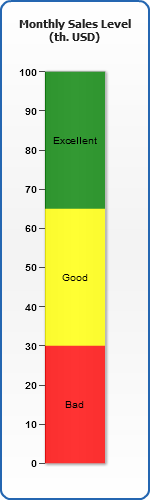
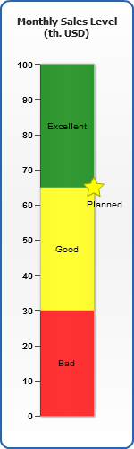
Step 4. Color Ranges
An essential part of vertical gauges are color ranges that are used to distinct the quality
of value shown, in our example we will create three color ranges "Bad", "Good" and "Excellent" sales levels.
The syntax should be as follows:
02 |
<scale minimum="0" maximum="100" major_interval="10" minor_interval="2" /> |
03 |
<labels enabled="true"> |
05 |
<format><![CDATA[{%Value}{numDecimals:0}]]></format> |
07 |
<minor_tickmark enabled="false" /> |
09 |
<color_range start="0" end="30" color="Red"> |
11 |
<format><![CDATA[Bad]]></format> |
14 |
<color_range start="30" end="65" color="Yellow"> |
16 |
<format><![CDATA[Good]]></format> |
19 |
<color_range start="65" end="100" color="Green"> |
21 |
<format><![CDATA[Excellent]]></format> |
Here we are - our gauge is colored:
Live Sample: Sample Simple vertical Gauge Step 4
Step 5. Adding Markers
Also, it may be useful to point our some special point, for example, planned sales level, we can
so that with the custom axis labels, that can have a custom tickmark.
02 |
<scale minimum="0" maximum="100" major_interval="10" minor_interval="2" /> |
03 |
<labels enabled="true"> |
05 |
<format><![CDATA[{%Value}{numDecimals:0}]]></format> |
07 |
<minor_tickmark enabled="false" /> |
09 |
<custom_label value="65" enabled="true"> |
10 |
<label align="Outside" enabled="true"> |
11 |
<position valign="Bottom" halign="Center" padding="10" /> |
12 |
<format><![CDATA[Planned]]></format> |
14 |
<tickmark enabled="true" shape="Star5" width="20" length="20" align="Outside" padding="-10"> |
15 |
<fill color="Yellow" /> |
16 |
<border color="DarkColor(Yellow)" /> |
Now we can clearly see planned level on a gauge.
Live Sample: Sample Simple vertical Gauge Step 5
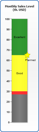
Step 6. Pointer
One of the last, but one of the main parts of a gauge is a pointer - there are several ways to display it, but we will choose the most typical for this type of the gauges (all previously set nodes are left apart in the snippet):
01 |
<?xml version="1.0" encoding="UTF-8"?> |
05 |
<linear orientation="vertical"> |
07 |
<pointer type="bar" value="35" color="Gray" /> |
Now the current sales level is shown, as you can see from the syntax you can place several pointers
on one gauge, they can be of a different shape and placed differently (this fact, by the way, allows to create
the Bullet Graphs with AnyChart easily):
Live Sample: Sample Simple vertical Gauge Step 6
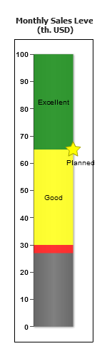
Step 7. Tuning frame and Margins
The final step in gauge creation is the definition of a frame and setting up margins. Frame is a complex graphical element that allows to display really nice-looking gauge. We will remove a general chart background and border, remove margins and configure frame in a desirable way.
01 |
<?xml version="1.0" encoding="UTF-8"?> |
07 |
<title text_align="Center"> |
08 |
<text><