Bullet Graph
Overview
A bullet graph is a variation of a bar graph developed by Stephen Few. Seemingly inspired by the traditional thermometer charts and progress bars found in many dashboards, the bullet graph serves as a replacement for dashboard gauges and meters. Few developed bullet graphs to overcome the fundamental issues of gauges and meters; they typically display too little information, require too much space, and are cluttered with useless and distracting decoration. The bullet graph features a single, primary measure (for example, current year-to-date revenue), compares that measure to one or more other measures to enrich its meaning (for example, compared to a target), and displays it in the context of qualitative ranges of performance, such as poor, satisfactory, and good. The qualitative ranges are displayed as varying intensities of a single hue to make them discernible by those who are color blind and to restrict the use of colors on the dashboard to a minimum.
AnyChart allows you to create bullet graph using variety of pointer styles and configurable visualization, please look at the samples described below to understand how to create Bullet Graphs with AnyChart.

Single Bullet Graph Sample
It fast bullet graph consists of two groups of elements that are unique for it and distinguish it from other linear gauges. They are typical color ranges and pointers. Let's at first create a scale bar and color ranges corresponding to our bullet graph and choose a layout for them.
So we create a linear gauge with horizontal orientation:
01 |
<linear orientation="Horizontal" /> |
Then we set axis size and scaling:
01 |
<linear orientation="Horizontal"> |
03 |
<scale minimum="0" maximum="300" major_interval="50" /> |
Now we create labels for our gauge and place them under it. We also add a decorative element: a narrow line in the bottom of the gauge:
01 |
<linear orientation="Horizontal"> |
03 |
<scale minimum="0" maximum="300" major_interval="50" /> |
04 |
<labels align="Outside" padding="20" /> |
05 |
<scale_line align="Outside" /> |
We disable scale_bar and add tickmarks:
01 |
<linear orientation="Horizontal"> |
03 |
<scale minimum="0" maximum="300" major_interval="50" /> |
04 |
<labels align="Outside" padding="20" /> |
05 |
<scale_line align="Outside" /> |
06 |
<scale_bar enabled="false" /> |
07 |
<major_tickmark align="Outside" length="20" /> |
08 |
<minor_tickmark enabled="false" /> |
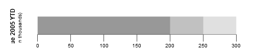
And now the final step: let's add color ranges with various hues of gray color that will finalize the view of our bullet graph:
02 |
<color_range start="0" end="200" start_size="%AxisSize" end_size="%AxisSize"> |
03 |
<fill color="RGB(127,127,127)" /> |
05 |
<color_range start="200" end="250" start_size="%AxisSize" end_size="%AxisSize"> |
06 |
<fill color="RGB(178,178,178)" /> |
08 |
<color_range start="250" end="300" start_size="%AxisSize" end_size="%AxisSize"> |
09 |
<fill color="RGB(217,217,217)" /> |
The result is as follows:
Live Sample: Sample Bullet Gauge 1
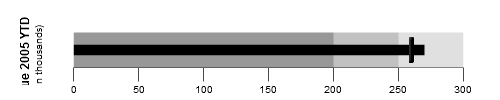
Now we miss only one thing: pointers. Or, to be strict, two things, because we will add two pointers on our bullet graph. One will be a bar pointer and another - marker pointer, that will imitate some sort of mark. At first we add bar pointer:
01 |
<pointer value="270" color="Black"> |
02 |
<bar_pointer_style width="%AxisSize*0.3" /> |
And then marker. It's a rectangular - shaped marker. Note that you can move not only your bar pointer but marker pointer too:
01 |
<pointer value="260" color="Black" type="Marker"> |
02 |
<marker_pointer_style shape="Rectangle" height="%AxisSize*0.1" width="%AxisSize*0.7" align="Center" /> |
And finally we get the result:
Live Sample: Sample Bullet Gauge 2
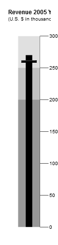
To make this Bullet Graph vertical you just need to change orientation attribute
to "Vertical", position attribute of title node to "top" and adjust width (to 120) and height (let it be 500):
Live Sample: Sample Bullet Gauge 3
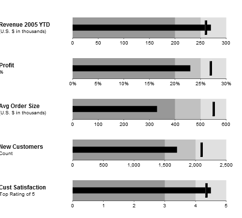
Bullet Graph Dashboard
Here is a sample of bullet graph dashboard usage:
Live Sample: Sample Bullet Gauge 4