Custom Axes Ranges (Areas)
Overview
Custom axes ranges (sometimes referred as areas or zones) are colored areas bound to an axis, that are drawn through data plot, they can be drawn basing on two values or four values - starting and ending.
These areas are useful when you need to name a highlight some value(s) on an axis, each area can have a label with custom text to describe it. If you need custom axes labels without areas, please take look at Custom Axes Labels article.
You can add custom ranges on any axis, both x axis, y axis and additional axes.

Adding axis range (area)
To add custom range you need to create <axis_markers> subnode in certain axis node (for example <y_axis>) and add <ranges> subnode in it. Each custom range is configured in <range> subnode of <ranges>:
04 |
<range minimum="0" maximum="10000"> |
07 |
<format><![CDATA[Severe]]></format> |
10 |
<range minimum="10000" maximum="20000" color="Gold"> |
13 |
<format><![CDATA[Average]]></format> |
16 |
<range minimum="20000" maximum="30000" color="Green"> |
17 |
<fill color="Green" /> |
19 |
<format><![CDATA[Good]]></format> |
You can configure visualization of top and bottom lines as any line or border in AnyChart, refer to Line and Border configuration.
If you need horizontal or vertical range - set only minimum and maximum attributes, if you need inclined ranges - use start_minimum, end_minumum, start_maximum and end_maximum.
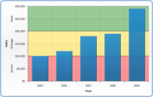
The sample below shows horizontal axes ranges.
Note 1: Inclined ranges start from the axis and when axis position changes - range is changing the direction.
Note 2: Use display_under_data = "false" to draw range over the chart series.
Live Sample: Sample Custom Axes Ranges Areas Zones
Prcalculated ranges values
When setting value for custom range you may either use constant value or Axis Keywords.
Axis keywords are contain several precalculated values that can be used as value. The table below lists all built-in keywords that provide axis data and can be used as a values for custom ranges (and lines ).
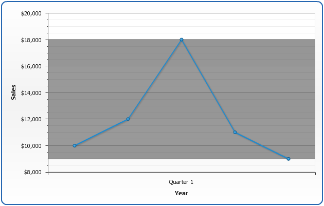
Using this feature you can add, for example, mark range from minumal to maximal value on the chart to any chart you plot, without setting the number for each chart individually.
| Keyword |
Description |
| {%AxisMax} |
The maximal value of all points in series that are bound to this axis. |
| {%AxisMin} |
The minimal value of all points in series that are bound to this axis. |
| {%AxisScaleMax} |
The maximal scale value. |
| {%AxisScaleMin} |
The minimal scale value. |
| {%AxisAverage} |
The average value of all points in series that are bound to this axis. |
| {%AxisMedian} |
The median value of all points in series that are bound to this axis. |
| {%AxisMode} |
The mode value of all points in series that are bound to this axis. |
| {%AxisSum} |
The sum of all y values of all points in series that are bound to this axis. |
The sample below shows marking chart from minimal to maximal value using keywords:
Live Sample: Sample Custom Ranges Precalculated
Configuring label
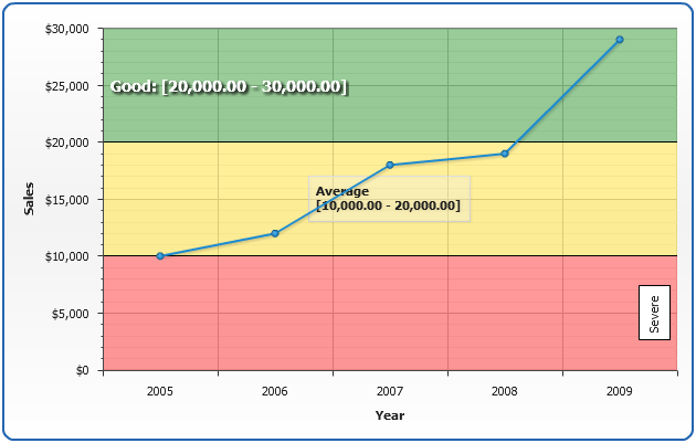
You can configure label placement, font and text of any custom range.
In <format> you can use {%MinValue} and {%MaxValue} keywords ({%MinStartValue}, {%MinEndValue}, {%MaxStartValue} and {%MaxEndValue} for inclined ranges).
When range is inclined are set {%MinValue} keyword returns an arithmetic mean of {%MinStartValue} and {%MinEndValue}, and {%MaxValue} keyword returns an arithmetic mean of {%MaxStartValue} and {%MaxEndValue}.
Label placement is controlled using position attribute of <label> node, possible position values are: "Axis", "Near", "Center", "Far", "BeforeAxisLabels" and "AfterAxisLabels".
Sample XML for labels formatting:
01 |
<range minimum="20000" maximum="30000" color="Green"> |
02 |
<fill color="Green" /> |
03 |
<label position="Near" enabled="true"> |
04 |
<format><![CDATA[Good: [{%MinValue} - {%MaxValue}] ]]></format> |
05 |
<font size="14" color="White" bold="true"> |
06 |
<effects enabled="True"> |
07 |
<drop_shadow enabled="True" /> |
In the sample below you can see different label positions and text formatting:
Live Sample: Sample Custom Axes Ranges Areas Zones Labels
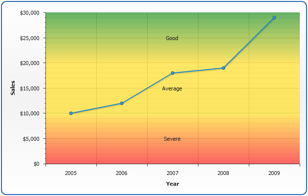
Advanced ranges visualization
As it was already stated above you can configure top and bottom lines of range, but you can also use
gradient, image and hatch fills of range to achieve desired style of your charts.
Sample XML for gradient filled range:
01 |
<range minimum="20000" maximum="30000"> |
02 |
<maximum_line enabled="false" /> |
03 |
<minimum_line enabled="false" /> |
04 |
<fill type="Gradient" opacity="0.6"> |
06 |
<key color="Green" position="0" /> |
07 |
<key color="Gold" position="0.99" /> |
10 |
<label enabled="true"> |
11 |
<format><![CDATA[Good]]></format> |
Sample below shows semitransparent filled range with with disabled minimum and maximum lines.
Live Sample: Sample Custom Axes Ranges Gradient