Scatter Chart
Overview
Data that is arranged in columns and rows can be plotted in an XY (Scatter) chart.
Scatter charts show the relationships among the numeric values in several data series, or plots
two groups of numbers as one series of XY coordinates.
A scatter chart has two value axes, showing one set of numerical data along the horizontal axis (x-axis) and another along the vertical axis (y-axis). It combines these values into single data points and displays them in uneven intervals, or clusters. Scatter charts are commonly used for displaying and comparing numeric values, such as scientific, statistical, and engineering data.
Consider using a scatter chart when:
- You want to change the scale of the horizontal axis.
- You want to make that axis a logarithmic scale.
- Values for horizontal axis are not evenly spaced.
- There are many data points on the horizontal axis.
- You want to effectively display data that includes pairs or grouped sets of values and adjust the independent scales of a scatter chart to reveal more information about the grouped values.
- You want to show similarities between large sets of data instead of differences between data points.
- You want to compare large numbers of data points without regard to time—the more data that you include in a scatter chart, the better the comparisons that you can make.

Chart Building
Depending on your task, with AnyChart, you can plot the following types on a Scatter plot: Line, Spline, Marker and Bubble charts. To start the creation of Scatter chart you need to specify plot_type="Scatter":
01 |
<chart plot_type="Scatter" /> |
XY Line and Spline Chart
As Scatter charts are plotted using two values you always need to specify both x and y
attributes in <point> node.
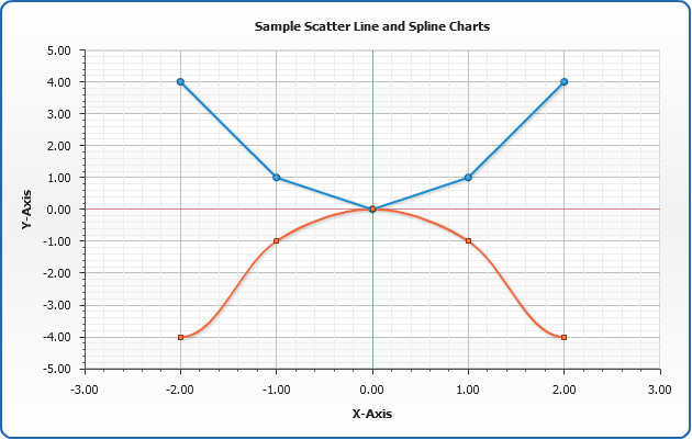
Let's take the following data tables to be plotted as XY-Line and XY-Spline charts (a graphs of x=y2 and x=-y2):
| Line |
Spline |
| x |
y |
x |
y |
| -2 |
4 |
-2 |
-4 |
| -1 |
1 |
-1 |
-1 |
| 0 |
0 |
0 |
0 |
| 1 |
1 |
1 |
-1 |
| 2 |
4 |
2 |
-4 |
Now we convert this table to AnyChart XML:
03 |
<point x="-2" y="4" /> |
04 |
<point x="-1" y="1" /> |
09 |
<series type="Spline"> |
10 |
<point x="-2" y="-4" /> |
11 |
<point x="-1" y="-1" /> |
13 |
<point x="1" y="-1" /> |
14 |
<point x="2" y="-4" /> |
As you can see we've created to series one of "Line" type, the second of "Spline" type. Now, we just set <chart plot_type="Scatter">, as mentioned above and scatter chart are ready to be displayed:
Live Sample: Sample Line and Spline Scatter Charts
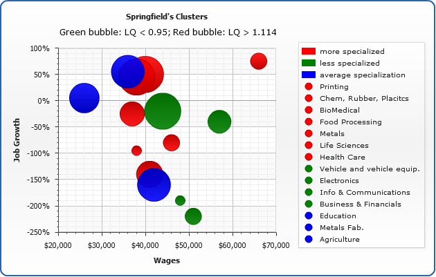
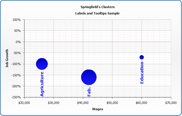
Scatter Bubble Chart
Scatter Bubble Charts are widely used in many analytical studies an it
is one of the popular tools for identifying and illustrating industry clusters. Essentially,
these charts allow four different variables to be plotted within the same graph,
making it easy to assess relative economic performance.
As we've said Bubble charts can be used to plot up to 4 different
variables on the single plot:
02 |
<series color="Red" type="Bubble"> |
03 |
<point name="Point 1" x="10" y="20" size="10" /> |
04 |
<point name="Point 2" x="20" y="30" size="20" /> |
06 |
<series color="Green" type="Bubble"> |
07 |
<point name="Point 3" x="20" y="30" size="18" /> |
In the XMl above we've created two data series of Bubble type,
colored these series with Red and Green colors and set x, y and size attributes in <point> nodes.
In the sample below we will apply these knowledge to plot a real sample of
cluster analysis charting:
We illustrate industry cluster relationships for the 17 "Springfield" targeted industry
clusters. The following four variables are plotted in this single graphic:
1. Average cluster wages: on the x-axis (horizontal)
2. Growth in jobs; on the y-axis (vertical)
3. Employment size of the industry; indicated by the size of the bubble
4. The industry’s location quotient; indicated by the color of the bubble
With user-defined demarcations, location quotients show
whether a state or region is more specialized (>1.1149), less specialized
(<0.95) or as specialized in a particular industry as is the nation or the reference region. In
this graphic, clusters in which the state is more specialized than the nation are shown in red, clusters
with less specialization are shown in green, while clusters with average specialization are
shown in blue.
Live Sample: Sample Scatter Bubble Charts for Cluster Analysis
Please notice that we've used a number of AnyChart Features to build this pretty complex chart:
- Axes labels were formatted ($ and % signs)
- Axes minimum and maximum were specified
- Tooltips are used to show detailed Bubble description
- Legend is added and it is formatted to show series and points - move the mouse over the legend elements and corresponding bubbles will be highlighted.
- Hatch fill and border is changed on hover
- Subtitle is formatted using HTML
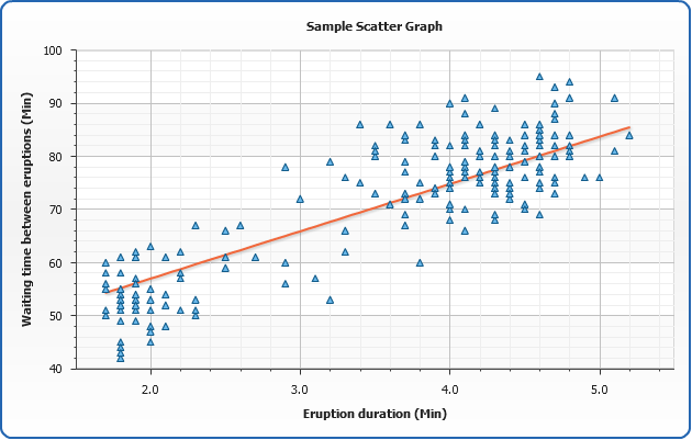
Scatter Point (Marker) Chart
Scatter Point or Marker chart is used to plot a scatter plot (scatter diagram or scatter graph). It is a chart used to display values for two variables. The data
is displayed as a collection of points, each having one coordinate
on the horizontal axis and one on the vertical axis.
A scatter plot does not specify dependent or independent variables.
Either type of variable can be plotted on either axis. Scatter plots
represent the association (not causation) between two variables.
To plot a scatter diagram using AnyChart you should
use Marker series type when plot_type="Scatter":
01 |
<series type="Marker"> |
02 |
<point x="2" y="10" /> |
03 |
<point x="2" y="20" /> |
05 |
<point x="13" y="0" /> |
In the sample below we will plot waiting time between eruptions and the duration of the eruption for
the Old Faithful geyser in Yellowstone National Park, Wyoming, USA.
This chart suggests there are generally two "types" of eruptions:
short-wait-short-duration, and long-wait-long-duration.
We will also draw a "best-fit" straight line through the data,
calculated using linear regression method.
Live Sample: Sample Scatter Graph Charts
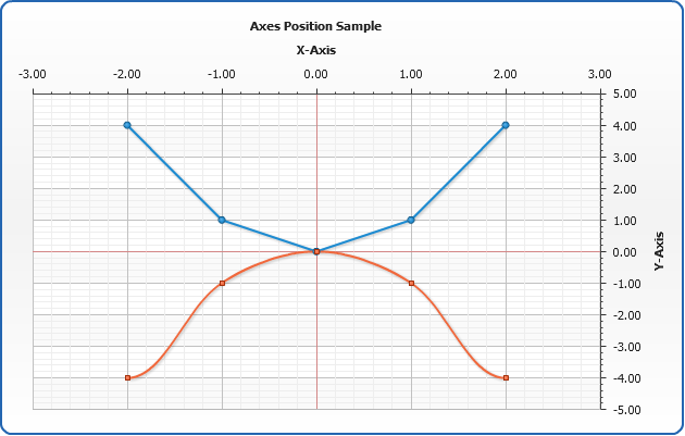
Axes management
In AnyChart axis is an object that allows you to configure chart grid, axis line along with tick marks and labels, axis scale and settings and many more. All axis features are described in
Working with Axes tutorial, in this section we will quickly demonstrate how axis position can be adjusted, how axis scale can be inverted and how minimum and maximum values can be controlled.
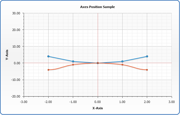
Positioning
With AnyChart you can place axes to any side if the chart, all you need to do is to adjust position attribute of <y_axis> or <x_axis> nodes.
Positioning depends on plot type and inversion of axes, you will find list of all possible positining and inversion settings in Axes Positioning and Inverting Templates.
02 |
<y_axis position="Opposite" /> |
03 |
<x_axis position="Opposite" /> |
And here is the demonstration of this feature on the Line/Spline sample:
Live Sample: Axes Position Sample Single-Series Scatter Line Chart
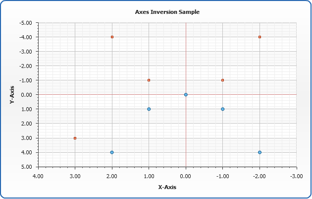
Inversion
AnyChart allows to invert any axis: Y, X or any extra axis. Inversion is controlled by axis <scale>:
02 |
<scale inverted="True" /> |
And here is the demonstration of X and Y Axis inversion on the Marker chart sample:
Live Sample: Axis Inversion Sample Single-Series Scatter Marker Chart
Minimum and Maximum values control
By default AnyChart calculates axis minimum and maximum automatically, you can see this on the scale
inversion chart sample above: minimal value on the Y Axis is -5, and maximum is 5. You can control these
values by setting maximum and minimum attributes of <scale> node:
02 |
<scale minimum="-20" maximum="30" /> |
And here is the demonstration of maximum and minimum values on the Line/Spline sample:
Live Sample: Scale Maximum and Minimum Values Sample Scatter Line and Spline Chart
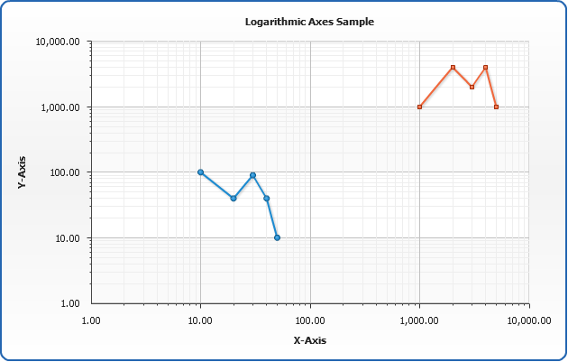
Logarithmic
AnyChart allows to make Y, X or any extra axis Logarithmic. This is controlled by axis <scale>:
02 |
<scale type="Logarithmic" /> |
And here is the demonstration of Logarithmic Y Axis on Line chart sample - using of both X an Y logarithmic axes allowed us to plot data within hundreds and within thousands on the same plot:
Live Sample: Axis Logarithmic Sample Scatter Line Chart
Working with data labels and tooltips
In this section we will explain how to add and configure data labels and tooltips. Full explanation of formatting and tuning visual appearance for them can be found in Labels and tooltips.
If you want to configure data labels and tooltips for all series - you should do that in
<label> and <tooltip> sub-nodes of <line_series>, <marker_series> or <bubble_series> nodes. You can tune their visual appearance, positioning and format. Let's do that in the following example: we will make data labels appear to the top of the data points, also, we will format labels so they show only the value corresponding to the point and tooltip will show detailed description.
When formatting data labels text and tooltip we will use formatting keywords:
{%YValue} - to show Y value,
{%XValue} - to show X value,
{%Name} - to show point name.
Live Sample: Sample Scatter Chart - Working with data labels and tooltips