Range Column/Bar/Cylinder chart
Overview
The Range Column/Bar/Cylinder charts displays a range of data by plotting two Y
values per data point. Each Y value used is drawn as the upper, and lower bounds of a column/bar/cylinder.
Sometimes range charts are referred as "floating" column/bar charts. Some data may look
very nice and are easily understood in this form, in which the column floats in the chart, spanning a
region from a minimum value to a maximum value.
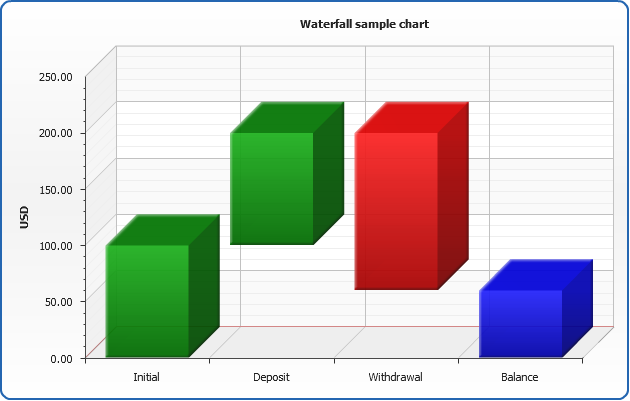
Also you can create Waterfall charts, which are a special type of Floating Column Charts.
A typical waterfall chart shows how an initial value is increased and decreased by a series of intermediate
values, leading to a final value.
Chart Building
As range bar charts have to define lower and upper bound
of bars - you have to specify these two values in <point> node using "start" and "end" attributes.
Also "RangeBar" series type should be specified.
01 |
<series type="RangeBar"> |
02 |
<point name="January" start="0.7" end="6.1" /> |
03 |
<point name="February" start="0.6" end="6.3" /> |
04 |
<point name="March" start="1.9" end="8.5" /> |
Simple and clean range bar XML is demonstrated in Waterfall chart sample.

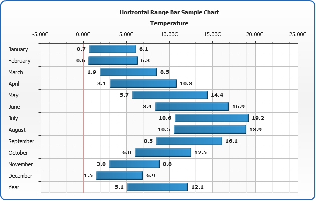
Temperature Range Cylinder chart sample
This sample shows how range bars can be used to chart temperature
averages, the data is taken from UK weather stations 1971-2000 averages statistics:
Live Sample: Sample Range Bar chart - Temperature ranges
Waterfall Chart Sample
In the sample below we formatted start and end values, colored cylinders
as we need and here it is - waterfall chart is displayed.
Live Sample: Sample Range Cyllinder chart - Waterfall chart
Configuration
All range charts are configured and tuned almost the same way as usual Bar, Column or Cylinder charts,
with the only difference: as we have to Y values (start and end point) - we have two tooltips, two labels and two markers.
So, to configure them we use <range_bar_series> node and <bar_style>. <range_bar_series> contain <start_point> and <end_point> nodes that hold tooltip, label and marker settings for start and end points.
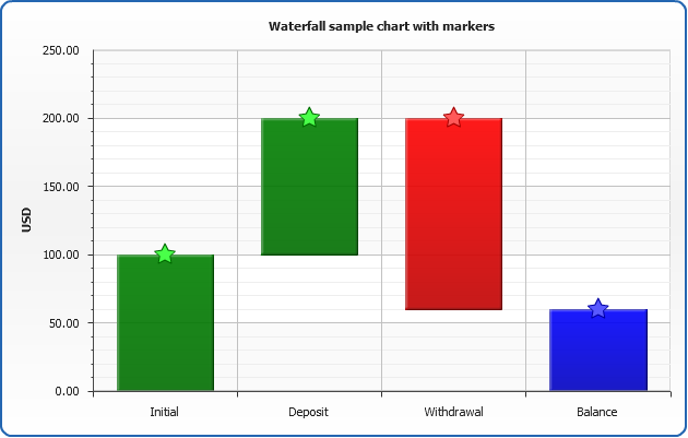
For example we want to change markers to "Star" for all range bar series on the chart, for
both start and end point:
03 |
<marker_settings enabled="True"> |
04 |
<marker type="Star5" size="20" /> |
08 |
<marker_settings enabled="True"> |
09 |
<marker type="Star5" size="20" /> |
Here is the result of application of these settings to the waterfall chart sample data:
Live Sample: Sample Range chart - Waterfall chart with markers
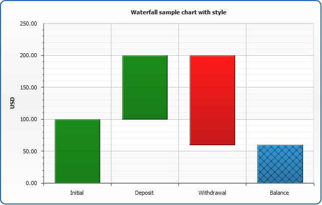
Some range bar settings can be moved to a style definition, and this style can be applied to the
certain point - not a series.
Style named "Balance" definition may look like that:
01 |
<range_bar_style name="Starring"> |
03 |
<hatch_fill enabled="True" /> |
To apply this style to the certain point we specify its name in it:
01 |
<point name="Balance" start="0" end="60" style="Balance" /> |
And again, here is a sample resulting chart:
Live Sample: Sample Range chart - Waterfall chart with style