Cylinder Chart
Overview
Cylinder charts are column (or bar chart) that use cylinder shaped items to show data.
Although cylinder charts do not add any additional data, sometimes using this shape allows to achieve a better visual appearance of your data.
The best visualization of Cylinder charts can be seen in 3D mode, so we will present all examples
of them in this mode.

Chart Building
As Cylinder charts are just a usual bar charts of a cylindrical shape, to create such type of
chart you should set shape_type="Cylinder" attribute in <bar_series>, <series> or <point> nodes.
If you will set this attribute in <bar_series> all bar or column series will be displayed as Cylinder, if you will define it in <series> or <point> - only certain series or point will become Cylindrical.
02 |
<series type="Bar" shape_type="Cylinder"> |
03 |
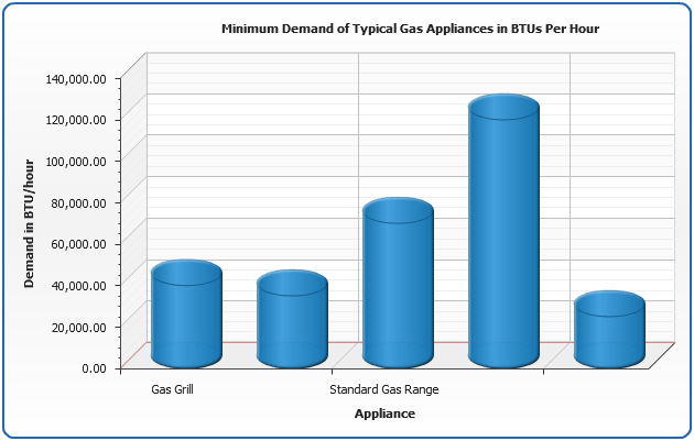
<point name="Gas Grill" y="40000" /> |
04 |
<point name="Gas Dryer" y="35000" /> |
05 |
<point name="Standard Gas Range" y="70000" /> |
06 |
<point name="Furnace" y="120000" /> |
07 |
<point name="Gas Log Lighter" y="25000" /> |
An example below shows Minimum Demand of Typical Gas Appliances chart:
Live Sample: Sample Single-Series Cylinder Chart
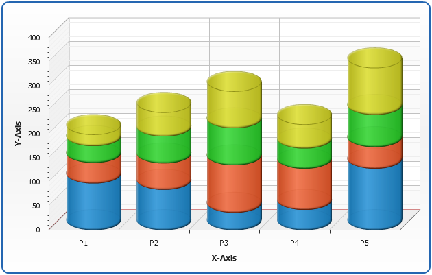
Stacked Cylinder Charts
As well as other bar charts Cylinder charts can be stacked, below we will plot a sample
sales percentage of ACME Pipes Corp.
01 |
<y_axis enabled="false"> |
02 |
<scale mode="PercentStacked" /> |
Live Sample: Sample Stacked Cylinder Chart
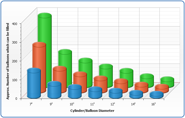
3D Cylinder Charts Clustered by Z axis
In 3D mode you may want to show columns one over another - in other words cluster them along Z Axis. To do this you need to change scale mode of Y Axis to "Overlay":
02 |
<scale mode="Overlay" /> |
In the sample below we will create a Helium Cylinder/Balloon Chart
Live Sample: Sample 3D Clustered Cylinder Chart