Separated Tooltips Visualization and Layout

Overview

This article describes how to alter the visual appearance of Separated tooltips: change background, width and tooltip balloon offset.

to top

Horizontal Offset

You can set how far tooltip is shown from the point it is related to - change the horizontal offset of the tooltip relative to its anchor:

XML/JSON Syntax
Plain code
01{
02  horzOffset: 20
03}


Width

You can alter tooltip width. If it is not set, the tooltip width is calculated automatically to fit the content. If you want tooltips to be always of the same width, set it as shown:

XML/JSON Syntax
Plain code
01 <separated_tooltip width="100" />
01{
02  width: 100
03}

Live sample with offset set to 50 and width to 200:

Live Sample:  Separated Tooltip - Offset And Width

to top

Background

Separated tooltip has a common background shaped in a classic pointing tooltip.

Border and Fill

Standard <fill> and <border> nodes are used to configure this background. Sample XML for configuration:

XML/JSON Syntax
Plain code
02   <background>
03     <fill type="Gradient">
04       <gradient angle="90">
05         <keys>
06           <key color="#FEFEFE" />
07           <key color="#F1F1F1" />
08         </keys>
09       </gradient>
10     </fill>
11     <border color="#BDBDBD" />
12   </background>
01{
02  background: {
03    fill: {
04      type: "Gradient",
05      gradient: {
06        angle: 90,
07        keys: [
08          {
09            color: "#FEFEFE"
10          },
11          {
12            color: "#F1F1F1"
13          }
14        ]
15      }
16    },
17    border: {
18      color: "#BDBDBD"
19    }
20  }
21}

Live sample of the separated tooltip with such settings:

Live Sample:  Separated Tooltip - Fill and Border Settings

To learn more about the possible settings see Background Settings or XML Reference.

to top

Corners

As any other background you have an ability to configure corners shape using <corners> node. Sample XML for changing the corners of tooltip:

XML/JSON Syntax
Plain code
02   <background>
03     <corners type="Cut" left_top="0" right_top="8" right_bottom="0" left_bottom="0" />
04   </background>
01{
02  background: {
03    corners: {
04      type: "Cut",
05      leftTop: 0,
06      rightTop: 8,
07      rightBottom: 0,
08      leftBottom: 0
09    }
10  }
11}

Live sample of such settings:

Live Sample:  Separated Tooltip - Background Corners Settings

To learn more about the possible settings see Background Settings or XML Reference.

to top

Shadow

You can also change and configure the shadow of tooltip. By default it is turned on, an you can either turn it off or reconfigure. Sample XML:

XML/JSON Syntax
Plain code
02   <background>
03     <shadow enabled="true" color="Red" angle="45" distance="5" blur_x="3" blur_y="3" />
04   </background>
01{
02  background: {
03    shadow: {
04      enabled: true,
05      color: "Red",
06      angle: 45,
07      distance: 5,
08      blurX: 3,
09      blurY: 3
10    }
11  }
12}

Live sample of separated tooltips with red shadow:
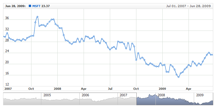
Live Sample:  Separated Tooltip - Background Shadow Settings

To learn more about all possible settings see XML Reference.

to top

Margins

You can configure inner margin between tooltip text and border. Simple XML Syntax:

XML/JSON Syntax
Plain code
03     <background>
04       <inside_margin left="20" top="5" right="20" bottom="5" />
05     </background>
06   </separated_tooltip>
01{
03    background: {
04      insideMargin: {
05        left: 20,
06        top: 5,
07        right: 20,
08        bottom: 5
09      }
10    }
11  }
12}

Live Sample with configured margins:

Live Sample:  Separated Tooltip - Inside Margins Settings

to top