Scroller Visual Settings
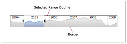
Border and Selected Range Outline
You can change the look and the scroller border and selected range outline. Illustration below shows what are they:
Sample XML of Border and Selected Range Outline settings:
01 |
<?xml version="1.0" encoding="UTF-8"?> |
02 |
<stock xmlns="http://anychart.com/products/stock/schemas/1.9.0/schema.xsd"> |
Live sample with such settings:
Live Sample: Scroller - Outline and Border Settings
To learn more about the configuration of elements mentioned above see XML Reference.

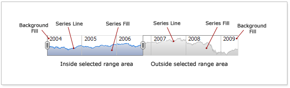
Scroller Chart Series and Background
If scroller has the Data Provider and it has a small chart of Area type in the background you can configure this series look. There are two blocks of configuration of this series and its background:
- Inside Selected Range - defines how series and fill are displayed in the selected range.
- Outside Selected Range - defines how series and fill are displayed outside of the selected range.
Each block has following settings:
- Series Line - sets line options drawn on the top of Area series.
- Series Fill - sets fill of Area series.
- Background Fill - sets fill underneath Area series.
Illustration below highlights these elements. All highlighted elements can be tuned individually:
Sample XML with series and background settings:
01 |
<?xml version="1.0" encoding="UTF-8"?> |
02 |
<stock xmlns="http://anychart.com/products/stock/schemas/1.9.0/schema.xsd"> |
Live sample of such settings :
Live Sample: Scroller - Series Settings
To learn more about the configuration of elements mentioned above see XML Reference.
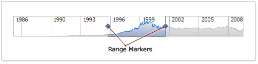
Range Markers
Range Markers are markers used to change the selected range, here they are:
All settings of the Range Markers are done in <range_markers> node:
01 |
<?xml version="1.0" encoding="UTF-8"?> |
02 |
<stock xmlns="http://anychart.com/products/stock/schemas/1.9.0/schema.xsd"> |
The table below lists possible settings:
| Attribute |
Possible Values |
Description |
| enabled |
true
false |
Disables/Enables markers. At the same time disabling markers disallow user to change the start and end of the selected range. Default: "true". |
| shape |
Circle
Diamond
Thumb |
Sets marker shape . Default: "Thumb". |
| size |
Any Number |
Sets width and height of the markers in pixels. Works only when types is Circle or Diamond. Default: 10px. |
| show_always |
true
false |
Defines whether marker are always shown or only when mouse hovers selected range. The default is false. |
As it was already said shape attribute define marker outlook. Table below shows the types:
|
Shape |
 |
Circle |
 |
Diamond |
 |
Thumb |
Also you can change how markers of Circle and Diamond types look like using <fill> and <border> nodes.
Sample XML with marker settings:
01 |
<?xml version="1.0" encoding="UTF-8"?> |
02 |
<stock xmlns="http://anychart.com/products/stock/schemas/1.9.0/schema.xsd"> |
Live sample with such settings :
Live Sample: Scroller - Range Markers Settings
Learn more about <fill> and <border> nodes in Background Tutorial or in XML Reference.