01 | { |
02 | settings: { |
03 | scrollBar: { |
04 | enabled: true |
05 | }, |
06 | scroller: { |
07 | enabled: true |
08 | } |
09 | } |
10 | } |
To navigate through the chart you either Scroller and/or Scroll Bar. You can use them in combination, or separately. Illustration below shows different combinations:
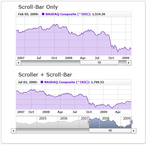
When Scroll Bar is used with Scroller they unite and become one entity. Scroll Bar buttons step aside of the chart and you should set <inside_margin> so these button could be visible.
Sample XML to enable scroll bar and define margins:

Live sample of the chart with scroll bar:

As you can see both scroll bar and scroller are shown, but please do not forget about margins, you can learn more about them in Chart Layout article.
To use scroll bar without scroller you just need to disable the last. Note that only scroller gives user an ability to change selected range and zoom in zoom out. The only feature scroll bar provides is scrolling the chart and, in this case zooming can be don using Range Selector Panel or using JavaScript API method zoomTo.
To use scroll bar alone use this XML settings:
Live sample below demonstrates settings shown above:

Note: When you use scrollbar without Scroller you have to enlarge left and right inside margins.
Scroll Bar has a lot of visual settings. Sample XML with scroll bar visual configuration:
01 |
<scroll_bar enabled="true" size="16"> |
04 |
<buttons> |
05 |
<states> |
06 |
<normal> |
07 |
<background> |
11 |
</background> |
12 |
</normal> |
13 |
<hover> |
14 |
<background> |
18 |
</background> |
19 |
</hover> |
20 |
</states> |
21 |
</buttons> |
22 |
<thumb> |
23 |
<states> |
24 |
<normal> |
25 |
<background> |
29 |
</background> |
30 |
</normal> |
31 |
<hover> |
32 |
<background> |
36 |
</background> |
37 |
</hover> |
38 |
</states> |
39 |
</thumb> |
40 |
</scroll_bar> |
01 | { |
02 | enabled: true, |
03 | size: 16, |
04 | fill: { |
05 | type: "Solid", |
06 | color: "#F0F0F0" |
07 | }, |
08 | border: { |
09 | enabled: true, |
10 | color: "#E7E7E7" |
11 | }, |
12 | buttons: { |
13 | states: { |
14 | normal: { |
15 | background: { |
16 | fill: { |
17 | type: "Solid", |
18 | color: "#DADADA" |
19 | }, |
20 | border: { |
21 | enabled: true, |
22 | color: "#D0D0D0" |
23 | }, |
24 | corners: { |
25 | type: "Square" |
26 | } |
27 | } |
28 | }, |
29 | hover: { |
30 | background: { |
31 | fill: { |
32 | type: "Solid", |
33 | color: "#DADADA" |
34 | }, |
35 | border: { |
36 | enabled: true, |
37 | color: "#FF8F8F" |
38 | }, |
39 | corners: { |
40 | type: "Square" |
41 | } |
42 | } |
43 | } |
44 | } |
45 | }, |
46 | thumb: { |
47 | states: { |
48 | normal: { |
49 | background: { |
50 | fill: { |
51 | type: "Solid", |
52 | color: "#DADADA" |
53 | }, |
54 | border: { |
55 | enabled: true, |
56 | color: "#D0D0D0" |
57 | }, |
58 | corners: { |
59 | type: "Square" |
60 | } |
61 | } |
62 | }, |
63 | hover: { |
64 | background: { |
65 | fill: { |
66 | type: "Solid", |
67 | color: "#DADADA" |
68 | }, |
69 | border: { |
70 | enabled: true, |
71 | color: "#FF8F8F" |
72 | }, |
73 | corners: { |
74 | type: "Square" |
75 | } |
76 | } |
77 | } |
78 | } |
79 | } |
80 | } |
Live sample that shows configured scroll bar:

To learn more about Scroll Bar configuration please see respective nodes in XML Reference.