Rectangle Annotation
Overview
Rectangle annotation allows to add a square or rectangle to the chart, as any other annotation it can
be drawn by user or added to the chart via XML or JSON settings. In this article you can learn how
to add a rectangle via XML or JSON settings and what visual settings can be done.
To learn about basic settings, that can be done with an annotation please refer to: Drawing Tools and Annotations: General Settings.

Adding annotation via settings
To add a rectangle annotation to a chart you need to, as with any other annotation, add an annotation node, assign
the id, set "Rectangle" type and specify the chart id using chart attribute.
In rectangle_annotation node you need anchors, which define two points on which rectangle is based.
All this you can see in the basic XML/JSON snippet below:
01 |
<?xml version="1.0" encoding="UTF-8"?> |
02 |
<stock xmlns="http://anychart.com/products/stock/schemas/1.9.0/schema.xsd"> |
05 | id: "Rectangle_0856719161", |
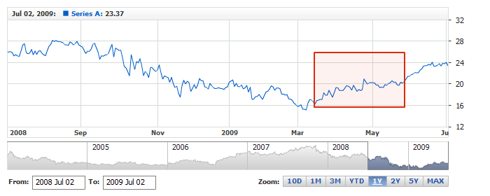
Live sample below shows a chart with this sample basic Rectangle annotation:
Live Sample: Adding Rectangle Annotation
Visual settings
You have a total control over the look of the rectangle, to define visual settings you
need to add settings node and then use border and fill nodes
to set how it should look like. Sample XML/JSON snippet below shows this.
If you click on nodes in the snippet, XML or JSON reference
will be opened and you will be able to browse all possible settings, including the look of the rectangle in
different states.
01 |
<?xml version="1.0" encoding="UTF-8"?> |
02 |
<stock xmlns="http://anychart.com/products/stock/schemas/1.9.0/schema.xsd"> |
05 | id: "Rectangle_0856719161", |
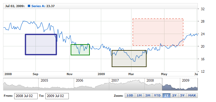
Live sample below contains several Rectangle annotations colored and configured in a different way:
Live Sample: Rectangle Annotation - Visual Settings