Circular Gauge Tickmarks
- Overview
- Labels Parameters
- Enabling/Disabling tickmarks
- Positioning tickmarks
- Changing tickmarks' visual appearance
Overview
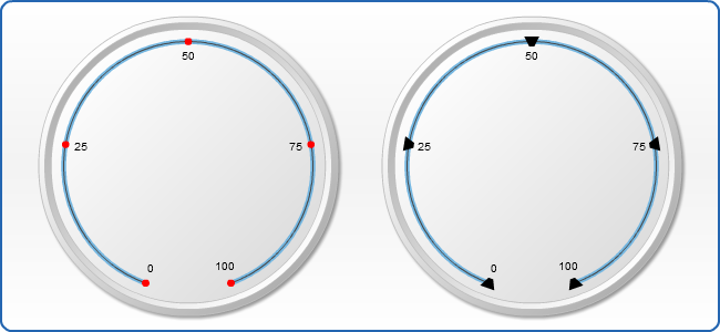
Tickmarks are the small marks used to represent a point on an axis scale, there are major and minor tickmarks, first used to indicate major step of an axis scale, second - minor step. You can control their appearance and position. To enable/disable tickmarks set enabled="True" or enabled = "false" to major_tickmarks or minor_tickmarks
Typical XML settings for the tickmarks are:

01 |
<axis> |
02 |
<major_tickmark enabled="true" width="4" length="10" padding="0" align="Inside" shape="Trapezoid" /> |
03 |
<minor_tickmark enabled="true" width="2" length="5" padding="10" align="Outside" shape="Triangle" /> |
04 |
</axis> |
Tickmarks Parameters
The following attributes can be set for tickmarks:
| Attribute | Values | Default | Description |
|---|---|---|---|
| enabled | true | false | True | Sets whether tickmarks are enabled or not |
| length | Number | Auto | The length of tickmarks |
| width | Number | Auto | The width of tickmarks |
| padding | Number | Auto | The padding of tickmarks |
| align | Inside | Outside | Center | Center | Sets the position of tickmarks |
| shape | all marker types | Trapezoid | Pentagon | Rectangle | Triangle | Sets the shape of tickmarks |
Enabling/Disabling tickmarks
You may enable/disable major/minor tickmarks by editing the enabled attribute of the corresponding node:
01 |
<axis> |
02 |
<major_tickmark enabled="false" /> |
03 |
<minor_tickmark enabled="false" /> |
04 |
</axis> |
In this example we have disabled both major and minor tickmarks:
Positioning tickmarks
There are two nodes responsible for tickmarks' positioning. They are: align and padding. Let's look at some samples demonstrating the practical usage of these nodes.
Align attribute has three states: "Inside", "Outside" and "Center". Padding attribute is set in percents and defines how far from the scale we move the tickmark. Padding can be represented in positive or negative values, which affects the direction of tickmark's movement.
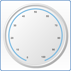
By default the tickmarks are enabled and their position is set to "Center", so if the corresponding nodes are missing, our gauge looks like this:
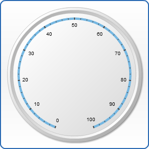
Let's imagine we want to create a gauge with tickmarks with size greater than usual one. We just enhance their length. That's how it looks:
01 |
<axis> |
02 |
<major_tickmark length="10" /> |
03 |
<minor_tickmark length="8" /> |
04 |
</axis> |
Changing tickmarks' visual appearance
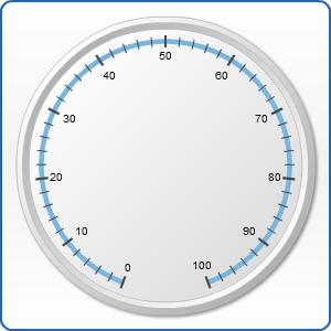
And finally let's change our tickmarks' visual appearance. We have a whole arsenal of tools for it: width, length, shape. Their names speak for themselves. In addition, we may change the tickmarks' view with the help of subnodes: fill, hatch_fill, border, effects. Let's look at the following examples: