HeatMap Chart
Overview
A heat map is a graphical representation of data where the values taken by a variable in a two-dimensional map are represented as colors. A very similar presentation form is a tree map.
Heat map is good when you need to show how one parameter changes against another, just like usual char, but with cells colored.
Chart Building
Let's measure temperature every ten minutes in two different points: Point1 and Point2. When data is collected we will put it into the chart:
| Time |
Point1 |
Point2 |
| 0 min |
25 |
18 |
| 10 min |
30 |
20 |
| 20 min |
40 |
19 |
| 30 min |
18 |
25 |
| 40 min |
19 |
60 |
| 50 min |
20 |
45 |
| 60 min |
19 |
10 |
As a result we get 2х7 table. We then define tempreature ranges and define color for each - that is Heat Map already, we just need to put the data into XML and pass it to AnyChart:
03 |
<point row="0 min" column="Point1" y="25" /> |
04 |
<point row="10 min" column="Point1" y="30" /> |
05 |
<point row="20 min" column="Point1" y="40" /> |
06 |
<point row="30 min" column="Point1" y="18" /> |
07 |
<point row="40 min" column="Point1" y="19" /> |
08 |
<point row="50 min" column="Point1" y="20" /> |
09 |
<point row="60 min" column="Point1" y="19" /> |
10 |
<point row="0 min" column="Point2" y="18" /> |
11 |
<point row="10 min" column="Point2" y="20" /> |
12 |
<point row="20 min" column="Point2" y="19" /> |
13 |
<point row="30 min" column="Point2" y="25" /> |
14 |
<point row="40 min" column="Point2" y="60" /> |
15 |
<point row="50 min" column="Point2" y="45" /> |
16 |
<point row="60 min" column="Point2" y="10" /> |
Heat Map Live sample:
Live Sample: Heat_Map Chart 1
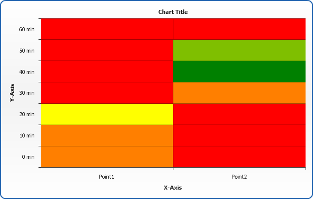
To color the map properly we can
define a palette and threshold:
03 |
<palette name="custom" type="ColorRange" color_count="3"> |
06 |
<key color="Yellow" /> |
12 |
<threshold name="autoTr" type="EqualSteps" range_count="5" palette="custom" /> |
15 |
<series threshold="autoTr" /> |
Which will allow us to show Heat map like that:
Live Sample: Heat_Map Chart 2
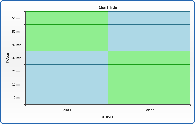
Or you can simple set what items should have what color:
02 |
<series color="LightBlue"> |
03 |
<point row="0 min" column="Point1" y="25" /> |
04 |
<point row="10 min" column="Point1" y="30" /> |
05 |
<point row="20 min" column="Point1" y="40" /> |
06 |
<point row="30 min" column="Point1" y="18" /> |
07 |
<point row="40 min" column="Point2" y="60" /> |
08 |
<point row="50 min" column="Point2" y="45" /> |
09 |
<point row="60 min" column="Point2" y="10" /> |
11 |
<series color="LightGreen"> |
12 |
<point row="0 min" column="Point2" y="18" /> |
13 |
<point row="10 min" column="Point2" y="20" /> |
14 |
<point row="20 min" column="Point2" y="19" /> |
15 |
<point row="30 min" column="Point2" y="25" /> |
16 |
<point row="40 min" column="Point1" y="19" /> |
17 |
<point row="50 min" column="Point1" y="20" /> |
18 |
<point row="60 min" column="Point1" y="19" /> |
Live sample of direct color setting:
Live Sample: Heat_Map Chart 3