Task Style
Overview
Task Style - is the cope-stone of tuning tasks functionality and visualization. This style is used to configure all task types: Regular Task, Summary Task and Milestone.
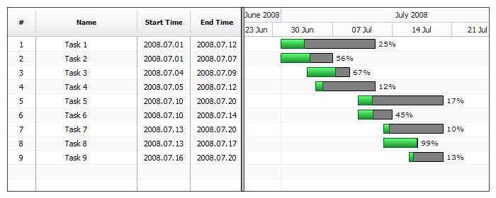
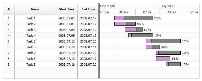
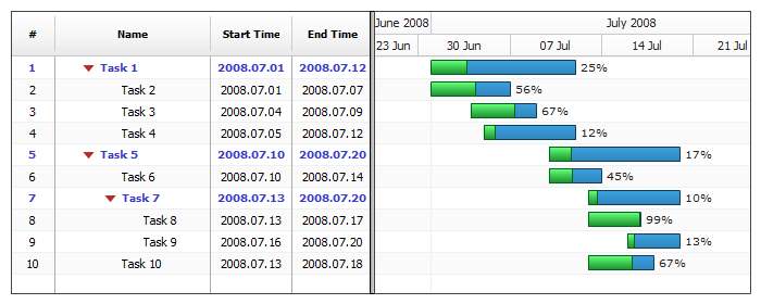
The illustration below shows almost every elements that are configured in task style:

Style Application
There are two options for style application: you can create reusable predefined style and then apply it to a task (each style has the unique id), or in-line in task node. Below you will find out what are pros and cons of each method.
Reusable Style
Reusable styles give you an opportunity to describe how task should be displayed only once and then apply it when needed.
To define and apply style you should use XML as shown:
04 |
<task_style name="sampleStyle"> |
06 |
<fill enabled="true" type="Solid" color="Rgb(250,0,0)" opacity="0.2" /> |
13 |
<task id="01" name="Task 01" actual_start="2008.07.07" actual_end="2008.07.16" progress="14" style="sampleStyle" /> |
14 |
<task id="02" name="Task 02" actual_start="2008.07.08" actual_end="2008.07.17" progress="34" style="sampleStyle" /> |
15 |
<task id="03" name="Task 03" actual_start="2008.07.06" actual_end="2008.07.15" progress="78" style="sampleStyle" /> |
16 |
<task id="04" name="Task 04" actual_start="2008.07.09" actual_end="2008.07.17" progress="23" style="sampleStyle" /> |
As you can see, once the style is defined in <task_styles> with certain id, you can apply it to the resource using style attribute: <task style="sampleStyle"/>
In-line Style
If you need to change some setting for one task only, you can avoid creation of the new style and configure task visualization in-line.
Here is a sample how style can be defined in-line:
04 |
<task id="01" name="Task 01" actual_start="2008.07.07" actual_end="2008.07.16" progress="14" style="sampleStyle"> |
07 |
<fill enabled="true" type="Solid" color="Rgb(250,0,0)" opacity="0.2" /> |
As you can see we have <style> node within<task> node, syntax is the same for reusable and in-line style.
Setting Global Default Style
You can define named style and apply it to all elements, but this may be inconvenient when there are a lot of elements, for example periods in a project.
AnyGantt allows you to set defaults for basic styles using defaults section. See Default Styles for more.
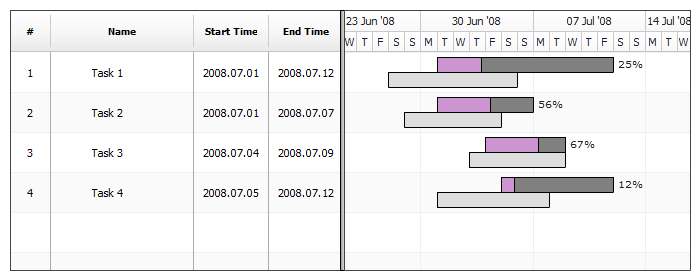
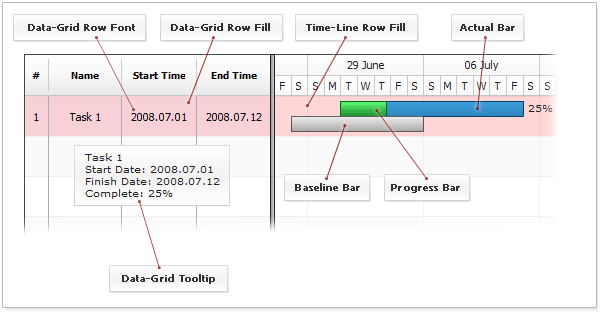
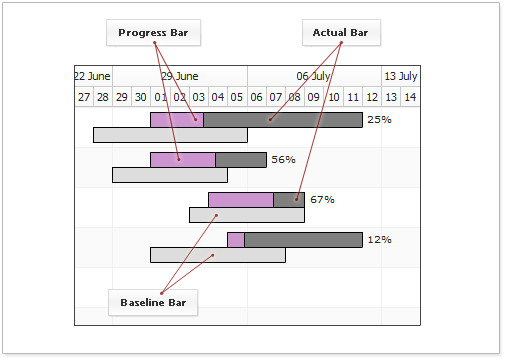
Task Style Parts
There are three elements that present the task - Actual Task State, Task Progress and Planned Task State. Illustration below shows these three elements:
Each of these elements is configured using Bar Style. Bar style is in charge for configuration of border, fill, markers, labels and interactive states. Bar Style is described in details in Bar Style Tutorial .
Actual Task State (Actual)
Actual start time and end time is set using actual_start and actual_end attributes of <task> node, for example:
<task actual_start="2008.07.01" actual_end="2008.07.12"/>.
As said above - visual representation is configured using Bar Styles. Bar style for actual state in configured like that:
01 |
<task_style name="testStyle"> |
05 |
<fill enabled="true" type="Solid" color="Gray" opacity="1" /> |
06 |
<border enabled="true" type="Solid" color="Black" opacity="1" /> |
Live sample shows modified border and fill for actual state:
Live Sample: Task-Style-Actual-Bar
To learn more about configuration like that - please refer to Bar Style Tutorial.
Task Progress
Task progress is optional, but it is used in the most of the cases and set using progress attribute of <task> node, for example: <task progress="72"/>.
Just as actual state the visual representation is configured using Bar Style. Here is the sample XML showing the modification of progress fill and border:
01 |
<task_style name="testStyle"> |
05 |
<fill enabled="true" type="Solid" color="Gray" opacity="1" /> |
06 |
<border enabled="true" type="Solid" color="Black" opacity="1" /> |
Live sample shows the same modifications:
Live Sample: Task-Style-Progress-Bar
To learn more about configuration like that - please refer to Bar Style Tutorial.
Planned Task State (Baseline)
Planned task state is optional, it set using baseline_start and baseline_end attribute in <task> node, for example:
<task baseline_start="2008.07.01" baseline_end="2008.07.12"/>.
Planned task bar is displayed under the actual bar and has its own settings. To configure planned task bar the following XML is used:
01 |
<task_style name="testStyle"> |
05 |
<fill enabled="true" type="Solid" color="Gray" opacity="1" /> |
06 |
<border enabled="true" type="Solid" color="Black" opacity="1" /> |
Live sample shows altered fill and border for planned bar:
Live Sample: Task-Style-Baseline-Bar
To learn more about configuration like that - please refer to Bar Style Tutorial.
Task Tooltip Configuration
Using Task Style you can override default tooltip in task datagrid .
XML syntax:
01 |
<task_style name="critical"> |
02 |
<tooltip enabled="true"> |
03 |
<text><![CDATA[{%Name} - CRITICAL]]></text> |
04 |
<font face="Tahoma" size="10" bold="false" italic="false" /> |
05 |
<border enabled="true" type="Solid" color="DarkRed" thickness="2" /> |
06 |
<fill enabled="true" type="Solid" color="#FFFFFF" opacity="0.8" /> |
07 |
<margin left="10" right="10" top="5" bottom="5" /> |
This XML shows only the basic settings, to learn more please see XML Reference.
In this sample each task has its own style that changes tooltip :
Live Sample: Task-Style-Tooltip
Timeline Plot Row Fill Configuration
You can configure how task row in timeline plot looks like in normal and hovered state using <row> node.
XML look like that:
01 |
<task_style name="critical"> |
03 |
<fill enabled="true" type="Solid" color="#FF0000" opacity="0.2" /> |
06 |
<fill enabled="true" type="Solid" color="#FF3333" opacity="0.5" /> |
This XML shows only the basic settings, to learn more please see XML Reference.
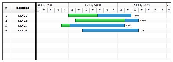
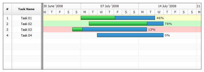
Sample below shows custom timeline plot fill for three tasks and default settings for the fourth:
Live Sample: Task-Style-Row-Fill-Sample
DataGrid Row Fill Configuration
Besides timeline plot row fill you can set datagrid row fill. Use <row_datagrid> to do that.
XML Sample for datagrid row configuration:
01 |
<task_style name="critical"> |
04 |
<fill enabled="true" type="Solid" color="#FF0000" opacity="0.2" /> |
07 |
<fill enabled="true" type="Solid" color="#FF3333" opacity="0.5" /> |
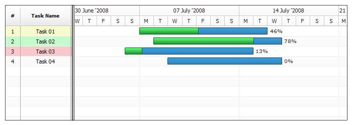
Sample below shows custom datagrid plot fill for three tasks and default settings for the fourth:
Live Sample: Task-Style-Data-Grid-Row-Fill-Sample
DataGrid Row Height
Using Task Style you can override default datagrid row height:
01 |
<task_style name="big"> |
02 |
<row_datagrid height="50" /> |
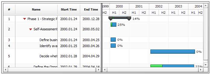
Here is a sample of a chart where two tasks have custom height:
Live Sample: Task-Style-Data-Grid-Row-Height
DataGrid Tooltip
Using Task Style you can override default tooltip in task datagrid .
XML syntax:
01 |
<task_style name="critical"> |
03 |
<tooltip enabled="true"> |
04 |
<text><![CDATA[{%Name} - CRITICAL]]></text> |
05 |
<font face="Tahoma" size="10" bold="false" italic="false" /> |
06 |
<border enabled="true" type="Solid" color="DarkRed" thickness="2" /> |
07 |
<fill enabled="true" type="Solid" color="#FFFFFF" opacity="0.8" /> |
08 |
<margin left="10" right="10" top="5" bottom="5" /> |
This XML shows only the basic settings, to learn more please see XML Reference.
In this sample each task has its own style that changes tooltip :
Live Sample: Task-Style-Data-Grid-Tooltip-Settings
DataGrid Font
Besides row fill Task style can also configure font for all cells in datagrid. You can set font for normal and hover states. the only limitation is the fact that these settings override datagrid column font settings.
Datagrid font settings configuration XML:
01 |
<task_style name="summaryStyle"> |
04 |
<font face="Times New Roman" size="15" bold="true" italic="false" underline="false" color="#393939" /> |
07 |
<font face="Times New Roman" size="15" bold="true" italic="true" underline="true" color="#790202" /> |
One style with normal and hover states and font settings is applied to all of the summary tasks in this live sample:
Live Sample: Task-Style-Data-Grid-Font-Settings
Splitter Line
If you want a splitter line between tasks you can alter style of some task so a splitter line appears befor or after this task.
To draw splitter you have to add splitter node:
02 |
<splitter thickness="1" color="Red" position="Bottom" /> |
Splitter can be placed above or below the task, you have to set position attribute to "Top" or "Bottom" to change this. Splitter is a simple line, so you can set its thickness and color. Here is a sample of a chart where some tasks have splitters:
Live Sample: Task-Style-Splitter