Grouped Tooltips
Overview
Unlike Separated - Grouped tooltip is the type that shows one tooltip for all the series shown on the chart instead of showing an individual tooltip for each series. Its configuration is in many ways similar to the one of Separated tooltip, but there is a lot of special options and grouping modes.
This article describes all the available Grouping modes and explains how to configure them.

Enable/Disable
To enable/disable tooltips you need to use the enabled attribute of <tooltip_settings> node.
You can enable/disable tooltips for all charts, some of the charts, some of the series types or some of the series, as it is described in the
Tooltip Settings section.
Here is a sample XML for enabling tooltip on all charts:
01 |
<?xml version="1.0" encoding="UTF-8"?> |
02 |
<stock xmlns="http://anychart.com/products/stock/schemas/1.9.0/schema.xsd"> |
To use Grouped tooltips, you need to set the tooltip_mode attribute to "Grouped":
01 |
<?xml version="1.0" encoding="UTF-8"?> |
02 |
<stock xmlns="http://anychart.com/products/stock/schemas/1.9.0/schema.xsd"> |
Display Modes
There are three ways to show a grouped tooltip:
- Global - show one tooltip for all series and indicators on all charts.
- Local Simultaneous - each chart shows its own group, all groups are shown simultaneously.
- Local Active Only - each chart shows its own group, only one group - from the active chart - is shown at a time.
Below you can find the description for each mode along with the explanation how to enable it.
Global: All series and Indicators in One Tooltip
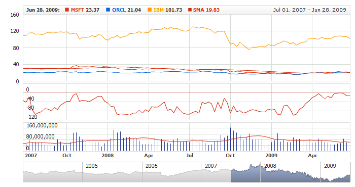
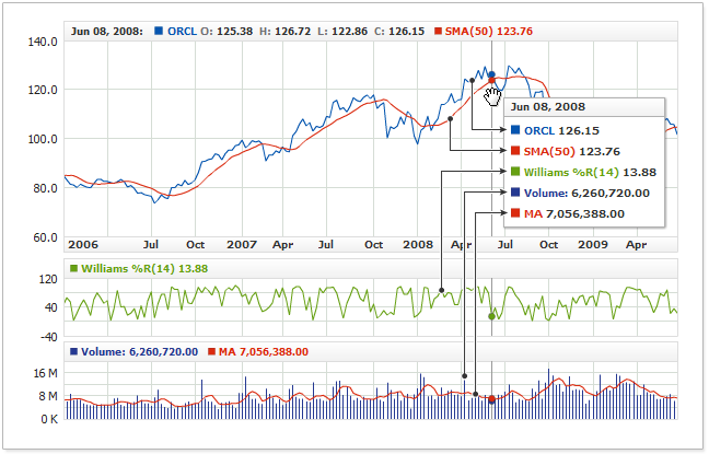
The Global mode with all the series and indicators on all the charts may look like what is shown on the illustration below. As you can see here, there are three charts: one that displays price data and SMA(50) and two charts below it showing respectively Williams %R and Volume+MA. Showing separate tooltips for each of the lines could be misleading and make the chart more difficult to read. A grouped tooltip allows showing the relevant data all in one place.
To use such tooltip, you need to set the use_global_tooltip attribute of the <tooltip_settings> node to "true".
Note that this attribute exists only in the <tooltip_settings> subnode of the <settings> node, for it is a global option.
01 |
<?xml version="1.0" encoding="UTF-8"?> |
02 |
<stock xmlns="http://anychart.com/products/stock/schemas/1.9.0/schema.xsd"> |
The live sample below demonstrates a chart with a Grouped Tooltip in the Global mode:
Live Sample: Grouped Tooltip - Global Mode
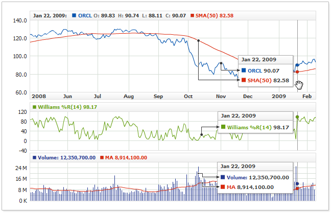
Local: Each Chart Displays Own Group
When each chart in a set shows a group of series logically linked to each other, but putting that data along with all
the data of the other charts would create a too large and unreadable tooltip - you can display each group separately:
To do so, you need to set the use_global_tooltip attribute to "false":
01 |
<?xml version="1.0" encoding="UTF-8"?> |
02 |
<stock xmlns="http://anychart.com/products/stock/schemas/1.9.0/schema.xsd"> |
The live sample below shows two charts, each displaying its own grouped tooltip:
Live Sample: Grouped Tooltip - Local Mode
Local: Only One Active Chart Displays a Group
Grouped tooltips can be rather large, and showing them all simultaneously, as it has been shown in the previous section, could be unacceptable. In this case,
you can switch to the mode where only one chart would shows a tooltip - the chart being under the mouse pointer at the moment:
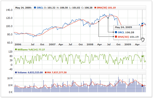
To show a tooltip for the current chart only, you need to set the display_mode attribute to "CurrentChart":
01 |
<?xml version="1.0" encoding="UTF-8"?> |
02 |
<stock xmlns="http://anychart.com/products/stock/schemas/1.9.0/schema.xsd"> |
Here is a live sample that demonstrates a Grouped tooltip shown only for the chart under the mouse pointer:
Live Sample: Grouped Tooltip - Active Chart
Tooltip Settings
Grouped tooltips are always configured in the <grouped_tooltip> subnode of the <tooltip_settings> node. This
node has a lot of configuration options, which are described in detail in Grouped Tutorials.
The main thing we want to highlight in this section is that a tooltip can be configured in several places and, depending on the task, you can choose any of them.
Please note that not all the <grouped_tooltip> nodes are similar; this happens because of the complex structure of a Grouped tooltip. When you configure a tooltip in a series or for a series of some type - you can only control the tooltip text and its properties, but not its background or title.
Individual Settings for Each Series
You can configure the tooltip options for a given series in the series list; for example, to change the format of the text for a selected series, you would need to use the following XML:
01 |
<?xml version="1.0" encoding="UTF-8"?> |
02 |
<stock xmlns="http://anychart.com/products/stock/schemas/1.9.0/schema.xsd"> |
12 |
<format><![CDATA[Custom Text ({%Value}{numDecimals:2})]]></format> |
14 | format: "Custom Text ({%Value}{numDecimals:2})" |
In the sample below, the two series have an individual format defined for each of them, and the third series has no tooltip at all, as tooltips are disabled for that series:
Live Sample: Grouped Tooltip - Individual Series Settings
Defaults for Series Types
When you use several types of series on one chart, it may happen that the series of a given type have typical
tooltip settings; in this case, you can define the defaults for this series type. To do that, you need, for example, to make the following settings:
01 |
<?xml version="1.0" encoding="UTF-8"?> |
02 |
<stock xmlns="http://anychart.com/products/stock/schemas/1.9.0/schema.xsd"> |
12 |
<format><![CDATA[Area: {%SeriesIcon} {%Name} {%Value}]]></format> |
22 |
<format><![CDATA[Line: {%SeriesIcon} {%Name} {%Value}]]></format> |
14 | format: "Area: {%SeriesIcon} {%Name} {%Value}" |
27 | format: "Line: {%SeriesIcon} {%Name} {%Value}" |
As you can see here, these settings define that the separated tooltips for the area series and line series should have different background and font settings.
The live sample below shows a sample chart with such settings in action:
Live Sample: Grouped Tooltip - Series Type Settings
Chart Defaults
For a given chart, you can configure all the tooltips in the chart one standard way and, unlike in the previous section, you can also
set a standard background, title and separator for them all:
01 |
<?xml version="1.0" encoding="UTF-8"?> |
02 |
<stock xmlns="http://anychart.com/products/stock/schemas/1.9.0/schema.xsd"> |
Please note: Setting anything on this level doesn't cancel the settings on the levels described above. In the live sample below we use series type settings, individual series settings and chart defaults at the same time:
Live Sample: Grouped Tooltip - Chart Default Settings
All Charts Default
And another level higher, where you can configure all the tooltips on all the charts:
01 |
<?xml version="1.0" encoding="UTF-8"?> |
02 |
<stock xmlns="http://anychart.com/products/stock/schemas/1.9.0/schema.xsd"> |
Please note: Setting anything on this level doesn't cancel the settings on the levels described above. In the live sample below we combine the settings again:
Live Sample: Grouped Tooltip - All Charts Default Settings
Configuration and Formatting
To find out how to configure a tooltip element's text and visual settings and layout, please refer to: