01 | { |
02 | settings: { |
03 | rangeSelector: { |
04 | rangePicker: {} |
05 | } |
06 | } |
07 | } |
Range Picker - two text fields that allow user specify manually the period to view. You can tune the template for data input so it matches user preferences, even, say: "2009 April 16, 3:15 PM".
Each input field has three states with own visual and date time template configuration. These states are:
All settings of Range Piker are done in <range_picker> node:

01 |
<?xml version="1.0" encoding="UTF-8"?> |
02 |
<stock xmlns="http://anychart.com/products/stock/schemas/1.9.0/schema.xsd"> |
03 |
<settings> |
04 |
<range_selector> |
05 |
<range_picker /> |
06 |
</range_selector> |
07 |
</settings> |
08 |
</stock> |
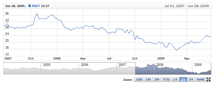
If you don't need Range Picker you can turn it off like that:
Live sample of the chart without Range Picker:
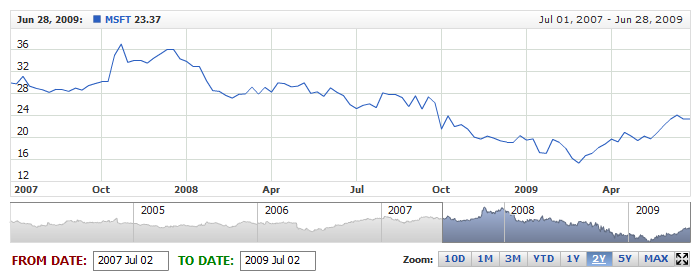
Both start and end input fields has the label. These are "from" and "to" labels. You can change it if you'd like to. Sample XML to change the labels follows:
01 |
<range_selector enabled="true"> |
02 |
<range_picker> |
03 |
<from_label enabled="true"> |
06 |
</from_label> |
10 |
</to_label> |
11 |
</range_picker> |
12 |
</range_selector> |
01 | { |
02 | enabled: true, |
03 | rangePicker: { |
04 | fromLabel: { |
05 | enabled: true, |
06 | font: { |
07 | family: "Tahoma", |
08 | size: 12, |
09 | bold: true, |
10 | color: "DarkRed" |
11 | }, |
12 | format: "FROM DATE: " |
13 | }, |
14 | toLabel: { |
15 | enabled: true, |
16 | font: { |
17 | family: "Tahoma", |
18 | size: 12, |
19 | bold: true, |
20 | color: "Green" |
21 | }, |
22 | format: " TO DATE: " |
23 | } |
24 | } |
25 | } |
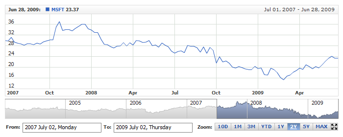
Sample XML with modified From and To labels:
There are some other settings for the labels and you can find the description in XML Reference.
By default each field is 75px wide, but you can change it if you'd like to. Use edit_box_width attribute to redefine the width. Sample XML:
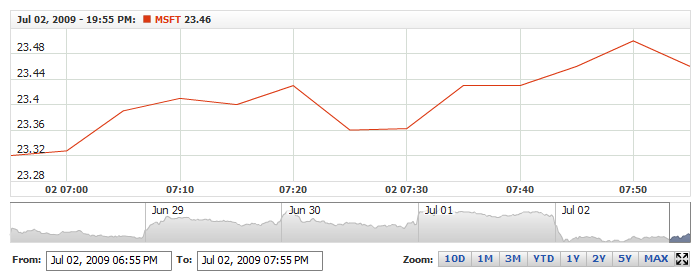
Live sample below shows Range Picker with long Date Time format and wide text boxes (160px):
For normal and hover states Date Time formatting string defines how Date Time looks like, and for edit state it is a mask that defines how user should type the start or end date.
To define the format you should use <format> node in the respective node. Sample XML below shows what we mean:
01 |
<range_selector> |
02 |
<range_picker> |
03 |
<states> |
04 |
<normal> |
06 |
</normal> |
07 |
<hover> |
09 |
</hover> |
10 |
<edit> |
12 |
</edit> |
13 |
</states> |
14 |
</range_picker> |
15 |
</range_selector> |
To define format string you should use date time formatting tokens which is used everywhere in AnyChart Stock and described in Date Time Formatting Article.
Sample XML below shows normal, hover and edit states format settings:
01 |
<range_selector enabled="true"> |
02 |
<range_picker edit_box_width="125"> |
03 |
<states> |
04 |
<normal> |
06 |
</normal> |
07 |
<hover> |
09 |
</hover> |
10 |
<edit> |
12 |
</edit> |
13 |
</states> |
14 |
</range_picker> |
15 |
</range_selector> |
01 | { |
02 | enabled: true, |
03 | rangePicker: { |
04 | editBoxWidth: 125, |
05 | states: { |
06 | normal: { |
07 | format: " %MMM %dd, %yyyy %hh:%mm %tt" |
08 | }, |
09 | hover: { |
10 | format: " %MMM %dd, %yyyy %hh:%mm %tt" |
11 | }, |
12 | edit: { |
13 | format: " %yyyy/%MM/%dd %HH:%mm" |
14 | } |
15 | } |
16 | } |
17 | } |
Live sample below shows how settings shown above work:
For each state of the input field you can define the settings for the background and font. Sample XML for that:
01 |
<range_selector enabled="true"> |
02 |
<range_picker> |
03 |
<states> |
04 |
<normal> |
06 |
<background> |
09 |
<keys> |
13 |
</keys> |
14 |
</gradient> |
15 |
</fill> |
16 |
</background> |
17 |
</normal> |
18 |
<hover> |
20 |
<background> |
23 |
<keys> |
27 |
</keys> |
28 |
</gradient> |
29 |
</fill> |
31 |
</background> |
32 |
</hover> |
33 |
<edit> |
34 |
<background> |
37 |
</background> |
38 |
</edit> |
39 |
</states> |
40 |
</range_picker> |
41 |
</range_selector> |
01 | { |
02 | enabled: true, |
03 | rangePicker: { |
04 | states: { |
05 | normal: { |
06 | font: { |
07 | color: "#2551A5" |
08 | }, |
09 | background: { |
10 | fill: { |
11 | type: "Gradient", |
12 | gradient: { |
13 | angle: 90, |
14 | keys: [ |
15 | { |
16 | color: "#F1F1F1" |
17 | }, |
18 | { |
19 | color: "#FFFFFF" |
20 | }, |
21 | { |
22 | color: "#F1F1F1" |
23 | } |
24 | ] |
25 | } |
26 | } |
27 | } |
28 | }, |
29 | hover: { |
30 | font: { |
31 | color: "#5A2FAB" |
32 | }, |
33 | background: { |
34 | fill: { |
35 | type: "Gradient", |
36 | gradient: { |
37 | angle: 90, |
38 | keys: [ |
39 | { |
40 | color: "#F7E7EB" |
41 | }, |
42 | { |
43 | color: "#FFFFFF" |
44 | }, |
45 | { |
46 | color: "#F7E7EB" |
47 | } |
48 | ] |
49 | } |
50 | }, |
51 | border: { |
52 | color: "#5A2FAB", |
53 | thickness: 2 |
54 | } |
55 | } |
56 | }, |
57 | edit: { |
58 | background: { |
59 | fill: { |
60 | type: "Solid", |
61 | color: "#FEFFA2" |
62 | }, |
63 | border: { |
64 | color: "#5A5A39" |
65 | } |
66 | } |
67 | } |
68 | } |
69 | } |
70 | } |
And Live Sample with customized display of text fields:

There are some other settings and you can find them in nodes description in XML Reference.