01 | { |
02 | eventMarkers: { |
03 | groupingMode: "Merge" |
04 | } |
05 | } |
This article covers all visual and functional settings of event markers. Before getting started with this article, it is highly recommended to have first studied the structure of the <event_markers> node in XML Reference.
By default, if two or more event markers have the same date or fall onto the same point after grouping a series from a greater time span, they pile up one above the other.
This mechanism is good if the number of hashes isn't too great. But in a situation when tens of markers fall onto one timestamp, they simply don't fit its height physically, and some of them could get cut, leading to the data loss for end user.
The marker grouping mode is configured globally for all markers presented on the chart. There are two grouping modes are available for displaying markers:
Grouping mode is defined with the grouping_mode attribute in the <event_markers> node, which can accept the PutInStack and Merge values, described above. Here is a sample XML syntax for setting a grouping mode:

01 |
<?xml version="1.0" encoding="UTF-8"?> |
02 |
<stock xmlns="http://anychart.com/products/stock/schemas/1.9.0/schema.xsd"> |
03 |
<event_markers grouping_mode="Merge" /> |
04 |
</stock> |
Now let's look at these modes by the live examples:
1. PutInStack: For demonstrating this example, we are going to use one group of markers with different characters on each of them:

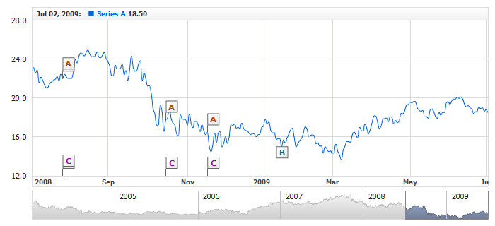
2. Merge: For demonstrating this mode, we are going to use two groups of markers labeled with the "A" and "B" characters. All the event markers in the "A" group have the timestamp "2008-10-12", and in the "B" group - three markers have the "2008-10-12", and the other three - "2008-12-06".

When merging markers with an identical timestamp into a single marker, their original grouping is also taken into account. In other words, for example, a marker from the "A" group cannot merge to a marker from the "B" group, as they might have a completely different logical essence. Thus, merged markers appear one above the other and submit to the stacking settings described in Stacking Settings.
There are no internal mechanisms for displaying merged markers, but there is a way to obtain all the required information on them using the external events and display them using the external means. Examples demonstrating the use of such events are available in a bunch of samples in Online HTML/JavaScript Samples Center: Working with Event Markers section.
The event marker stacking settings are global and apply to all markers presented on the chart. They are provided in the <stack_settings> node. Here is a list of attributes available for the node along with their descriptions:
| Attribute Name | Description | Type | Possible Values | Default Value |
|---|---|---|---|---|
| mode | Sets events markers stack behavior on mouse click. | Enum | AlwaysExpanded Interactive |
Interactive |
| spacing_in_collapsed_state | Sets the spacing between items when event markers are stacked. | Number | N/A | 3 |
| collapse_after | Sets the lower limit of event markers in stack when it is forced to collapse (in Interactive stack mode). | Number | N/A | 2 |
Special coverage is to be given to the use of the mode attribute. By default, it is set to Interactive. In this mode, the markers in the stack collapse into packs of three markers, one behind another, and whenever user clicks on a pack of this kind, it expands, arranging the markers one above the other.
To have all the event markers visible at all times, disable the collapsing by setting the mode attribute to AlwaysExpanded. Here is a live sample that demonstrates the use of such mode:

Each event marker can have a character or text of any length displayed on its body. The character or text to be displayed on markers can be specified for a specific event marker or for an entire group to avoid the redundancy in the configuration file.
To specify a character for a specific event marker, use the format attribute in the event node. The attribute can accept the character that you want to bind to the event. Below is the sample XML syntax for specifying characters for different markers within one group:
01 |
<event_markers> |
02 |
<groups> |
04 |
<events> |
05 |
<event locale_based_date="2009-01-21" format="A" /> |
06 |
<event locale_based_date="2009-02-12" format="B" /> |
07 |
<event locale_based_date="2009-04-23" format="C" /> |
08 |
<event locale_based_date="2009-05-18" format="D" /> |
09 |
<event locale_based_date="2009-06-03" format="E" /> |
10 |
<event locale_based_date="2009-06-24" format="F" /> |
11 |
</events> |
12 |
</group> |
13 |
</groups> |
14 |
</event_markers> |
01 | { |
02 | groups: [ |
03 | { |
04 | chart: "idMainChart", |
05 | series: "idSeries", |
06 | events: [ |
07 | { |
08 | localeBasedDate: "2009-01-21", |
09 | format: "A" |
10 | }, |
11 | { |
12 | localeBasedDate: "2009-02-12", |
13 | format: "B" |
14 | }, |
15 | { |
16 | localeBasedDate: "2009-04-23", |
17 | format: "C" |
18 | }, |
19 | { |
20 | localeBasedDate: "2009-05-18", |
21 | format: "D" |
22 | }, |
23 | { |
24 | localeBasedDate: "2009-06-03", |
25 | format: "E" |
26 | }, |
27 | { |
28 | localeBasedDate: "2009-06-24", |
29 | format: "F" |
30 | } |
31 | ] |
32 | } |
33 | ] |
34 | } |
Here is a live sample demonstrating specifying characters for several markers:

To specify the same character for an entire group, also use the format attribute, but now in the group node. Here is a sample syntax for specifying a character for two different groups:
01 |
<event_markers> |
02 |
<groups> |
04 |
<events> |
05 |
<event locale_based_date="2009-01-21" /> |
06 |
<event locale_based_date="2009-02-12" /> |
07 |
<event locale_based_date="2009-05-18" /> |
08 |
<event locale_based_date="2009-06-24" /> |
09 |
</events> |
10 |
</group> |
12 |
<events> |
13 |
<event locale_based_date="2009-03-18" /> |
14 |
<event locale_based_date="2009-04-03" /> |
15 |
<event locale_based_date="2009-07-12" /> |
16 |
</events> |
17 |
</group> |
18 |
</groups> |
19 |
</event_markers> |
01 | { |
02 | groups: [ |
03 | { |
04 | chart: "idMainChart", |
05 | series: "idSeries", |
06 | format: "A", |
07 | events: [ |
08 | { |
09 | localeBasedDate: "2009-01-21" |
10 | }, |
11 | { |
12 | localeBasedDate: "2009-02-12" |
13 | }, |
14 | { |
15 | localeBasedDate: "2009-05-18" |
16 | }, |
17 | { |
18 | localeBasedDate: "2009-06-24" |
19 | } |
20 | ] |
21 | }, |
22 | { |
23 | chart: "idMainChart", |
24 | series: "idSeries", |
25 | format: "B", |
26 | events: [ |
27 | { |
28 | localeBasedDate: "2009-03-18" |
29 | }, |
30 | { |
31 | localeBasedDate: "2009-04-03" |
32 | }, |
33 | { |
34 | localeBasedDate: "2009-07-12" |
35 | } |
36 | ] |
37 | } |
38 | ] |
39 | } |
The live sample below demonstrates the use of such settings:
The following elements of the event markers' settings can be customized:
All these elements are covered in detail in this section.
Marker shape and size, like many other settings, can be defined for all markers, for a group or for a specific marker. Marker shape and size is configured in the <shape> node. Below is the sample syntax for making such customization for all markers:
Marker shape and size are controlled by the following attributes, which can be used in the <shape> node:
| Attribute | Possible Values | Description |
|---|---|---|
| type | Flag Circle Rect Pin |
Sets event marker shape. |
| size | Any number (e.g. 10) | Sets background width and height. The value is set in pixels. |
| width | Any number (e.g. 10) | Sets background width. The value is set in pixels. |
| height | Any number (e.g. 10) | Sets background height. The value is set in pixels. |
| auto_size | true false |
If this attribute is set to true, the background width and height will be calculated automatically to fit the text. By default, this attribute is set to false. |
Here is a table with the graphic representation of the shapes supported by event markers:
| Sample | Shape Type |
|---|---|
 |
Flag |
 |
Circle |
 |
Rect |
 |
Pin |
Here is a live sample demonstrating the use of markers of different shapes on the same chart:

Event Marker has four visual states, and each one of them is used for plotting a marker in one or the other situation. Here is a list of the attributes available for the node along with their descriptions:
Please note that the Selected Normal and Selected Hover states are applicable when user is allowed to select markers. This option is further described in Enabling Event Marker Selection.
For each of the state, you can configure an individual fill, background borders, corners - for rectangular markers, and font to be used for displaying the character or text on the marker.
Below is a sample syntax for configuring these settings for all four states, by the example of a group of markers:
01 |
<event_markers> |
02 |
<stack_settings mode="AlwaysExpanded" /> |
03 |
<groups> |
05 |
<settings> |
08 |
<states> |
09 |
<normal> |
11 |
<shape> |
14 |
</shape> |
15 |
</normal> |
16 |
<hover> |
18 |
<shape> |
21 |
</shape> |
22 |
</hover> |
23 |
<selected_normal> |
25 |
<shape> |
28 |
</shape> |
29 |
</selected_normal> |
30 |
<selected_hover> |
32 |
<shape> |
35 |
</shape> |
36 |
</selected_hover> |
37 |
</states> |
38 |
</settings> |
39 |
</group> |
40 |
</groups> |
41 |
</event_markers> |
01 | { |
02 | stackSettings: { |
03 | mode: "AlwaysExpanded" |
04 | }, |
05 | groups: [ |
06 | { |
07 | chart: "idMainChart", |
08 | series: "idSeries", |
09 | format: "B", |
10 | settings: { |
11 | shape: { |
12 | type: "Circle", |
13 | size: 16 |
14 | }, |
15 | connector: { |
16 | length: 17 |
17 | }, |
18 | states: { |
19 | normal: { |
20 | font: { |
21 | color: "#B23729", |
22 | bold: true |
23 | }, |
24 | shape: { |
25 | fill: { |
26 | type: "Solid", |
27 | color: "#FFF1EF" |
28 | }, |
29 | border: { |
30 | color: "#B23729", |
31 | opacity: 1, |
32 | thickness: 1 |
33 | } |
34 | } |
35 | }, |
36 | hover: { |
37 | font: { |
38 | color: "#4D8E4D", |
39 | bold: true |
40 | }, |
41 | shape: { |
42 | fill: { |
43 | type: "Solid", |
44 | color: "#F3FBF3" |
45 | }, |
46 | border: { |
47 | color: "#4D8E4D", |
48 | opacity: 1, |
49 | thickness: 1 |
50 | } |
51 | } |
52 | }, |
53 | selectedNormal: { |
54 | font: { |
55 | color: "#FFFFFF", |
56 | bold: true |
57 | }, |
58 | shape: { |
59 | fill: { |
60 | type: "Solid", |
61 | color: "#4D6F8E" |
62 | }, |
63 | border: { |
64 | color: "#333333", |
65 | opacity: 0.3 |
66 | } |
67 | } |
68 | }, |
69 | selectedHover: { |
70 | font: { |
71 | color: "#FFFFFF", |
72 | bold: true |
73 | }, |
74 | shape: { |
75 | fill: { |
76 | type: "Solid", |
77 | color: "#6795BE" |
78 | }, |
79 | border: { |
80 | color: "#333333", |
81 | opacity: 0.3 |
82 | } |
83 | } |
84 | } |
85 | } |
86 | } |
87 | } |
88 | ] |
89 | } |
The live sample below demonstrates the use of such settings:
The AnyChart Stock component gallery has a special section demonstrating capabilities of event markers. It contains several examples for various visualization configurations.
To learn more about them, please refer to:
The line connecting the point with the actual marker has two settings: length and visual properties.
Connector is configured in the connector node, which can be used on any level. Connector length is customized with the length attribute, which specifies the height in pixels. Below is the sample syntax for customizing the connector height and visualization for a group markers:
01 |
<event_markers> |
02 |
<groups> |
04 |
<settings> |
06 |
</settings> |
07 |
<events> |
08 |
<event locale_based_date="2009-01-21" /> |
09 |
<event locale_based_date="2009-02-12" /> |
10 |
<event locale_based_date="2009-04-23" /> |
11 |
</events> |
12 |
</group> |
13 |
</groups> |
14 |
</event_markers> |
01 | { |
02 | groups: [ |
03 | { |
04 | chart: "idMainChart", |
05 | series: "idSeries", |
06 | format: "A", |
07 | settings: { |
08 | connector: { |
09 | length: 20, |
10 | thickness: 2, |
11 | color: "#DD1010", |
12 | opacity: 1 |
13 | } |
14 | }, |
15 | events: [ |
16 | { |
17 | localeBasedDate: "2009-01-21" |
18 | }, |
19 | { |
20 | localeBasedDate: "2009-02-12" |
21 | }, |
22 | { |
23 | localeBasedDate: "2009-04-23" |
24 | } |
25 | ] |
26 | } |
27 | ] |
28 | } |
Here is a live sample demonstrating customization of connector settings for a group of markers:

For the comprehensive coverage on all available connector settings, please refer to XML Reference.
By default when you hover event markers the arrow cursor is used, if you want to use hand cursor you need to set use_hand_cursor for a group or a selected event marker:
01 |
<event_markers> |
02 |
<settings allow_select="true" /> |
03 |
<groups> |
04 |
<group chart="idMainChart" series="idSeries1" format="A" use_hand_cursor="true"> |
05 |
<events> |
06 |
<event locale_based_date="2009-01-21" /> |
07 |
<event locale_based_date="2009-02-12" /> |
08 |
<event locale_based_date="2009-04-23" /> |
09 |
</events> |
10 |
</group> |
11 |
<group chart="idMainChart" series="idSeries2" format="B" use_hand_cursor="true"> |
12 |
<events> |
13 |
<event locale_based_date="2009-01-21" /> |
14 |
<event locale_based_date="2009-02-12" /> |
15 |
<event locale_based_date="2009-04-23" use_hand_cursor="true" /> |
16 |
</events> |
17 |
</group> |
18 |
</groups> |
19 |
</event_markers> |
01 | { |
02 | settings: { |
03 | allowSelect: true |
04 | }, |
05 | groups: [ |
06 | { |
07 | chart: "idMainChart", |
08 | series: "idSeries1", |
09 | format: "A", |
10 | useHandCursor: true, |
11 | events: [ |
12 | { |
13 | localeBasedDate: "2009-01-21" |
14 | }, |
15 | { |
16 | localeBasedDate: "2009-02-12" |
17 | }, |
18 | { |
19 | localeBasedDate: "2009-04-23" |
20 | } |
21 | ] |
22 | }, |
23 | { |
24 | chart: "idMainChart", |
25 | series: "idSeries2", |
26 | format: "B", |
27 | useHandCursor: true, |
28 | events: [ |
29 | { |
30 | localeBasedDate: "2009-01-21" |
31 | }, |
32 | { |
33 | localeBasedDate: "2009-02-12" |
34 | }, |
35 | { |
36 | localeBasedDate: "2009-04-23", |
37 | useHandCursor: true |
38 | } |
39 | ] |
40 | } |
41 | ] |
42 | } |
Here is a sample of a chart with two groups of event markers, the A groups uses hand cursor for all markers and the B group uses it for the last one:
By default, user cannot select event markers. When event marker selection is disabled, the visual states Selected Normal and Selected Hover do not trigger.
To enable the option, use the following syntax:
01 |
<event_markers> |
02 |
<settings allow_select="true" /> |
03 |
<groups> |
05 |
<events> |
06 |
<event locale_based_date="2009-01-21" selected="true" /> |
07 |
<event locale_based_date="2009-02-12" /> |
08 |
<event locale_based_date="2009-04-23" /> |
09 |
</events> |
10 |
</group> |
11 |
</groups> |
12 |
</event_markers> |
01 | { |
02 | settings: { |
03 | allowSelect: true |
04 | }, |
05 | groups: [ |
06 | { |
07 | chart: "idMainChart", |
08 | series: "idSeries", |
09 | format: "A", |
10 | events: [ |
11 | { |
12 | localeBasedDate: "2009-01-21", |
13 | selected: true |
14 | }, |
15 | { |
16 | localeBasedDate: "2009-02-12" |
17 | }, |
18 | { |
19 | localeBasedDate: "2009-04-23" |
20 | } |
21 | ] |
22 | } |
23 | ] |
24 | } |
Once the allow_select attribute is set to true, user can select specific events with the selected attribute, as shown on the listing above.
Here is a live sample with an enabled event marker selection option; click on an event marker to make sure they have become selectable.

Please note that only one event marker at a time can be selected on a chart.
Besides the end-user's actions, marker can be selected with the external method selectEventMarker, and drop the selection with resetEventMarkerSelection.
Event markers can be plotted in two positions: on a point in the series the group of markers is bound to or within the X-axis area. The position can be set for each specific marker or for an entire group of markers.
A specific event marker's position is configured with the position and direction attributes in the <event> node.
position attribute accept the following values:
direction attribute accepts the following values:
Note: direction works only with Series, SeriesPositive and SeriesNegative.
Below is a sample syntax for positioning markers within one group:
01 |
<event_markers> |
02 |
<groups> |
04 |
<events> |
05 |
<event locale_based_date="2009-01-21" position="Axis" /> |
06 |
<event locale_based_date="2009-02-12" position="Axis" /> |
07 |
<event locale_based_date="2009-04-23" position="Series" direction="Down" /> |
08 |
<event locale_based_date="2009-05-27" position="SeriesPositive" direction="Up" /> |
09 |
<event locale_based_date="2009-06-17" position="SeriesNegative" /> |
10 |
</events> |
11 |
</group> |
12 |
</groups> |
13 |
</event_markers> |
01 | { |
02 | groups: [ |
03 | { |
04 | chart: "idMainChart", |
05 | series: "idSeries", |
06 | format: "A", |
07 | events: [ |
08 | { |
09 | localeBasedDate: "2009-01-21", |
10 | position: "Axis" |
11 | }, |
12 | { |
13 | localeBasedDate: "2009-02-12", |
14 | position: "Axis" |
15 | }, |
16 | { |
17 | localeBasedDate: "2009-04-23", |
18 | position: "Series", |
19 | direction: "Down" |
20 | }, |
21 | { |
22 | localeBasedDate: "2009-05-27", |
23 | position: "SeriesPositive", |
24 | direction: "Up" |
25 | }, |
26 | { |
27 | localeBasedDate: "2009-06-17", |
28 | position: "SeriesNegative" |
29 | } |
30 | ] |
31 | } |
32 | ] |
33 | } |
Here is a live sample demonstrating event markers within the same group that hold different positions:

To define a position for an entire group of event markers, you can use the same position and/or direction attribute, now in the <group> node. The position attribute can as well accept the Axis, Series, SeriesPositive or SeriesNegative values, and direction can be Up or Down .
Below is a sample syntax for positioning a group of markers on the X-axis:
01 |
<event_markers> |
02 |
<groups> |
04 |
<events> |
05 |
<event locale_based_date="2009-01-21" /> |
06 |
<event locale_based_date="2009-02-12" /> |
07 |
<event locale_based_date="2009-04-23" /> |
08 |
</events> |
09 |
</group> |
10 |
</groups> |
11 |
</event_markers> |
01 | { |
02 | groups: [ |
03 | { |
04 | chart: "idMainChart", |
05 | series: "idSeries", |
06 | format: "A", |
07 | position: "Axis", |
08 | events: [ |
09 | { |
10 | localeBasedDate: "2009-01-21" |
11 | }, |
12 | { |
13 | localeBasedDate: "2009-02-12" |
14 | }, |
15 | { |
16 | localeBasedDate: "2009-04-23" |
17 | } |
18 | ] |
19 | } |
20 | ] |
21 | } |
The live sample below uses three groups of markers, where two are positioned on the series, but with different direction, and one sits on the axis.
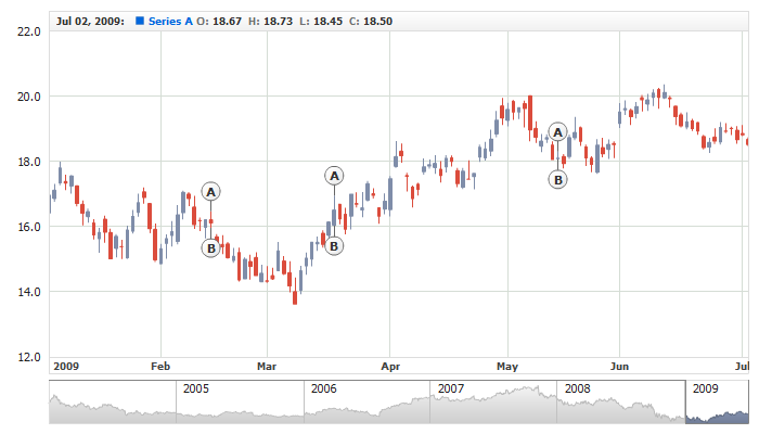
Be default all event markers are bound to "close" value (i.e. they are drawn near this value). It works fine, when you show group of markers on Lines, Splines, Areas, etc, but when you use Candlesticks, OHLC or range-based series, you may want to bind them to another value. To change the filed, to which markers are bound you should alter field_type attribute:
01 |
<event_markers> |
02 |
<groups> |
03 |
<group chart="idMainChart" series="idSeries" format="A" field_type="High"> |
04 |
<events> |
05 |
<event locale_based_date="2009-01-21" /> |
06 |
<event locale_based_date="2009-02-12" /> |
07 |
</events> |
08 |
</group> |
09 |
</groups> |
10 |
</event_markers> |
01 | { |
02 | groups: [ |
03 | { |
04 | chart: "idMainChart", |
05 | series: "idSeries", |
06 | format: "A", |
07 | fieldType: "High", |
08 | events: [ |
09 | { |
10 | localeBasedDate: "2009-01-21" |
11 | }, |
12 | { |
13 | localeBasedDate: "2009-02-12" |
14 | } |
15 | ] |
16 | } |
17 | ] |
18 | } |
In this attribute you can use standard field names ("Open", "Low", etc.) or set it to "Custom" and specify custom name in field_custom_type_name attribute, as it is shown below:
01 |
<event_markers> |
02 |
<groups> |
03 |
<group format="A" field_type="Custom" field_custom_type_name="MyCustomField"> |
04 |
<events> |
05 |
<event locale_based_date="2009-01-21" /> |
06 |
</events> |
07 |
</group> |
08 |
</groups> |
09 |
</event_markers> |
01 | { |
02 | groups: [ |
03 | { |
04 | format: "A", |
05 | fieldType: "Custom", |
06 | fieldCustomTypeName: "MyCustomField", |
07 | events: [ |
08 | { |
09 | localeBasedDate: "2009-01-21" |
10 | } |
11 | ] |
12 | } |
13 | ] |
14 | } |
Illustration below shows event marker positioning adjustment with Candlestick series:
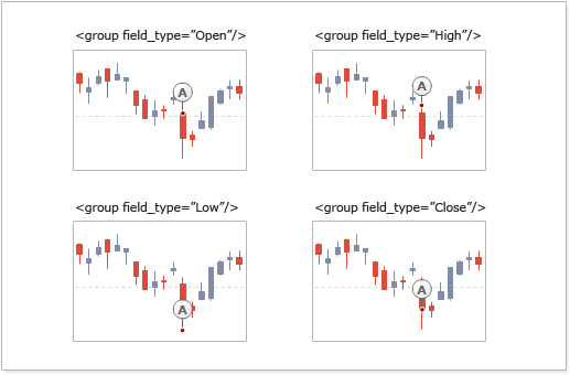
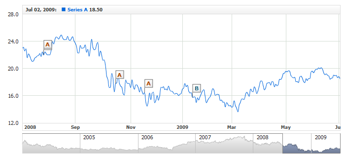
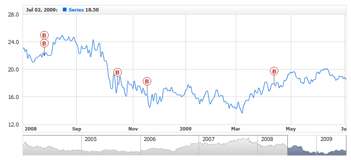
And here is a live sample with Candlestick series and two groups of event markers: bound to "High" field and "Low" field, note how direction attribute can make them look even better.