Data Grouping and Values Approximation
Overview
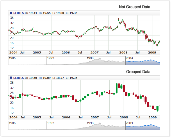
For the better graphical representation of the large data sets AnyChart Stock component provides the ability to group data points and display them as a single point. We call this feature data grouping.
The benefits of showing grouped data are better readability of the charts and faster rendering of chart on the page at the expense of drawing less number of elements.
Illustration below shows two chart depicting the same data in non grouped and grouped modes:
With grouping turned on you should explicitly set maximum number of point on X axis that can be shown on the chart for the given time interval, with no regard to the current scale. When the number of points in the given interval exceeds defined maximum - data points will be grouped.

Basic Settings
Basic settings for the grouping are on/off status and the number of maximum visible points:
XML Sample:
01 |
<?xml version="1.0" encoding="UTF-8"?> |
02 |
<stock xmlns="http://anychart.com/products/stock/schemas/1.9.0/schema.xsd"> |
Approximation Types
When you decide to use grouping you need to set how exactly several values should be grouped in one. To do that you need to set type of approximation for each field of Data-Provider in Data-Provider definition.
Approximation type is set in approximation_type attribute of <field> node. XML below shows the syntax for Data-Provider definition and setting approximation type for the single field:
There are seven Approximation types in AnyChart Stock Component:
| Type |
Description |
| Average |
Calculates the arithmetic mean of values in the interval. |
| Open |
Returns the first value in the interval. |
| Low |
Finds the minimal value in the interval. |
| High |
Finds the maximal value in the interval. |
| Close |
Returns the last value in the interval. |
| Sum |
Calculates the sum of all values in the interval. |
| WeightedAverage |
Described below. |
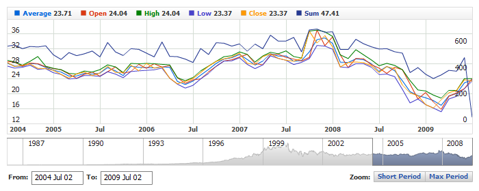
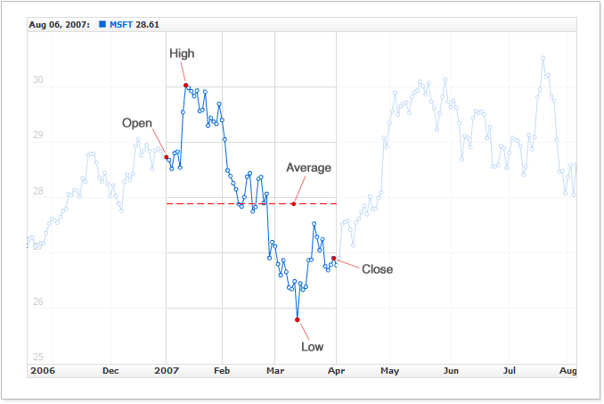
Illustration below highlights the period with values to be grouped. Depending on the chosen approximation type one of values shown by the red points is used:
Live sample below shows how different type of approximation change the look of the chart. The same data is used as the source from the Data Set and Data Providers are created for each line. Each provider uses one of approximation types and, as the result, lines are drawn by the different values on the large intervals and by the same on the small intervals (as the grouping isn't used):
Live Sample: Comparing Types of Approximation
Look at the correct settings to group OHLC series:
Weighted-Average Approximation Type
You can also use the Weighted-Average approximation type, which requires some additional settings. The primary objective of this type is preserving peak changes when grouping data.
You can find the further description of this type at: http://en.wikipedia.org/wiki/Weighted_mean
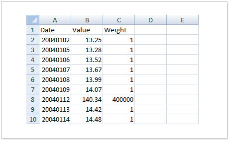
To use Weighted Average in AnyChart Stock, in data provider you should specify the column with weighting coefficients.
Here is an XML syntax for configuring Weighted Average:
As you can see, once the approximation type is set to Weighted Average, we define the weights_column attribute in the <field>, which sets the zero-based index for the column with weights.
The illustration below shows a table with three columns: Timestamp, Value and Weight:
Weight can be any positive number, and the greater the weight is - the more likely the value point would be chosen as the value that represents several points in the grouped period.
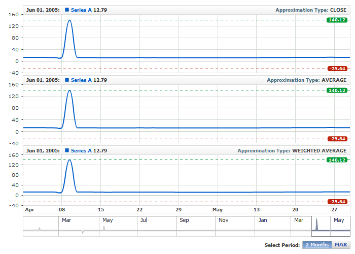
To demonstrate the pros of the Weighted-Average type, the live sample below provides a comparison of it to the Average and Close types. The sample uses the following data table: values_and_weights.csv.
For each approximation type, we have placed axis markers colored in red and green - they represent the minimal and maximal values. Use the scroller or range selector buttons to see how each approximation type works:
Live Sample: Weighted Average Approximation Type
If you have studied the look of the chart in different ranges, you could see that with the Average approximation line changes and loses the peak values, and the Close approximation turns in almost a straight line, while the Weighted-Average approximation type preserves the peak values, since those values have appropriate weights in the weight column.
Managing Intervals
Grouping intervals are time periods that are used for grouping data when zooming.
By default, the engine uses a predefined all-purpose set of grouping intervals. But if that set doesn't work for you - you can modify them.
Intervals List
To redefine the list of intervals, use the <intervals> node with several <interval> subnodes contained in them.
Here is the list of intervals that the component uses by default:
01 |
<?xml version="1.0" encoding="UTF-8"?> |
02 |
<stock xmlns="http://anychart.com/products/stock/schemas/1.9.0/schema.xsd"> |
The table below describes the attributes of the <interval> node:
| Type |
Possible values |
Description |
| unit |
Year
Semester
Quarter
Month
ThirdOfMonth
Week
Day
Hour
Minute
Second
Millisecond |
Defines what time unit in the count setting represents one grouping domain. |
| count |
Any positive integer value greater than zero. |
Sets the number of units that together correspond with one grouping domain. |
| max_visible_points |
Any positive integer value. |
Sets visible point count maximum for this grouping interval. If not set, the default value set in max_visible_points of the <data_grouping> node is used. |
Take a look at the sample XML, where only three intervals are used - week, month and 3-months:
01 |
<?xml version="1.0" encoding="UTF-8"?> |
02 |
<stock xmlns="http://anychart.com/products/stock/schemas/1.9.0/schema.xsd"> |
Note: If you manually define at least one interval on the list - all the default intervals are reset. Thus, if the new list doesn't contain intervals matching the original data - the points will be grouped at the very start.
To explain intervals better, let's take a look at the following sample.
There is a set with daily reports for a long period of time, say, over 80 years, and we need to show the data the following way:
- User should be able to see the daily data within a 3-year (or 1092-day) range.
- If user changes the range and the range exceeds 1092 days - the chart should group the points into weeks. When one point represents one week, user should be able to see the weekly data within a 15-year (780-week) range.
- When the range exceeds 780 weeks - the chart should start showing the monthly data for all the 80 years.
To have the AnyChart Stock component show the data according to this scenario, you should configure the intervals as follows:
01 |
<?xml version="1.0" encoding="UTF-8"?> |
02 |
<stock xmlns="http://anychart.com/products/stock/schemas/1.9.0/schema.xsd"> |
And here is the explanation for each interval:
- <interval unit="Day" count="1" max_visible_points="1092"/> - this interval allows showing data in the daily mode - the original data. The max_visible_points attribute sets the maximum number of days that can be shown on the chart at a time. When user attempts to show more than 1092 points, the program starts grouping to the next level of grouping.
- <interval unit="Week" count="1" max_visible_points="780"/> - this interval defines larger units - weeks. When the limit of the interval with smaller units (1092 days in our case) is exceeded, the component will group the points into weeks. max_visible_points set to 780 tells the component that it must not show more than 780 weeks at a time. When user attempts to show more than 780 groups, the program starts grouping to the next level of grouping.
- <interval unit="Month" count="1"/> - this is the largest unit interval. When the previous limits of the previous levels of grouping are exceeded - the component shows the chart using this interval's settings - monthly grouped points. There is no need to define max_visible_points here, for we don't need the next grouping level.
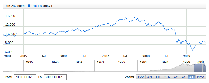
And now take a look at the live sample with the settings shown and described above: This sample uses the dji_daily_close.csv data set with daily close values of Dow Jones Industrial Average from 1928 to 2009, which is over 20 thousands of points:
Live Sample: Data Grouping - Grouping Intervals
Fixed Intervals
For many applications, especially those that deal with financial data, it may be necessary to show charts grouped in some predefined interval. Usually the grouping interval is set with some external control like ComboBox, where end user selects options like Daily, Weekly, etc.
By default, the component groups or shows the original data according to predefined intervals set as shown above; to change this and make the component show data grouped with some predefined precision, you should use one interval of your choice from the interval list. The sample XML below demonstrates how to make AnyChart Stock always show data grouped in weeks:
01 |
<?xml version="1.0" encoding="UTF-8"?> |
02 |
<stock xmlns="http://anychart.com/products/stock/schemas/1.9.0/schema.xsd"> |
The live sample below uses a data source with daily data, but the chart always shows the data grouped in weeks, because of the custom interval settings:
Live Sample: Data Grouping - Using Fixed Intervals
Please see the Custom Sample that shows how an external control can be used for switching fixed grouping intervals on-the-fly:
Online HTML/JavaScript Sample
Adaptive Date Time Formatting
When the use of grouping changes the interval, the data details change as well; for example, when a chart is shown in daily intervals, the date and time are shown as "21 May, 2009" or "16 Apr, 2009"; but when the data groups into months, the date and time are shown as "1 May, 2009" or "1 Apr 2009", because all the month's data is represented by the first day of the month.
But user may be confused with this label and prefer to see a label like "May, 2009".
To solve this issue and prevent the confusion, use adaptive date-time formatting, which allows to set how the elements change their format depending on the grouping level.
This mechanism is described in detail in: