Context Menu
Overview
AnyChart Stock adds special context menu items to the flash player's context menu. When user clicks on an AnyChart Stock Flash movie, the following context menu shows up:
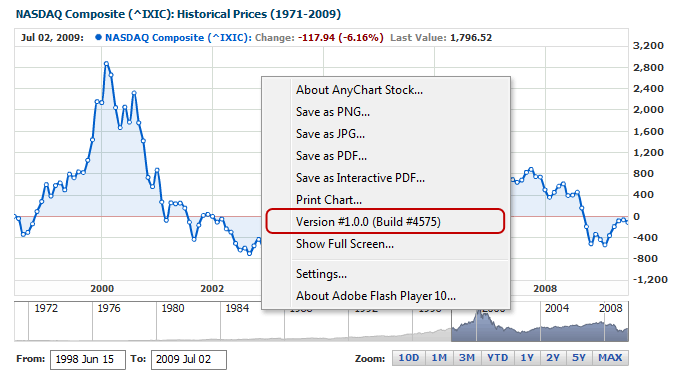
The items on the menu are:
- Version - AnyChart Stock component version.
- About AnyChart Stock - Information about the AnyChart Stock component.
- Print Chart - Prints current chart.
- Save as PNG - Saves chart as a PNG image.
- Save as JPG - Saves chart as a JPG image.
- Save as PDF - Saves chart as a PDF document.
- Save as Interactive PDF - Saves chart as Interactive PDF.
- Full Screen - View current chart in the full screen mode.
All of the context menu settings are configured in the <context_menu> item of the <utils> node.
Here is a sample XML for configuring the context menu:
01 |
<?xml version="1.0" encoding="UTF-8"?> |
02 |
<stock xmlns="http://anychart.com/products/stock/schemas/1.9.0/schema.xsd"> |

Limitations
Flash player context menu can contain only 15 elements, including those described in Overview.
If you need to add more slots in context menu you can disable some of the items AnyStock adds to the menu, like "About AnyChart Stock", "Version" or any other.
Turning Context Menu Items On/Off
To turn on an item of AnyChart Stock's context menu, set the corresponding attributes to 'true'. To turn an item off, set the corresponding attribute to 'false'. Here is the description of the context menu attributes:
| Attribute |
Possible Values |
Description |
| version_info |
true
false |
Turns On/Off the menu item that displays version info. |
| print |
true
false |
Turns On/Off the "Print Chart" menu item. |
| about |
true
false |
Turns On/Off the "About AnyChart Stock" menu item. |
| export_as_png_image |
true
false |
Turns On/Off the "Save as PNG " menu item. |
| export_as_jpg_image |
true
false |
Turns On/Off the "Save as JPG " menu item. |
| export_as_pdf |
true
false |
Turns On/Off the "Save as PDF " menu item. |
| export_as_interactive_pdf |
true
false |
Turns On/Off the "Save as Interactive PDF" menu item. |
This XML syntax demonstrates turning off all items of the context menu in AnyChart Stock:
01 |
<?xml version="1.0" encoding="UTF-8"?> |
02 |
<stock xmlns="http://anychart.com/products/stock/schemas/1.9.0/schema.xsd"> |
Customization and Localization
The following standard items of the context menu can be customized and localized:
- Save as PNG
- Save as JPG
- Save as PDF
- Save as Interactive PDF
- Print Chart
- Show Full Screen
Here is an XML sample for localizing all these items to Russian:
01 |
<?xml version="1.0" encoding="UTF-8"?> |
02 |
<stock xmlns="http://anychart.com/products/stock/schemas/1.9.0/schema.xsd"> |
The live example below demonstrates that all the items on the context menu have got a new look:
Live Sample: Context Menu Customization
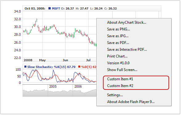
Using Custom Items
Besides the standard menu items added by the component, you can add your own items to the menu. For the custom menu items, you can specify the required text and define event handlers for user's selection.
The illustration below demonstrates the order how custom menu items are placed against the standard ones added by the component and the flash player:
Adding Items
Custom menu items are supplied as a list; each item must have a text. Besides, you can optionally add a separator bar preceding the item and an identifier that would be used for handling the selection event.
The XML sample below demonstrates adding two custom items with text "Custom Item #1" and "Custom Item #2":
01 |
<?xml version="1.0" encoding="UTF-8"?> |
02 |
<stock xmlns="http://anychart.com/products/stock/schemas/1.9.0/schema.xsd"> |
07 |
<text><![CDATA[Custom Item #1]]></text> |
10 |
<text><![CDATA[Custom Item #2]]></text> |
07 | text: "Custom Item #1" |
10 | text: "Custom Item #2" |
Here is the live example demonstrating the customized context menu in action:
Live Sample: Adding Custom Items to Context Menu
Handling Events
For handling the click event for a specific item, the item must have an identifier. Identifier is defined by the id attribute in the <item> node. Below is a sample XML for adding custom items with identifiers:
01 |
<?xml version="1.0" encoding="UTF-8"?> |
02 |
<stock xmlns="http://anychart.com/products/stock/schemas/1.9.0/schema.xsd"> |
07 |
<text><![CDATA[Custom Item #1]]></text> |
10 |
<text><![CDATA[Custom Item #2]]></text> |
08 | text: "Custom Item #1" |
12 | text: "Custom Item #2" |
For handling the events for the added items, the HTML page with the chart has a special event handler in the JavaScript library supplied with the component.
Online HTML/JavaScript Sample