Scale Bar
Overview
Scale Bar
Scale Bar node adjusts whether Scale bar is enabled or not and controls its align, width and padding. Scale bar, in fact, is only a visual form of your scale. Therefore you can fully customize its visual appearance, fill, border of add some effects.
Typical XML settings for the scale bar are:
XML Syntax

01 |
<scale_bar enabled="true" width="%AxisSize" align="Center" /> |
Scale Bar Parameters
The following attributes can be set for scale bar:
| Attribute | Values | Default | Description |
|---|---|---|---|
| enabled | true | false | true | Sets whether scale bar is enabled or not |
| align | Inside | Outside | Center | Center | Adjusts the position of scale bar |
| padding | Number | Auto | Sets the padding of scale bar |
| size | Number | Auto | The size of scale bar |
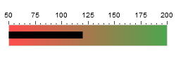
Adjusting scale bar's visual appearance.
We will configure our scale bar: set its align to "Center", padding to "0":
XML Syntax
01 |
<scale_bar enabled="true" padding="0" align="Center" /> |
You can also set a color of your scale bar using fill, border, effects subnodes of scale_bar node. Let's enable border for our scale bar and color it using "Gradient" coloring mode:
XML Syntax
01 |
<scale_bar enabled="true" padding="0" align="Center"> |
02 |
<border enabled="true" type="Solid" color="#D3D2CC" /> |
03 |
<fill enabled="true" type="Gradient"> |
04 |
<gradient angle="-90"> |
05 |
<key color="Green" opacity="0.7" /> |
06 |
<key color="Red" opacity="0.7" /> |
07 |
</gradient> |
08 |
</fill> |
09 |
<effects enabled="false" /> |
10 |
</scale_bar> |
Live Sample: Sample Linear Scale Bar Gauge